By: Koen Verbeeck | Comments (6) | Related: > Reporting Services Charts
Problem
I have two sets of data that I want to display in a chart using SQL Server Reporting Services (SSRS). However, the sets have different scales, so I want to plot the chart with a secondary axis. How can this be done in SSRS?
Solution
Plotting data on a primary and a secondary axis can be useful to compare data sets with two distinct ranges. Another use case is having a regular quantitative scale on the primary axis and a scale with percentages on the secondary axis. A typical example is a Pareto analysis, also known as the "80/20 rule". This analysis can be used to find your most important customers. "20% of your customers are responsible for 80% of the revenue". So it makes sense to focus on retaining that top 20% of customers. Or, "20% of the site contributors are responsible for about 80% of the content". This is a rule of thumb of course and it has its roots in the quote from Pareto where he stated that 20% of the population of Italy hold 80% of the land. Anyway, a typical Pareto chart has a bar series with numerical values and a line series that represents the percentage of total.
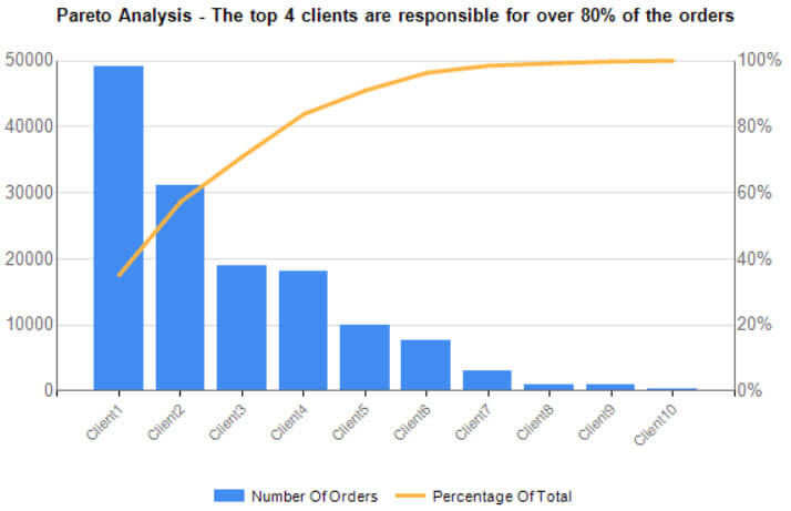
Example Pareto Chart in SQL Server Reporting Services
With the following query, we can quickly generate a small set of data that we can use to create a sample Pareto chart with two vertical axes.
WITH CTE_Values AS
(
 SELECT ID = 1, Client = 'Client1', NumberOfOrders = 49000
 UNION ALL
 SELECT ID = 2, Client = 'Client2', NumberOfOrders = 31000
 UNION ALL
 SELECT ID = 3, Client = 'Client3', NumberOfOrders = 19000
 UNION ALL
 SELECT ID = 4, Client = 'Client4', NumberOfOrders = 18000
 UNION ALL
 SELECT ID = 5, Client = 'Client5', NumberOfOrders = 10000
 UNION ALL
 SELECT ID = 6, Client = 'Client6', NumberOfOrders = 7500
 UNION ALL
 SELECT ID = 7, Client = 'Client7', NumberOfOrders = 3000
 UNION ALL
 SELECT ID = 8, Client = 'Client8', NumberOfOrders = 1000
 UNION ALL
 SELECT ID = 9, Client = 'Client9', NumberOfOrders = 800
 UNION ALL
 SELECT ID = 10, Client = 'Client10', NumberOfOrders = 350
)
SELECT
  ID
 ,NumberOfOrders
 ,PercentageOfTotal = RunningTotal*1.0 / GrandTotal
FROM
(
 SELECT
   ID
  ,Client
  ,NumberOfOrders
  ,RunningTotal = SUM(NumberOfOrders) OVER (ORDER BY NumberOfOrders DESC ROWS BETWEEN UNBOUNDED PRECEDING AND CURRENT ROW)
  ,GrandTotal  = SUM(NumberOfOrders) OVER ()
 FROM CTE_Values
) tmp
ORDER BY ID;
Creating the Pareto Chart in SSRS
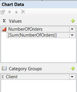
Insert a blank chart on to the report canvas and give it the type Column. Then add NumberOfOrders as a series and Client as a category group.
When we preview the chart, the clients are in a random order so we need to sort them.
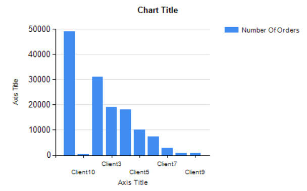
Right-click on Client in Category Groups, go to its properties, then to the Sorting pane and configure the clients to be sorted by ID instead.

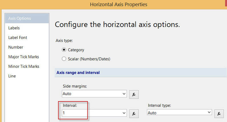
To make sure all the clients names can be displayed on the horizontal axis, right-click on the axis, go to its properties and in the Axis Options pane, replace the value for Interval from Auto to 1.
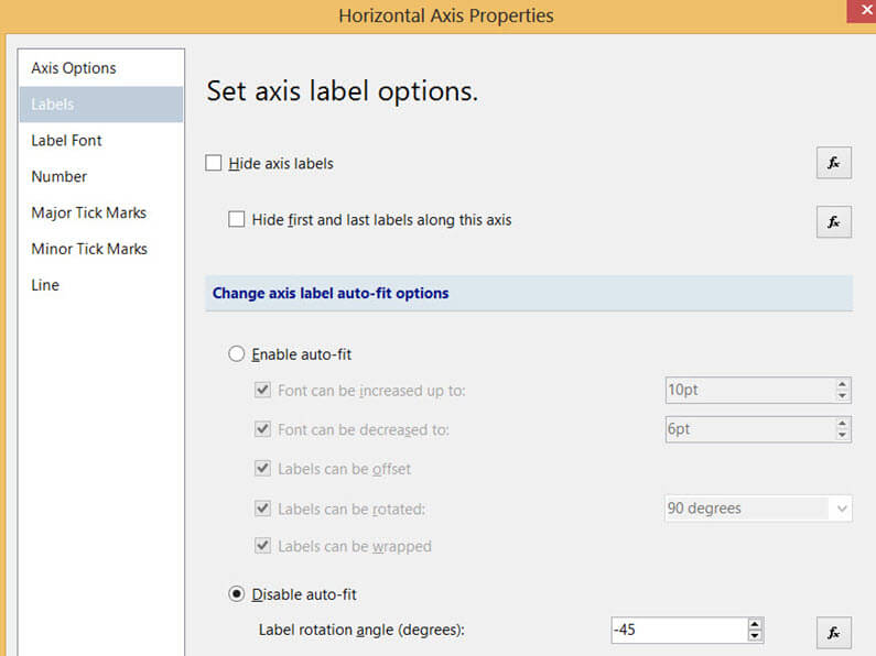
Then go to the Labels pane and disable auto-fit. Rotate the labels with an angle of -45.
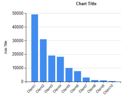
This gives us the following chart:
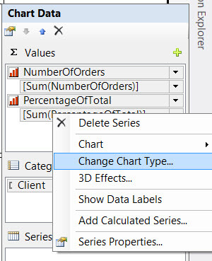
Now we add our second series, the PercentageOfTotal. After adding it, right-click the series and choose Change Chart Type…
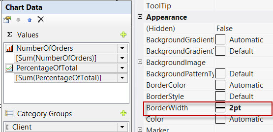
Change the series to a line series. In its properties, set the BorderWidth to two points.
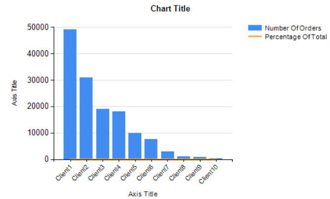
When we preview the chart, we can see the percentage line is stuck against the horizontal axis, since its values never are higher than 1. Meanwhile, the other series has values of almost 50,000, so the two scales of the data sets are in two very distinct ranges. This is why a secondary axis is needed.
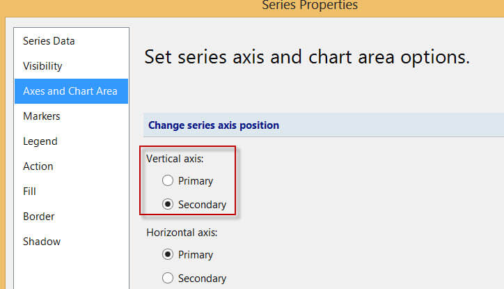
Right-click the line series and go to its properties. In the Axes and Chart Area pane, set the vertical axis to Secondary.
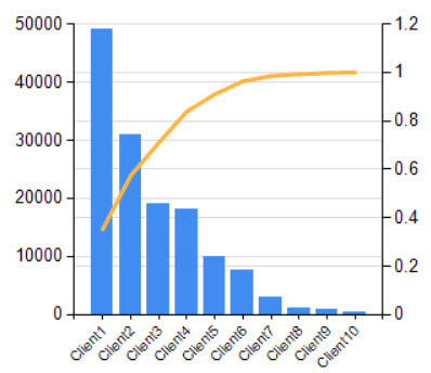
We can see a secondary axis is now added to the chart. However, we still need to configure its scale, otherwise we get some real ugly results, like the one below.
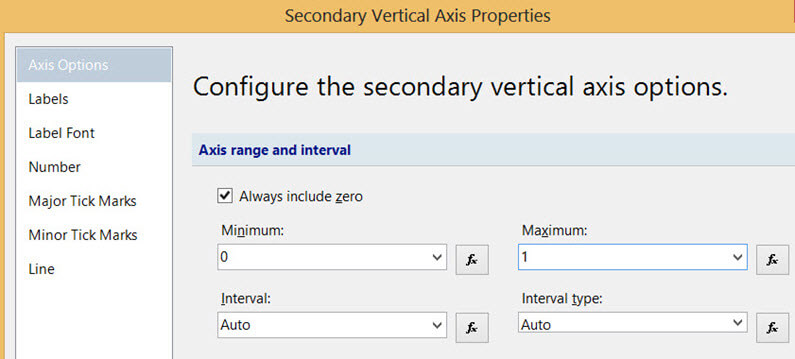
Right-click the secondary axis and go to its properties. In the Axis Options pane, set the minimum of the axis range to 0 and the maximum to 1.
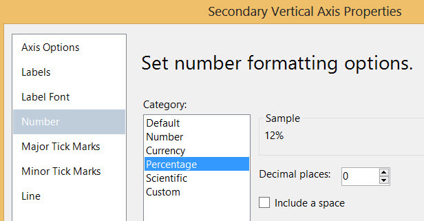
Go to the Number pane and configure the number formatting to Percentage, with no decimal places.
The chart now looks like this, which is already much better.
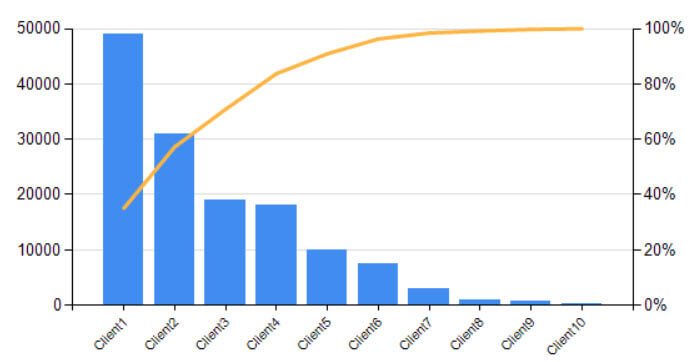
After some cosmetic changes (changing or hiding titles, moving the legend, changing the fonts and colors of the axes and slimming down the gridlines), we get our final result:

Using this chart, we can easily conclude that the two most important clients are already responsible for 60% of the orders.
Conclusion
It is straightforward in SSRS to add a secondary axis to a chart. You can assign one or multiple series to this secondary axis, making it possible to compare or analyze data sets of distinct ranges.
Next Steps
- If you want to redo the steps from this tip, you can download the .rdl report file here.
- The official MSDN documentation about adding a secondary axis can be read here.
- For more SSRS tips, you can visit the MSSQLTips website.
About the author
 Koen Verbeeck is a seasoned business intelligence consultant at AE. He has over a decade of experience with the Microsoft Data Platform in numerous industries. He holds several certifications and is a prolific writer contributing content about SSIS, ADF, SSAS, SSRS, MDS, Power BI, Snowflake and Azure services. He has spoken at PASS, SQLBits, dataMinds Connect and delivers webinars on MSSQLTips.com. Koen has been awarded the Microsoft MVP data platform award for many years.
This author pledges the content of this article is based on professional experience and not AI generated.
View all my tips


