Problem
I created a line chart in Reporting Services (SSRS). In order to analyze the data better, I’d like to add some sort of trendline to the graph, such as a weighted average for example. In Excel it is possible to add this functionality with just a few clicks. Can we achieve the same in SSRS without having to do many extra calculations?
Solution
Fortunately it is pretty straight forward in SSRS to add an extra calculated series to a graph. A calculated series is a series where its data is derived from another series in the graph through a specific formula. A very simple example is the mean. Here the data is derived by aggregating the data of the base series and dividing it by the total number of data points. The result is a straight horizontal line indicating the value of the mean:

The advantage of a calculated series is that you don’t have to go through the hassle of calculating it yourself in the source query. Calculating the mean is easy enough, but there are more complex formulas. The following calculated series can be added in SSRS:
- Mean
- Median
- Bollinger bands
- Moving average
- Exponential moving average
- Triangular moving average
- Weighted moving average
- MACD
- Detrended price oscillator
- Envelopes
- Performance
- Rate of change
- Relative strength index
- Standard deviation
- TRIX
Those are a lot of options, but unfortunately one of the most crucial trendlines is missing: the linear regression! This means that if you want to add a linear trendline to your graph, you still have to do the calculations yourself. This will be covered in another tip.
The official Microsoft documentation is pretty poor on this subject. The MSDN page for calculated series just lists the available options without explaining anything. There is a bit more information in an MSDN page about adding a moving average in Report Builder, but as you can guess it deals only with the moving average. Fortunately there is a lot more information on the different formulas that can be found here from this 3rd party tool. A lot of the same formulas are supported and luckily they provided an explanation.
SQL Server Reporting Services Line Chart Example
To demonstrate the functionality of the calculated series, we will first create a simple line chart in SSRS. The test data is retrieved from the AdventureWorksDW2012 database with the following query:
SELECT
  [OrderQuantity] = SUM([OrderQuantity])
 ,[OrderDate]  = CONVERT(DATE,[OrderDate])
 ,OrderMonth   = LEFT(d.[EnglishMonthName],3) + '-' + CONVERT(CHAR(4),YEAR([OrderDate]))
FROM [dbo].[FactResellerSales] f
JOIN [dbo].[DimProduct]   p ON f.ProductKey = p.ProductKey
JOIN [dbo].[DimDate]   d ON f.OrderDateKey = d.DateKey
WHERE OrderDate >= '2007-01-01' AND EnglishProductName = 'Mountain-500 Silver, 42'
GROUP BY p.[ProductKey], [OrderDate],[EnglishMonthName]
ORDER BY [OrderDate];
With this data set we will analyze the trends of the order quantity of the product ‘Mountain-500 Silver,42’. The OrderMonth column is a user friendly representation of the year and month, and the OrderDate column is kept to ensure a correct sorting in SSRS.
Add a data source pointing to the AdventureWorksDW2012 database and add a data set with the query listed above (Learn more – Reporting Services Tutorial). Then add a line chart using the following configuration:

The OrderMonth category group is sorted by OrderDate to prevent the months from being sorted alphabetically.
Adding a calculated series to a SSRS report
To add a new calculated series, right-click the series you want to base the calculation upon and select Add Calculated Series…

A dialog pops up, where you can select the type of formula. Some formulas have parameters and others have none at all, such as the mean and the median. The moving average takes two parameters: the number of periods to average on and if the series should start from the first point or not.

In the other panes of the dialog you can configure typical settings of a series, such as visibility, axes, borders and so on. After clicking OK, the new calculated series is added to the graph.

It’s a good idea to change the name of the new series in the properties pane. When clicking the down arrow and selecting Calculated Series Properties… you can go back to the same dialog as before. There you can change the parameters of the series or choose a different formula altogether.

It’s possible to add multiple calculated series to one chart. In the following example, the moving average, the mean and the median have been added to our example.

Make sure to not clutter the graph by adding too many series. It is not possible to add a calculated series based upon another calculated series. Furthermore, not all chart types in SSRS support calculated series; you can add a calculated series to a bar chart for example, but not to a pie chart. If you do try though, you are greeted with the following message:

If you click Yes, a new chart area is added to the chart that will contain the newly created calculated series.
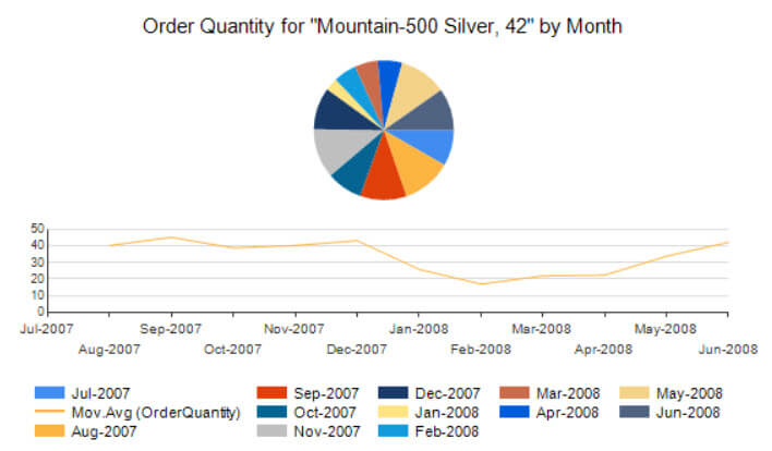
The pie chart defies all rules of best practices regarding data visualization, but it’s just there to show off the concept.
Conclusion
The calculated series feature in SSRS allows us to easily add trendlines to an existing graph. There are many different options, such as moving averages, mean, median and more advanced formulas such as the Bollinger bands, but somehow they forgot to add the linear regression trendline, which is really unfortunate as its use is very common. The official documentation about the different formulas is also severely lacking.
Next Steps
- You can download the .rdl report here, if you want to see the calculated series in action.
- You can find more SSRS tips here.

Koen Verbeeck is a seasoned business intelligence consultant with over a decade of experience with the Microsoft Data Platform. He holds several certifications, including Azure Data Engineer. He’s a prolific writer, with over 375 articles on technologies such as Microsoft Fabric, SSIS, ADF, SSAS, SSRS, MDS, Power BI, Snowflake and Azure services. He has spoken at various events such as PASS, SQLBits, dataMinds Connect and many others. He frequently delivers educational webinars on MSSQLTips.com. For his efforts, Koen has been awarded the Microsoft MVP data platform award for many years.
- MSSQLTips Awards:
- Leadership Award (200+ Tips) – 2021
- Author of the Year – 2014/2020/2022
- Author Contender – 2024/2025