Displaying Multiple Series on an SSRS Chart using Chart Area

By:   |   Comments (14)   |   Related: 1 | 2 | 3 | 4 | 5 | > Reporting Services Charts


Problem

A report might contain multiple data series on a chart, which can have considerably varying scales but common category groups. In such cases where this a big difference in scales, the data series with the lower scale can become obscured. In this tip we will take a look at how to solve this problem using Chart Areas.

Solution

To simulate the problem let's create a report with multiple data series on one chart.

Step 1:

Create a new SSRS report and add a bar chart to the report.

Step 2:

Add a dataset to the report using the Sales.vSalesPerson from AdventureWorks sample database.

Step 3:

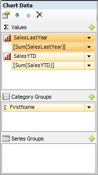
Configure the chart as shown in the below screenshot. Here we have two Values - SalesLastYear and SalesYTD and one Category Group on FirstName.

Chart Config

Step 4:

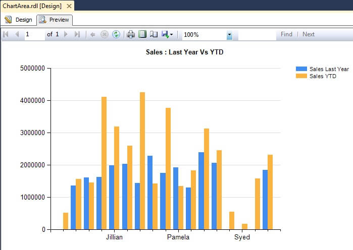
When you execute / preview the report, you should see a report similar to the below screenshot. If you look at the chart carefully, you will notice that none of the bars for the Sales Last Year series cross the halfway point in the chart.  This is because the values in the Sales YTD series are so much greater they obscure the Sales Last Year series.

Bar Chart

Step 5:

To solve this, generally developers would create multiple charts and configure each of them to contain one series, in order to separate the series. But even if you separate these charts, these charts are connected with each other as they have the same category groups. So when you make a change to one chart, you will have to keep making changes to other chart too.

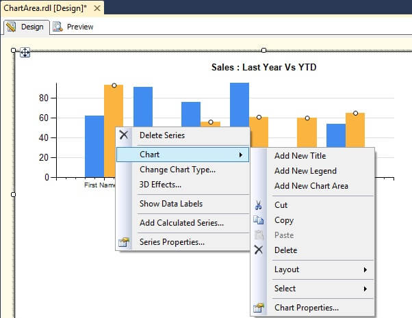
SSRS 2008 introduced a new feature known as Chart Area, which can solve this issue but still keep the charts aligned and associated with each other. To use this, select the series, right-click and select Chart -> Add New Chart Area, which will add a new chart area below the existing chart area.

Chart Area

Step 6:

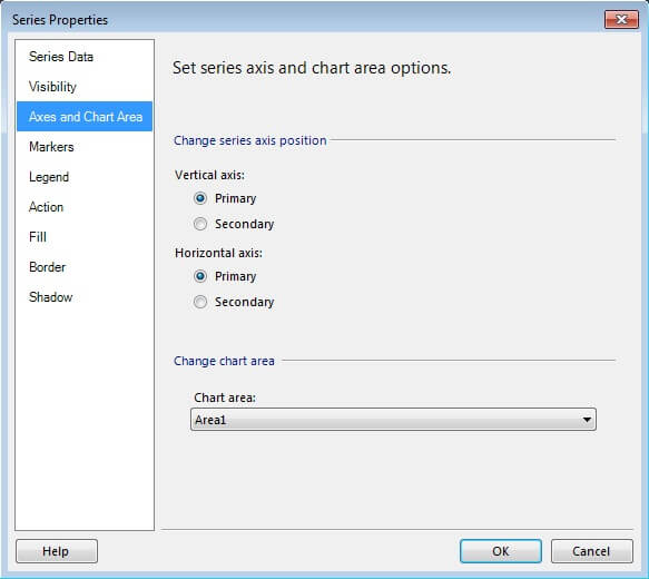
Select the Sales YTD series from the Chart Data tab, right-click and select "Series Properties". From this tab, on the "Axes and Chart Area" page, select the newly created Chart Area "Area1" as shown below. This will make the Sales YTD series display in this new chart area and the rest of the chart data configurations will remain the same for both the Sales YTD and Sales Last Year series.

Series Properties

Step 7:

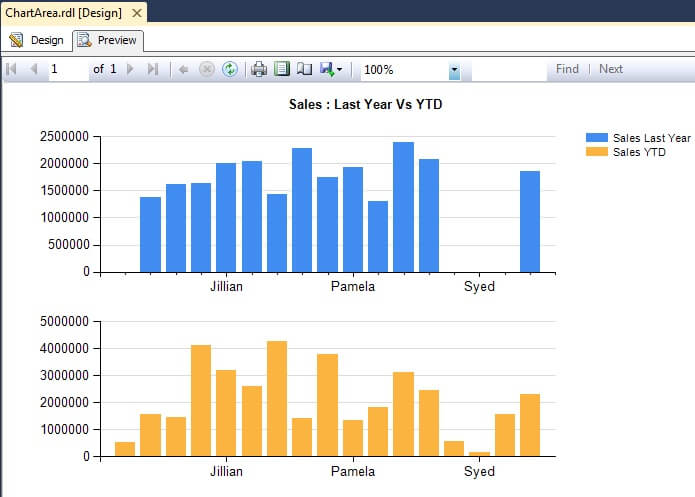
Preview the report, and you should find a report similar to the below screenshot. Using Chart Area, you can separate the series, which would effectively have the benefit of flexible scaling for individual series.  Both charts can be configured using a centralized configuration and still have the flexibility to override and configure each chart area independently if needed.

Result Set

Next Steps
  • Add more chart areas to the report and try adding more series to these chart areas. Also add one more category group to the above example and study the effect on the chart areas.
  • Try changing the chart types for different chart areas.


sql server categories

sql server webinars

subscribe to mssqltips

sql server tutorials

sql server white papers

next tip


About the author
MSSQLTips author Siddharth Mehta Siddharth Mehta is an Associate Manager with Accenture in the Avanade Division focusing on Business Intelligence.

This author pledges the content of this article is based on professional experience and not AI generated.

View all my tips


Comments For This Article


Tuesday, May 17, 2022 - 12:32:17 PM - Peter Back To Top (90096)
PM - Gramps: no, that's incorrect. The minute you put two different values into the Values panel, you've got yourself more than one series. Series groups allows you to group those series. In order to do that, you have to first create the series (in the Values panel as the author of the article describes)

Friday, May 10, 2019 - 6:20:11 PM - gramps Back To Top (80042)

Ok here's the problem with this tip: the terminology.  In your example, you have no series groups, so you are not displaying different series in different chart areas, as you propose.  You have two different measures aka values.  You can separate the different data measures into the different chart areas.  You cannot separate different series into different chart areas.


Thursday, April 5, 2018 - 9:42:55 PM - Rodolfo Reyes Back To Top (75618)


 Thank you very much. It was very useful.


Friday, November 6, 2015 - 5:49:45 AM - Deepak Sharma Back To Top (39032)

 -Hi , I have treid to do the same thing but for me first chart giving me the correct data but second and third chart giving me same type data...they are not changing their shape. Basically i have three dataset. (1) BuildingWise (2) Regional (3) National Wise data.. and Category group is common..MonthyearName like : NOV 2015..


Please let me know if we have another scope.


Friday, February 13, 2015 - 1:06:39 PM - Rohan Back To Top (36236)

Hi,

I want to create line chart which show week start date at horizantal bar and data will be two or three datetime record for each date , how can i show this data .


Wednesday, October 1, 2014 - 11:50:53 AM - Ivo Milanov Back To Top (34796)

Hi,

You can try Nevron Chart for SSRS - https://www.nevron.com/products-reporting-services-chart-overview.aspx. It has very flexible category axis labeling options, that avoid overlapping, has support for wrapping and other. I work for Nevron and we also provide paid support for SSRS so you can fix many problems with your reports using our extensions and services.

Best regards,
Ivo


Monday, February 10, 2014 - 11:16:39 PM - Sukhjeet Back To Top (29397)

Hi,

I am using SSRS 2012.  I have a series of charts that have multiple category groups.  When I preview the chart, everything looks great unless the category group label is too long.  In that case it just gets cut off.  I've tried allowing "wrapped text", changed interval values,font size for Y AXIS but that seems to only affect the inside (child) category group.  Is there a way to allow text wrapping on the outside (parent) group label?

I am expecting AREA VIII  BUT it shows AR on y axis.

I need to fix it asap.


Tuesday, July 30, 2013 - 6:23:20 AM - Naven Back To Top (26058)


Thanks. Great article that helps me in 2013


Monday, April 29, 2013 - 7:02:32 AM - Shahbaz Nasir Back To Top (23606)

can we add 10-12 bar chart in a report so that all remains in same page. i am nt getting the option for the same to make them on the same page. it is going automitically on 2nd page.


Wednesday, April 24, 2013 - 5:32:09 PM - Nilesh Back To Top (23550)


thanks much.. it helped me 


Wednesday, February 20, 2013 - 9:01:42 AM - Greg Back To Top (22303)

I have a hard time just with seeing all of last year compared to YTD. YTD for both (parallel periods) or Daily rates are  so much easier to compare.

Or have YTD on one graph, and then last year vs. YTD projected out to year end to see if they are on track.

So for me, good question / problem, but the example could have been better.

Similar to what Mr. Stricker noted, we should be trying to give a visual 'at a glance' view of the data that clearly shows who is doing well, and who might need some help meeting goals.


Tuesday, October 16, 2012 - 5:23:10 AM - Saikat Malakar Back To Top (19935)

Please help me how to create dynamic series in chart. I have parameter. depending on the parameter the series will be change. How to write the expression.


Monday, February 20, 2012 - 12:47:20 AM - Rafael Back To Top (16086)
Andy I've used ADS in the past with MySQL. For some rseoan it never clicked with me perhaps I didn't use it long enough Will check it out again with MSSQL

Tuesday, August 30, 2011 - 4:47:11 AM - ThomasStricker Back To Top (14559)
  1. I understand what you are saying, but if you split the chart into two chart areas, you lose the  comparison effect that you have with one chart area. In other words, the two chart areas do not have the effect of displaying graphically how much greater is the increase in sales this year-to-date from last year.
  2. I assume you can add data labels to top of the sales year-to-date bars which show how much is the percentage increase from sales last year, to give the effect of how much greater is the increase?


get free sql tips
agree to terms