Problem
In a typical bar chart, the height of the bars represents the value of the data along the X axis and the Y axis represents the category of the data point. All these values can be classified in logical groups depending upon the logic used for analysis. One general requirement that arises in the case of repeating groups, is to highlight these groups without representing it on the X or Y scale. In this tip we will look at how to address this requirement.
Solution
To emulate the problem, we need a report with some simple data that suits the issue. Follow the below mentioned steps to create such a report.
Step 1
Create a new report project using BIDS and add a blank report to the project.
Step 2
Add a data source to the project and configure it to use the AdventureWorks database. It is assumed that the reader has this database installed on a development machine.
Step 3
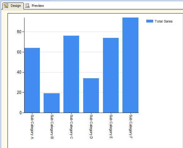
Create a dataset with some sample data that returns two types of fields – one having total values (for example – total sales ) and the other having categories of the values (for example – product categories / sub categories). I have created a dataset that returns a sum of total sales grouped by product subcategories and configured it with a bar chart. After these steps, the graph should look like the below screenshot.
Step 4
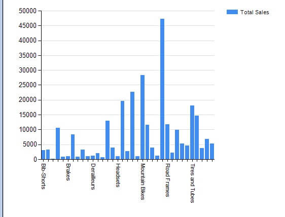
I have set an interval of 5000 for the vertical axis, and when I execute my report it looks like the below screenshot.
Step 5
Say that I want to consider the sales in five different groups in ranges of 10,000. This would mean that I have five ranges starting from 0 to 50,000. Let’s assume that for some analytical purpose, these ranges have two common groups – a Lower Half and an Upper Half. Any value less than 50% of a range is the lower half and above the 50% range it is the upper half. For example, in the range of 0 to 10,000 the values that fall between 0 to 5000 would be in the lower half group and values between 5000 to 10,000 would be in the upper half group. If you analyze carefully, you will find that the lower half and upper half are repeating groups and it may not be an appropriate way to represent it on the scale, but we still need to explicitly highlight these groups.
The solution to this requirement is using Interlacing. By using this mechanism, we highlight the color of these repeating groups alternatively. Each repeating group is given a common color alternately.
Step 6
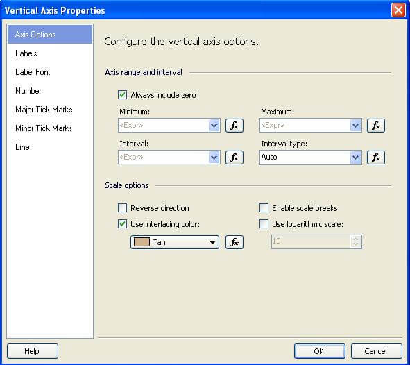
In the design view, select the vertical axis and select its properties from the right-click menu. As shown in the below screenshot, from the scale options select “Use interlacing color” and select a color.
Step 7
After this is done, you should be able to see the effect in the design view. Execute the report, and your report should look similar to the below screenshot.
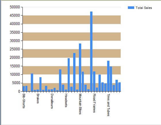
As you can see, using interlacing we have very easily highlighted the existence of the logical groups we discussed in step 5 and this solves our problem in question without listing this groups on any scale too.
Next Steps
- Try to give an interlacing color based on an expression.
- Check out how different range and axis options have an effect on interlacing.

Siddharth has more than 14 years of experience in the IT Industry, with more than a decade of experience in Business Intelligence and Analytics, for clients banking, logistics, government, Media Entertainment, products, life sciences and other domains. He has been a lead architect for a portfolio of 40+ apps, containing apps in web, mobile, BI, Analytics, data warehousing, reporting, collaboration, CMS, NoSQL and other technologies. He has several certifications and is a published author for online and print-media publications, as well as the MSDN Library.
In his present role, he remains responsible for architecture design, technology stack selection, infrastructure design, 3rd party products evaluation and procurement, and performance engineering. These applications use technologies like Elasticsearch / Lucene, MongoDB, SharePoint 2013 and 2010, jQuery-based framework like Highcharts and GoJS, SQL Server and the Microsoft Business Intelligence stack (SSIS, SSAS, SSRS, MDX, PowerPivot, PowerView), jQueryMobile, Bootstrap, iOS xCode framework, and many others.
- MSSQLTips Awards: Champion (100+ tips) – 2018 | Author of the Year – 2017 | Author Contender – 2016, 2018-2019