By: Siddharth Mehta | Comments (7) | Related: 1 | 2 | 3 | 4 | 5 | > Reporting Services Charts
Problem
Correlation analysis is a method of data analysis where the relation between two measures are determined in addition to identifying outliers in the data set. For this type of analysis, a scatter chart is very helpful. In this tip we would look at how to create a scatter chart based on a X and Y coordinate system in SQL Server Reporting Services.
Solution
Before we start creating a scatter chart in SQL Server Reporting Services, we need to have a dataset that can serve the purpose of our analysis using the scatter chart. For this purpose, consider a hypothetical example of a dataset, containing values for a city, the temperature and carbon emission. The purpose for the analysis is to correlation the temperature versus the carbon emission. Follow the steps below to create the scatter chart.
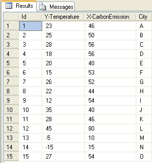
Step 1: Create a table and populate it with the data as shown in the screenshot below. Consider how much data you can analyze by just looking at a grid based representation of the data and consider how complex it would be to analyze a large dataset.
Step 2: Create a new SSRS report and configure it to use data from this table. Add a SSRS Scatter Chart to this report.
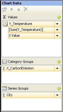
Step 3: Configure the chart with the fields from the dataset as shown in the screenshot below. This would plot the data on the chart, where the temperature field would be on the Y-axis and the carbon emission field would be on the X-axis.
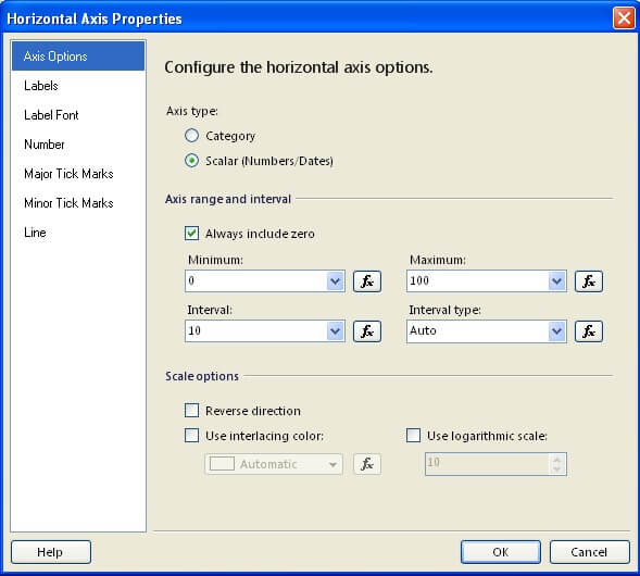
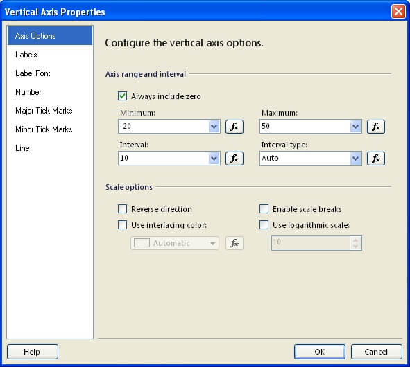
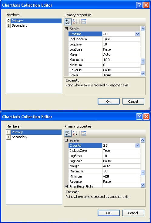
Step 4: Say, we know that the range of temperature would be from -20 to +50 degrees and the range of carbon emission would be from 0 to 100. Select horizontal axis and vertical axis properties, by selecting the axis, right-click and selecting properties and configure it as shown in the screenshots below.
Step 5: We have already done the configuration for plotting the data and configuring the length of the scale. As this point, we need to arrange the scale such that all the normal data points should be at the center of the graph. So both axes of the graph should cross at the ideal values for the X and Y axis. In our example, we consider 25 degrees as ideal temperature and 50 as the ideal value for carbon emission, these are the values where the axis should cross. To configure this, select the chart and from the properties window under the Axis section, you would find CategoryAxis and ValueAxis properties. Configure the CrossAt property for both these axis as shown in the below screenshot.
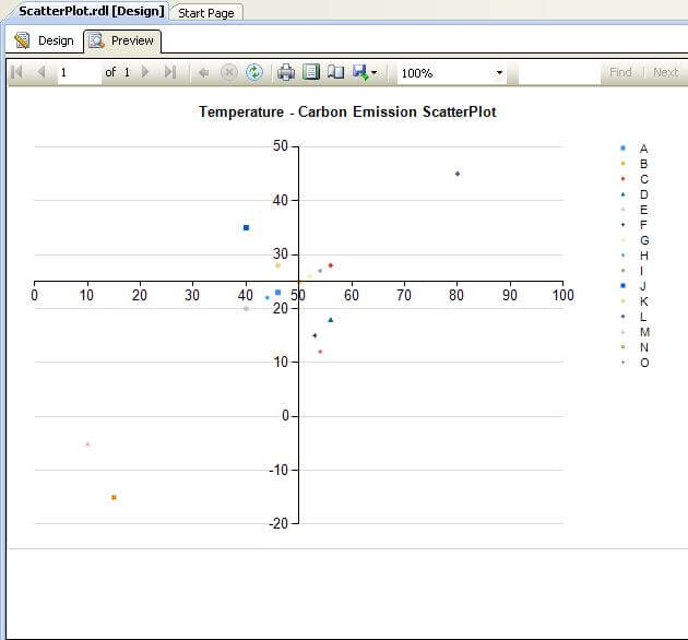
Step 6: After all these steps, preview the graph and you should find a result similar to the screenshot below. If you look carefully at the graph, you can see that the entire cluster of points revolve around ideal value i.e. near the intersection of both axis. Outliers would be very far from this intersection and you would also be able to derive the correlation between the temperature and carbon emission.
Next Steps
- Configure the UI of the scatter chart as per your requirements, like removing legends.
- Use interlacing on this chart to create alternate repeating color patterns on the chart to highlight values.
- Check out these related tips:


About the author
 Siddharth Mehta is an Associate Manager with Accenture in the Avanade Division focusing on Business Intelligence.
This author pledges the content of this article is based on professional experience and not AI generated.
View all my tips
