Problem
My client has an existing report used for displaying Prospective Buyers statistics and few other related details. In the current report, a Pie Chart is being used to display the Number/Percentage of Prospective Buyers in each of the states. Initially when the number of states being surveyed was limited, the Pie Chart was working well for the scenario. However, now they are surveying a lot more states and as a result, the number of categories (State Provinces) in the Pie Chart has increased to a large number leaving the chart in a non-usable state. I want to know what are the best options to make the chart usable and more intuitive to the users.
Solution
In this tip we will see some of the options to make the chart more intuitive to the end users by using different chart types and also by making some customizations in Pie Chart itself.
Note: This tip assumes that you have prior knowledge of working with SQL Server Reporting Services (SSRS) and are familiar with Developing a Pie Chart. If you are not familiar with SSRS, refer to the SSRS Tutorial. The demonstration in this tip is based on SQL Server 2012. However, the steps are pretty much same for previous version of SSRS also.
First let us simulate the scenario given in the Problem Statement. To simulate the scenario, let us consider a sample data set from AdventureWorksDW sample database using the below query.
Building the Sample Dataset
SELECT
    [PB].[ProspectiveBuyerKey]
    , [SP].[StateProvinceName]
FROM
    [dbo].[ProspectiveBuyer] AS [PB]
    INNER JOIN (
                SELECT
                    [StateProvinceCode]
                    , [StateProvinceName]
                FROM [dbo].[DimGeography]
                GROUP BY [StateProvinceCode], [StateProvinceName]
    ) AS SP
        ON [PB].[StateProvinceCode] = [SP].[StateProvinceCode]
WHERE [PB].[StateProvinceCode] NOT IN ('CA','WA','OR')
Creating the Pie Chart with above Scenario (Large number of categories)
Let us create a Pie Chart using the above dataset by following these steps:
- Open SQL Server Data Tools (SSDT) or Business Intelligence Development Studio (BIDS) if you are working with previous version of SSRS.
- Create a Report Server Project.
- Create a Data Source (You can either create a Report Data Source directly or create a Shared Data Source first and then use this to create a Report Data Source).
- Create a dataset using the above query.
- Add a new Pie Chart (“3-D Pie”) to the Report Design surface.
- Set the Chart Values to “ProspectiveBuyerKey” and “Aggregate Function” to “Count”.
- Set the Category Group to “StateProvinceName” and Sort by property to “StateProvinceName”.
- With a little bit of formatting around Colors, Fonts etc., the completed Pie Chart should look as shown below.
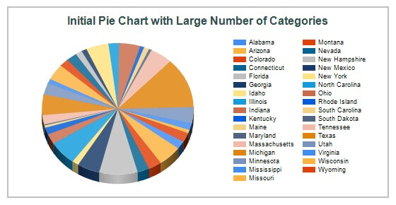
As we can see in the above Pie Chart, it is difficult to identify which item on the legend corresponds to which slice on the Pie and the value of Prospective Buyers for each of the states.
The above chart can be improved and made more intuitive and usable for the users by using the following two approaches:
- Approach 1: Changing the Chart Type
- Approach 2: Customizing the Pie Chart
We will see two flavors of each of the above two approaches.
Approach 1(a): Convert Pie Chart to Column Chart
Let us convert the above Pie Chart into a Column Chart using the following steps:
- Right Click on the Chart and Change the Chart Type to Column Chart.
- Go to Horizontal Axis Properties and set Interval to “1”. This will ensure that, all the State Provinces are displayed on the Chart.
- Set the Vertical Axis Title as “# of Prospective Buyers”
- Set the Horizontal Axis Title as “State Province”
- Delete the Legend. We don’t need it since we have only one metric, which is usually indicated using the Chart Title in a Real-Time scenario.
- Go to Chart Properties and set the Width to 8in and Height to 4in.
- Right Click on any of the Columns and set “Show Data Labels” if it is not already set.
- Right Click on a Data Label, select “Series Label Properties”, and set “Label data” to “#VALY”.
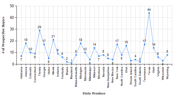
- With some formatting around Color, Font, and Border etc. the Line Chart should look as shown below.

The chart above is much cleaner and easier to understand. In the above chart, if there is a huge gap between the largest and smallest values, then Scale Break can be added. Next let us see a second flavor of this approach.
Approach 1(b): Convert Pie Chart to Line Chart
Let us convert the Column Chart from Approach 1(a) to a Line Chart using the following steps:
- Right Click on Vertical Axis and set “Show Major Gridlines” (if it is not already set).
- Right Click on Horizontal Axis and set “Show Major Gridlines” (if it is not already set).
- Right Click on the Line and set “Show Data Labels” if it is not already set.
- Right Click on a Data Label, select “Series Label Properties”, and set “Label data” to “#VALY”.
- Right Click on the Line, go to “Series Properties”, click on “Markers” in the left navigation pane, and set “Marker type” to “Square”.
- With some formatting around Color, Font, and Border etc. the Line Chart should look as shown below.
The chart above is much cleaner and easier to understand.
Now let us see the 2nd approach using Pie Chart with some customization.
Approach 2(a): Group/Consolidate Smaller Slices in Pie Chart
- Right click on the initial Pie Chart and set “Show Data Labels” (if it is not already set).
- Right Click on a Data Label, select “Series Label Properties”, and set “Label data” to “#PERCENT” (If you get a warning, select “Yes”).
- Right Click on a Data Label, go to properties window, and set “Position” to “Outside”.
- Preview the Report and you can see that the report looks even more cluttered with Data Labels on it.
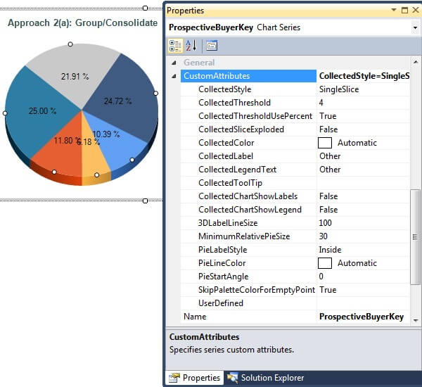
- Go to Chart Series Properties –> Expand “General” –> “CustomAttributes” and make the following settings as shown below:
- “CollectedStyle” to “Single”. This will group the specific set of slices (defined by “CollectedThreshold”) into single slice.
- “CollectedThreshold” to “4”. This will collect all the slices which contribute to less than 4% of total Prospective Buyers and put it into combined Pie Slice.
- “CollectedThresholdUsePercent” to “True” if it is not already set. This is used to indicate that the threshold is in Percent.
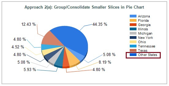
- With some formatting around Color, Font, and Border etc. the modified Pie Chart should look as shown below.

As we can see the above chart is very clean and is suitable for most of the scenarios. In this kind of scenario, it is most likely that the users are interested in those states where the greatest number of Prospective Buyers are located and hence it is fine to combine those states where Prospective Buyers is less than a specified percentage (4% in above chart) into one slice in a Pie Chart.
There are various other Custom Attributes, as shown in the above settings window, which can be modified to customize the chart further. For instance, “CollectedLegendText” can be set to something else (default is “Other”) to make it more meaningful as shown below by setting it to “Other States”.
Approach 2(b): Separate Smaller Slices into Separate Pie
- Right Click on the Pie in the above Pie Chart in Approach 2(a), go to Properties, expand “CustomAttributes”, and make the following settings:
- “CollectedStyle” to “CollectedPie”
- Relocate the Legend to bottom.
- Increase the size of the chart.
- Right click on a data label and set the “Label data” to “#VALY”.
- With some formatting around Color, Font, and Border etc. the Pie Chart should look as shown below.
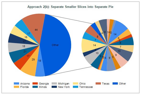
Notice that the chart automatically gets displayed as 2-D even though we started with 3-D. This is because, when we split the Pie, it automatically gets transformed to 2-D.
This chart can be further customized using few other properties under “CustomAttributes”.
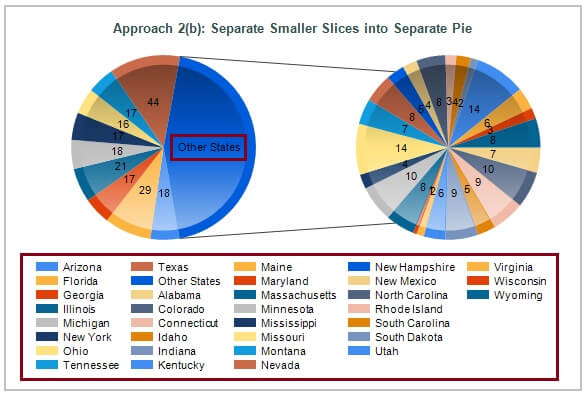
- Right Click on the above Pie Chart in Approach 2(a) and change the “Chart Type” to “Pie” (2-D Pie).
- Right Click on the Pie, go to Properties, expand “CustomAttributes”, and make the following settings:
- “CollectedChartShowLegend” to “True”. This will enable the display of Legends for the separated Pie as well, which in the above Pie is collected marked as “Other” in Legends section.
- “CollectedLabel” to “Other States”. This will change the text displayed on the slice of Pie in the Main Pie which is being split into separate pie.
- “PieDrawingStyle” to “Concave”. This will change the Pie Style.
- With some formatting around Color, Font, and Border etc. the Pie Chart should look as shown below.
As we can see from the above demonstration, there are many different ways in which we can address the issue outlined in the Problem Statement using the capabilities of SSRS.
Next Steps
- Explore all the properties listed under CustomAttributes section.
- Explore other options on how this particular problem can be solved.
- Check out the SQL Server Reporting Services tutorial
- Check out the SQL Server Report Builder 3.0 Tutorial
- Check out the Business Intelligence Development Studio (BIDS) Tutorial
- Check out these additional tips on few more intuitive reports:
- Creating a Reporting Services Histogram Chart for Statistical Distribution Analysis
- Creating Trellis Charts to Make SSRS Reports More Readable
- Displaying Multiple Series on an SSRS Chart using Chart Area
- Distribution Analysis using a SQL Server Reporting Services Box Plot Chart
- Highlighting repeating groups in SSRS 2008 R2 charts
- How to handle empty values in a line chart in SSRS
- SQL Server Reporting Services Scatter Chart for Data Correlation
- SSRS 2008 R2 KPIs with bullet graphs
- Check out the other Tips the in Reporting Services category

Dattatrey Sindol (aka Datta) is a Business Intelligence enthusiast, passionate developer, and blogger. He started his career in November 2006 and since then has worked on various technologies including SQL Server BI, Power BI, Microsoft Azure, & Azure HDInsight within Microsoft Stack and other Cloud & Big Data technologies outside Microsoft Stack. Currently, he is working as an Associate BI Architect at a leading IT Services company in India (Bangalore). Datta also is a Microsoft Certified IT Professional (MCITP) in SQL Server Business Intelligence 2008.
- MSSQLTips Awards: Trendsetter (25+ tips) – 2014 | Author Contender – 2014