Problem
When continuous data is displayed on a chart, such as a line chart, data is displayed very smoothly. But when non-continuous data is displayed on such a chart, the chart behavior is different. The continuous data is displayed correctly, but the non-continuous data is ignored on the chart. In such cases, handling of empty points in the dataset is required to make the data continuous and displayed correctly on the chart. In this tip we will look at how to implement a solution for this problem.
Solution
In this tip we will create a line chart to simulate the problem and then we will walk through how to fix this issue.
Step 1
First let’s create a dataset that will support the problem. Below is a very simple dataset, that is designed for this purpose. We have created two groups / series for the sales person field (i.e. Series-1 and Series-2) as we intend to create two series on the line chart. We have given a common sales value in the Sales field for each SalesPerson just to illustrate this example. The Sales field will be the Y axis and the Month field will be the X axis. As we intend to create non-continuous data, we have used completely non-matching month numbers for each SalesPerson. So for Series-1 data is present for months 1,3,5,7,9 and for Series-2 data is present for months 2,4,6,8.

Step 2
Create a new SSRS report to access the data from the above table we just created. We need to use this data in a line chart and data fields should be configured as shown in the below screenshot.

Step 3
Now preview the report and you will find the result as shown in the below screenshot. As you can see nothing is displayed on the chart, because a line chart needs continuous data to create the line between two consecutive points. Here you can see that on the Y axis, ticks are from 1 to 10. For each group, we do not have continuous month values (i.e. we have empty or missing data points).

Step 4
To fix this, click on the sales series section in the configuration box and select Properties as shown below.

Step 5
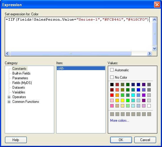
You will find an EmptyPoint properties collection under the data section as shown in the above image. We need to specify the intelligence for Color when drawing lines for empty data points. Enter the Expression for Color in the EmptyPoint properties as shown in the below screenshot. The expression says if the SalesPerson value equals “Series-1” then use color “FCB441” otherwise use color “418CF0”. These are the colors I selectecd, but you can use any colors you want for this expression.
Step 6
Expand the CustomAttributes property collection and you will find the EmptyPointValue property. This property signifies how empty data points are handled. Average is the default value for this property. Let’s say we want missing data points to be “Zero”, so we will select “Zero” for this property as shown below. The effect that this property will have is that it will fill the missing data values for the X-axis with a value of zero.
Step 7
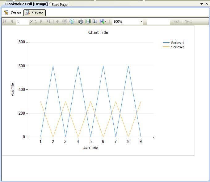
Preview the report now and you will find the result as shown in the below screenshot. Data is visible now, but if you look at the dataset carefully you will find that the colors are reversed for the series compared to the legend. This is the effect of the color intelligence we have specified in the earlier Expression. If you swap the color values in the Expression this will correct the result.
Next Steps
- Try handling different values for a different kind of chart.
- Explore the other options available in the EmptyPoint properties collection to handle empty data points in the dataset.
- Review these other SSRS tips

Siddharth has more than 14 years of experience in the IT Industry, with more than a decade of experience in Business Intelligence and Analytics, for clients banking, logistics, government, Media Entertainment, products, life sciences and other domains. He has been a lead architect for a portfolio of 40+ apps, containing apps in web, mobile, BI, Analytics, data warehousing, reporting, collaboration, CMS, NoSQL and other technologies. He has several certifications and is a published author for online and print-media publications, as well as the MSDN Library.
In his present role, he remains responsible for architecture design, technology stack selection, infrastructure design, 3rd party products evaluation and procurement, and performance engineering. These applications use technologies like Elasticsearch / Lucene, MongoDB, SharePoint 2013 and 2010, jQuery-based framework like Highcharts and GoJS, SQL Server and the Microsoft Business Intelligence stack (SSIS, SSAS, SSRS, MDX, PowerPivot, PowerView), jQueryMobile, Bootstrap, iOS xCode framework, and many others.
- MSSQLTips Awards: Champion (100+ tips) – 2018 | Author of the Year – 2017 | Author Contender – 2016, 2018-2019