Problem
SQL Server Reporting Services (SSRS) 2016 – currently in preview – introduces the treemap as a new chart type. I am wondering if it is possible to turn the treemap into a heat map, like in Power BI Desktop?
Solution
A heat map is a representation of data onto a graph where the individual values are represented in the form of colors. A typical example is a matrix, where each cell has a different color depending on the value of that cell. You can find an example on the Wikipedia page about heat maps. However, heat maps can have other representations as well, such as a row or column inside a table or a geographical map. Even a medical scan of your body can be considered as a heat map, because certain areas are highlighted and others aren’t.
Treemaps, which were introduced in the tip How to create a Treemap Graph in Reporting Services 2016, typically embed the features of a heat map as well. In fact, if you search the web for treemap examples, most visualizations you’ll find actually are heat maps, e.g. Treemapping and 10 Lessons in Treemap Design. This makes treemaps very efficient, as they can display two measures (the size of the rectangle and its color intensity) of a lot of data points in a small area.
In Power BI Desktop, it’s straight forward to create such a heat map:

You only need to drag a second measure into the Color Saturation field. Be aware though that at the time of writing, you cannot do this when you have a column in the Details field; it’s not possible to combine those.
This tip will guide you through the process of creating such a treemap. The sample data used is exactly the same as in the tip How to create a Treemap Graph in Reporting Services 2016.
SQL Server 2016 Preview
As mentioned earlier, at the time of writing SQL Server 2016 is still in preview (currently CTP 2.2 has been released). This means that the look and feel of Reporting Services and its charts can still change and that functionality might change, disappear or be added.
Another issue is there is for the moment not yet a new version of SSDT-BI (the Visual Studio shell for developing business intelligence solutions) released for SQL Server 2016. You can develop BI solutions for SQL Server 2016 preview using SSDT-BI 2013 (which is actually for SQL Server 2014), but it has only SQL Server 2014 features. So how are we going to test SSRS functionality now? Luckily Report Builder has already been updated and included in the SQL Server 2016 CTP 2.2 release, so in this tip we’ll use Report Builder to create the heat map.
In order to use Report Builder, you need to install SSRS 2016 CTP 2.2 (or later), preferably not on your production machine. Then you navigate to Report Manager – typically the URL has the format http://myserver/Reports – where you can launch Report Builder.

Creating a heat map in SQL Server Reporting Services
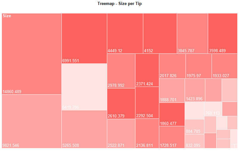
Our starting point is a finished treemap, but without the color saturation. As noted before, you can find a detailed explanation in the tip: How to create a Treemap Graph in Reporting Services 2016.

Unfortunately, SSRS does not provide an easy way to set the color saturation in the user interface like in Power BI Desktop. This means we have to do it ourselves. We need to specify an expression for the color of the series, which returns a different shade of a color depending on the value of the current measure. This is easily accomplished in Visual Basic .NET and luckily someone has already written the code for us! The blog post Custom Code for Color Gradation in SSRS by Jason Thomas (blog | twitter) details a VB .NET function called ColorDWB which returns a different shade of a color depending on its input parameters and it is exactly what we need. The function has the following parameters:
- Value – This is the value of the current measure. In our example, this can be the size in KB of a certain folder or it can be the number of items in that folder.
- MaxPositive – This is the upper limit of values that the measure can take.
- Neutral – This is the lower limit of values that the measure can take.
- ColStr – This is the hexadecimal RGB representation of a color, e.g. #2322EE.
Calling ColorDWB as ColorDWB(MaxPositive,MaxPositive,Neutral,ColStr) will return the full color and ColorDWB(MaxPositive,MaxPositive,Neutral,ColStr) will return the color white. For more info on this function, please refer to the blog post by Jason.
First of all, the code has to be added to Report Builder. Make sure the properties window is visible:
In the Report properties, you can find the Code property:

Clicking the ellipsis will open the Report Properties dialog, where you can enter the code.

The easiest method to calculate the values to pass to the ColorDWB function is to calculate them in the source query of the report. The following query retrieves the maximum number of items found in a folder and it divides the result set in 5 buckets.
SELECT
 [Year]
,[Tip]
,Size= SUM([Size])
,NumberOfItems= COUNT(1)
,MaxItems= MAX(COUNT(1)) OVER ()
,ItemBucket= CONVERT(INT,NTILE(5) OVER (ORDER BY COUNT(1)) * ((MAX(COUNT(1)) OVER ()) / 5.0))
FROM [dbo].[FileSizes]
GROUP BY [Year],[Tip];
The buckets are calculated using the NTILE window function. The result is multiplied by the maximum found, divided by the number of buckets. This ensures that the value of the bucket is between the range of 1 and the maximum value. In the example here, the maximum number of items is 46. NTILE returns values between 1 and 5. By multiplying with (46/5), we get values between 1 and 46.

The query nests aggregate functions inside window functions. For more information about this behavior, check out Nesting Aggregates with Window Functions.
The next step is to create an expression on the Fill Color property of the series.

The expression takes the following form:
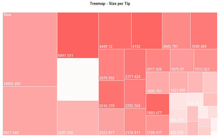
=Code.ColorDWB(Fields!ItemBucket.Value, Fields!MaxItems.Value, 1, "#fd625e")
The treemap is now successfully transformed into a heat map:
In the source query, we used NTILE(5) to divide the sample data into 5 buckets, resulting in 5 different shades in the heat map. This might be a bit too coarse depending on your data distribution, as for example a folder with 19 items is in the same bucket as the folder with 46 items. By playing with the SQL statement, you can work out other algorithms for dividing your data set into different buckets. Simply raising 5 to a higher number will already result in a more fine grained heat map. The highest level of detail can be achieved by replacing NTILE() with ROW_NUMBER() and by taking the amount of rows returned as the maximum value.
SELECT
 [Year]
,[Tip]
,Size= SUM([Size])
,NumberOfItems= COUNT(1)
,MaxItems= COUNT(1) OVER ()
,ItemBucket= ROW_NUMBER() OVER (ORDER BY COUNT(1))
FROM [dbo].[FileSizes]
GROUP BY [Year],[Tip];
The only downside of creating heat maps in SSRS using the method of this tip is there is no legend detailing the different shades of the color and how they relate to the measure.
Creating a heat map with multiple series groups
As noted before, in Power BI desktop you can for the moment only use color saturation if there is no field on details. In SSRS however, this is possible. Building upon our current example, we can add a series group to the treemap:

But this requires the expression for the color to be adapted. Since there are now multiple series groups with their own color, we cannot just pass one color value to the ColorDWB function. What we need is a color palette, similar to the one you can define on a chart. The MSDN article Specify Consistent Colors across Multiple Shape Charts specifies how you can do this, using again another Visual Basic function: GetColor. Basically the function keeps a list of colors and maps them against values in a hash table. So every time you call the function GetColor(Value), it will assign a color for that value and store it in the hash table. If you call the function again with the same value, you will get the same color in return. If you call the function with a new value, you will get the next color of the list returned.
Using this function, we can adjust the expression:
=Code.ColorDWB(Fields!ItemBucket.Value, Fields!MaxItems.Value, 1, Code.GetColor(Fields!Year.Value))
For every year, a new color is assigned. The resulting heat map:

Conclusion
Creating a heat map in SSRS is possible if you use a bit of Visual Basic code. The result works quite well and is flexible, the only absence is a legend for the colors.
Next Steps
- Try it out yourself!
- Follow the steps in the tip How to create a Treemap Graph in Reporting Services 2016 to create a basic treemap.
- Follow the steps in this tip to convert it to a heat map.
- Download Power BI desktop from PowerBI.com and create a heat map over there. Which one do you like best? Let me know in the comments!
- For more SQL Server 2016, read these other SQL Server 2016 Tips.
- For more Reporting Services tips: Reporting Services Charts Tips.

Koen Verbeeck is a seasoned business intelligence consultant with over a decade of experience with the Microsoft Data Platform. He holds several certifications, including Azure Data Engineer. He’s a prolific writer, with over 375 articles on technologies such as Microsoft Fabric, SSIS, ADF, SSAS, SSRS, MDS, Power BI, Snowflake and Azure services. He has spoken at various events such as PASS, SQLBits, dataMinds Connect and many others. He frequently delivers educational webinars on MSSQLTips.com. For his efforts, Koen has been awarded the Microsoft MVP data platform award for many years.
- MSSQLTips Awards:
- Leadership Award (200+ Tips) – 2021
- Author of the Year – 2014/2020/2022
- Author Contender – 2024/2025