Problem
I want to create a line chart in SQL Server Reporting Services. I have two series I need to plot on the chart, but one series has high values while the other series has much lower values. The second series is being pushed flat against the X-axis by the first series. How can I plot both series without losing detail in both series? I’d like to compare the growth or change between the series.
Solution
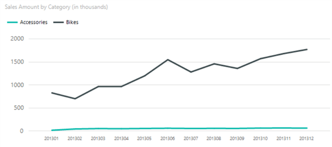
When plotting two-line series with a big difference in absolute values on the same chart, the series with the lowest values will lose detail, as you can see in the following chart:

Here the line for the sales amount of the Accessories category are plotted against the X-axis, since the Y-axis has a very large scale. This makes it seem the Accessories sales approach zero, while in reality they are not. They are multiple possible solutions:
- Adding a scale break, although this is not considered to be a best practice
- Plotting the two-line series on two separate charts. It’s easy to compare the two lines with each other, both it takes up more space on your report.
- Using a dual axis on the same chart, which can lead to misleading interpretations
- Reformatting the data into an indexed chart. Here the data is indexed using the first data point. It allows to easily compare the trends of two data sets.
In this tip, we’ll focus on the last option while also showing the alternatives.
Creating an Index Line Chart
Test Data
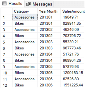
In this tip, we’ll use the AdventureWorks 2017 data warehouse, which can be downloaded from Github. We’ll retrieve the online sales for the categories Bikes and Accessories of the year 2013. Bikes have very high revenue (since the price is much higher), while the revenue of accessories is considerably lower. The following query satisfies our requirement:
SELECT
     [Category]     = c.[EnglishProductCategoryName]
    ,[YearMonth]    = YEAR([OrderDate]) * 100 + MONTH([OrderDate])
    ,[SalesAmount]  = SUM([SalesAmount])
FROM [dbo].[FactInternetSales]      f
JOIN [dbo].[DimProduct]             p ON [p].[ProductKey]               = [f].[ProductKey]
JOIN [dbo].[DimProductSubcategory]  s ON [s].[ProductSubcategoryKey]    = [p].[ProductSubcategoryKey]
JOIN [dbo].[DimProductCategory]     c ON [c].[ProductCategoryKey]       = [s].[ProductCategoryKey]
WHERE   c.[EnglishProductCategoryName] IN ('Bikes','Accessories')
    AND YEAR([OrderDate]) = 2013
GROUP BY YEAR([OrderDate]) * 100 + MONTH([OrderDate])
        ,[c].[EnglishProductCategoryName]
ORDER BY [YearMonth], [Category]
The result set is as follows:
Creating a Simple Line Chart
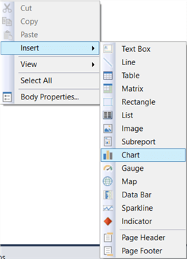
Let’s start by turning this data into a line chart. Create a new report with a connection to the AdventureWorks data warehouse and add a new data set using the query from the previous section. Right-click on the report canvas and choose Insert > Chart.
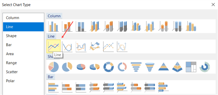
In the dialog, choose the line chart type.
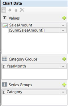
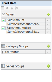
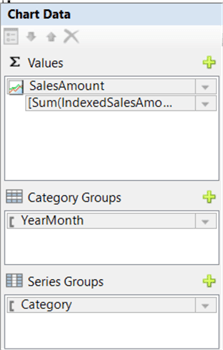
Use the following configuration for the chart data:
With default settings (and a decent title), we get the line chart from the introduction:
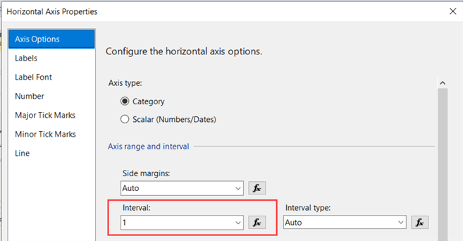
On the horizontal axis, the interval is changed from Auto to 1. This makes sure that all months are displayed on the axis.
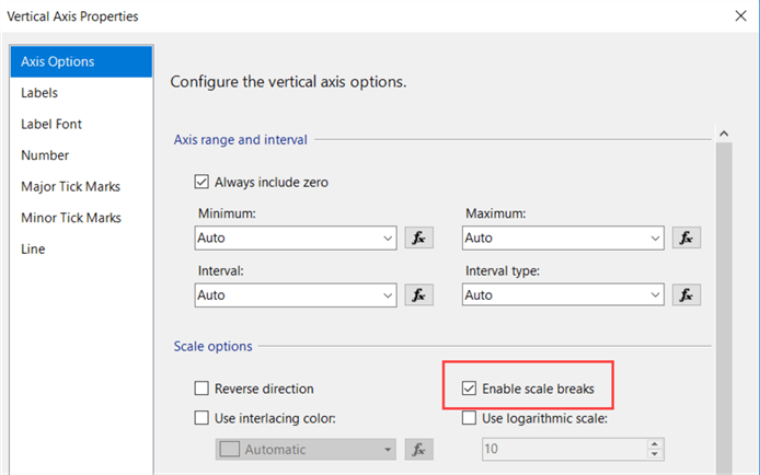
If you want to enable a scale break, right-click on the vertical axis and go to its properties. In the Axis Options pane, select the Enable scale breaks option.
The chart now looks like this:
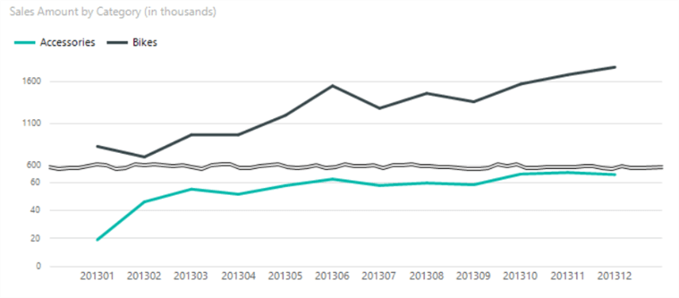
The line series for the Accessories now shows all details. However, the chart becomes more cluttered by the not-so-subtle scale break “rip”. Furthermore, viewers of the chart might be tempted to compare the two lines in absolute values. However, the horizontal axis is now quite misleading. In the bottom part, the gridlines are closer together and the difference between the minimum and maximum value is a bit over 40,000. In the top part, the gridlines have more space between and the difference between the min and max value is about 1,000,000! A huge difference although the two lines look the same.
Plotting the two lines on separate chart will also allow you to compare evolution, but it suffers from the same shortcomings since the axis will have the same scale issues.
Using a Dual Axis
Before we can create a chart with dual axis, we need to make some adjustments to the query, so we have two measures (one for Bikes, one for Accessories) for each month:
WITH CTE_source AS
(
    SELECT
         [YearMonth]                = YEAR([OrderDate]) * 100 + MONTH([OrderDate])
        ,[SalesAmountAccessoires]   = IIF(c.[EnglishProductCategoryName] = 'Bikes',NULL,[SalesAmount])
        ,[SalesAmountBikes]         = IIF(c.[EnglishProductCategoryName] = 'Accessories',NULL,[SalesAmount])
    FROM [dbo].[FactInternetSales]      f
    JOIN [dbo].[DimProduct]             p ON [p].[ProductKey]               = [f].[ProductKey]
    JOIN [dbo].[DimProductSubcategory]  s ON [s].[ProductSubcategoryKey]    = [p].[ProductSubcategoryKey]
    JOIN [dbo].[DimProductCategory]     c ON [c].[ProductCategoryKey]       = [s].[ProductCategoryKey]
    WHERE   c.[EnglishProductCategoryName] IN('Bikes','Accessories')
        AND YEAR([OrderDate]) = 2013
)
SELECT
     [YearMonth]
    ,[SalesAmountAccessoires]   = SUM([SalesAmountAccessoires])
    ,[SalesAmountBikes]         = SUM([SalesAmountBikes])
FROM [CTE_source]
GROUP BY [YearMonth]
First, we calculate the two measures in the inner query by setting the value to NULL if it’s one category or the other. In the outer query, we aggregate those measures by the month. The results look like this:

Add a new data set to the report using this query. Add a new line chart and configure the chart data as in the following screenshot:
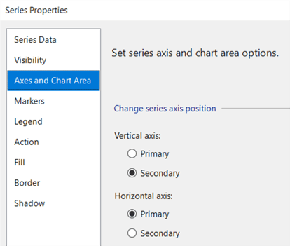
Right-click the line of the Bike series and go to the Series Properties.

In the Axes and Chart Area pane, set the vertical axis to Secondary.
This results in the following chart:
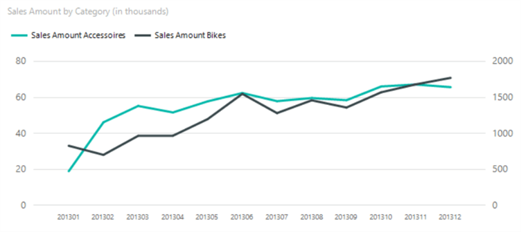
There are some issues with this type of charts:
- Like the normal line chart, readers might be tempted to compare the values, which makes no sense. Sometimes, one axis can be in different units than the other axis (for example, quantity versus revenue).
- Readers might also assume there’s some meaning in the intersections between the two lines. However, they are pure accidental and have no actual importance.
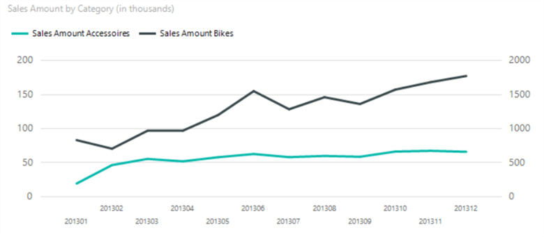
- By changing scale of an axis, you can manipulate the steepness of the line. The following chart makes it look like the growth for Accessories is less steep than in the previous chart, although it is the same data:
Indexing the Data
A solution to the problem is to index the data. With this process, all data points are related to the first point in the data set. The first point is scaled to 100 and the other points are scaled accordingly. This results in a chart where two lines of very different scale can be compared with each other. Instead of comparing actual values, you’ll be comparing the growth (or decline) of the trend.
First we need to adjust our query. The formula to index the values is as follows:
100 * (current value / first value)
Using the window function FIRST_VALUE, we can easily incorporate indexing into the query:
WITH cte_src AS
(
    SELECT
         [Category]     = c.[EnglishProductCategoryName]
        ,[YearMonth]    = YEAR([OrderDate]) * 100 + MONTH([OrderDate])
        ,[SalesAmount]  = SUM([SalesAmount])
    FROM [dbo].[FactInternetSales]      f
    JOIN [dbo].[DimProduct]             p ON [p].[ProductKey]               = [f].[ProductKey]
    JOIN [dbo].[DimProductSubcategory]  s ON [s].[ProductSubcategoryKey]    = [p].[ProductSubcategoryKey]
    JOIN [dbo].[DimProductCategory]     c ON [c].[ProductCategoryKey]       = [s].[ProductCategoryKey]
    WHERE   c.[EnglishProductCategoryName] IN('Bikes','Accessories')
        AND YEAR([OrderDate]) = 2013
    GROUP BY YEAR([OrderDate]) * 100 + MONTH([OrderDate])
            ,[c].[EnglishProductCategoryName]
)
SELECT
    [Category]
   ,[YearMonth]
   ,[SalesAmount]
   ,IndexedSalesAmount = 100.0 * [SalesAmount]
                         /(FIRST_VALUE([SalesAmount]) OVER(PARTITION BY [Category] ORDER BY [YearMonth]))
FROM [cte_src]
ORDER BY [YearMonth], [Category]
Using this data set, we can create a new line chart with the following configuration:
When we preview the report, we get the following visualization:
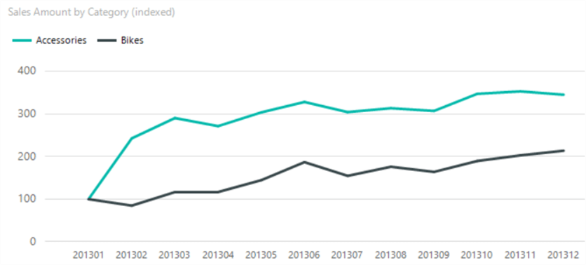
You can see both series start at the same point: 100. Now that both series are indexed, it’s clear Accessories had a much bigger growth in the first 3 months than Bikes, while Bikes has a steadier growth.
Next Steps
- You can follow the steps in the tip to create your own indexed chart.
- For more information about indexed charts, check out this article. Or maybe this one.
- More tips about creating charts in SSRS:
- Creating a box plot graph in SQL Server Reporting Services
- Create a Treemap Graph in SQL Server Reporting Services 2016
- How to create a heat map graph in SQL Server Reporting Services 2016
- How to create a Sunburst Graph in SQL Server Reporting Services 2016
- How to Create a Slope Chart in SSRS part 1 and part 2.
- For more Reporting Services tips: Reporting Services Tips.

Koen Verbeeck is a seasoned business intelligence consultant with over a decade of experience with the Microsoft Data Platform. He holds several certifications, including Azure Data Engineer. He’s a prolific writer, with over 375 articles on technologies such as Microsoft Fabric, SSIS, ADF, SSAS, SSRS, MDS, Power BI, Snowflake and Azure services. He has spoken at various events such as PASS, SQLBits, dataMinds Connect and many others. He frequently delivers educational webinars on MSSQLTips.com. For his efforts, Koen has been awarded the Microsoft MVP data platform award for many years.
- MSSQLTips Awards:
- Leadership Award (200+ Tips) – 2021
- Author of the Year – 2014/2020/2022
- Author Contender – 2024/2025