Problem
We live in a world of data. Data are the facts and figures that are collected to make a decision [1]. Companies who use Microsoft technologies usually store their data in SQL Server databases. To extract business values from these data, we usually apply statistical techniques. Statistics involves collecting, classifying, summarizing, organizing, analyzing, and interpreting data [2]. R, which has become the worldwide language for statistics [3], can bridge the gap between statistics and business intelligence development. Furthermore, The Microsoft platform enable us to work with SQL Server databases and R together [4]. With powerful statistical tools, how can we get started to use statistical methods to extract meaningful information from voluminous amount of data?
Solution
We are going to use data from the AdventureWorks sample database “AdventureWorks2017.bak” [5]. We should always start with asking research questions when we analyze data. Here are research questions needed to be addressed through this study:
- Did an employee have a different sales performance in 2013 from 2012?
- Was an employee sales performance impacted by the seasonal factors?
- Were postal codes of customer addresses in the database valid?
We will use “R Tools for Visual Studio sample projects” [6] as a starting point. While investigating employee sales performance, we will go through procedures to create and publish a stored procedure by using R Tools for Visual Studio (RTVS) and use line graphs to interpret data. Then, we will compute mean and median of the all employee sales to measure the "central tendency", which are indicators of typical middle value of all employees’ performance [1]. In the end, we will use regular expression to test Canadian postal codes in the database.
The solution was tested with SQL Server Management Studio V17.4 and Microsoft Visual Studio Community 2017 on Windows 10 Home 10.0 <X64>. The DBMS is Microsoft SQL Server 2017 Enterprise Edition (64-bit).
A First Look at RTVS
Line graphs are commonly used to present changes in data over a period [1]. We are going to look at employee monthly sales and reveal the employee performance changes through a line graph. In the meanwhile, we will create a stored procedure by using RTVS.
1 – Work on the first R project
1.1 Download the sample project and Open the solution file “Examples.sln”.
For using RTVS effectively, we use “Data Science Setting” as the Visual Studio setting. Before switching on this setting, I recommend that we save the current window layout. We can revert to the previous window layout after we have done data analysis. Figure 1 shows the menu item that we can use to save the window layout.

Figure 1 – Save current window layout
To change the setting for using RTVS, click on the menu item shown in the Figure 2.

Figure 2 – Switch to the data science settings
Figure 3 shows the window layout for using RTVS. It is noteworthy that we should verify if a correct version of R is used when we have multiple versions installed. We can find the version number in the “Workspaces” panel or in the bottom right corner of the IDE. For the best experience, we should follow the instructions in [6] to run the R codes of the “1-Getting_Started_with_R.R” file line-by-line.

Figure 3 – IDE window layout for data analysis
1.2 Add a database connection to the project
Click on the menu item “Add Database Connection…”, as shown in Figure 4.

Figure 4 – Add database connection to the project
Configure the connection properties, as shown in the Figure 5.

Figure 5 – Configure the connection properties
Click on the “OK” button. An R script file “Settings.R” is automatically added to the project, as shown in Figure 6. To access the connection string, we should run the codes immediately, consequently save the connection string in the “setting” variable.

Figure 6 – Application settings file
2 – Create a new stored procedure
2.1 Add a new stored procedure
Right-click on the “A first look at R” folder and select “Add > New Item” from the context menu. A pop-up window shows up as illustrated in Figure 7. Select “SQL Stored Procedure with R” template and name the procedure as “sp_employee_sales_monthly”.

Figure 7 – Create a new stored procedure
In the “Solution Explore” panel shown in Figure 8, we find three files have been created. This allows us to work on R scripts and SQL scripts, separately.

Figure 8 – R Tool for Visual Studio creates three files for one stored procedure
2.2 Write a SQL query to retrieve data from the database
In this tip, we adopt SQL queries used in the SQL Server Reporting Services Product Samples [7]. Open the file “sp_employee_sales_monthly.Query.sql” and replace the content with the following SQL query:
-- Place SQL query retrieving data for the R stored procedure here
--  Employee sales
DECLARE @EmployeeID int
SET @EmployeeID = 283

SELECT   P.FirstName + SPACE(1) + P.LastName AS Employee,
   DATEPART(Year, SOH.OrderDate) AS [Year],
   DATEPART(Month, SOH.OrderDate) AS MonthNumber,
   DATENAME(Month, SOH.OrderDate) AS [Month],
   SUM(DET.LineTotal) AS Sales
FROM [Sales].[SalesPerson] SP
   INNER JOIN [Sales].[SalesOrderHeader] SOH ON SP.[BusinessEntityID] = SOH.[SalesPersonID]
   INNER JOIN Sales.SalesOrderDetail DET ON SOH.SalesOrderID = DET.SalesOrderID
   INNER JOIN [Person].[Person] P ON P.[BusinessEntityID] = SP.[BusinessEntityID]
WHERE SOH.SalesPersonID = @EmployeeID
      and DATEPART(Year, SOH.OrderDate) in (2012, 2013)
GROUP BY P.FirstName + SPACE(1) + P.LastName,
      SOH.SalesPersonID,
      DATEPART(Year, SOH.OrderDate), DATEPART(Month, SOH.OrderDate),
      DATENAME(Month, SOH.OrderDate)
Click on the arrow button, as shown in Figure 9, to run the query. If we run the query first time, a pop-up window may show up and ask us to establish a database connection.
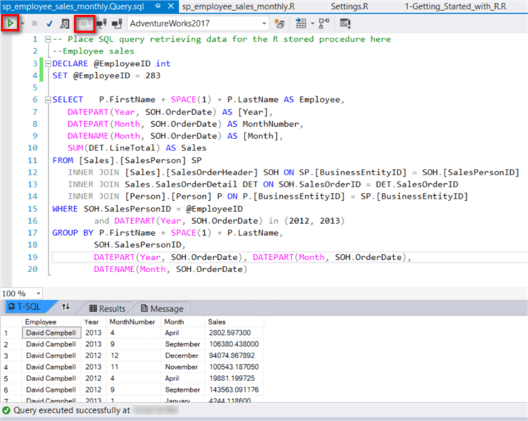
Figure 9 – Run the SQL query in Visual Studio
2.3 Write R script to plot a multiple line graph for an employee
Open the file “sp_employee_sales_monthly.R”. The RTVS included some testing codes in the file, as shown in the Figure 10. These testing codes provide us a method to load data from a SQL Server database.
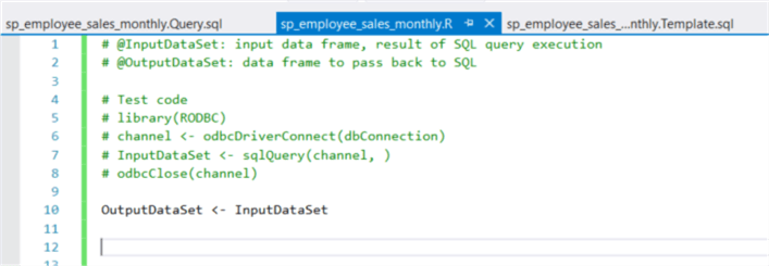
Figure 10 – Initial R codes in the new file
Uncomment all these testing codes from line 5 to line 8. Replace “dbConnection” with “settings$dbConnection” in line 6. Drag the file “sp_employee_sales_monthly.Query.sql” and drop the file in the parentheses in line 7. Then execute the R codes. In the “R Interactive” window, execute the function “head(OutputDataSet)” to view first several rows in the data set. The execution results are shown in Figure 11.

Figure 11 – R scripts execution results
Now we focus on plotting a line graph by using generic techniques. We will plot a line for each year, thus, a multiple line graph will be constructed. In the plot, month values are on the horizontal axis and associated employee sales values are on the vertical axis. The following R codes are self-explained.
# @InputDataSet: input data frame, result of SQL query execution
# @OutputDataSet: data frame to pass back to SQL

# Test code
 library(RODBC)
channel <- odbcDriverConnect(settings$dbConnection)
InputDataSet <- sqlQuery(channel, iconv(paste(readLines(' auto-generated query  file location/sp_employee_sales_monthly.query.sql', encoding = 'UTF-8', warn = FALSE), collapse = '\n'), from = 'UTF-8', to = 'ASCII', sub = ''))
 odbcClose(channel)

# sort data by year and month
OutputDataSet <- InputDataSet[order(InputDataSet$Year, InputDataSet$MonthNumber),]

# get distinct years in the dataset
v_years <- sort(unique(OutputDataSet$Year))

# get employee name
employee_name <- as.character(OutputDataSet$Employee[1])

# convert sales amount to be in thousands
OutputDataSet$Sales <- OutputDataSet$Sales / 1000

# calculate the boundary of the plot
xrange <- range(OutputDataSet$MonthNumber)
yrange <- range(OutputDataSet$Sales)
num_lines <- length(v_years)

# save colors in a vector
colors <- rainbow(num_lines)

# save symbols in a vector
plot_symbols <- seq(15, 15 + num_lines, 1)

# save the graph to a pdf file
pdf(paste("C:\\Development\\workfolder\\", employee_name, ".pdf"))

# open a graphics window. generate x axis and y axis. the type "n" means no plotting.
plot(xrange,
     yrange,
     type = "n",
     xlab = "Month", ylab = "Sales(in Thousands)")

# add a line for each year
for (year in v_years) {

    loop_count <- which(v_years == year)

    # Selecting rows for the specific year
    new_data_set <- OutputDataSet[OutputDataSet$Year == year,]

    # plot a line
    lines(new_data_set$MonthNumber,
          new_data_set$Sales,
          type = "b",
          col = colors[loop_count],
          pch = plot_symbols[loop_count])
}

# add a title
title("Yearly SalesComparison", paste("Employee Name: ", employee_name))

# add a legend
legend(xrange[1],
       yrange[2],
       v_years,
       col = colors,
       pch = plot_symbols,
       title = "Years")

# shut down the current device
dev.off()
As indicated in the R scripts, a PDF file was created in the folder “C:\Development\workfolder”. Figure 12 presents David’s monthly sales in 2012 and 2013. Except that sales in March, April, May, November and December were comparable, David’s sales performance in the other months reveals different fluctuation patterns. This implied that the employee performance somewhat varied from 2012 to 2013. In addition, the line graph implies some seasonal factors may impact sales performance.

Figure 12 – Yearly Sales Comparison
3 – Publish the stored Procedure
3.1 Modify the stored procedure template
We want the stored procedure to pass in a value of “Employee Id”, thus we can generate a line graph for each employee. We also need the stored procedure to return data in a tabular form. These requirements can be satisfied by modifying the template file.
Open the “sp_employee_sales_monthly.Template.sql” file and use the following codes as the template:
CREATE PROCEDURE [sp_employee_sales_monthly]
   @EmpID int
AS
BEGIN
EXEC sp_execute_external_script @language = N'R'
    , @script = N'_RCODE_'
    , @input_data_1 = N'_INPUT_QUERY_'
    , @params = N'@EmployeeID INT'
    , @EmployeeID = @EmpID
--- Edit this line to handle the output data frame.
    WITH RESULT SETS ((
      Employee_Name nvarchar(50),
      Years         int,
      Month_Number  int,
      Month_Nname   nvarchar(50),
      Sales         money
   ))
END;
3.2 – Comment the testing codes
Comment the testing codes in the query file, as shown in Figure 13.

Figure 13 – Comment the testing codes in the query file
3.3 – Comment the testing codes in the R script
Comment the testing codes in the R script file, as shown in Figure 14.

Figure 14 – Comment the testing codes in the R script file
3.4 – Set the publish option
Click on the menu item “Publish With Options…” shown in the Figure 15.

Figure 15 – Set the publish options
Ensure the “Database” option is selected in the “Publish to” field, as shown in Figure 16.

Figure 16 – Select the publish options
3.4 – Publish the stored procedure
Click on the “Publish” button in the pop-up window shown in Figure 16 to publish the stored procedure to the target database. When the publishing process completes successfully, a confirmation message, shown in figure 17, is written into the output window.

Figure 17 – Confirm publishing successfully
Connect the database through SSMS and then execute the stored procedure, as shown in the Figure 18.

Figure 18 – Run the stored procedure through SSMS
Check the file drop folder shown in Figure 19. The execution of the stored procedure has created a pdf file with a multiple line graph.

Figure 19 – File drop folder
In this section, we have gone through a step-by-step process to create a stored procedure through RTVS. The stored procedure not only give us a detailed report of employee monthly sales, but also generate a multiple line graph from a SQL Server database directly. It is said that a graph is worth a thousand words. The human brain is exceptionally good at discovering information from visual representations. From the line graph, we can immediately recognize that the employee sales performance somewhat varied from 2012 to 2013.
Calculate Central Tendency of Sales
We have plotted a line graph to show the employee sales performance. It seems the performance was affected by seasonal factors. We would like to investigate whether seasonal factors have an influence on all employees. We can use central values, referred to as measure of central tendency, to represent most employee sales. The most common types of central values are the mean, the median, and the mode [1]. In this tip, our focus is on the mean monthly sales and median monthly sales in 2012 and 2013, respectively.
1 – Review mean and median
To have a better understanding of mean and median, first let’s review some basic terms from statistics:
An experimental unit is an entity upon which we collect data. A characteristic of the experimental unit being measured is termed a variable and the measured value is called an observation. The data that can be measured and written down with any value in a range are quantitative data. The data that can only be classified into categories are qualitative data [2].
Then, let’s look over the difference between a population and a sample. A population is the entire set of experimental units from which inferences are to be drawn. A sample is a small subset of the population and can be used to perform a statistical test to obtain an estimate, prediction, or some other generalization about a population. For valid statistical inferences, the sample must be a simple random sample, which means that every experimental unit in the population has equal chance of selection [2]. Nowadays, it is possible that we can measure an entire population because a company can collect data of all experimental units.
In January 2012, only 10 employees had the sales records in the database. We use these employees as experimental units. We consider the January sales as a variable. The distinction between a population and a sample is a little confused here. If our interests are on sales in January 2012 only, the population is the set of these 10 employees.
To organize observation data, we arrange data in an array in ascending or descending order of magnitude [1]. Here is the array of January sales:
The mean of a data set is determined by adding the values and dividing by the number of values [1]. Here is the formula for computing the mean:

where ![]() is mean of the sample data set,
is mean of the sample data set, ![]() is the number of observations in the sample dataset,
is the number of observations in the sample dataset, ![]() is the individual value of the
is the individual value of the ![]() observations. By the way, we use symbol
observations. By the way, we use symbol ![]() to denote the mean of population.
to denote the mean of population.
Thus, we can determine the mean of the January sales in 2012 by:
![]()
The median is the value that occupies the half way point in an ascending array [1]. Here is the formula to find the position of median in an array:
where ![]() is the number of observations in the array.
is the number of observations in the array.
To calculate the median January sales in 2012, we first ensure the values are in order of magnitude in the data set, then apply the formula:
The fractional value 5.5 indicates that the median located between the fifth and sixth position. The median is assumed to be the average of two middle positions [1], therefore:
I have explained the concepts of mean and median through the manual computation. Fortunately, R provides functions “mean” and “median” to compute the mean and median of a data set, respectively.
2 – Create a new R script file
Right-click on the folder “A first look at R”, select “Add R Script” from the context menu. In the “Solution Explore” panel, rename the file to “calculate_central_tendency.R”. As shown in Figure 20, some preceding codes are used in this new file.
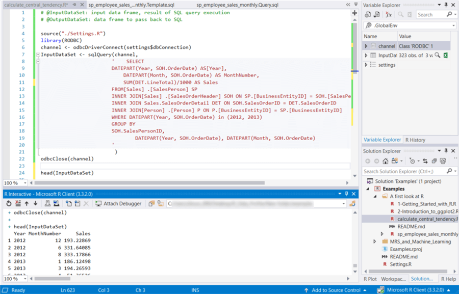
Figure 20 – Create a new R script file
3 – Compute the mean and the median
The function “aggregate(x, by, FUN)” is a powerful methods for aggregating data by replacing groups of observations with summary statistics based on those observations [3]. We use this function to calculate mean and median.
# calculate mean
aggdata_mean <- aggregate(InputDataSet,
                     by = list(Group.Year = InputDataSet$Year, Group.Month = InputDataSet$MonthNumber),
                     FUN = mean, na.rm = TRUE)

# calculate median
aggdata_median <- aggregate(InputDataSet,
                     by = list(Group.Year = InputDataSet$Year, Group.Month = InputDataSet$MonthNumber),
                     FUN = median, na.rm = TRUE)
4 – Plot the mean and the median
The “plot(x, y)” function places x on the horizontal axis and y on the vertical axis. We can add other options to decorate the plot.
plot(aggdata_mean[aggdata_mean$Group.Year == 2012,][, "Group.Month"],
     aggdata_mean[aggdata_mean$Group.Year == 2012,][, "Sales"],
     type = "b",
     xlab = "Month", ylab = "Sales(in Thousands)",
     sub= "The Mean of Sales in 2012")
5 – Complete Source Codes
For simplicity, I plotted 4 graphs. By using either the par() function, we can combine these 4 graphs into one.
# @InputDataSet: input data frame, result of SQL query execution
# @OutputDataSet: data frame to pass back to SQL

source("./Settings.R")
library(RODBC)
channel <- odbcDriverConnect(settings$dbConnection)
InputDataSet <- sqlQuery(channel,
                        ' SELECT
                        DATEPART(Year, SOH.OrderDate) AS[Year],
                        DATEPART(Month, SOH.OrderDate) AS MonthNumber,
                        SUM(DET.LineTotal)/1000 AS Sales
                        FROM[Sales] .[SalesPerson] SP
                        INNER JOIN[Sales] .[SalesOrderHeader] SOH ON SP.[BusinessEntityID] = SOH.[SalesPersonID]
                        INNER JOIN Sales.SalesOrderDetail DET ON SOH.SalesOrderID = DET.SalesOrderID
                        INNER JOIN[Person] .[Person] P ON P.[BusinessEntityID] = SP.[BusinessEntityID]
                        WHERE DATEPART(Year, SOH.OrderDate) in (2012, 2013)
                        GROUP BY
                        SOH.SalesPersonID,
                        DATEPART(Year, SOH.OrderDate), DATEPART(Month, SOH.OrderDate)
                        '
                         )
odbcClose(channel)

head(InputDataSet)


# calculate mean
aggdata_mean <- aggregate(InputDataSet,
                     by = list(Group.Year = InputDataSet$Year, Group.Month = InputDataSet$MonthNumber),
                     FUN = mean, na.rm = TRUE)

# calculate median
aggdata_median <- aggregate(InputDataSet,
                     by = list(Group.Year = InputDataSet$Year, Group.Month = InputDataSet$MonthNumber),
                     FUN = median, na.rm = TRUE)

# sort by year and month
aggdata_mean <- aggdata_mean[order(aggdata_mean$Group.Year, aggdata_mean$Group.Month),]
aggdata_median <- aggdata_median[order(aggdata_median$Group.Year, aggdata_median$Group.Month),]

# plot mean along month in 2012
plot(aggdata_mean[aggdata_mean$Group.Year == 2012,][, "Group.Month"],
     aggdata_mean[aggdata_mean$Group.Year == 2012,][, "Sales"],
     type = "b",
     xlab = "Month", ylab = "Sales(in Thousands)",
     sub= "The Mean of Sales in 2012")

# plot mean along month in 2013
plot(aggdata_mean[aggdata_mean$Group.Year == 2013,][, "Group.Month"],
     aggdata_mean[aggdata_mean$Group.Year == 2013,][, "Sales"],
     type = "b",
     xlab = "Month", ylab = "Sales(in Thousands)",
     sub = "The Mean of Sales in 2013")

# plot median along month in 2012
plot(aggdata_median[aggdata_median$Group.Year == 2012,][, "Group.Month"],
     aggdata_median[aggdata_median$Group.Year == 2012,][, "Sales"],
     type = "b",
     xlab = "Month", ylab = "Sales(in Thousands)",
     sub = "The Median of Sales in 2012")

# plot median along month in 2013
plot(aggdata_median[aggdata_median$Group.Year == 2013,][, "Group.Month"],
     aggdata_median[aggdata_median$Group.Year == 2013,][, "Sales"],
     type = "b",
     xlab = "Month", ylab = "Sales(in Thousands)",
     sub = "The Median of Sales in 2013")
6 – Present mean and median of monthly sales by using line graphs
Table 1 shows all 4 graphs. Regardless of the year of sales, the fluctuation patterns in these graphs are comparable. These graphs imply that seasonal factors may impact employee monthly sales.

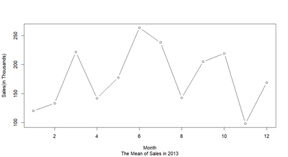


Table 1 – Line graph matrix
In this section, we first review a few basic terms from statistics. Then we plot 4 graphs to represent mean sales and median sales in 2012 and 2013, respectively. The line graphs reveal the periodic fluctuation of monthly sales. Since mean and median are the most representative of the array, we can conclude that employee sales performance during 2012-2013 might be impacted by some seasonal factors to some extent.
Zip Code validation
Nowadays, many organizations depend on their data for daily operations. Inaccurate data may cost their money and opportunities. One technology for identifying data quality problem is data profiling, which uses analytical techniques to discovery the true content, structure, and quality of data [8]. In this section, we are going to use R to test the Zip codes in the “AdventureWorks2017” database.
The domain definition for the Zip code in the “[Person].[Address]” table is “nvarchar (15)”, which can satisfy international addresses. But this cannot prevent invalid zip codes from entering into the database. For demonstration purposes, we only test Canadian postal codes. We use the regular expression provided by [9]:
Add a new R script file “zip_code_validation.R” to the project. The R function “grep(pattern, x, ignore.case=FALSE, fixed=FALSE)” is used to search for pattern defined in the regular expression. To test postal codes of other countries, we just need to change the regular expression. The following codes are used to test the Canadian postal codes:
source("./Settings.R")
library(RODBC)
channel <- odbcDriverConnect(settings$dbConnection)
InputDataSet <- sqlQuery(channel,
                        '
                           SELECT distincta.PostalCode
                           FROM [Person].[Address] a INNER JOIN [Person].[StateProvince] s
                                                 ON a.StateProvinceID = s.StateProvinceID
                           WHERE s.CountryRegionCode = \'CA\'
                        '
                        ,stringsAsFactors = FALSE)
odbcClose(channel)

#head(InputDataSet)

postal_code_pattern <- "^(?!.*[DFIOQU])[A-VXY][0-9][A-Z] ?[0-9][A-Z][0-9]$"
OutputDataSet <- grep(postal_code_pattern, InputDataSet$PostalCode,
                      ignore.case = TRUE,
                      perl = TRUE,
                      value = TRUE,
                      fixed = FALSE,
                      invert=TRUE)
OutputDataSet
The test results indicate 14 kinds of postal codes in the database table are not valid Canadian postal codes:
+ OutputDataSet
 [1] "N2V" "L4N" "G1R" "V8X" "8Y"  "R3"  "G1W" "V9"  "V0"  "V8P" "G1T" "7L"  "T5"  "V8V"
In this section, we have used a Canadian Postal Code pattern to check all Canadian postal codes in the database table. We have found some postal codes did not conform the pattern. This approach is also known as assertive testing [8]. This also indicates that we can use R as a data profiling tool.
Summary
In this tip, we have walked through a process to create a SQL stored procedure. The RTVS allows us to work on SQL scripts and R scripts separately. The stored procedure template file will combine the SQL scripts and the R scripts into one stored procedure in the publishing process. We have created two graphs for two employees, respectively. These line graphs indicated that employee sales performance varied from 2012 to 2013. We also observed the sales periodic fluctuation in the line graphs. We have used central values to represent overall employee sales, and we have discovered that some seasonal factors may impact sales. Finally, we have identified the data quality issues of the Canadian postal codes in the database table “[Person].[Address]”.
In upcoming tips, we will explore more statistical methods to present data by means of tables and graphs and to transform data into actual insight.
References
[1] Hummelbrunner, S. A., Rak, L. J., Fortura, P., & Taylor, P. (2003). Contemporary Business Statistics with Canadian Applications (3rd Edition). Toronto, ON: Prentice Hall.
[2] William, M., & Sincich, T. (2012). A Second Course in Statistics: Regression Analysis (7th Edition). Boston, MA: Prentice Hall.
[3] Kabacoff, R. (2015). R in Action, Second Edition: Data analysis and graphics with R. Shelter Island, NY: Manning Publications.
[4] Brockschmidt, K., McGee, M. & Hogenson, G. (2018, June 24). Work with SQL Server and R. Retrieved from https://docs.microsoft.com/en-us/visualstudio/rtvs/integrating-sql-server-with-r?view=vs-2017.
[5] Kess, B. (2017, December 12). AdventureWorks sample databases. Retrieved from https://github.com/Microsoft/sql-server-samples/releases/tag/adventureworks.
[6] Brockschmidt, K., Hogenson, G., Warren, G., McGee, M., Jones, M., & Robertson, C. (2017, December 12). R Tools for Visual Studio sample projects. Retrieved from https://docs.microsoft.com/en-us/visualstudio/rtvs/getting-started-samples?view=vs-2017.
[7] MSFTRSProdSamples: Microsoft SQL Server Product Samples: Reporting Services. Retrieved from https://archive.codeplex.com/?p=msftrsprodsamples.
[8] Olson, E. J. (2003). Data Quality: The Accuracy Dimension. San Francisco, CA: Morgan Kaufmann Publishers.
[9] Goyvaerts, J. & Levithan, S. (2012). Regular Expressions Cookbook (2nd Edition). Sebastopol, CA: O'Reilly Media, Inc.
Next Steps
- The file “1-Getting_Started_with_R.R” in the sample project has informative comments. Reading these comments and running the codes line-by-line would speed up our learning process. John Lam provided a 12 minute tutorial video, R Tools for Visual Studio 2017, on YouTube. In his tutorial session, he has demonstrated: using R from SQL Server Stored Procedures, using SQL server from R projects and visualizing SQL Server data using R. This tip was intended to introduce data analysis through the solution of practical business problems. All R functions used in this tip are from the base installation. The codes are for ease-of-understanding rather than efficiency. You can re-write all these codes with your favorite packages and functions.
- Check out these related tips:
- SQL Server sp_execute_external_script Stored Procedure Examples
- Getting started with R in SQL Server
- Setup R Services for SQL Server 2016
- R in SQL Server Ecosystem
- SQL Server 2016 R Services: Executing R code in SQL Server
- Data Science for SQL Server Professionals
- Basics of Machine Learning with SQL Server 2017 and R

Nai Biao Zhou has twenty years of experience in software development, with strong analytical skills and a broad range of computer expertise.
He has fifteen years of experience in development and maintenance of database applications on SQL Server in OLTP/OLAP/BI environments.
He has a master’s degree in Control Engineering and is pursuing a Master of Science degree in Predictive Analytics.
Knowledge/Skills
Advanced computer programming skills and well versed with C/C#, Java, ASP.NET, JavaScript, and SQL.
In depth knowledge of Solution Architecture, and Software Development Life Cycle (SDLC).
Microsoft Certified Application Developer (MCAD) since 2004.
- MSSQLTips Awards: Author of the Year – 2021 | Rising Star (50+ tips) – 2024 | Author Contender – 2020, 2023