Problem
Microsoft’s Power BI facilitates its users with various numerical calculation options, providing abstraction and ease of use for the user. In particular, data scientists and analysts will likely be interested in data distribution—what story is the data conveying to us? In such a scenario, a beneficial functionality provided by the Power Query Editor is the statistical calculation options, which enable users to calculate statistics like the mean and median of the data, to name a few. This tip will provide an instructional overview of efficiently utilizing this functionality provided by Power BI.
Solution
Statistics is a branch of mathematics concerned with data collection, analysis, and interpretation. The need for statistical scientific methods can range from the governmental needs for census data collection and a country’s economic activity analysis to more profit-motivated needs of firms eager to gauge their performance in the market. Furthermore, in the age of big data, where quintillion bytes of data are generated in a single day, the importance of statistical methods is at an all-time high in almost all facets of our lives! This tip will focus on the fundamentals–the descriptive statistical measures and how to implement them in Microsoft’s Power BI.
Descriptive statistics are summary statistics that essentially summarize the characteristics of a given dataset. These measures that describe the data can be used to quantitatively access the central tendency and spread of the data. In simpler words, these measures help us evaluate the most typical, central value occurring in a dataset, alongside how data points are dispersed around this average value.
Now that we understand that descriptive statistical measures can be broadly divided into central tendency measures and variability (spread) measures, let’s look at some of the measures in more detail:
- Arithmetic Mean: This is one of the most common measures and one which you might already be familiar with. This type of mean is defined by taking the sum of all data points and dividing the resulting sum by the data counts. The resulting numerical value provides an approximate location on the real number line where most data points lie. Although very simplistic in its concept, arithmetic mean (most commonly known as average) has a drawback: it is easily skewed by outliers in the data. Outliers are atypical data points and differ significantly from the rest. These values distort the mean, making it less representative of the central tendency of a dataset.
- Median: A remedy to our previous problem related to outliers can be mitigated by the median. It is also a central tendency measure that calculates the midpoint of an ordered dataset. This measure is robust against outliers as it does not consider the magnitude of each data point.
- Mode: This is essentially the most frequently occurring data point in a dataset. For instance, if a fruit column in a dataset comprises 6 oranges and 2 bananas, the mode of the fruit column will be oranges. This measure is particularly applicable in the case of categorical variables, as we just discussed.
- Variance: To measure the spread of our data, variance is a common numerical measure. It quantifies how data points are distributed around the mean of data. The square root of variance yields the standard deviation of data. A larger value of variance and standard deviation indicated that data is not tightly clustered around the mean value.
- Skewness & Kurtosis: These measures compute a value that quantifies the shape of a data distribution. Skewness measures the asymmetry of the distribution. For instance, the normal distribution has zero skewness as it is perfectly symmetrical. On the other hand, kurtosis measures the tailedness of a distribution or how frequent outliers are in a dataset.
All this complicated terminology begs the question: How are these concepts important to us in our day-to-day lives?
- These measures enhance the interpretability of the data. Rather than staring at monotonous data matrices to make sense of them, descriptive measures of central tendency and spread can provide a complete picture of data concisely. In other words, complex findings can be condensed to simpler metrics, aiding communication with a broader, non-technical audience.
- Descriptive statistics are also used alongside data visualizations as they help reveal important insights in a graphical manner, which is often more intuitive and easier to understand.
- This part of statistics is integral to data science and analytics. For instance, businesses and organizations require frequent information regarding the status of their KPIs, market and financial trends, and even how the business itself is performing in the market. Descriptive statistics about such key variables aid businesses in data-informed decision-making.
- Now that the hype is about large language models (LLMs) and AI, it might surprise you that the modern field of machine learning is all based on statistical methods. Descriptive statistics play a significant role in it. For instance, utilizing the mean and standard deviation of features for data normalization techniques is a standard practice to make the gradient descent algorithm faster.
- Descriptive statistics also help us understand the world around us. Environmental scientists are particularly on the lookout for patterns related to climate change, pollution levels, and ecological trends. Understanding these variables allows scientists to design appropriate conversation strategies in a timely manner.
Creating a Schema in SQL Server
Now that we understand the fundamentals, it is time for a more practical demonstration using Power BI and SQL Server.
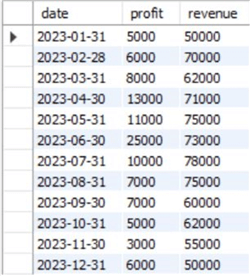
First, we will use SQL Server to create a simple dataset containing information regarding a hypothetical firm’s monthly profit and revenue. We will then play with these variables and analyze them using different statistical measures.
To get started, we will first create a database in SQL Server and access it using the following command:
--MSSQLTips.com
CREATE DATABASE stat;
USE stat;
We will then create a table containing information regarding profit and revenue trends.
--MSSQLTips.com
CREATE TABLE monthly_sales
(
    [date] DATE,
    profit INT,
    revenue INT
);
Lastly, we can now populate our table with relevant values by executing the following statement:
--MSSQLTips.com
INSERT INTO monthly_sales VALUES
('2023-01-31', 5000, 50000),
('2023-02-28', 6000, 70000),
('2023-03-31', 8000, 62000),
('2023-04-30', 13000, 71000),
('2023-05-31', 11000, 75000),
('2023-06-30', 25000, 73000),
('2023-07-31', 10000, 78000),
('2023-08-31', 7000, 75000),
('2023-09-30', 7000, 60000),
('2023-10-31', 5000, 62000),
('2023-11-30', 3000, 55000),
('2023-12-31', 6000, 50000);
We can visualize the created table through the command outlined below:
--MSSQLTips.com
SELECT * FROM stat.dbo.monthly_sales;
Using the Statistics Option in Power BI
Now that we have a dataset, we can import it on Power BI from SQL Server and use the statistical calculations option on our columns. To do so, we will go through the following steps.
Step 1: Importing the Dataset
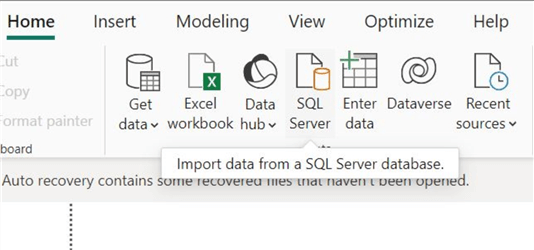
We will first start by importing our data scheme from SQL Server. To do so, click on the "SQL Server" icon in the "Data" section of the "Home" ribbon in the main interface of Power BI.
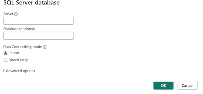
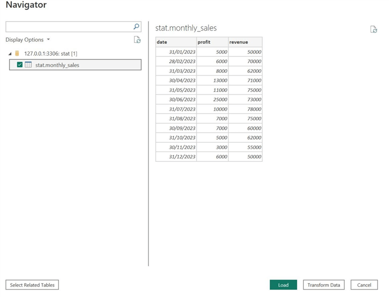
Afterward, the SQL Server database window will open. Enter the relevant server and database credentials, then click OK.
If Power BI has successfully established a connection with your database, the Navigator window will open, as shown below. Beneath Display Options, select the relevant table name you want to import, and then click Transform Data at the bottom.
To the right, we can also see that Power BI allows users to review the tables and data at this stage. It provides a quick overview of the data and will enable users to clean and manipulate it through the Power Query Editor, available through the Transform Data option.
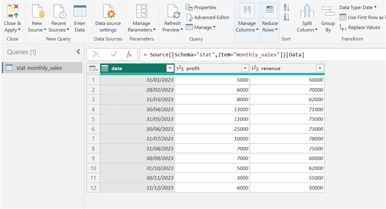
As we can see below, our tables will now appear in the Power Query Editor. We are ready to utilize the statistical calculations option to better understand our dataset.
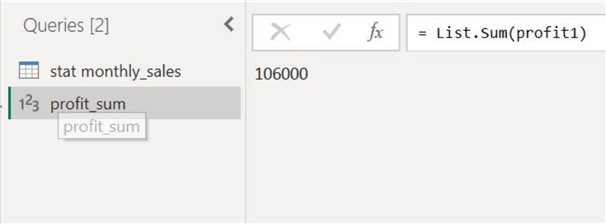
Step 2: Sum
Suppose we want to know the total annual profit a firm made in 2023. When we think about this problem, it requires us to add the entire "profit" column from our table, as each observation denotes a monthly profit.
To do so using the statistical calculations option, we first need to clone our column to create a new measure. We can achieve this by right-clicking the "profit" column and selecting the "Add as New Query" option, as shown below.
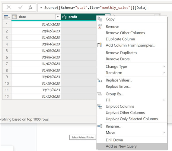
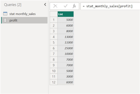
This will create a separate query of our profit column.
Then, in the "Transform" ribbon shown below, select "Statistics" and then "Sum."

Our annual profit figures will be calculated and displayed, as shown below.
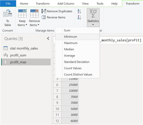
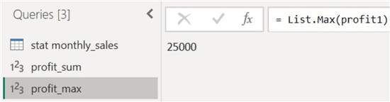
Step 3: Maximum and Minimum Values
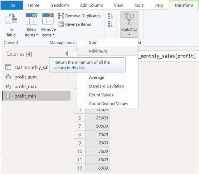
Now, we will use the Maximum and Minimum options to find the extreme data points from our profit column. We will again clone our "profit" column and select "Maximum" from the "Statistics" option, as shown below.
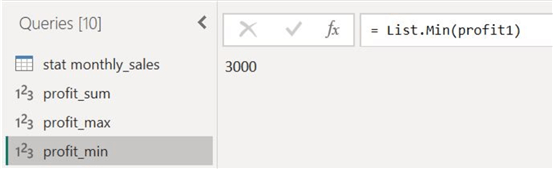
Similarly, we will again clone our "profit" column and get the minimum profit earned in 2023 by selecting the "Minimum" option, as shown below.
Our minimum and maximum profit figures are as follows, respectively.
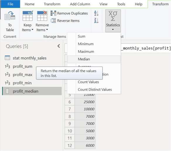
Step 4: Median
Now, let’s calculate the middle-most values of our profit and revenue figures from 2023.
After cloning our profit and revenue columns separately, we can get the median of these two columns by selecting "Median" from the "Statistics" option, as shown below.
Below, we have displayed both the median values of profit and revenue. As we previously discussed, the median is a particularly useful measure of financial performance because it presents a central tendency that is more robust to outliers present in the data.


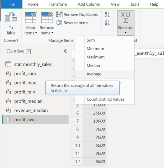
Step 5: Average
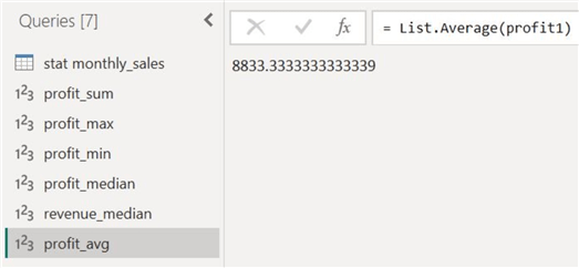
Let’s also explore the arithmetic mean option on both columns. After creating separate measures for both profit and revenue columns, we can calculate their mean by selecting "Average" from the "Statistics" calculations list, as shown below.
The average profit and revenue for the year 2023 is as follows:

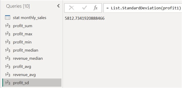
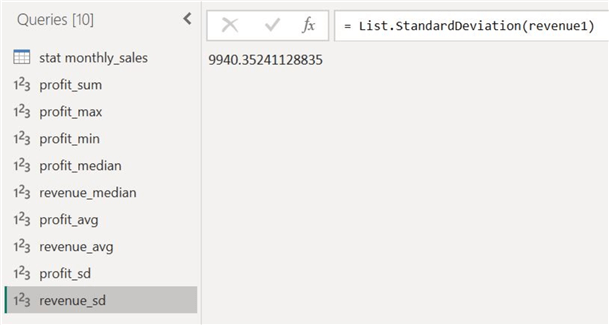
Step 6: Standard Deviation
Although we have computed several measures of central tendency for our data, let’s try to understand its spread. After creating separate measures for the two columns, we can click "Standard Deviation" in the "Statistics" option, as shown below.

The standard deviation for the two columns is as follows:
Step 7: Visualization
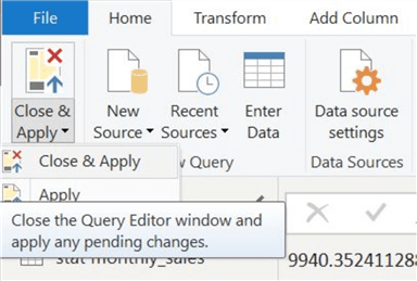
Now that we have various statistics describing our dataset, we can close the Power Query Editor and go to the main interface of Power BI for a more visual analysis. After all, graphical illustrations are still more intuitive than plain numbers.
Select "Close & Apply" in the "File" ribbon to close the Power Query Editor.
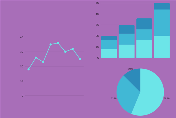
With the main interface of Power BI loaded, let’s create a visualization to better understand the 2023 profit distribution. For this purpose, select the area chart from the Visualizations panel and plot months on its x-axis and the profit trend and median on the y-axis, as shown below.
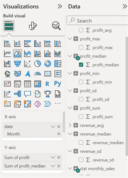
The profit distribution with the median threshold is illustrated below. We have also created a card visual to represent the standard deviation of this trend.

Analysis
Since we now have several statistical measures of our dataset, let’s see how they describe and summarize it.
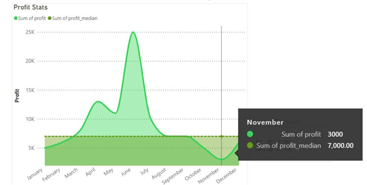
From the visualization above, we can immediately observe that the lowest profit figures occurred in November, with a total of 3000 units. This corresponds with the minimum measure we calculated in the Power Query Editor. The median measure we plotted also allows us to easily see how half of the profit data points are above it and how the other half is below it. Furthermore, the distribution has many big fluctuations, so we can expect a high standard deviation. With the actual deviation value being 5,565, we can see how the data is not tightly clustered around the mean profit value.
To understand the impact of outliers on central tendency, let’s also observe the differences in the average and median measures of our two columns. Since there was a high variability in the profit data, with many outliers, we can expect a disparity between the mean and median figures. We then see that this hypothesis can be confirmed by the actual figures calculated before, as the mean profit and the median profit is 8833 units, whereas the median stat is 7000. On the other hand, for the annual revenue distribution, the mean and median values are in more agreement due to the lower number of outliers in that data series.
Conclusion
In this tip, we have successfully outlined the fundamentals of some basic statistical measures to calculate the central tendency and spread of any dataset. We have also discussed why these measures are important and how they aid us daily. For a more hands-on approach, we created a dataset in SQL Server and analyzed it in Power BI to demonstrate a typical statistics use case.
Next Steps
Hopefully, the reader is comfortable with and confident in the concepts discussed and outlined in this tip. If they wish to explore more, readers can examine the remaining statistical measures offered by the Statistics option in the Power Query Editor.
- For instance, it is essential to know what type of data we need and when to use options like count values and count distinct values.
You may have also noticed that the statistics option we reviewed did not have any functionality to calculate the skewness and kurtosis of a data series. To get these statistics, readers can investigate how these measures are calculated and how we can do so using DAX formulas and functions.
Check out all the Power BI Tips on MSSQLTips.com.

Harris Amjad currently works as a Software Engineer at Strategic Systems International. He is Microsoft Certified Data Analyst and Microsoft Certified Trainer. A rigorous, task-driven Data Enthusiast with substantial experience in Data Science, Data Analysis, and Data Engineering.
- MSSQLTips Awards: Trendsetter (25+ tips) – 2024 | Author Contender – 2023, 2024 | Rookie Contender – 2022


Thank you so much for explaining concepts in a simple way.