By: Arshad Ali | Comments (10) | Related: > Microsoft Excel Integration
Problem
Power View is a new tool for intuitive ad hoc SQL Server reporting which provides an interactive data exploration, visualization, and presentation experience to the business users. But how do you create these Power View reports? Check out this tip to learn more.
Solution
SQL Server 2012 delivers Power View as a new tool for intuitive ad hoc reporting which provides an interactive data exploration, visualization, and presentation experience to the business users. These reports can be created based on data models in the PowerPivot workbooks or tabular models or multi dimensional models (this requires installation of SQL Server 2012 Service Pack 1 Cumulative Update 4) deployed to SQL Server 2012 Analysis Services (SSAS) instances. In this example, I am going to create Power View reports in SharePoint 2013 (the process for creating Power View reports in SharePoint 2010 remains similar) based on multi-dimensional cubes. In this next tip, I am going to demonstrate how you can create Power View reports in Excel 2013 (available in Office Professional Plus and Office 365 Professional Plus editions) if you don't have or don't want to use SharePoint. For now, you can learn about this feature here.
Creating Power View reports
In my last tip "Getting started with Power View Reports" I demonstrated how you can configure and create a SharePoint site in order to create Power View reports. In this tip, I am going to use the same connection (RSDS file) which I created in my last tip to connect to multi-dimensional cubes. Please remember you need to create a shared Report Data Source (RSDS file) for connecting to multi-dimensional cubes. The connection string for the Report Data Source should look like this Data Source=<instance name>;Initial Catalog=<database name>;Cube='<cube name>.
In my last tip, I created a new reporting services data source called AdventureWorks to connect to an AdventureWorks multi-dimensional cube as you can see below. I am going to use the same report shared data source for this demonstration. You can refer to my last tip "Getting started with Power View Reports" to create a report shared data source from the scratch.
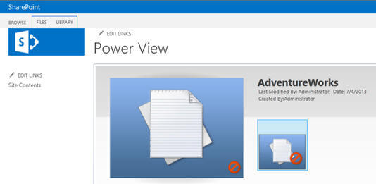
When you click on the report shared data source already created it will take you to the Power View report designer as you can see below.
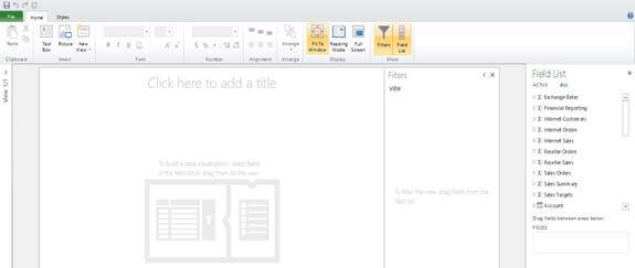
On the left side of the Power View report designer, you will notice the Field List which contains measure groups and dimensions from the connection or report shared data source we are connected to using the above created report shared data source. Now let me add some fields to create the report as shown below:
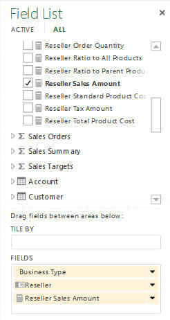
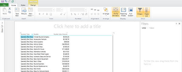
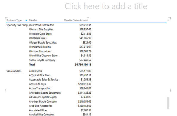
Normally when we create Power View reports we start with creating the tabular report first and then change to other report types (chart, bubble, map, etc.) based on the requirements. As you can see in the image above, I have selected "Business Type", "Reseller" and "Reseller Sales Amount" and hence this is how the tabular report would look with the data.
Now let me change the report type; in order to do that I need to click on the Design tab in the ribbon of the designer and select one of the available options as shown below:
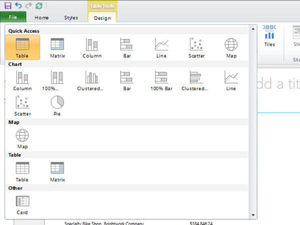
From the available options, I chose a Matrix type of report and hence the layout of the report from tabular to matrix was changed automatically as you can see below:
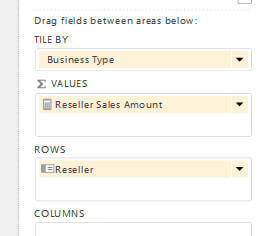
Now I want to do a grouping on "Business Type" and want the group to appear as tiles and so I dragged "Business Type" to the TILE BY section as you can see below:
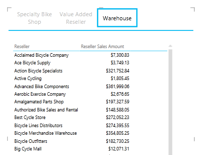
And this is what you would see below. All the business types are appearing as tiles on the top of the report and based on what you selected, the detailed information will be shown as you can see here for Warehouse.
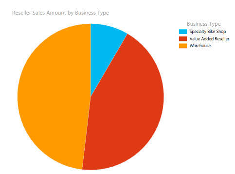
Now suppose I want to create pie chart report by business group to show the reseller sales amount as shown below; in order to do that just go to the Design tab in the ribbon and select report layout as a pie chart and here is the result:
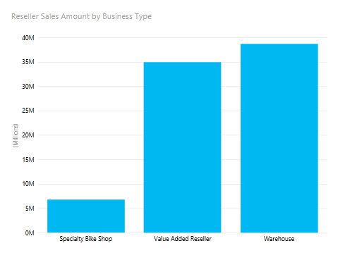
Now suppose I want to create bar chart report by business group to show the reseller sales amount as shown below; in order to do that just go to the Design tab in the ribbon and select report layout as bar chart. The idea here is, you can change the layout or structure of the report with just few clicks as per your requirements and needs.
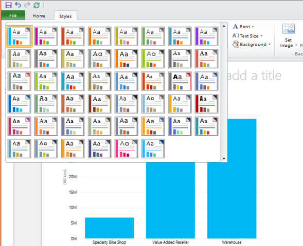
You can even change the style of the report by going to Styles tab on the ribbon based on predefined styles. You can even customize the style of each section of the report based on your requirement.
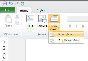
A single Power View report can contain more than one view; all these views will be based on the same data model. Each view can have its own visualization and filters specific to that view. In order to create a new view for the report, click on New View icon on the Home tab in the ribbon as shown below. You can create either a new blank view and work from the scratch or create a duplicate view from the existing view:
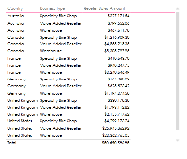
For a new view, I created a tabular report to show "Country", "Business Type" and "Reseller Sales Amount" as you can see below:
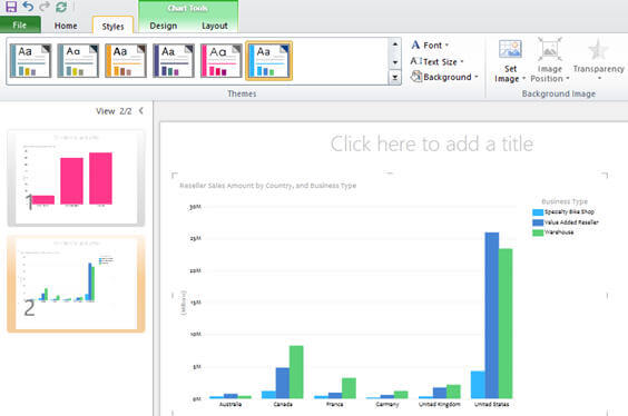
Now I want to change the tabular report to show a bar chart. To do so, I just needed to change it by going to the Design tab in the ribbon and selecting bar chart layout type. Also, from the available styles, I chose a another style than default to make it look different for demonstration purposes.
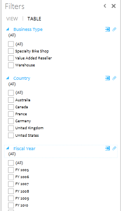
From the Filters pane, you can select or apply any filters based on columns or attributes included in the report as you can see below:
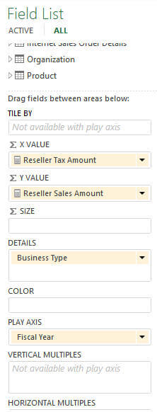
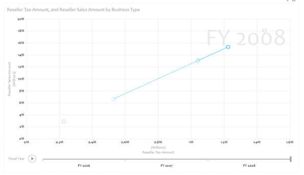
Now what I want to do is create a scatter report from the one above, which should show me data over a period of time (trend analysis). To that, I have added "Fiscal Year" in the report and added "Fiscal Year" in the Play Axis section of the Field List as you can see below:
And this is how the report will look. If you click on the Play icon on the bottom of the report, it will show a beautiful animation showing the "Reseller Sales Amount" over a period of fiscal years helping you analyze the trends.
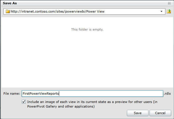
You can click on the Save icon under the File menu to save the report on the SharePoint site as shown below:
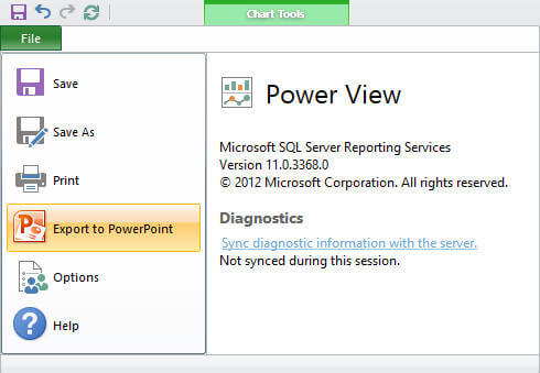
Power View reports are updated as you are working on the real data and you don't need to preview the report to get the real feel of the layout for the reports. For presentation and for better visualization you can use reading or full screen presentation modes. You can also export these interactive reports to PowerPoint (as shown below) where each view of the report becomes a slide in the PowerPoint presentation and provides the same interactivity that is available in the original Power View reports. Please note, in the reading and full screen modes or in the PowerPoint slides you can just use the visualizations and filters available in the each view though you cannot create other visualizations or filters.
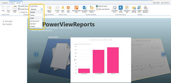
When viewing the Power View gallery you can change the view from the available views like theatrical, carousal, etc. For example, as you can see below, the documents from the Power View gallery that we have are shown here as Carousal view:
In this tip, I created some very simple Power View reports though you can create different varieties of much powerful, complex reports or dashboards with excellent visualization easily and quickly based on data models you have. Some of the online demos are available here, here, here and here. These demos require a Windows Live ID and Silverlight.
In my next tip I am going to demonstrate how you can create different types of reports in Power View in Excel 2013.
Next Steps
- Review Understanding the SQL Server 2012 BI Semantic Model (BISM) tip.
- Review Getting started with Tabular Model in SQL Server 2012 tip.
- Review my last tip "Getting started with Power View Reports" on the series.
- Review Power View on msdn.
- Review my previous tips.


About the author
 Arshad Ali is a SQL and BI Developer focusing on Data Warehousing projects for Microsoft.
This author pledges the content of this article is based on professional experience and not AI generated.
View all my tips
