Problem
How can I adjust the interactions that take place between different visuals on a Power BI report page?
Solution
Power BI provides neat interactive features which allows for easy navigation and filtering with a click of the mouse. However, there are times when all these interconnected features are not conducive to the goals of a Power BI report. Fortunately, the Power BI developers added the ability to customize and turn on and off the connection between visuals on a report. Currently the default interactions for any page report is one of two variations, all depending on the type of visualization involved. Some of the visuals default to a filter functionality where as other visuals use the highlight method. The filtering method is often not desired when you have a high level or rollup visual such as a Card.
So, let us get started with discussing the options available for interactions on a page; you need to do a few things to get everything setup for access to Power BI. First, you need to go to the Power BI web site and sign up to access Power BI. Note that you must use a work or school address to sign up for Power BI. Next, you need to download the Power BI Desktop (PBID) tool. Once you have your account setup and your Power BI Desktop application installed, you are ready to start working with Power BI!
Controlling Interactions
We will use the Wide World Importers databases, which is freely available from Microsoft, as the basis for our data. We will not go into all the details here ( feel free to review both this tip, Querying SQL Server Data with Power BI Desktop, and this tip, Power BI Data Import and Export with Excel, for details on retrieving data from a SQL Server or Excel dataset), but our first step is to load the Sales tables using the Get Data functionality. We will use these tables as the source for our visualizations. Next, as shown below, we add 4 visualizations to our page:
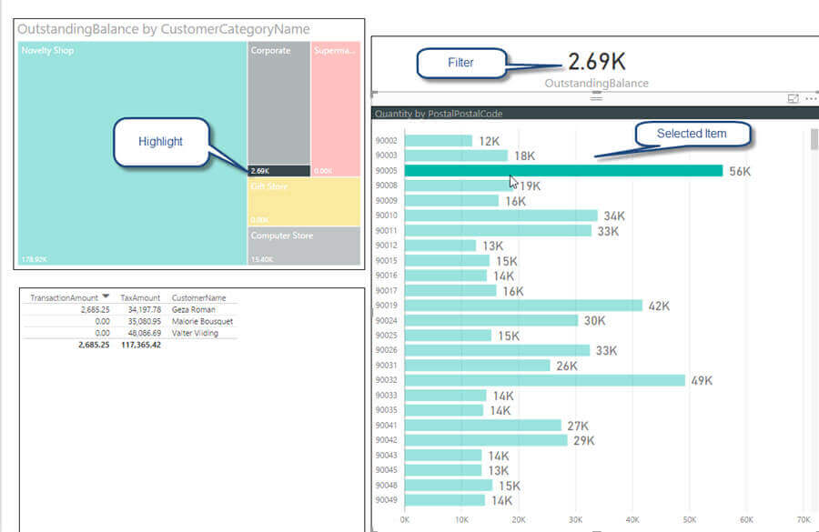
- A Treemap with customer category and outstanding balance
- A card with total outstanding balance
- A cross tab with customer name, transaction amount, and tax amount
- A clustered bar chart with postal code and quantity

On our newly created page, if we select the Postal Code 90005 from the Quantity by Postal Code visual, you will see that both the cross tab and bar chart are filtered to just Postal Code 90005 whereas the Treemap visual utilizes the highlight method.
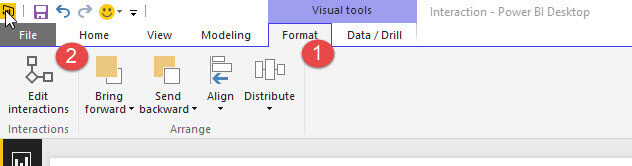
We actually may not want, for instance, for the Card visual to be filtered when other visualization’s objects and values are selected and clicked. In order to make this change, we need to use the Edit Interactions button on the Format Tab of the ribbon in Power BI Desktop.
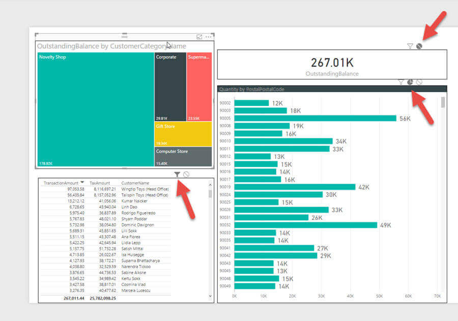
Once you click the Edit interactions button, you can now edit the interactions between the different visuals by selecting the “originating” visual for the interactions. Thus, as shown in the below screen print, the Outstanding Balance by Customer Category Name visual is selected as the originating visuals and there for you are deciding what should occur with the other visuals when you click on an object within the Outstanding Balance by Customer Category Name visual. You will notice that all the other visuals have either two or three symbols activated in the upper right corner of the visual. These symbols are as a follows:
- Funnel – this symbol indicates that the visual will be filtered
- Circle with Slash – this symbol indicates that no filtering will occur
- Pie with slice offset – this symbol indicates that the visual will use highlighting
When an option is selected, it will be filled in with black coloring. Thus, in the below screen print, all three of the other visuals on the report page will be filtered when a value / area is selected on the Outstanding Balance by Customer Category Name visual.

As illustrated next, the three other visuals now interact differently from the default. The card visual will now not be affected by selections on the Outstanding Balance by Customer Category Name visual. The bar chart will be highlighted when one or more items are selected while the cross tab will remain filtered.
Now, as shown below, when one of the boxes is selected on the Treemap visual, the card visual does not change, the Quantity by Postal Code visual highlights the impacted postal codes, and the cross tab is still being filtered.

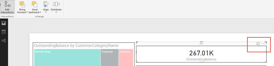
This customization of the interactions does come with a few caveats. First, as noted in the below screen prints, certain visualizations including the cross tab and card visuals do not have allow selection and interaction (they cannot be the “originating” visual for the interaction), but they can respond to interaction and be changed based on other objects. Additionally, these same visuals only allow filtering or no action, while the highlighting option is not available.

Finally, the interaction between visuals is not automatically two way. For instance, we have been adjusting the interaction for the Treemap visual. For the other visuals on the report page, we would need to adjust their interaction in a similar way if we want them to behave different from the default interactions for each visual. As such, the interaction can be:
- No-way – no interaction between visuals
- One-way – interaction occurs from one visual to another, but not in the reverse direction
- Two-way – interaction occurs between one visual and another in both directions
Conclusion
Interactions between the visuals on a Power BI Report are one of the features that make Power BI very attractive in the Dashboard marketplace. With a click here and a click there, you can easily drill into specific details that are present on a set of visualizations. However, there are also times when you would want to customize how the visuals interact; fortunately, Power BI gives you the ability to set the interaction functionality that will be used on specific visuals. The options include no action, highlighting, or filtering. However, some visuals, such as cross tab, can only be on the receiving end of the interaction and do not allow for customization of its interaction.
Next Steps
- Check out these additional resources:

I have a passion for crafting Business Intelligence Solutions for my user groups. My experience includes almost 15 years of SQL Server involvement with the last 12 years focused specifically on Business Intelligence, SharePoint, OLAP, SSRS, and Decision Support solutions. Currently, I am a Business Intelligence Architect in the healthcare industry, and I also teach database and analytics classes for Kennesaw State University, Southern New Hampshire University, and Reinhardt University. My education includes an MBA and an undergraduate in Accounting (yes I am a reformed accountant!), both from Kennesaw State University. I enjoy every day by trying to grow my faith and spend precious time with my family. I have been happily married to my wife of over 20 years, and we have two teenagers one who we home school with the help of a University Model School, Cornerstone Prep in Acworth, GA (cornerstoneprep.org). Our other child is a Construction Management major at KSU’s Southern Poly / Marietta campus. We are a soccer and Cross Country (XC) family who play, coach, and referee soccer or run for fun most every day. For several years, our family has volunteered (and played with the dogs and cats) at Etowah Valley Humane Society in Cartersville, GA.
- MSSQLTips Awards: Champion (100+tips) – 2016 | Author of the Year – 2015 | Author Contender – 2014, 2016-2021