By: Jeffrey Yao | Comments | Related: > SQL Server 2016
Problem
As a SQL Server DBA, we usually need to collect various performance counter data or other query performance data via Extended Events (XEvent) or Trace. After collecting these data, one common use is to compare the data of troubling time with the data of the non-troubling time, this comparison is best to be presented via a graph. For example, I had a performance issue between 10:00am and 11:00am, so to fully investigate the performance issue, I may want to check the CPU usage between 10:00am to 11:00am of today and compare it to that same 10:00am to 11:00am window of yesterday. Is there any way I can do data comparison quickly?
Solution
Visualizing data is becoming easier in SQL Server with multiple ways, such as Excel, Reporting Services, Power BI, etc., but with R embedded in SQL Server 2016, we now have another easy and quick way to do data comparison in a graph.
Assume we have collected one week’s CPU performance counter (% Processor Time) from Apr 1st, 2017 to Apr 7, 2017, and the collection frequency is every minute. Say we had some performance issue between 10:00am to 11:00am on April 7, and so we want to check the CPU performance during this window and compare it with the same window in previous days.
Test Data Preparation
We first need to prepare some test data. In the real world, I find when I schedule the performance collection to be at every minute, say at (ideally) 10:01:00, 10:02:00, 10:03:00, 10:04:00, etc., but often, the real collection time may be 10:01:01, 10:02:00, 10:03:001, 10:04:02, i.e. there can be a few seconds discrepancy. This presents a unique small challenge when we do data comparison based on point of time as we need to “normalize” the time data for the X axis.
The code below is trying to mimic this “time-drifting” occurrence of data collection.
use TestDB
drop table if exists dbo.PerfCounter;
go

create table dbo.perfCounter (id int identity primary key, [value] decimal(5,2), [logtime] datetime);
go
declare @dt datetime = '2017-04-01';
declare @i int=0;
begin tran
  while (@i < 10080) -- 24 hrs/day X 60 min/hr * 7 days = 10080
  begin
insert into dbo.perfCounter( [value], [logtime])
values ( cast(rand()*100 as decimal(5,2)),  dateadd(second, cast(ceiling(rand()*10) as int)%5, dateadd(minute, @i, @dt)))
set @i += 1;
  end
commit tran
Now with the testing data available, we can start to plot the graphs. We will present the plotting in two ways.
1. Plotting in the same coordinate system (one panel)
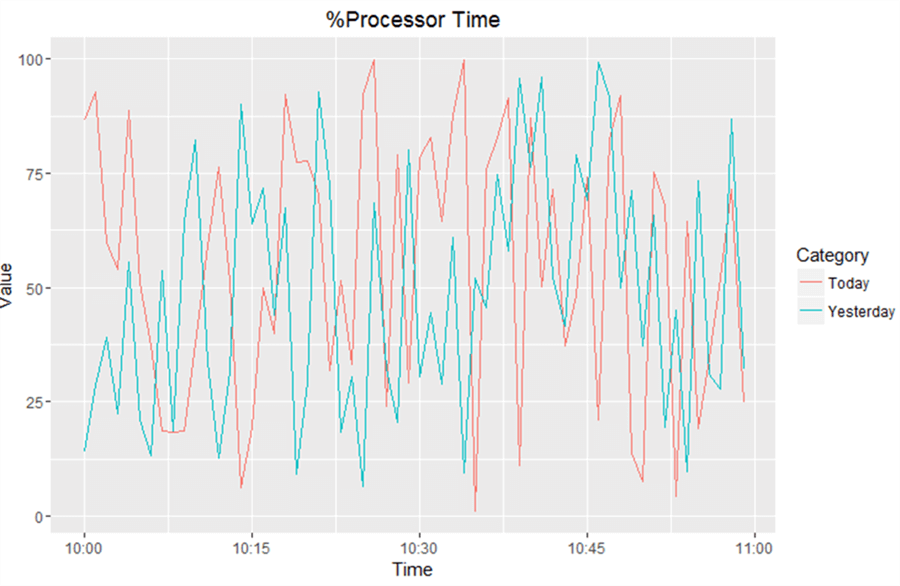
We will first look at the final graph before we review the code.

Before we generate the graph, we need to prepare the data, in our case, we want to see the CPU usage of the time window from 10:00am to 11:00am for today (2017/04/07) and yesterday (2017/04/06). Since this is a comparison on time series data, we will use X axis for time (while ignoring the exact date value as the date will be distinguished by different color) and Y axis for value.
Here is T-SQL code to generate the data. Three things to note:
- A new column [Category] is created in the query, it has two values “Today” and “Yesterday”, which you can define any other values if needed.
- If a record has [LogTime] of 2017/04/06 (i.e. yesterday), in the query, [LogTime] will be added by one day, this is to ensure we have the same X axis value for the corresponding 2017/04/07 (i.e. today) record, thus it facilitates the comparison.
- The query is designed to remove the “second” value (caused by time-drifting issue mentioned above) with only “minute” value left.
select [Category]=case datediff(day, '2017-04-06',logtime)
when 0 then 'Yesterday'
when 1 then 'Today'
else 'wrong date'
   end
, [Value]=[value]
, [Time]= case  datediff(day, '2017-04-06',logtime)
when 0 then dateadd(minute, datediff(minute, '20010101', logtime), '20010101') + 1
else dateadd(minute, datediff(minute, '20010101', logtime), '20010101')
  end
from dbo.perfCounter
where datediff(hour, logtime, '2017-04-06 10:00:00') = 0 -- only get records of 10:00am to 10:59am window
or datediff(hour, logtime, '2017-04-07 10:00:00')=0 -- only get records of 10:00am to 10:59am window
Graph Generation Code
To generate the graph, we use the following code, the graph is generated as a PDF file c:\test\CPUPerf.pdf:
-- compare [%Processor Time] of window 10:00am to 11:00am between yesterday and today (2017/04/07)
-- two lines in one panel
USE TestDB
exec sp_execute_external_script @Language=N'R'
, @Script = N'
library("ggplot2")
ggplot(data=rslt, aes(x=Time, y=Value, color=Category)) +
  geom_line() + ggtitle("%Processor Time") +
  ggsave(pth, width=10, height=8)
'
, @input_data_1_name = N'rslt'
, @input_data_1 = N'
select [Category]= case datediff(day, ''2017-04-06'',logtime)
when 0 then ''Yesterday''
when 1 then ''Today''
else ''wrong date''
   end
, [Value]=[value]
, [Time]=case datediff(day, ''2017-04-06'',logtime)
when 0 then dateadd(minute, datediff(minute, ''20010101'', logtime), ''20010101'') + 1
else dateadd(minute, datediff(minute, ''20010101'', logtime), ''20010101'')
  end
from dbo.perfCounter
where datediff(hour, logtime, ''2017-04-06 10:00:00'') = 0
or datediff(hour, logtime, ''2017-04-07 10:00:00'')=0
'
, @params = N'@pth varchar(128)'
, @pth = N'c:/test/CPUPerf.pdf'; -- file path should use / instead of \
2. Plotting in two panels
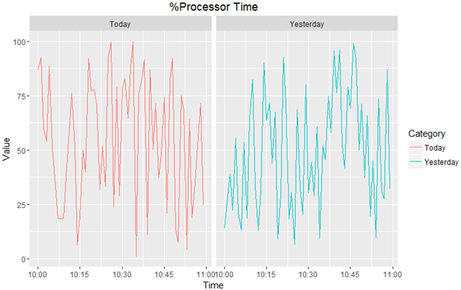
The previous graph puts two variables (i.e. today’s %Processor time values and yesterday’s in the same panel), but we may want to see them each in their own panel as shown below.

With R, this is extremely easy. The dataset will still be the same using the same T-SQL query as shown above to prepare the data, just the R code is a little bit different.
Here is the code, with the graph generated in file c:\test\CPUPerf2.pdf as shown in the code, the difference to the previous graph generating code is highlighted in yellow.
-- compare [%Processor Time] of window 10:00am to 11:00am between yesterday and today (2017/04/07)
-- two lines each in its own panel
USE TestDB
exec sp_execute_external_script @Language=N'R'
, @Script = N'
library("ggplot2")
#two graphs each with its own panel
ggplot(data=rslt, aes(x=Time, y=Value, color=Category)) +
  geom_line() + facet_grid(. ~ Category) +
  ggtitle("%Processor Time") +
  ggsave(pth, width=10, height=8)
'
, @input_data_1_name = N'rslt'
, @input_data_1 = N'
select [Category]=case datediff(day, ''2017-04-06'',logtime)
when 0 then ''Yesterday''
when 1 then ''Today''
else ''wrong date''
  end
, [Value]=[value]
, [Time]=case  datediff(day, ''2017-04-06'',logtime)
when 0 then dateadd(minute, datediff(minute, ''20010101'', logtime), ''20010101'') + 1
else dateadd(minute, datediff(minute, ''20010101'', logtime), ''20010101'')
 end
from dbo.perfCounter
where datediff(hour, logtime, ''2017-04-06 10:00:00'') = 0
or datediff(hour, logtime, ''2017-04-07 10:00:00'')=0
'
, @params = N'@pth varchar(128)'
, @pth = N'c:/test/CPUPerf2.pdf'; -- file path should use / instead of \
Summary
In this tip, we have explored a method to do data comparison using R. This type of data analysis and visualization is very common for DBAs, especially when presenting findings to management. The best part of such data visualization analysis is there are many ways to achieve the same goal with different R packages. My personal preference is ggplot2 package at this time for its flexibility and power, just see below for another example with a new format.
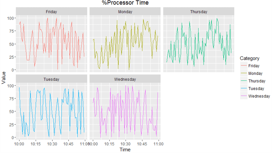
The following graph plots five weekdays’ (i.e. Apr 3, 2017 to Apr 7, 2017) data from 10:00am to 11:00am in five panels.

The T-SQL Code is as follows
USE TestDB
exec sp_execute_external_script @Language=N'R'
, @Script = N'
library("ggplot2")
#two graphs each with its own panel
ggplot(data=rslt, aes(x=Time, y=Value, color=Category)) +
  geom_line() + facet_wrap(~ Category, nrow=2) +
  ggtitle("%Processor Time") +
  ggsave(pth, width=10, height=8)
'
, @input_data_1_name = N'rslt'
, @input_data_1 = N'
select [Category]=datename(dw, logtime)
, [Value]=[value]
, [Time]= dateadd(minute, datediff(minute, ''20010101'', logtime), ''20010101'') + datediff(day, logtime, ''2017-04-07'')
from dbo.perfCounter
where datediff(hour, ''2017-04-03 10:00:00'', logtime)%24 = 0  -- only get records of 10:00am to 10:59am window
and  logtime between ''2017-04-03'' and ''2017-04-07 23:59:59''
'
, @params = N'@pth varchar(128)'
, @pth = N'c:/test/CPUPerfWeek.pdf'; -- file path should use / instead of \
Next Steps
To discuss the details of ggplot2 is out of the capacity of this tip. The tip just shows one potential way to present data comparison. To further learn the power and beautify of ggplot2, please check the following links:
- R Graphics Cookbook
- SQL Server sp_execute_external_script Stored Procedure Examples
- Automatically Generate Performance Counter Graphs with SQL Server 2016 and R
- The code in this tip has hard-coded many values, like ‘2017-04-03’, this is mainly for brevity purpose, actually, they can be replaced with input variables to make the solution more flexible. Please try to replace these hard-coded values with variables.
About the author
 Jeffrey Yao is a senior SQL Server consultant, striving to automate DBA work as much as possible to have more time for family, life and more automation.
This author pledges the content of this article is based on professional experience and not AI generated.
View all my tips


