By: Siddharth Mehta | Comments | Related: > SQL Server 2017
Problem
Exploratory data analysis is a very standard, fundamental and preliminary process of data exploration before it is considered suitable for different kinds of statistical analysis like machine learning, deep learning, etc. When data volumes are in the range of few thousand records, visualizations like boxplots, scatterplot and hexplots may come to use. The limitation with these visualizations is that the same plot would have to be rendered the number of times as the number of fields in a table, as the visual displays univariate data by itself. To understand the spread of data in a table that is composed of numerical as well as categorical values, another challenge is that different kind of visualizations are required to analyze the spread of categorical data – for example mosaicplots. In summary, the need here is to start with a visualization that can deal with all types of voluminous data in a single visual, which can become the starting point for exploratory data analysis over multi-variate data.
Solution
TabPlot package in R and SQL Server 2017 provides the ability to create Tableplots which can be used to analyze multi-variate data of numerical as well as categorical types in a single visualization. Let's get started:
Step 1 - It is assumed the SQL Server 2017 as well as R is installed on the development machine. If you are new to R in SQL Server, you can refer the R tutorial to get up to speed on working with R in SQL Server.
Step 2 - Its assumed that SQL Server Management Studio (SSMS) in installed on the development machine, open SSMS and open a new query window. Before we proceed with the next steps, we need to install the necessary packages that will be used in the upcoming steps. We need high cardinality data that can be used to simulate the problem in question, and we need the package that can create a table plot. For this, we need to install ggplot2 as well as tabplot packages respectively. The ggplot2 package has the famous diamonds dataset, and tabplot package is the one which specializes in providing the functionality to create table plots. You can read more about installing R packages in SQL Server from here.
Step 3 - Now we are ready to start executing queries using the above-mentioned packages. The first step is to explore the diamonds dataset. Execute the below query to take a stock of the data in this dataset.
EXECUTE sp_execute_external_script @language = N'R', @script = N'

library(ggplot2)
library(tabplot)

data(diamonds)
print(diamonds)

'
Step 4 - The output from the above query would look as shown below. This code executes the R script, where we are using the library function to refer to the ggplot2 and tabplot libraries and then just printing the diamonds dataset.
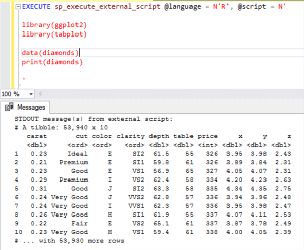
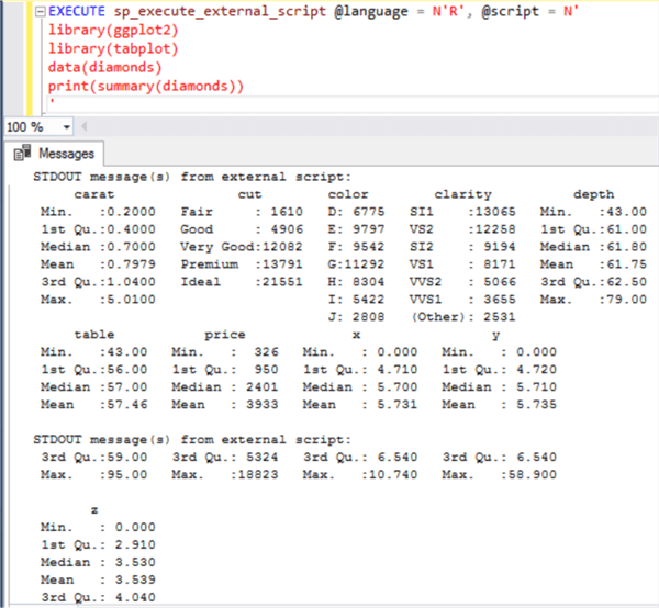
Step 5 - If you change the code a little and print the summary of this dataset using the summary function as shown below, you would be able to see the spread in the data.
Step 6 - Now coming to the core of the problem, our intention is to compare all this visually instead of studying a lot of different numbers as shown above. The reason for this is that in real life scenarios, there can be tens to hundreds of fields, and it would be increasingly tedious to analyze all this fields together as the number of fields starts increasing. So, let’s create our first tableplot and understand how it helps to analyze the data in a better way. Execute the below code.
EXECUTE sp_execute_external_script @language = N'R', @script = N'
library(ggplot2)
library(tabplot)

data(diamonds)
jpeg(filename="C:\\temp\\tableplot.jpeg", width = 1480, height = 1080, units = "px", pointsize = 125, quality = 100);

#Create Table Plot
tableplot(diamonds, fontsize = 14, legend.lines = 8, title = "Table Plot", fontsize.title = 18)

dev.off();

&a'
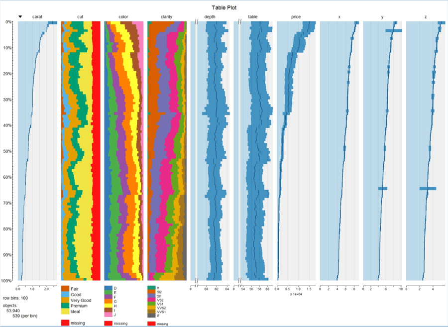
Step 7 - In the above code, we are using the jpeg function to create a graphics device, which will capture the visualization that is rendered using the tableplot function. In this function we are passing the entire dataset, which is a data frame as an input parameter, and then finally when we close the device, the file is being saved at the specified location. Once the above code executes successfully, the file should get created in the provided location. Open the file and the visualization would look as shown below.
Step 8 - In this visualization, the entire data is sorted based on the column indicated by the down arrow i.e. carat column. This can be changed by using the sortcol input parameter to the tabplot function. If you carefully analyze each column, you would find a different scale under each numeric variable and categorical variables are shown as stacked bar/area charts. Missing values are shown with a red color. All the legends are shown at the bottom of the visualization. Creating this visual is just a line of code using the tabplot function, but the real value is in analyzing the visualization.
Tableplots can be created to inspect data distributions, analyze relationships between the sorted and other variables and indicate quality issues like missing data and other data anomalies. Tableplots show the aggregated distribution of variables in relation to one sorted variable. Data is aggregated and represented in bins like a histogram, so certain data distributions may suffer based on bin size, particularly variables with highly skewed distributions. It is advisable to experiment with a different number of row bins to bring out the distribution clearly in the visualization, the way we do it is with histograms. Combining the values for a numeric variable of the records in a row bin is done by calculating their mean value. For categorical variables, the fraction of the various categories in the row bin is determined, with missing value as an additional category.
Step 9 - Now let’s say we have figured out a few columns of interest from a large list of columns, we can specify the columns of interest as well as the sort column of the entire dataset to make the visual more focused on the data of interest. Modify the code and replace the tableplot function with the below line of code.
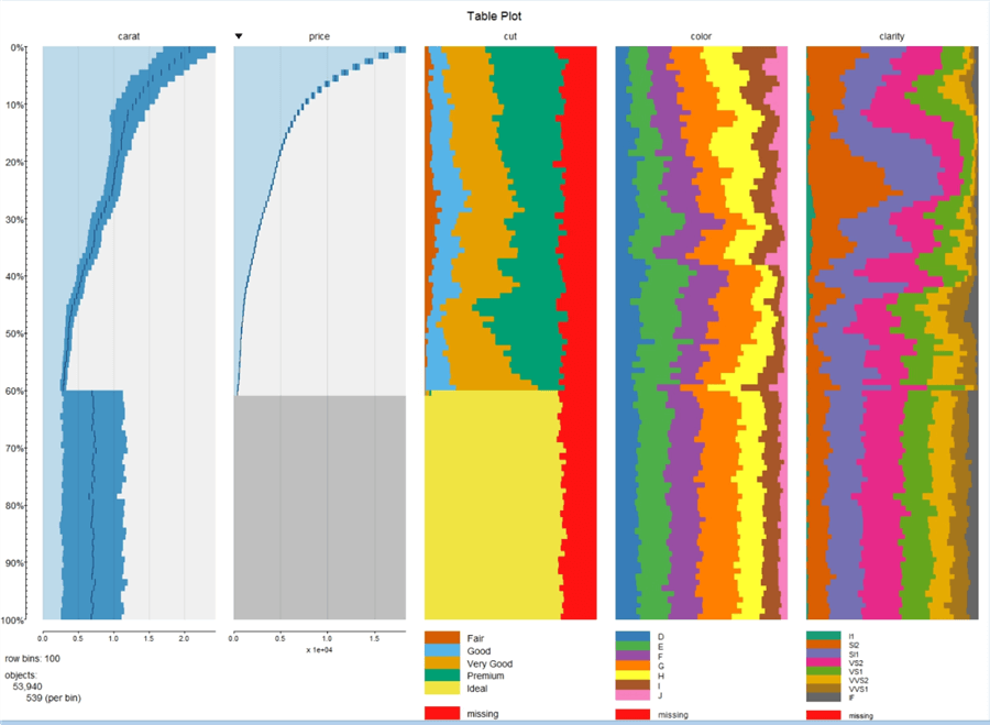
tableplot(diamonds, select = c(carat, price, cut, color, clarity), sortCol = price, fontsize = 14, legend.lines = 8, title = "Table Plot", fontsize.title = 18)
Step 10 - The visualization would look as shown below. As you can see, the spread in the data is more clearly visible in this visualization, making it derive insights. For example, if you analyze the curve of carat and price, it is easy to make out that with decrease in price, the carat units also decrease, which means cheaper diamonds are smaller in size.
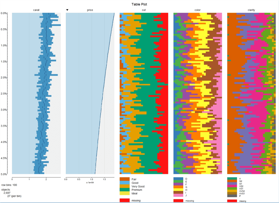
Step 11 - Let’s say we are only interested in top 5% of the diamonds, we can limit the scale to show the top 5% data only. Execute the below code.
tableplot(diamonds, select = c(carat, price, cut, color, clarity), sortCol = price, from = 0, to = 5, fontsize = 14, legend.lines = 8, title = "Table Plot", fontsize.title = 18)
Step 12 - Once you execute the code successfully, your visualization should look as shown below.
Step 13 - Let’s say we intend to filter the entire dataset, for example we are interested only in Premium diamonds whose price is less than a certain dollar value, we can filter the dataset that is passed to the visualization. Modify the tableplot function as shown below and execute the code.
tableplot(diamonds, subset = price < 5000 & cut == "Premium", fontsize = 14, legend.lines = 8, title = "Table Plot", fontsize.title = 18)
Step 14 - Once the code executes successfully, the visualization should look as shown below.
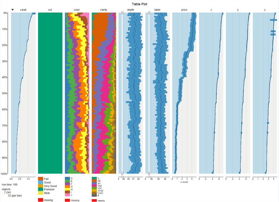
In this way, we can use a tableplot for multi-variate high-voluminous data analysis primarily to understand distribution and relationships between different variables in a dataset.
Next Steps
- Consider applying table plot on high-cardinality and high-voluminous datasets to exploit the maximum potential of this visualization.
- Consider reading more about tabplot package and creating tableplots from here.
About the author
 Siddharth Mehta is an Associate Manager with Accenture in the Avanade Division focusing on Business Intelligence.
This author pledges the content of this article is based on professional experience and not AI generated.
View all my tips


