Problem
At our company we have chosen Power BI as our corporate Business Intelligence (BI) tool for enterprise reporting and self-service analytics. I’m tasked with creating a dashboard in the Power BI service. How do I start?
Solution
Power BI has started as the self-service business intelligence solution for reporting & analytics by Microsoft. But over the years it has grown to a capable enterprise-wide BI tool. The Power BI service is the online platform where users can share their reports and dashboards.
In this tip, we’ll learn how we can start building our first dashboard, but first, some terminology.
Terminology
Datatset
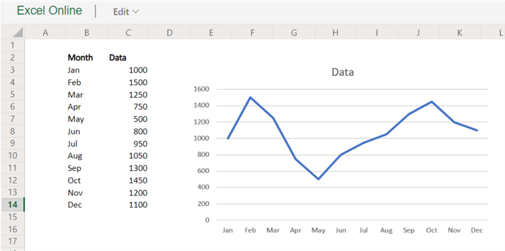
A dataset is a definition of the data used in a report. It is comprised of a set of tables and the relationships between those tables. It can also contain calculated columns and measures, which are written in the DAX language. A dataset is created in Power BI Desktop and then published to the service. For more information about datasets, check out the tip Power BI Datasets. An example:

Workbook
A workbook is an Excel workbook published to the service. You can either convert the workbook to a dataset, or you can keep it as-is and browse the contents using Excel Online in the service. More information can be found in the tip Power BI Workbooks.
Report
A report is a set of pages containing visualizations created on top of a dataset. It is created in Power BI Desktop and then published to the service, or it can be created in the service itself using an existing dataset. Keep in mind Power BI Desktop has more editing features at the moment.

Dashboard
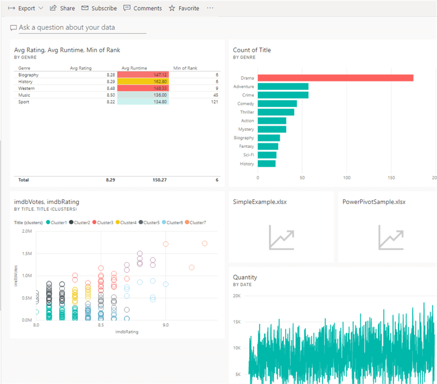
A dashboard is a set of tiles in the Power BI service. These tiles are visualizations from reports published in the service, or they contain other information such as URLs or text. You can create tiles from multiple reports, even if they are built upon different datasets. When you click on a tile, you are redirected to the underlying report. Dashboards only exist in the Power BI service and are created in the browser.
It is necessary to make a distinction between reports and dashboards. In data visualization, reports and dashboards are sometimes used interchangeably. Most of the time, reports are more static. They are pixel-perfect pages with different types of visualizations such as charts and tables, typically organized so it can easily be printed on paper. Dashboards are more dynamic and offer a “single glance” over your company’s data and KPIs. They are meant to be viewed and interacted with (using filters and slicers) on a single screen, not necessarily to be printed out. In Power BI however, a “report” acts more like the dashboards we just described, while a “dashboard” is something of an interactive table of contents of your Power BI workspace. In Power BI a dashboard is not interactive: there are no slicers or filters to click on. If you click on a tile, you go to the report.
Creating our first Power BI Dashboard
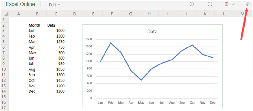
Before we start, we need to have some objects deployed to the Power BI service (https://app.powerbi.com): at least one report (with its dataset) and maybe an Excel workbook. You can find sample objects at the bottom of this tip. To start with our dashboard, we go to a report in the service, hover with our mouse over a visual and click the pin icon.
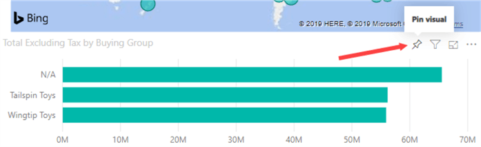
When you click the icon, a pop-up will appear. There you can choose to add the visual to an existing dashboard, or to create a new dashboard:

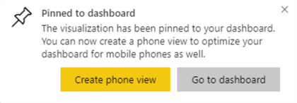
After clicking on Pin, the dashboard will be created in the background and you’ll get a pop-up asking you to either create a mobile-friendly version of the dashboard or to go to the dashboard itself. Let’s choose the last option.
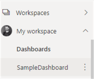
You can also find the dashboard listed under Dashboards in the workspace.
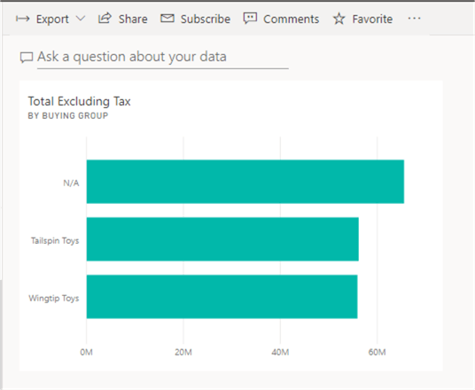
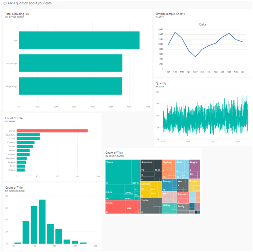
In the dashboard, we can see the visualization is added in a tile format:
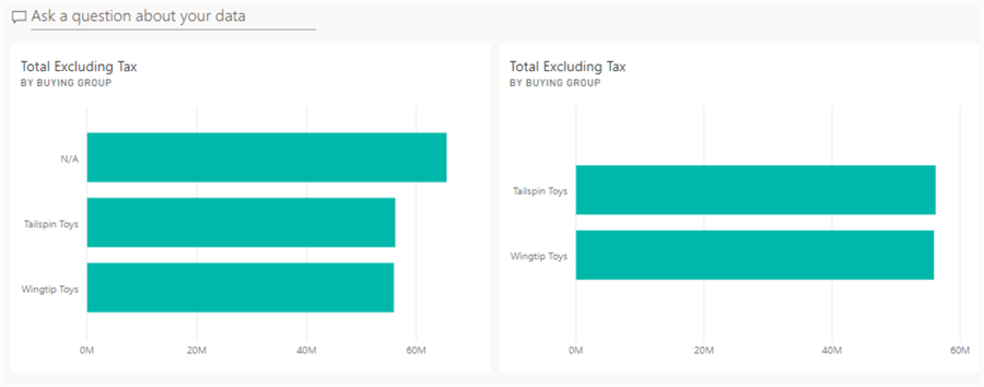
Keep in mind the tile is a snapshot of your visualization. This means it shows the state of the visualization at the moment it was pinned to the dashboard. The pinned visualization takes into account any slicers or filters that were active at that time. For example, here’s the same visual pinned twice, but the second time the N/A value was filtered out:
Also, if you would change the bar chart to a pie chart for example, the pinned visual would still be a bar chart. The data is periodically refreshed in the background and the tiles also respect row level security. For more information about the limitations of a tile, check out the paragraph Considerations and troubleshooting in the documentation. It’s a good idea to start developing your dashboard.
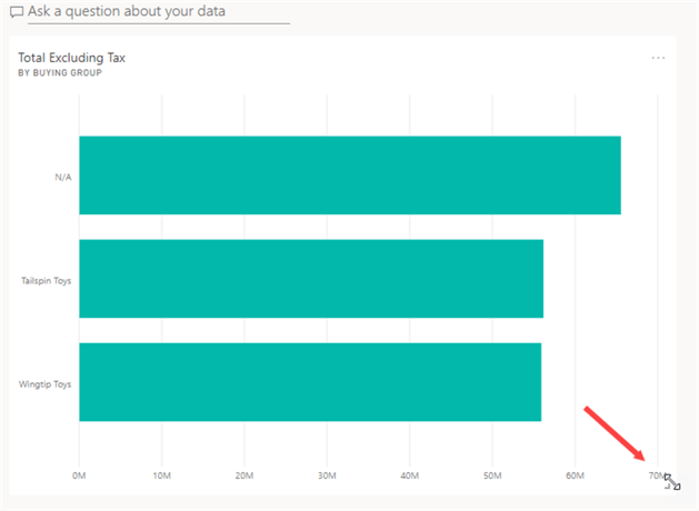
By clicking on the three dots in the upper right corner of the tile when hovering over with your mouse, you can open the context-menu:

Here you can for example delete the tile, but also export the data behind the tile. A tile can be resized by hovering over with the mouse and dragging the little angle in the bottom right corner:
To finish the dashboard, add some extra tiles from different reports. For workbooks, you can find the pin icon in the top right corner:
The selected area or object will then be pinned to the dashboard.
Tiles are added to the dashboard in the order they were pinned. This can sometimes create a messy layout:
We can also add tiles not from a report or workbook. In the menu bar, click on the three dots to see more options.

There we can choose to add an extra tile. There are different options, such as an image, video or a text box:

When adding a text box, you can add “headers” to your dashboard by centering the text and choosing a big font size:

By adding some headers, adding an image and resizing and reordering the tiles, we can create the following dashboard:

Next Steps
- Try it out yourself! If you have some reports in the Power BI service, pin some visuals to create a new dashboard. You can also download sample .pbix files and a sample workbook here.
- More information about datasets and workbooks can be found in here and here.
- Be sure to check out the official documentation.
- You can find more Power BI tips in this overview.

Koen Verbeeck is a seasoned business intelligence consultant with over a decade of experience with the Microsoft Data Platform. He holds several certifications, including Azure Data Engineer. He’s a prolific writer, with over 375 articles on technologies such as Microsoft Fabric, SSIS, ADF, SSAS, SSRS, MDS, Power BI, Snowflake and Azure services. He has spoken at various events such as PASS, SQLBits, dataMinds Connect and many others. He frequently delivers educational webinars on MSSQLTips.com. For his efforts, Koen has been awarded the Microsoft MVP data platform award for many years.
- MSSQLTips Awards:
- Leadership Award (200+ Tips) – 2021
- Author of the Year – 2014/2020/2022
- Author Contender – 2024/2025