By: Kenneth A. Omorodion | Comments | Related: > Power BI
Problem
Many experts have demonstrated how to calculate Time Intelligence in Power BI over the years including Year-on-Year, Month-on-Month, Week-on-Week and so on. These all can be grouped into what is known as "Period-on-Period", which is a technique used in business analytics to measure a value in the current date form as compared to same date form historically. Depending on the dataset or business requirements being analyzed, the end goal is always to get a view of the historical data in a way that the same amount of time has passed in the two compared periods.
Solution
For the purpose of this tip, the data source used for this work is a Power BI dataset which holds a table for the Tenant Product Usage and Activity. There is no calendar dimension table so we would need to create one later.
For this demo, we will calculate the rate of growth in the usage of each Microsoft Office 365 applications (OneDrive, SharePoint, Teams, Outlook, etc.) overtime. This will show the adoption of individual products within the organization as well as when there has been a spike or drop in active users overtime. This tip will concentrate on Month-on-Month date form and utilize the Office 365 adoption dataset for the demo.
To be able to create the rate of growth or increase in the usage of each O365 applications we need to first do the following:
- Create a Date dimension table as without this the Time Intelligence functions would not work.
- Create a measure for Current Usage.
- Create a measure for Previous Month Usage.
- Create a measure for Usage Difference.
- Create another measure for Rate of Growth or Increase in Usage.
What we are trying to achieve in the end is summarized in the formula as follows:
So, let's demonstrate these in a series of steps, but I will not go into detail on how to create a Power BI dataset in Power BI Service. Your dataset could come from any other source like SQL database, Azure SQL database, Salesforce, SharePoint, etc.
Step 1: Create a Date dimension table.
There are several techniques for creating a date dimension table (a.k.a. Calendar Table) in Power BI. However, I prefer this technique:
<table output>=Calendar(<start date>, <end date>)
Calendar = CALENDAR(DATE(2016,1,1),DATE(2022,12,31))
Or, to prevent hard coding your dates, you could dynamically set the start and end dates as follows:
Calendar = CALENDAR(FIRSTDATE(TenantProductUsage[ContentDate]),LASTDATE(TenantProductUsage[ContentDate])
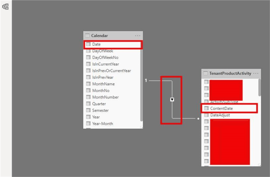
Link up the Calendar table with the TenantProductUsage table on the Dates to ContentDate on a 1:* (one to many relationship) as shown below. You can add more columns as it suits your project:
Step 2: Create a measure for Current Usage
The Current Usage is derived by summing the "ActiveUserCount" field in the "TenantProductUsage" table as shown below:
Current Usage = SUM(TenantProductUsage[ActiveUserCount])

Step 3: Create a measure for Previous Month Usage
To derive the Previous Month Usage, I used the time intelligence function "PREVIOUSMONTH" as shown below:
PriorMonthActiveUsers=CALCULATE(SUM(TenantProductUsage[ActiveUserCount]),PREVIOUSMONTH(Calendar[Date]))

Step 4: Create a measure for Usage Difference
To do this I will apply the use of variables in DAX just for an illustration as I can split the calculations where possible, but variables make the DAX code much simpler to read as shown below:
Usage Difference =
      VAR _CurrentMonthUsage = TenantProductUsage[Current Usage]
      VAR _PreviousMonthUsage = TenantProductUsage[PriorMonthActiveUsers]
      VAR _Result = _CurrentMonthUsage -  _PreviousMonthUsage
      RETURN _Result

Step 6: Create measure for Rate of Growth or Increase in Usage
This is derived by dividing Usage Difference by PriorMonthActiveUsers so we can get the rate of increase in usage as follows:
Usage Growth = DIVIDE ([Usage Difference], [PriorMonthActiveUsers], 0)CALENDAR(DATE(2016,1,1),DATE(2022,12,31))

Visualize on Reports
Having done these steps successfully, we can now visualize the created measures in Power BI to see and compare the output. If visualized on a table, you should have something like below:
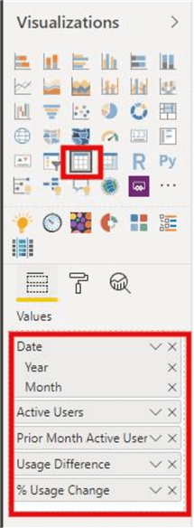
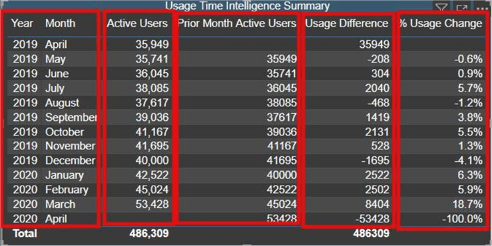
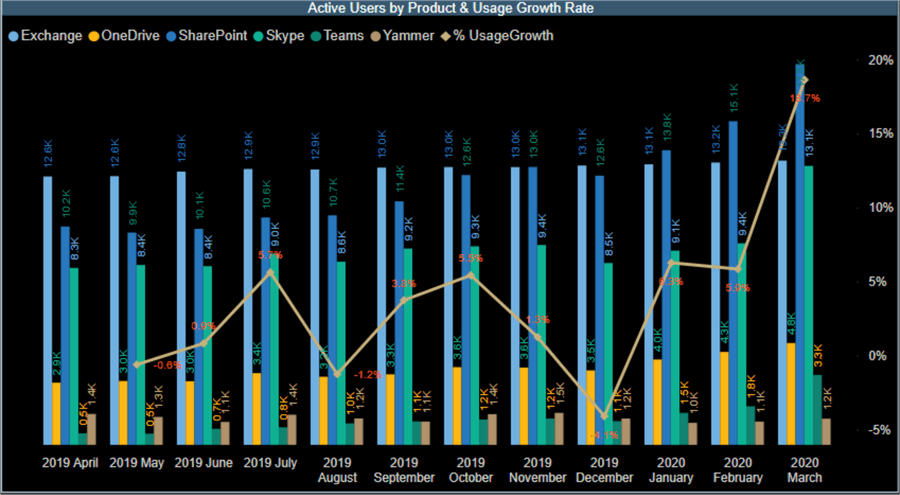
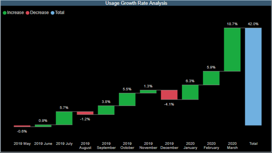
When we show these on other visuals and apply a slicer using a category like the different O365 applications, we should be able to dynamically visualize the rate of increase for each application as shown below:
Next Steps
- Learn more about how to create Date tables here.
- You can get more information on creating Power BI relationships here.
- You can get more information on how to use time intelligence functions in DAX here.
- Try this tip out in your own dataset.
Learn more about Power BI in this 3 hour training course.
About the author
 Kenneth A. Omorodion is a Business Intelligence Developer with over eight years of experience. He holds both a bachelor’s and master’s degree (Middlesex University in London). Kenneth has the MCSA, Microsoft Data Analyst - Power BI and Azure Fundamentals certifications. Kenneth is a Microsoft Certified Trainer and has delivered corporate training on Power BI, SQL Server, Excel and SSRS.
This author pledges the content of this article is based on professional experience and not AI generated.
View all my tips


