Problem
New methods and usage for themes were recently introduced for Power BI. In this article we cover how you can use these and customize them for Power BI.
Solution
A few years back, Microsoft introduced a preview feature that allowed for the creation, export, and import of themes for your Power BI dashboard. This process was covered in the tip: Power BI Layouts and Themes. However, additional enhancements have been introduced to make the theme generation process easier and requires less manual input and fiddling within a JSON based theme file. This enhancement provides the distinct ability to set the major formatting options for a Power BI Dashboard with ease.
Before we get into the details on the advanced themes functionality, be sure to download the latest version of Power BI desktop.
Additionally, we will be using the WideWorldImportersDW database as a basis for our data sources; this database can be downloaded from here.
If you need a refresher on bringing data into Power BI please see: Querying SQL Server Data with Power BI Desktop.
Power BI Advanced Theme Customization
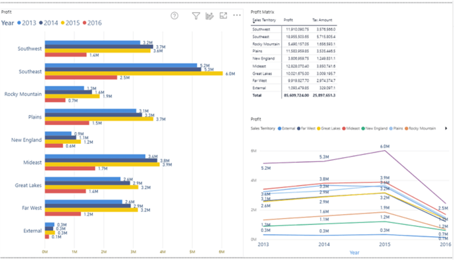
Create a simple dashboard tab with a column chart, a matrix, and a line chart.
Starting out, we can export out the base theme to see the default JSON theme file.

As seen in the image below, the JSON theme file is a simple list of data colors, background colors, and foreground colors.

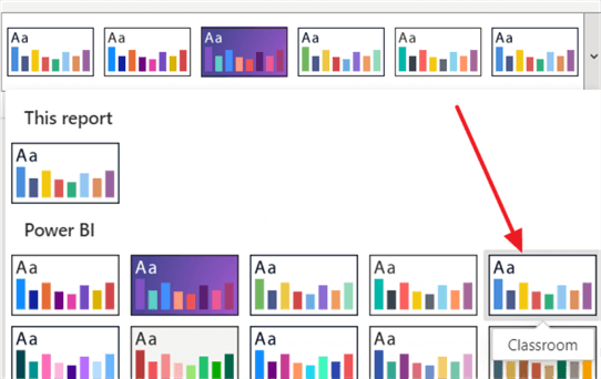
For this particular example, you will notice the name of the theme is Classroom, which is one of the default themes available in Power BI.
As we go through the rest of the tip, you will notice changes being updated in the JSON file.
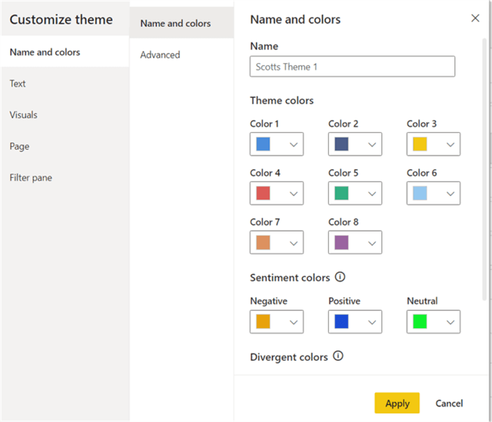
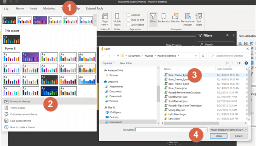
To begin to make adjustments to the theme, select the View ribbon menu item and then select the down arrow next to the theme box. Next, select Customize current theme.

The customize theme window opens and we are now able to set the name and primary color threads for the theme.
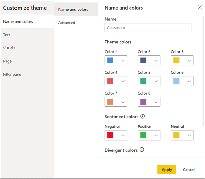
The primary theme colors are used for the color patterns on each visual. Thus, in the above example, the first color would be a lighter blue, then a darker blue, then yellow and so on. Note that you can actually specify more than 8 colors, but for the 9th color and beyond, those additions must be made in the JSON file itself. The next set of colors are the default values for a range when creating items such as a waterfall chart going from a negative red color to neutral yellow to positive green. The last set of colors is the divergent range used in conditional formatting of cells.
Clicking on the down arrow next to the color allows for that color to be changed. The color picker allows for selection based on the clicking on region in the color palate or by inputting the hexadecimal number or the RGB codes.

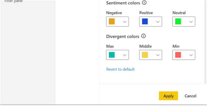
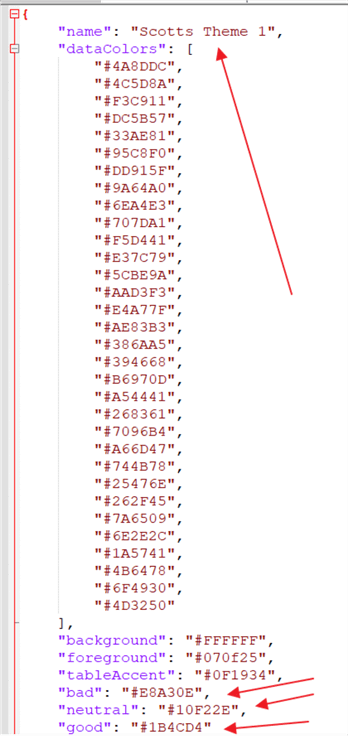
As shown in the below illustration, the sentiment colors have been adjusted to orange, blue, and green and the theme name has been changed.
Reviewing the JSON file, we see that it now shows an adjusted name of Scotts Theme 1 and the divergent color theme has been added to the JSON file.
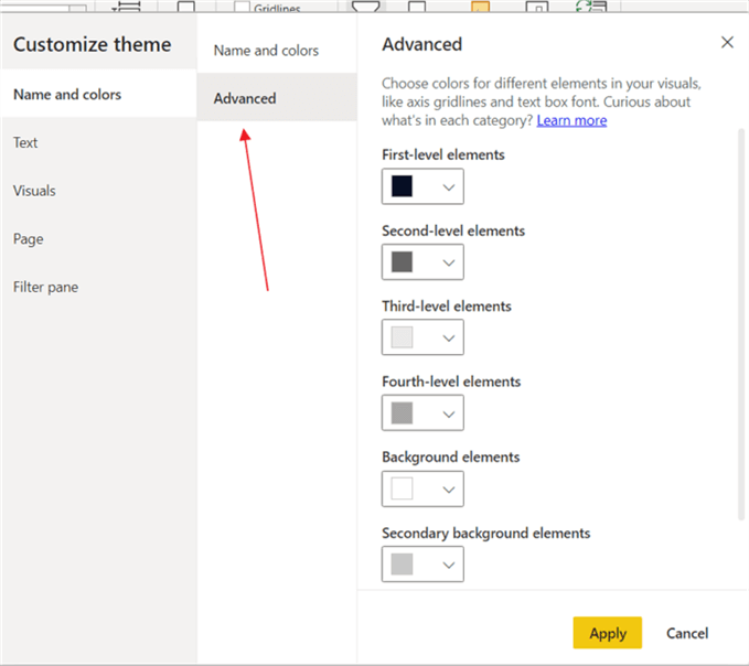
Moving to the advanced tab, several levels of element colors are listed with the ability to change the color used for each level, along with the selection of background colors. Some items that are included in the first level element include: label background colors, card data labels, slicer item and drop-down colors, among others. The second level includes legend color and axis colors. The full list for each level layer can be found here. The list is quite extensive as you pursue all the colors that can be set with these 4 elements.
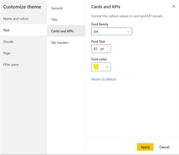
The next set of tabs allows for the customization of the text used across the dashboard. The font, font size, and font color can all be easily set.

The remaining tabs that fall under the Text window allow for setting the font, font size, and font color for Titles, Cards, and Tab Headers.

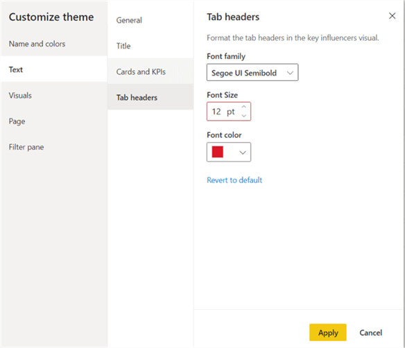
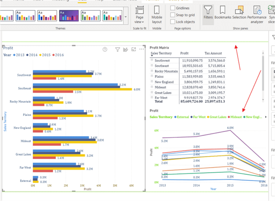
By clicking on the Apply button at this point, the theme is saved for this particular file. Notice in the below screen print that the legend color for the text is now green.
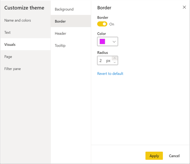
Next, we would move on to the Visuals settings. The first tab allows for setting the background color for a visual along with its transparency. The second window provides a method to set the border on or off and then set the color and radius (how the curves look) for a border. On the third set of windows, the background and border colors are set. As is the icon color for the visual header menu items (such as focus mode or export data). Finally, the fourth screen sets the background and label colors for a tool tip.


The color selections are not perfect, but you can see our them adjustments being applied to the current report.

Moving on to the page tab allows for the setting of the wallpaper, page background colors, and transparency (I would love for it to set the wallpaper itself).


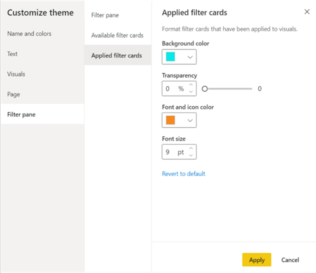
The final tab is for customizing the color scheme and fonts used on the filter pane area. We can set different colors based on whether we are looking at the available items to select or at the actual applied filter cards.


As illustrated in the image below, we have some crazy color and font themes applied to this file.

AAfter reviewing our JSON theme file, illustrated below, we see the number of tags has expanded significantly. Each section we changed has added value for the appropriate settings.
{   "name": "Scotts Theme 1",
   "dataColors": [
      "#4A8DDC",
      "#4C5D8A",
      "#F3C911",
      "#DC5B57",
      "#33AE81",
      "#95C8F0",
      "#DD915F",
      "#9A64A0",
      "#6EA4E3",
      "#707DA1",
      "#F5D441",
      "#E37C79",
      "#5CBE9A",
      "#AAD3F3",
      "#E4A77F",
      "#AE83B3",
      "#386AA5",
      "#394668",
      "#B6970D",
      "#A54441",
      "#268361",
      "#7096B4",
      "#A66D47",
      "#744B78",
      "#25476E",
      "#262F45",
      "#7A6509",
      "#6E2E2C",
      "#1A5741",
      "#4B6478",
      "#6F4930",
      "#4D3250"
   ],
   "background": "#FFFFFF",
   "foreground": "#070f25",
   "tableAccent": "#0F1934",
   "bad": "#E8A30E",
   "neutral": "#10F22E",
   "good": "#1B4CD4",
   "foregroundNeutralSecondary": "#70D90D",
   "textClasses": {
      "label": {
         "color": "#102AF3",
         "fontFace": "Cambria",
         "fontSize": 12
      },
      "callout": {
         "color": "#EFEF12"
      },
      "header": {
         "color": "#DA1828"
      }
   },
   "visualStyles": {
      "*": {
         "*": {
            "background": [
               {
                  "color": {
                     "solid": {
                        "color": "#0CB2E9"
                     }
                  }
               }
            ],
            "border": [
               {
                  "color": {
                     "solid": {
                        "color": "#E022F9"
                     }
                  },
                  "show": true,
                  "radius": 2
               }
            ],
            "visualHeader": [
               {
                  "background": {
                     "solid": {
                        "color": "#E61414"
                     }
                  },
                  "foreground": {
                     "solid": {
                        "color": "#A10FC5"
                     }
                  }
               }
            ],
            "visualTooltip": [
               {
                  "titleFontColor": {
                     "solid": {
                        "color": "#EF9A13"
                     }
                  },
                  "valueFontColor": {
                     "solid": {
                        "color": "#FFFFFF"
                     }
                  },
                  "background": {
                     "solid": {
                        "color": "#F80808"
                     }
                  }
               }
            ],
            "filterCard": [
               {
                  "$id": "Applied",
                  "backgroundColor": {
                     "solid": {
                        "color": "#0BE8E8"
                     }
                  },
                  "foregroundColor": {
                     "solid": {
                        "color": "#F38A22"
                     }
                  },
                  "transparency": 0
               }
            ]
         }
      },
      "page": {
         "*": {
            "background": [
               {
                  "color": {
                     "solid": {
                        "color": "#DEEC1D"
                     }
                  },
                  "transparency": 100
               }
            ]
         }
      }
   }
}
Now that the theme file has been saved, we can easily import it into another Power BI file.
OnOnce imported, the theme color and formatting options are applied to the dashboard. In the above screen print, note the dark background behind the file window. Upon applying the theme, the background is now light blue.

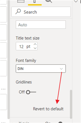
Upon importing the theme, you may notice that it seems a color or format is not being applied. Remember if a color, font, font color, or background is already set to a color outside the theme, when the import happens, that value will not be overridden. Instead, you may have to select the “Revert to default” option on the element so the theme color and formatting theme is used.
Note that even though the Power BI Customize Theme editor allows for changing many major coloring and formatting options and saving them in a theme file; some detailed customizations still require modifications in the JSON theme file itself. p>
In this tip we covered the new Advance Theme customization that can be utilized within Power BI desktop. It allows for several main formatting options to be set within a Power BI desktop as opposed to setting the items within the external JSON theme file.
Next Steps
- Check these other SQL Server Power BI Tips

I have a passion for crafting Business Intelligence Solutions for my user groups. My experience includes almost 15 years of SQL Server involvement with the last 12 years focused specifically on Business Intelligence, SharePoint, OLAP, SSRS, and Decision Support solutions. Currently, I am a Business Intelligence Architect in the healthcare industry, and I also teach database and analytics classes for Kennesaw State University, Southern New Hampshire University, and Reinhardt University. My education includes an MBA and an undergraduate in Accounting (yes I am a reformed accountant!), both from Kennesaw State University. I enjoy every day by trying to grow my faith and spend precious time with my family. I have been happily married to my wife of over 20 years, and we have two teenagers one who we home school with the help of a University Model School, Cornerstone Prep in Acworth, GA (cornerstoneprep.org). Our other child is a Construction Management major at KSU’s Southern Poly / Marietta campus. We are a soccer and Cross Country (XC) family who play, coach, and referee soccer or run for fun most every day. For several years, our family has volunteered (and played with the dogs and cats) at Etowah Valley Humane Society in Cartersville, GA.
- MSSQLTips Awards: Champion (100+tips) – 2016 | Author of the Year – 2015 | Author Contender – 2014, 2016-2021
I not aware of a way to conditionally format the page background color.
That is very useful to know, thanks. Can you set background colors in a theme to be depended on values? I.e. conditional formatting?
Great article. In regards to adding a wallpaper, well you can do a page background. I use PowerPoint to lay it out, save as picture and convert the picture to base64 and paste that into the JSON. Especially useful for custom page backgrounds with logos.