Problem
Microsoft Power BI Desktop provides a wide variety of visuals. In the June 2023 update, Microsoft introduced the new card visual for Power BI. This new card offers several novel capabilities; you can now display many cards in a container while maintaining complete control over each card’s component. This visual also improves the performance of reports since, in the older version, users had to use multiple elements to achieve a specific output, which is now made possible with a single visual. This tip will highlight the features and usage of the new card.
Solution
When your organization leverages business intelligence to transform raw data into actionable information to deploy data-driven decision-making, it immediately becomes vital for every professional involved in the decision-making pipeline to understand this data. Even without technical expertise, these decision-makers should be able to interpret the insights and patterns from their data, which ultimately reflects on their company’s standing, financially or otherwise. A lack of explainability of this data-based infrastructure will lead to a lack of trust, contributing to an under-utilization of business data analysis techniques and a shift to an experience-based decision-making framework that will likely cause a business to lag behind its competitors. Therefore, data visualization is one such technique that incorporates graphical elements to share quantitative data in a more digestible and user-friendly manner. Various mediums like infographics, dashboards, charts, and graphs can be used to aid decision-makers in interpreting important data patterns.

As shown above, a dashboard is one such method of presenting real-time data that summarizes related datasets by consolidating information from various data sources related to business metrics and key performance indicators (KPIs) in a simple, concise format. A key characteristic of the dashboard is its different visualizations that help users quickly grasp trends, patterns, and insights regarding their organization.
Sometimes, a solitary number is all you need rather than monitoring trends across time or different categories. Consider gross revenue, net profit, and important financial metrics like market value, liquidity, leverage, efficiency, and profitability ratios. These numbers alone can convey a more comprehensive story about how well your company has performed financially over a certain period, how desirable it is to shareholders, and how you are holding up to your competitors. In this tip, we will review how the card visualization in Power BI is optimal for viewing such numbers in your dashboard.
In Power BI, the characteristics of a card visual include:
- Title: As shown in the illustration above, there must be context that describes what the numerical value represents. For instance, in one of the card visuals above, we can quickly interpret that $60M represents total revenue.
- Numeric Value: This is the main element of the tile that is prominently displayed, as it represents the measurement of a metric we are interested in.
- Trend Indicator: Using Power BI, we can insert an image into our card visual, such as an indicator symbol, which can quickly aid users in deciding whether the value is improving, worsening, or remaining stable.
The importance of this visual is:
- A card visual is data visualization in its simplest form. This visual is very intuitive even for those who may not be experts in data because a title, a single numerical value, and a trend indicator leave limited room for doubt and alternative interpretations.
- This visual can also be used to highlight priorities. For instance, instead of showing your manager the company’s past annual sales trend, it is also a good practice to include a card visual that conveys the maximum and average sales value through that year.
Creating a Schema in SQL Server
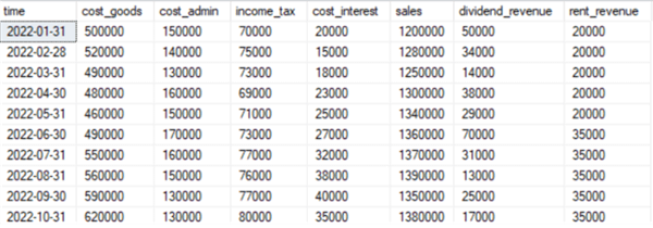
Now that we understand the fundamentals and importance of a card visual, it is time for a more practical demonstration. We will create a schema using SQL Server, which can later be exported to Power BI to explore the functionality of a card visual. For demonstration purposes, we will create a dataset that reflects the annual financial standing of a hypothetical company.
To get started, we will first create our database and then access it using the following commands:
--MSSQLTips.com
CREATE DATABASE income;
USE income;
Then, we will create a table that stores data related to the organization’s revenue and cost structure. To do so, we will run the following query:
--MSSQLTips.com
CREATE TABLE revenue_expenses
(
[time] DATE, cost_goods INT,
cost_admin INT,
income_tax INT,
cost_interest INT,
sales INT,
dividend_revenue INT,
rent_revenue INT
);
We can now populate this table with hypothetical values as shown below:
--MSSQLTips.com
INSERT INTO revenue_expenses VALUES
('2022-01-31', 500000, 150000, 70000, 20000, 1200000, 50000, 20000),
('2022-02-28', 520000, 140000, 75000, 15000, 1280000, 34000, 20000),
('2022-03-31', 490000, 130000, 73000, 18000, 1250000, 14000, 20000),
('2022-04-30', 480000, 160000, 69000, 23000, 1300000, 38000, 20000),
('2022-05-31', 460000, 150000, 71000, 25000, 1340000, 29000, 20000),
('2022-06-30', 490000, 170000, 73000, 27000, 1360000, 70000, 35000),
('2022-07-31', 550000, 160000, 77000, 32000, 1370000, 31000, 35000),
('2022-08-31', 560000, 150000, 76000, 38000, 1390000, 13000, 35000),
('2022-09-30', 590000, 130000, 77000, 40000, 1350000, 25000, 35000),
('2022-10-31', 620000, 130000, 80000, 35000, 1380000, 17000, 35000),
('2022-11-30', 590000, 120000, 78000, 38000, 1400000, 20000, 35000),
('2022-12-31', 580000, 140000, 79000, 42000, 1430000, 34000, 35000);
We can view this income table by running the following query:
--MSSQLTips.com
SELECT * FROM income.dbo.revenue_expenses;
Creating Visualizations in Power BI
Now that we have an appropriate data model, we can import this dataset on Power BI from the SQL Server and perform the required visualization techniques. To get started, we will be going through the following series of steps:
Step 1: Importing the Dataset
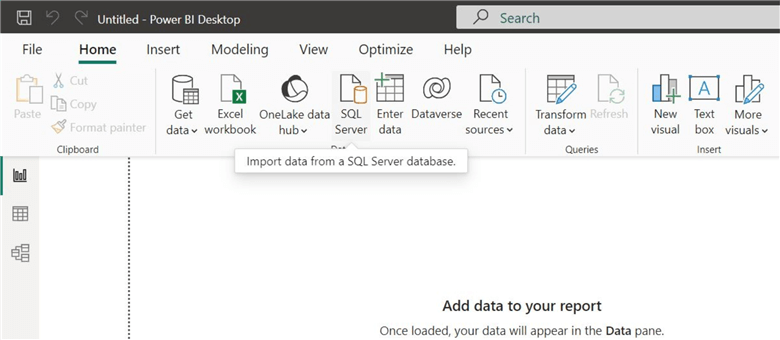
In the main interface of Power BI, click on the "SQL Server" icon in the "Data" section of the "Home" ribbon, as shown below.
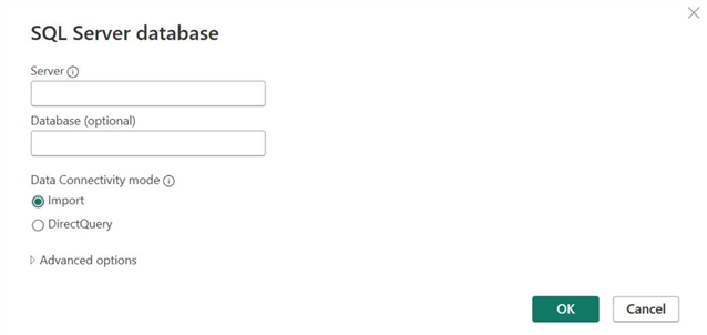
The "SQL Server database" window will open. Enter the relevant server and database credentials, then click "OK."
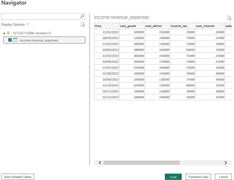
If Power BI has successfully established a connection with your database, the "Navigator" window will open, as shown below. Select your table by checking the checkbox below the "Display Options" button, then click "Load." We can also see that Power BI allows us to preview the tables we selected. If users want to manipulate the data to deal with missing and erroneous data points, they can click on the "Transform Data" option, which opens up the Power Query Editor. However, since our dataset is complete and clean, we do not need to go through this step.
Step 2: Creating Measures
Now that our data is successfully loaded in Power BI, we need to calculate the total revenue, total cost, taxes paid, and gross and net profit margin ratios of the business over the previous year. Again, our goal is to create a minimal dashboard that clearly represents the above financial metrics. As for the tools we will be using, Power BI allows us to create measures that are calculated values from your dataset. These calculations include counting, summation, taking averages, etc., using in-built DAX or custom user-defined functions.
Let’s start with calculating the total cost. Abstracting away from the tools, we know that to calculate this metric, we need to sum the columns of cost of goods sold, taxes, interest, and administrative costs. "SUMX()" is a DAX function that allows us to achieve exactly this. Let’s see how.
In the "Data" section, right-click on the table name, then select the "New Measure" option, as shown below.
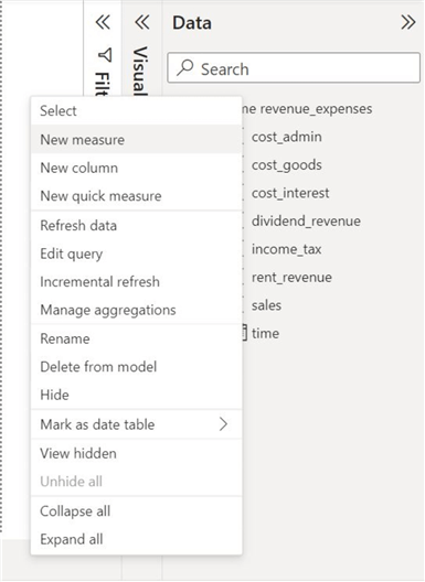
This will cause a formula box to open.

Enter the following formula and then click the tick mark:
Total Cost = SUMX('income revenue_expenses', 'income revenue_expenses'[cost_goods] + 'income revenue_expenses'[cost_admin] + 'income revenue_expenses'[cost_interest] + 'income revenue_expenses'[income_tax])
//MSSQLTips.com
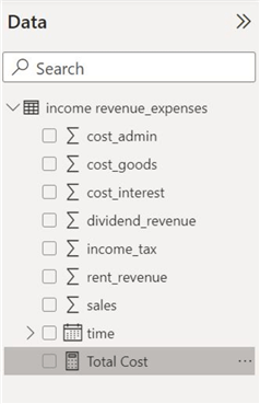
In our formula above, the function "SUMX()" takes two arguments–the name of the table and an expression that evaluates the sum of the four cost columns. If our formula has no syntactic errors, we can observe a new "Total Cost" measure in the "Data" section, as shown below.
We will now repeat the above process to calculate several other measures. Again, click on the "New Measures" option and use the following formula to calculate the total revenue:
Total Revenue = SUMX('income revenue_expenses', 'income revenue_expenses'[sales] + 'income revenue_expenses'[dividend_revenue] + 'income revenue_expenses'[rent_revenue])
//MSSQLTips.com
We again use the "SUMX()" function to calculate the total revenue by summing the sales, dividend, and rent revenue columns.
We can now directly calculate the total profit by subtracting the "Total Revenue" and "Total Cost" measures, using the following formula in a new measure:
Profit = [Total Revenue] - [Total Cost]
//MSSQLTips.com
When we need to sum a single column from a dataset, we can use the "SUM()" DAX function. For instance, I can use this function while calculating a new measure for total taxes paid using the following formula:
Total Taxes = SUM('income revenue_expenses'[income_tax])
//MSSQLTips.com
Finally, we will be calculating the gross and net profit margins. The formula for gross profit margin is:

We can implement this measure using the following formula:
Gross Profit Margin = ([Total Revenue] - SUM('income revenue_expenses'[cost_goods])) / [Total Revenue]
//MSSQLTips.com
Similarly, the formula for net profit margin is:

Since we already have the measures for total cost and total revenue calculated, we can directly calculate this new measure using the following formula:
Net Profit Margin = ([Total Revenue] - [Total Cost]) / [Total Revenue]
//MSSQLTips.com
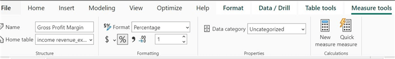
Additionally, for the above two ratios, we can change the "Format" of our ratios to a percentage, as shown in the "Formatting" tab of the "Measure tools" ribbon below.
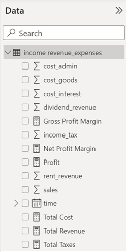
We can now observe all the measures we created in the "Data" section. As we can see below, they are denoted by a calculator symbol.
Step 3: Using the Old Card Visual
To fully appreciate the new card visual, let’s briefly overview the limitations of its older version.
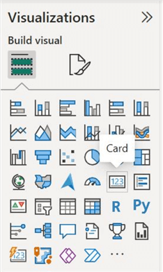
To create a card visual, click on its symbol from the "Visualization" panel, as shown below.
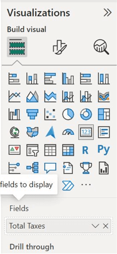
For example, we have populated this visual with our "Total Taxes" measure, as shown below.
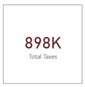
Below is the formatted version of the card visual we have just created.
Observations about this card include:
- It is immediately apparent that we can only create one card at a time. This is disadvantageous when one has several measures, making aligning the cards’ formatting difficult.
- In terms of formatting, the older card visual only allowed a limited variety of borders, which is not the case with the newer version, as we will see soon.
- Users often overlapped visual elements like icons, images, and texts in their cards to make them catchier. However, this process was usually time-consuming and slowed down the performance of the reports.
- This visual also displayed "BLANK" when no value was provided for a visual. The newer version instead provides functionality to implement a default value for a particular measure in a card.
Step 4: Using the New Card Visual
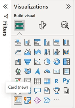
Considering the above limitations, let’s see how the newer card visual succeeds its predecessor. In the "Visualizations" panel, click on the new card visual icon shown below.
As we can see below, in the "Data" field, we have now populated all our measures into a single visual, which was previously not possible.
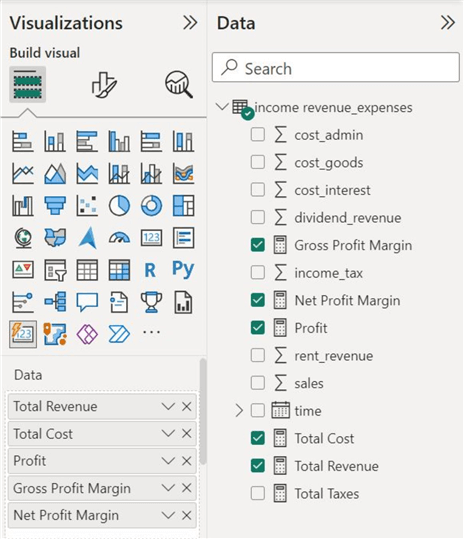
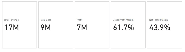
Below is a simplistic, non-formatted version of our new card visual, representing various financial measures.
Customizations
But wait, we are not done yet. We can format our visual to make it more appealing and less plain. To this end, Power BI enables formatting in two different streams. We will review some options in the two editing streams.
Visual Formatting
This formatting stream deals with the editing options specific to a visual.
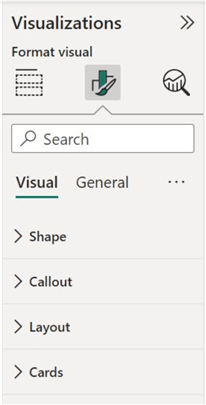
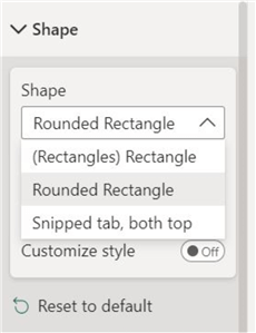
Shape. This enables users to edit the outline of the card visual. Various options are featured below.
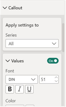
Callout. Here, we can edit the formatting of the numerical values and the text labels, including their font type, size, and color. We can also apply the changes individually to each card or all of them.
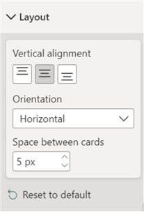
Layout. This allows us to alter the alignment of the numerical value and the text label of our card visual.
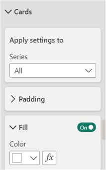
Cards. Here, we can change the appearance of our visual, including creating a border, appending shadow and glow on its outline, adding images, etc. Again, the formatting can be applied individually or over all the cards.
General Formatting
The general formatting stream edits the components of a visual that is generalized throughout different visuals.
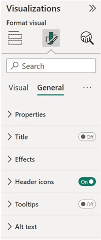
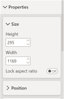
Properties. This option allows users to be more precise with the positioning and size of the visual.
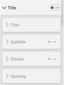
Title. We can also add a title to our visual using this option.
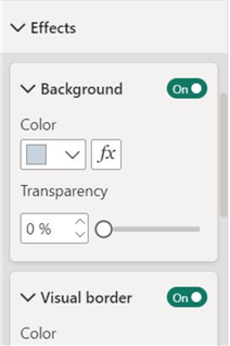
Effects. Here, we can alter the background color and append another primary outline around our visual.
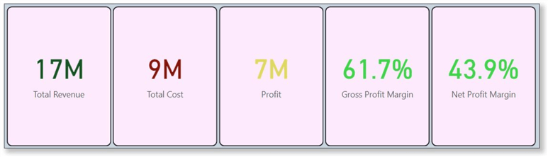
After incorporating various formatting elements, as we can now see, our visual is much more appealing and interesting to observe. We have also color-coded different measures to convey their status implicitly.
Conduct Analysis
Now that we have a finalized version of our card visual, it is time to use it to interpret the insights from our data model. At a glance, this hypothetical business is performing quite well, as its total revenues exceed its total costs by a large margin, creating an annual profit of 7 million. The gross profit margin of 61.7% and net profit margin of 43.9% are also considerably high. Overall, this company’s financial standing is quite strong. To make a more concrete judgment, we can also compare the profit levels and the profit margin ratios with other business industry players and the overall averages of this specific industry.
In this tip, we have explored the new card visual in Power BI. We extensively discussed the rationale behind this visual. Through a practical demonstration, we have shown how this visual can represent important, stand-alone, numerical values in Power BI using a custom dataset created in SQL Server.
Next Steps
- To explore this visual further, users can look into how to include images and icons in the cards.
- Furthermore, one can experiment with custom Power BI visualizations like the Advance Card and see how they compare to the default card visual.
- On the other hand, users should also be aware that the shadow and glow effect in the visual formatting stream of the new card visual is buggy and alters the size of all the tiles in the card unexpectedly.
- To explore other charts in Power BI.

Harris Amjad currently works as a Software Engineer at Strategic Systems International. He is Microsoft Certified Data Analyst and Microsoft Certified Trainer. A rigorous, task-driven Data Enthusiast with substantial experience in Data Science, Data Analysis, and Data Engineering.
- MSSQLTips Awards: Trendsetter (25+ tips) – 2024 | Author Contender – 2023, 2024 | Rookie Contender – 2022
Good Article. Well written. A really helpful tip for aspiring Data Analysts.