Problem
How can I use my own custom Power BI Visual or Infographic within a Power BI report?
Solution
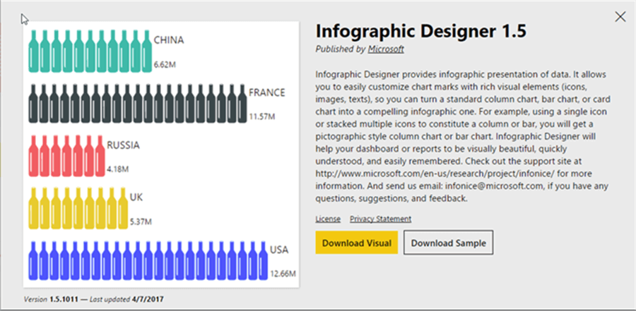
Although Power BI comes with a rich variety of visualizations, sometimes using a different graphic, makes a more lasting or meaningful impression on the consumer of a Power BI report. The custom Infographics visual, from Microsoft, fits the bill for this exact situation; with this custom visual, you can select the specific image to use to show whatever data points are needed in a bar or column chart. A custom visual, as described in this tip, Power BI Desktop Custom Visualization, is one that is developed by the Power BI Community, although some are sourced from Microsoft directly. As such, care must be exercised to verify that the source of the visual is reliable and worthy to use.
To get started with Power BI and Power BI Desktop, you need to do a few things to get everything setup for access. First, you need to go to the Power BI web site and sign up to access Power BI. Note that you must use a work or school address to sign up for Power BI. Next, you need to download the Power BI Desktop (PBID) tool. Once you have your account setup and your Power BI Desktop application installed, you are ready to start working with Power BI!
Create a Power BI Infographic Chart
In order to use the Infographics visual, you will need to download it from the Power Bi Visual Gallery, which is currently available at https://app.powerbi.com/visuals/ (note that the Visuals Gallery is migrating to the Windows store, so this link may change in the future).
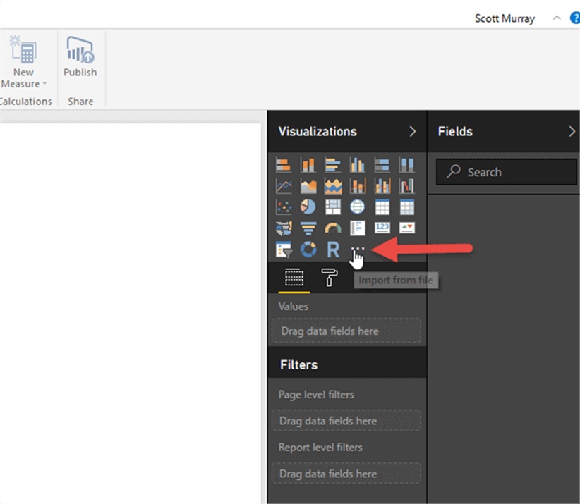
Our next step is to start up Power BI Desktop and create a new report. Thereafter, you will need to install the Infographic Designer visual for use in Power BI. To start this process, click the ellipse / three dot button in the bottom corner of the visualization gallery.
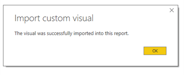
Subsequently, navigate to the location where the Infographic custom visual was placed during download and select the Infographic Designer pbiviz file. When successfully imported, the below message will result.
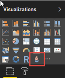
You will also notice we have a new visual button in the visualization gallery.
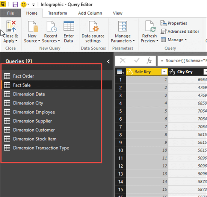
We will now need to obtain some data for use with our visuals. In this case, we will use data from the Wide World Exporter sample database from Microsoft (see Koen Verbeeck’s tip for details on these sample databases: https://www.mssqltips.com/sqlservertip/4459/install-sql-server-2016-sample-database-wide-world-importers-data-warehouse/ ). We will import in the Fact.Order and Fact.Sale tables and several dimension tables as shown in the below illustration. Selecting the Close and Apply button will return us the report design desktop and allow us to use these data tables on our report page.
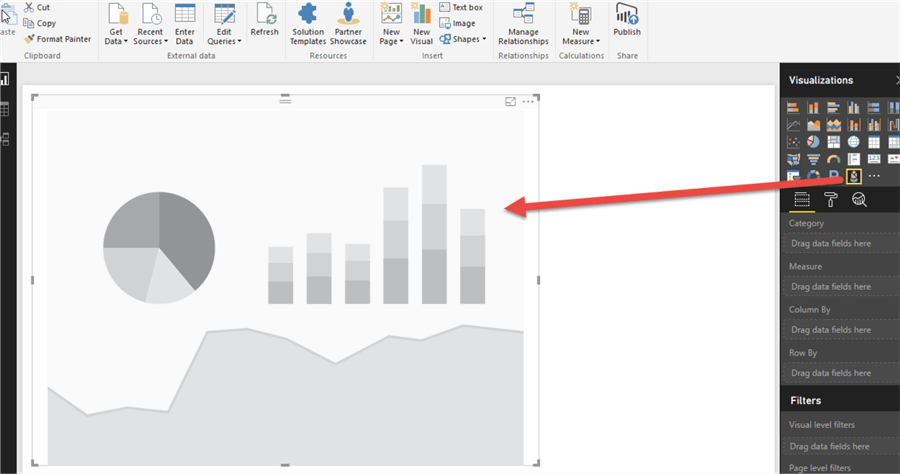
Next, add / drag the Infographic visual onto the design window.
Then, for this example add the Fiscal Year calendar label from the Dimension Date table to the Category and the Tax Amount from the Fact Sales table into the measure properties.
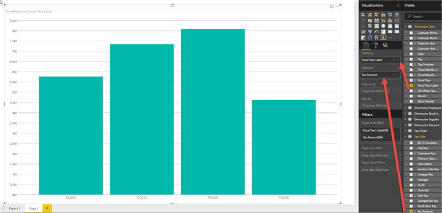
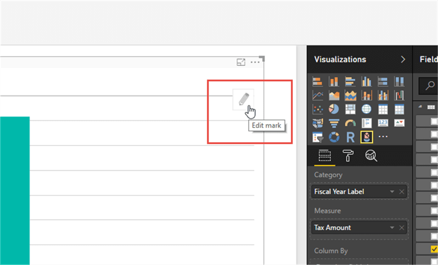
You will notice that the graphic at this point looks like a regular column chart. Also, the edit and format panes have only the “standard” properties for visualizations. We actually get to the visualization properties through the visualization itself. As shown below, if you hover over the upper right corner of the visual, just below the ellipse / 3 dots area a pencil will appear.
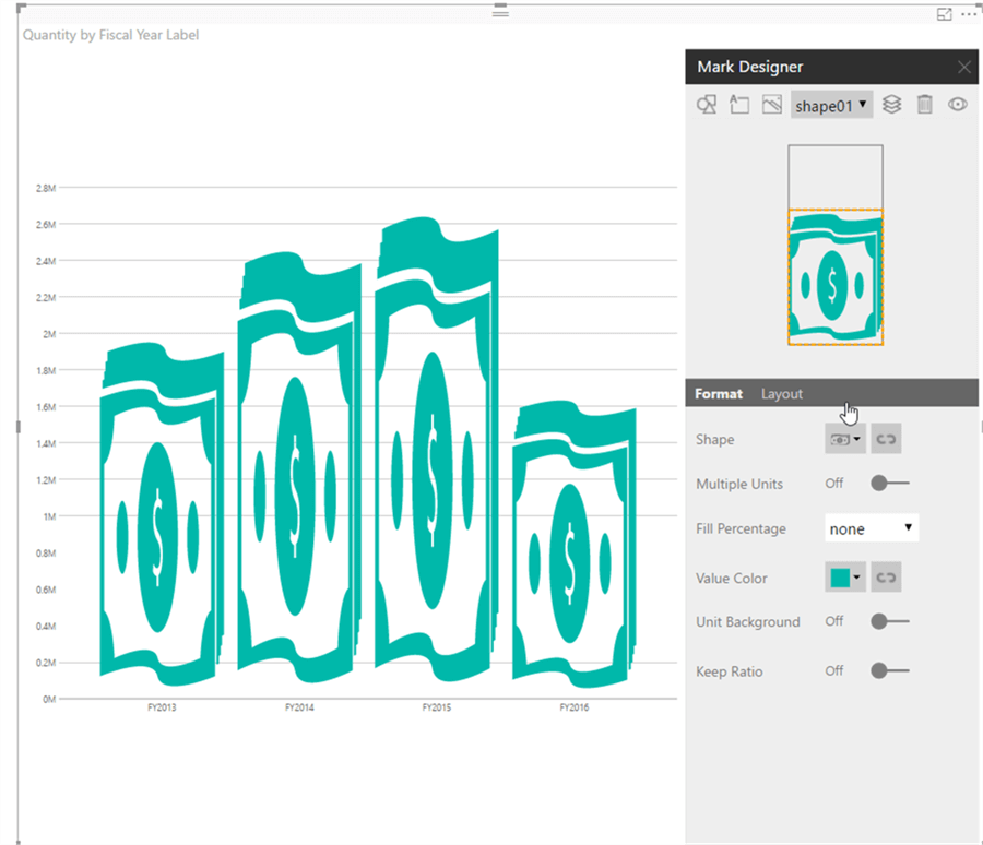
The Mark Designer window opens and we can now begin the customization process. Probably the most prominent of the properties is the ability to change the shape or image used for the bar.

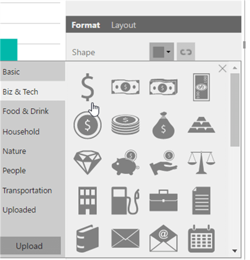
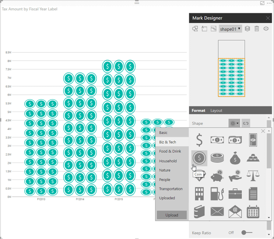
As you can see in the below screen print, a large variety of categories and preset shapes by default are available.
Selecting one of the default shapes quickly changes the bar to that shape.
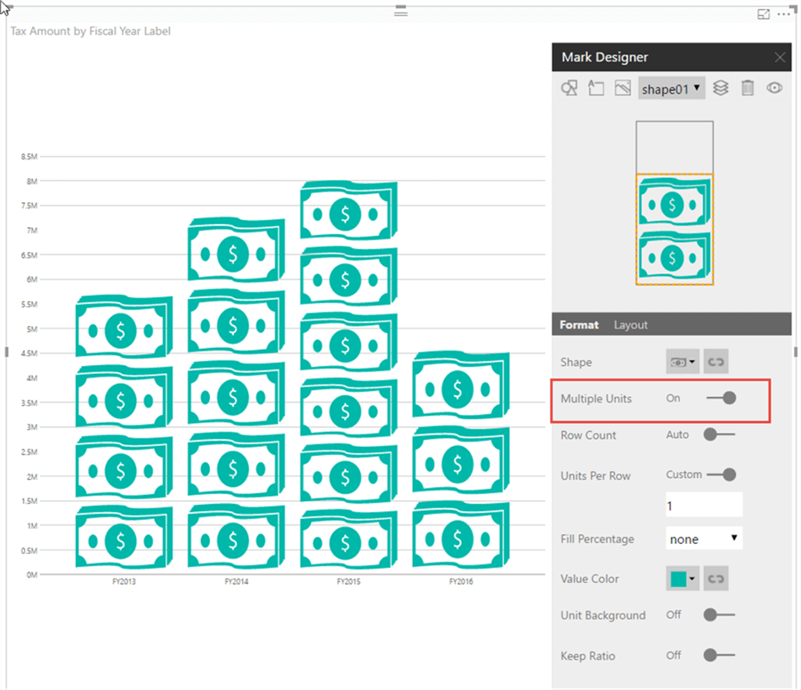
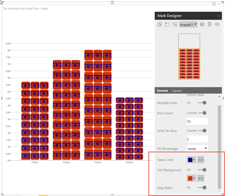
Changing the Multiple Units property to On, provides a better visual appearance without the “stretching” effect. You now get multiple shapes being used to convey the chart amount.
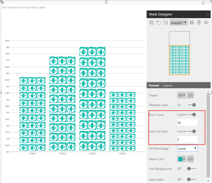
The row count (up to 20) and the number of units (unit = a shape) can also be adjusted. In the below example, the total units is 10 (meaning the maximum column shows the 10) while three of the shapes are listed in each row.
The last set of properties set the shape color, the shape background color (ok… I know the blue and orange are ugly! ), and finally the ratio. The keep ratio forces each column to maintain a consistent size ratio.
We can easily change the selected shape by selecting another image.
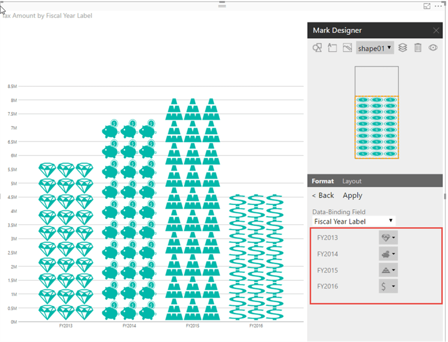
Alternately, we can set a different shape for each category in our visual by using the data bind button.

In the below example, we assigned a different shape for each Fiscal Year Label.
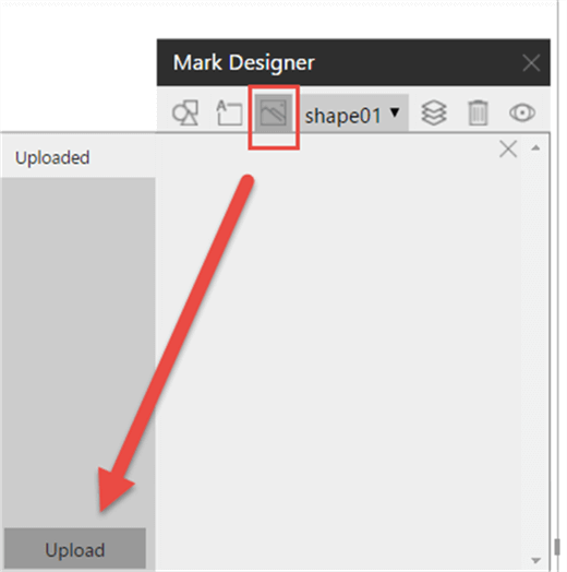
Up to this point, we have been using the shapes or images included in the Infographic visual, but we also have the ability to use our own images! To complete this process, we use the Insert Image button.
After selecting the image file from the windows explorer browser, the image or shape now shows in our image list; a soccer ball image was loaded in the below example.
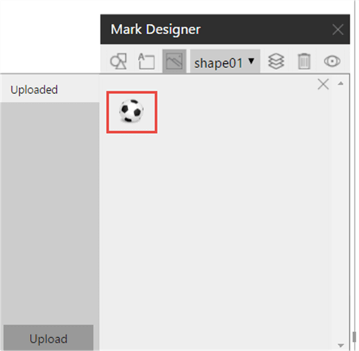
Now I can add the soccer ball image to the visual by just double clicking on it in the image (the soccer ball in the above illustration).
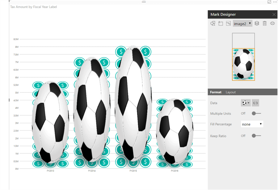
As you can see in the above example, we have a few issues occurring that will now need to be fixed:
- We have the original image (the $ in the circle) and now the soccer ball on top of it. We actually added a new layer to the visual. We will show how to remove the underlying layer in just a minute.
- The soccer ball image is again stretched and does not look proportional. We will need to again adjust the multiple unit’s properties.
In the below illustration, we can see that each visual is actually its own layer. Notice how two lines appear in the drop down list; it shows image2 and shape01.
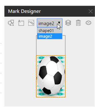
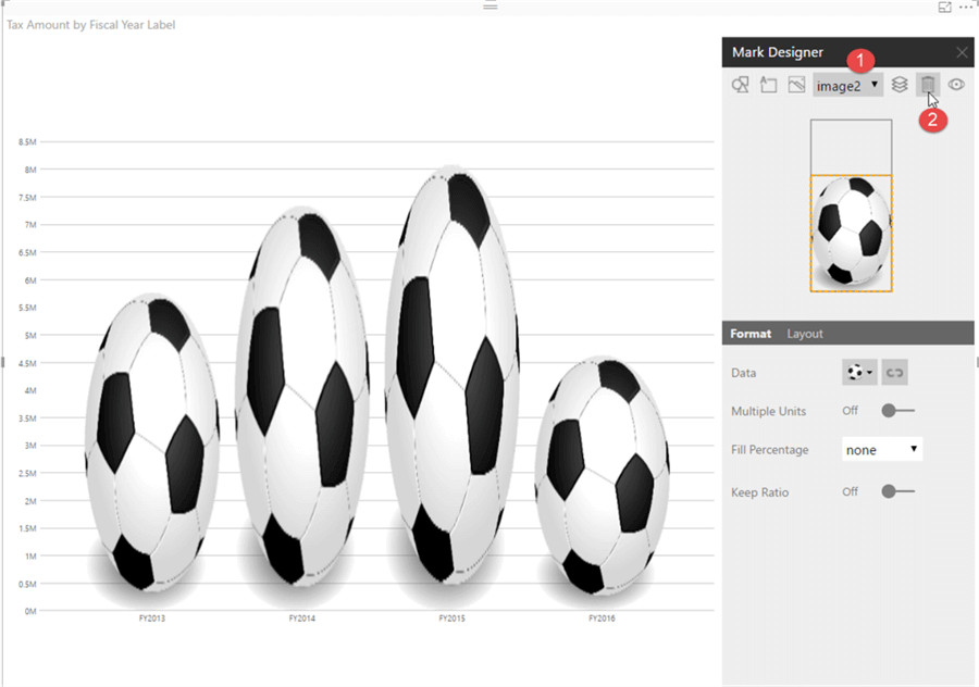
By selecting shape01 and then the delete button, we can remove the shape01 graphic and just leave the soccer ball image.
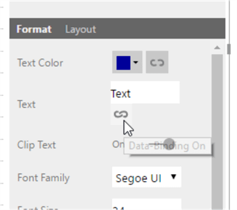
In a way similar to adding the images and shapes, text and markers can be added to a visual. The placement, text color, and font properties can all be set for the text.
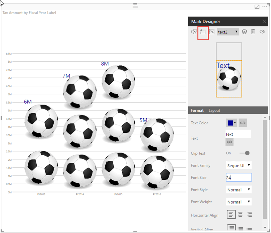
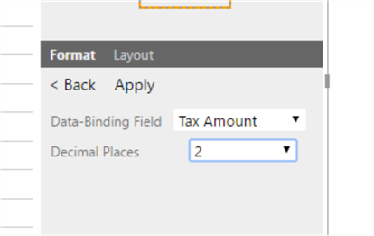
Furthermore, we can determine what text appears, by binding the text to a particular data value on the visual, Tax Amount in the below example.
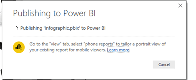
Finally, when our Infographic is complete, it can be published to our organizations Power BI site.
Next Steps
- The Infographic graphic designer can be downloaded free and can easily be included in your next Power BI project. Some folks would call these visuals, eye candy, but often times such a visual is needed to catch a reader or report consumer’s attention. In additional to a set of predefined shapes, the visuals provides the ability to use your own image while at the same time providing the capacity to set the size, color, and proportionality of these shapes and images.
- Power BI Tips: https://www.mssqltips.com/category/power-bi/
- Power BI Image Focus Mode: https://www.mssqltips.com/sqlservertip/4539/power-bi-focus-mode-for-images-and-data-on-dashboards/
- Power BI Visuals Interaction: https://www.mssqltips.com/sqlservertip/4784/power-bi-visual-interactions/

I have a passion for crafting Business Intelligence Solutions for my user groups. My experience includes almost 15 years of SQL Server involvement with the last 12 years focused specifically on Business Intelligence, SharePoint, OLAP, SSRS, and Decision Support solutions. Currently, I am a Business Intelligence Architect in the healthcare industry, and I also teach database and analytics classes for Kennesaw State University, Southern New Hampshire University, and Reinhardt University. My education includes an MBA and an undergraduate in Accounting (yes I am a reformed accountant!), both from Kennesaw State University. I enjoy every day by trying to grow my faith and spend precious time with my family. I have been happily married to my wife of over 20 years, and we have two teenagers one who we home school with the help of a University Model School, Cornerstone Prep in Acworth, GA (cornerstoneprep.org). Our other child is a Construction Management major at KSU’s Southern Poly / Marietta campus. We are a soccer and Cross Country (XC) family who play, coach, and referee soccer or run for fun most every day. For several years, our family has volunteered (and played with the dogs and cats) at Etowah Valley Humane Society in Cartersville, GA.
- MSSQLTips Awards: Champion (100+tips) – 2016 | Author of the Year – 2015 | Author Contender – 2014, 2016-2021
I am not sure you will be able to adjust the background in a specific area as each of those visuals is customized to the designer of the visual.
Thanks for article – really useful visual. I can’t seem to figure out a way to change the background colour / transparency of the chart. Obviously I can do it at the ‘General’ level – but there’s a persistent white background ontop of the ”General’ background. Am I missing something or is this not possible?