Problem
In Power BI, other than using filters or slicers, what other ways can be used to zoom into a visual?
Solution
The Power BI features just keep moving forward with each monthly release cycle; these features continue to make Power BI a Powerful contender in the Business Intelligence toolset especially with organizations who are looking for an all-in-one tool for both modeling and visualizations. Additionally, features like the zoom feature in today’s tip (and related features) provide dashboard consumers the best experience available from their dashboard. In each case these features are designed to give viewers the ability to see more detail and see it in an interactive way. You want report and dashboard consumers to answer their own questions without having to “download” the data.
In order to use zoom functionality, be sure to download the latest version of Power BI desktop in order to follow along with the examples. Additionally, we will be using the WideWorldImportersDW database as a basis for our data sources; this database can be downloaded from GitHub. Review this article for a refresher on bringing data into Power BI.
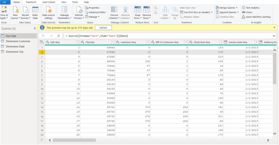
Our first step in the process of using the zoom functionality is to create a new Power BI PBIX file and then import the following dimension tables:
- Dim_City
- Dim_Customer
- Dim_Date
And then bring in the following fact table:
- Fact_Sales
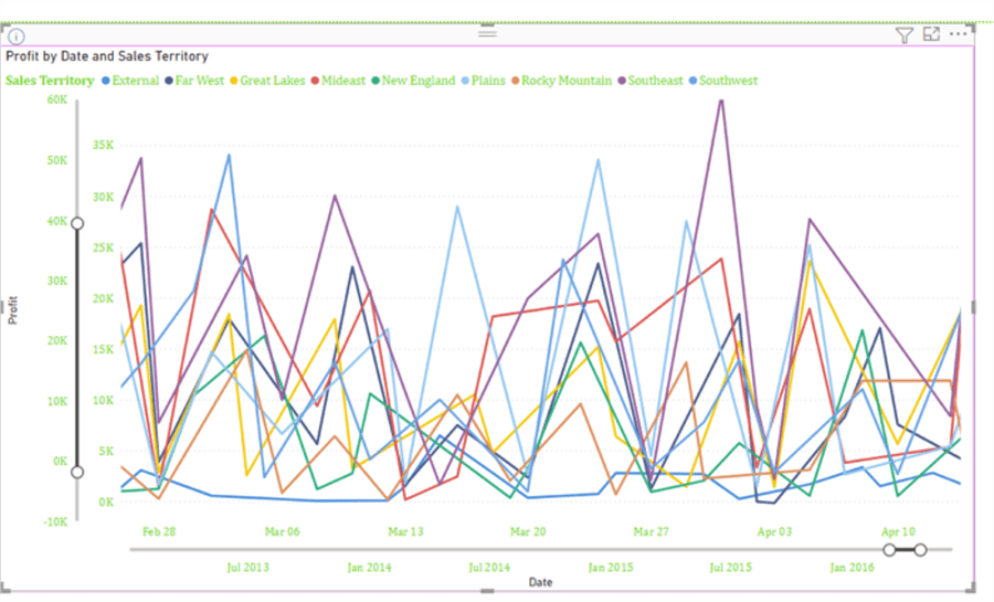
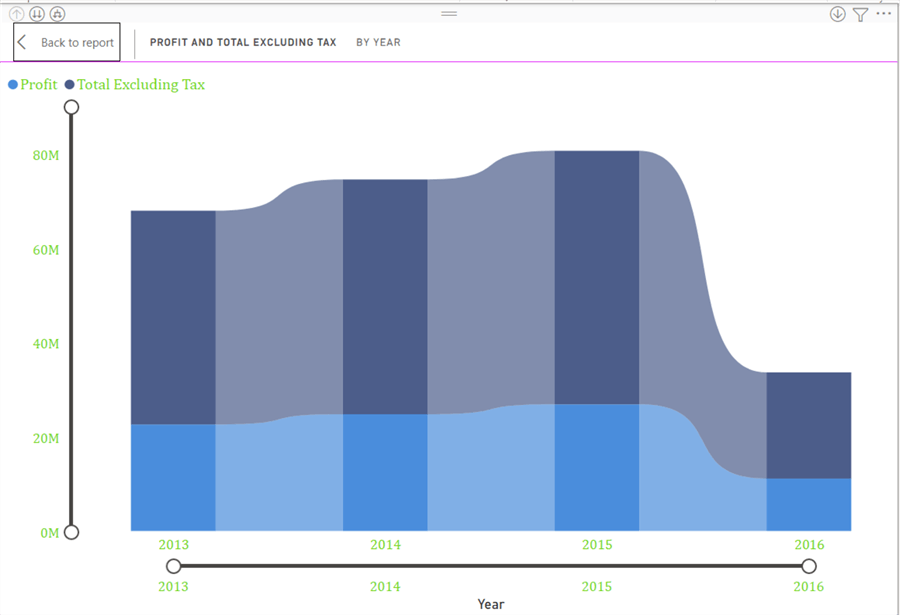
Next, a simple line chart visual is added with Profit as the value field for the y axis, Date (Delivery Date) as the x axis, Sales Territory as the legend.

To provide a bit more context on the issue at hand, the x axis is changed to use the date field as opposed to the date hierarchy.

This second version of the report is definitely much busier and could be desirable to see the daily changes in the data.
However, if you would like to drill into a particular month or period, it could be difficult to see such changes. However, turning on the zoom functionality provides a quick way to achieve a drill down effect for the dashboard user. In order to turn on the zoom functionality, the format paint brush button is selected, and then scrolling down the options list, the zoom slider option needs to be set to on.

Within the zoom slide area, options are available. The first two turn on zoom for the x and y axis. As shown in the below screen print, upon turning on the zoom slider for the x and y axis, we now have a slider bar on both axes.

As illustrated below, the zoom bar allows you to easily grab and slide the end point circles which will show on the visual being used. The below examples zoom into March and April of 2016.

One point to note in the above illustration and when working with the zoom bar, is that the axis labels are zooming in and changing as the scroll bar is adjusted. So, it sort of seems that the scroll bar is homing in on April 10th, but actually that is the axis label for the shown chart and NOT the time frame for the scroll bar. To solve that problem, you would set the slider labels to On. Now, the labels for the slide also show below (and to the left for the y axis). It can be a bit confusing seeing both labels, it would be a good idea to make sure that report consumers understand the difference.

A second option is to turn on tool tips which provide a visual representation of the value when you click on the endpoint circle of the “dumbbell” used on the zoom bar.

Likewise, on the y axis the zoom can be applied to the profit amount as shown in the below illustration.
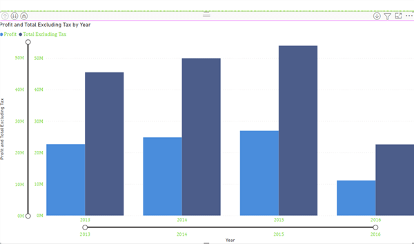
The next great part of the zoom feature happens when the report is published to the Power BI Service. The dashboard that we have been working on was published to the Power BI Service, and as shown below, the dashboard retains the zoom positions that were set when the report was saved in Power BI desktop.

However, the end dashboard consumer can adjust the zoom bars to whatever drill down position is desired.

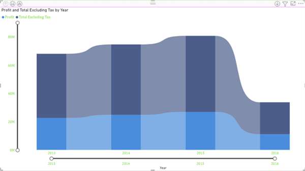
In addition to allowing zoom on the primary axis, adding a second axis to the chart, offers the opportunity to turn on the zoom slider for the second y axis as displayed below. This zoom is independent of the primary axis zoom bar.

The zoom functionality is available not only online charts, but also on bar charts and column charts along with ribbon charts, area charts, and scatter plots. However, I did notice that if drill down is available on a hierarchy, the date for instance, as soon as drill down was initiated, the zoom bar disappeared.


The other option for zooming into a particular visual is to use the focus mode. Focus mode is enabled by using the Focus Mode button in the upper right corner of the visual as illustrated below.

Once in focus mode, the visual selected will cover the entire screen area, so you can see a larger version of the report which is especially helpful for those dashboards that contain a large number of visuals that are too small to see fully. What you will also notice is the zoom bar is enabled for focus mode, so you can both hone in on a particular visual and then within that visual select a particular set of values or dates to zoom into.
In this tip we “zoomed” into “focusing” on a particular set of values or dates within a set of bar, column, line, and area charts. The fairly new zoom bar feature provides the ability to limit the values shown on a particular axis in order to offer a dashboard consumer the ability to self-select a group of items on the x or y axis of a report.
Next Steps

I have a passion for crafting Business Intelligence Solutions for my user groups. My experience includes almost 15 years of SQL Server involvement with the last 12 years focused specifically on Business Intelligence, SharePoint, OLAP, SSRS, and Decision Support solutions. Currently, I am a Business Intelligence Architect in the healthcare industry, and I also teach database and analytics classes for Kennesaw State University, Southern New Hampshire University, and Reinhardt University. My education includes an MBA and an undergraduate in Accounting (yes I am a reformed accountant!), both from Kennesaw State University. I enjoy every day by trying to grow my faith and spend precious time with my family. I have been happily married to my wife of over 20 years, and we have two teenagers one who we home school with the help of a University Model School, Cornerstone Prep in Acworth, GA (cornerstoneprep.org). Our other child is a Construction Management major at KSU’s Southern Poly / Marietta campus. We are a soccer and Cross Country (XC) family who play, coach, and referee soccer or run for fun most every day. For several years, our family has volunteered (and played with the dogs and cats) at Etowah Valley Humane Society in Cartersville, GA.
- MSSQLTips Awards: Champion (100+tips) – 2016 | Author of the Year – 2015 | Author Contender – 2014, 2016-2021