By: Siddharth Mehta | Comments (1) | Related: > Power BI Charts
Problem
In the last tip, we learned how to perform trend analysis using Power BI Desktop. Different types of analysis like trends, forecasting, aggregation, etc. is done on data with the base assumption that data belongs to the same entity. Suppose that the data is of different categories, and before performing different analysis, the primary requirement is to classify the data itself. In this tip, we will learn how to classify data in clusters using Power BI Desktop.
Solution
Power BI provides options to identify clusters using scatter plot charts.
First, we need sample labelled data that we can use for clustering. In this tip, we will be using the popular IRIS dataset from UCI Machine Learning repository.

This dataset consists a few hundred records with five fields – Sepal Length, Sepal Width, Petal Length, Petal Width and Class. Data consists of measurements for different classes of flowers. Let us say we want to use sepal length and sepal width and classify data in three cluster based on the characteristics of the data. To perform this analysis, we need to import this data. Follow the steps as shown below to import the data.
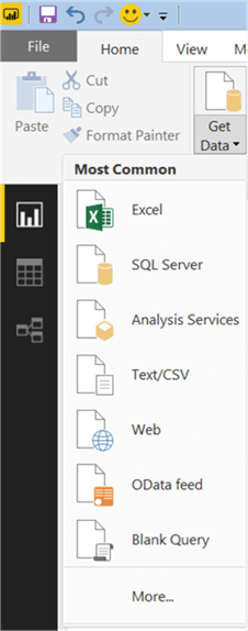
Click on the Get Data menu and select the Web option as shown below. As our data is located on the web from the UCI repository, we will be reading the data directly from the web and hence we need to select this option.
After you select the Web option, the next step would be to provide a URL from where we intend to read the data. Provide the appropriate URL as shown below. This URL should be the “.data” URL as this points to the actual data file hosted on the web.

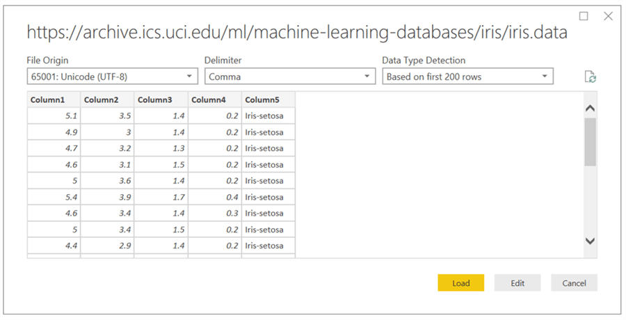
After you provide the URL and click OK, the next step would be to preview the data and provide a few configuration options to import the data. As seen below, the URL from where the data is being imported is displayed on the top. The File Origin field shows the format of the data that is being read from the URL. The delimiter field shows the delimiter format of the data. Almost the entire data hosted on the UCI repository is of comma-delimited format. This dialog just reads the first two hundred rows and detects the data type of the fields. In addition, the grid below these fields shows the rows and columns from the 200 records read by this dialog. This is the step where you should carefully review the data and confirm that the data meets your expectations, before loading it in Power BI. Once you confirm, click on the Load button to read the entire data set from the UCI repository.
Once the data is loaded, you should be able to see a list of fields as shown below. If you carefully observe, here the column does not have the proper names and instead the names are: Column1, Column2, Column3, Column4 and Column5. The reason for this is because the URL from where the data is read does not have any column headers. We need to have proper names in the fields for easy and accurate identification of data. The UCI repository contains the definition and order of the fields, based on which you identify the fields and rename them as well.
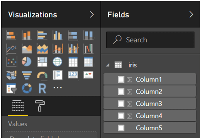
To rename the fields, just right-click on the field and select the rename option. The fields in IRIS dataset are: Class, Petal Length (PL), Petal Width (PW), Sepal Length (SL) and Sepal Width (SW). After renaming the fields, now we intend to create a scatterplot chart. So click on it in the visualization gallery and create a blank scatterplot chart. Once it has been created, select the field SL and SW. The aggregation that we need here is the average of SL vs average of SW. For this, the default aggregation would have to be changed. We already learned in the last tip how to change aggregation on any given field. Apart from this, make sure you add the SL field in the details section of the field list. Once you apply the new aggregation, this should create a visualization as shown below.
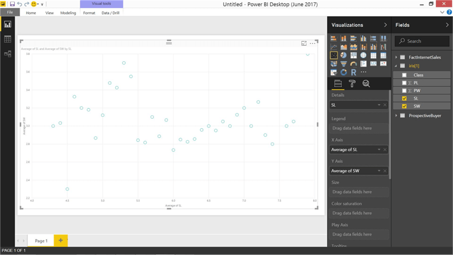
After creating the chart, click on the ellipsis icon that should pop-up options as shown below. Keep in mind that the Legend pane should not have any fields added to it; else, you will not be able to find the option to Automatically Find Clusters. In addition, the data in the chart needs to be of a format that can be clustered. If the data is not appropriate, the “Automatically find clusters” option would not appear at all in the pop-up menu. Ideally, this menu item should always be visible although in a disabled state when an incorrect data format is selected. However, as this menu option does not appear at all due to data not in expected format, it often leads to confusion that one might have installed an older version of Power BI Desktop or might have missed some updates due to which this option does not appear.
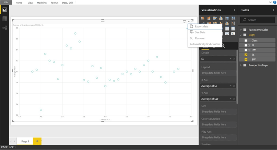
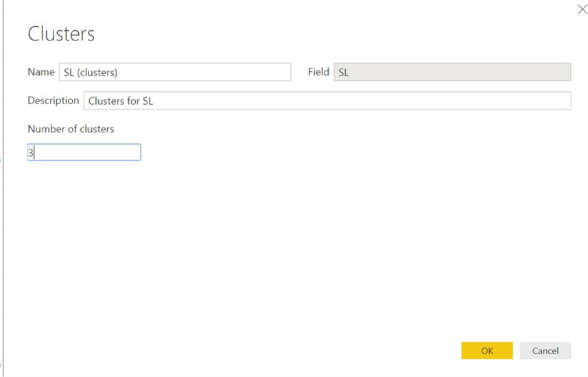
Click on the automatically find clusters option, and that should bring up a pop-up as shown below. If you analyze the data, you would find that the data is classified in three groups. If you do not provide the number of clusters to create, by default the algorithm would analyze the data and create clusters based on different readings in the data. In this case, it would create 10 clusters. As we already know the data, let us input 3 to create three clusters. The field name that we would provide here is the new cluster field created and added to the legends pane.
After you click OK, the new field is added and the visualization should show data in three clusters differentiated by colors. Try reading the individual data points in the clustered visualization and also try to associate them with individual data points to understand the accuracy of the clustering logic.
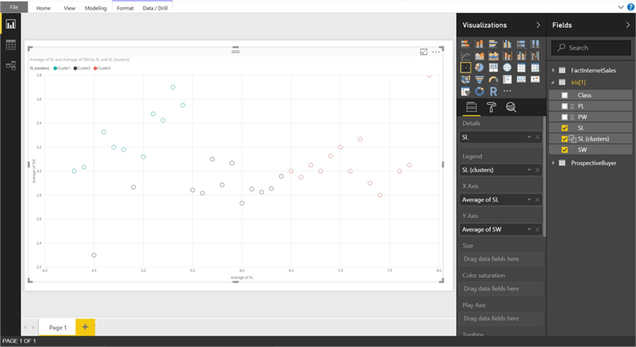
In this way, we can effortlessly apply clustering logic and represent clusters in a scatterplot using Power BI Desktop.
Next Steps
- Try using different datasets from UCI Repository to understand the functioning of clustering logic in Power BI Desktop.
- Check out the MSSQLTips.com Power BI tips.
Learn more about Power BI in this 3 hour training course.
About the author
 Siddharth Mehta is an Associate Manager with Accenture in the Avanade Division focusing on Business Intelligence.
This author pledges the content of this article is based on professional experience and not AI generated.
View all my tips


