Problem
Microsoft Power BI Desktop is a comprehensive visualization tool and the use of a Sankey chart can help illustrate resource flows when one wants to track complex processes visually. There are several situations where one needs to view how resources flow for different hierarchies or how multiple resources contribute to different aspects. In this case, the Sankey chart can be a great tool to illustrate this purpose. We will leverage this article to highlight the particular importance of the Sankey chart and how one can create a Sankey chart in Power BI.
Solution
Quantitative data is meaningless without the means to interpret it. Therefore, different data visualization techniques allow users, such as those in the business domain, to draw inferences and insights from their vast amounts of data and optimize their profit-making business strategy. Unfortunately, when data teams prioritize captivating imagery over accuracy and practicality, the insights deceive, contributing to policies that are likely detrimental to business operations over time. Particularly for path analysis, many of our traditional visual tools, like flow charts and pie charts, can be downright frustrating to use, often providing misleading insights. In such a situation, a more appropriate tool is a Sankey chart.
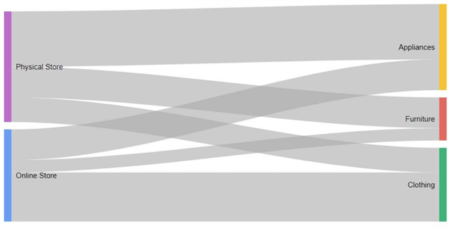
A Sankey chart visualizes insights into flow-like data. It offers a detailed, high-level overview of how your data flows and transitions from one level to another. Sankey charts are perfect for situations with complex and bulky datasets where we have to demonstrate the flow-like characteristics of the data. Illustrated above is a typical Sankey chart that represents the relative differences in furniture, appliances, and clothing sales from online and physical stores of a specific business. To sum up, we have created a bird’s eye view of how our data flows within a single stage. At a glance, we can confidently tell that while the physical store excels in appliance sales, it does poorly in clothing, which is better managed by the online store.
Now that we have covered the basics of a Sankey chart, let's discuss its components:
- Node: These colorful bars in the above diagram represent different data stages. Their height is proportional to the flow quantity that is being visualized. This means that in a diagram with two nodes, one twice the size of the other, represents double the quantity. Although this is adequate for relative comparison, we can also include the actual quantitative measurements on the nodes to be more transparent.
- Link: This is the connection between two nodes, illustrated as curved rectangles/bars in the diagrams.
Sankey charts have been gaining rapid popularity in many different sectors. They are particularly pervasive in visualizing energy usage and flows, supply chain, sales by regions, and so on. This can be attributed to the fact that:
- Multilevel Sankey diagrams are great at depicting large volumes of data in a single visualization, making them optimal for depicting complex systems and processes.
- Since these charts show how data transforms in different stages, business stakeholders can quickly gauge where the performance is lost or gained and then optimize strategies accordingly. Quick insights provided by this diagram over multiple stages are the key to this benefit.
- These diagrams are also great at illustrating pathways. For instance, where your web traffic is coming from or the number of candidate applications made through the different stages of your recruiting process.
Now that we have covered the fundamentals and applications of the Sankey chart, it’s time to move toward a more practical demonstration. We will now be creating a source table using the MySQL workbench. This table will illustrate a business entity’s annual cash outflows on sustaining and investments into its assets: property, plant, equipment (PPE), supplies, and inventory. Their subcategories will also be illustrated. We will then visualize how much each subcategory of assets contributes to the cash outflows using a Sankey chart with the help of Microsoft’s Power BI.
Creating a Source Table
To get started, we will first create our database and then access it using the following commands:
CREATE DATABASE assets;
USE assets;
We will then create our table containing the columns for the asset, its subtype, and the amount spent in acquiring that asset (the cash outflow).
CREATE TABLE cash_outflows
(
    asset varchar(40),
    sub_category varchar(40),
    purchasing_cost int unsigned
);
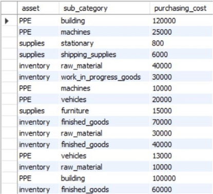
Now we can finally populate our table with relevant values. For the property, plant, and equipment (PPE), the enterprise has invested in buildings, land, machines, and vehicles. The enterprise also needed to top its supplies throughout the year, including furniture, stationary, and shipping supplies. Lastly, the business also purchased raw materials, work-in-progress goods, and finished goods to sell to customers. For our data entry, we will use the following SQL statements:
INSERT INTO cash_outflows VALUES
("PPE", "building", 120000),
("PPE", "machines", 25000),
("supplies", "stationary", 800),
("supplies", "shipping_supplies", 6000),
("inventory", "raw_material", 40000),
("inventory", "work_in_progress_goods", 30000),
("PPE", "machines", 10000),
("PPE", "vehicles", 20000),
("supplies", "furniture", 15000),
("inventory", "finished_goods", 70000),
("inventory", "raw_material", 30000),
("inventory", "finished_goods", 40000),
("PPE", "vehicles", 13000),
("inventory", "raw_material", 10000),
("PPE", "building", 100000),
("inventory", "finished_goods", 60000),
("supplies", "shipping_supplies", 9000),
("PPE", "land", 110000);
To view our table, we will execute the following command:
SELECT * FROM assets.cash_outflows;
This will output the table below, whose the first few rows look like this:
Creating Sankey Chart in Power BI
Now we are ready to import our database to Power BI and build our Sankey chart visualization. We will launch Power BI and implement the following steps:
Step 1
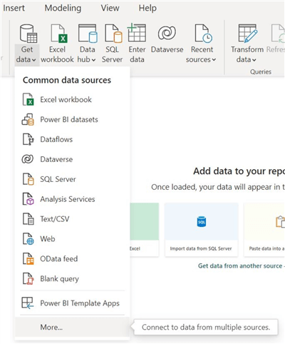
In the main interface of Power BI, click on “Get Data” in the data section, as shown below. This will produce a drop-down menu with different sources from which we can import our dataset. We will click on “More…” to get further options.
Step 2
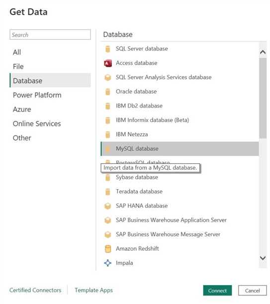
A new dialog box will appear. Click on “Database” below the search option and find the “MySQL database” option. Select it and click “Connect” at the bottom of the menu, as shown below.
Step 3
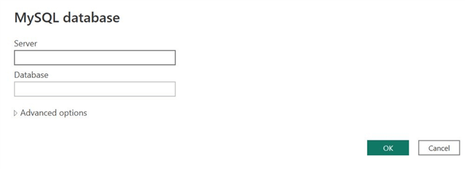
Enter the relevant credentials regarding your server and database and click on “OK.”
Step 4
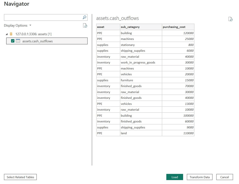
The following menu will appear if Power BI successfully connects with your MySQL database. As shown below, select the box beside your table’s name and click “Load” at the bottom. As we can see, Power BI also gives the option to preview our tables. If discrepancies like missing values and repetitive or wrongful data entries are present, we can resolve them using the “Transform Data” option at the bottom. For now, we don't need to bother with this step as our dataset is clean and complete.
Step 5
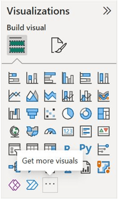
After successfully loading our desired dataset into Power BI, click on “…” in the visualizations panel, as shown below. This is because Power BI does not natively support Sankey chart visualization. Therefore, we will need to install a third-party extension.
Step 6
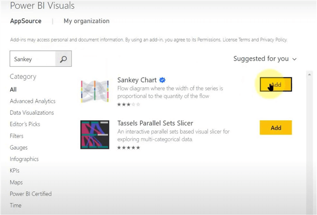
The “Power BI Visuals” menu will appear. In the search box to the left, as shown below, search for “Sankey chart.”
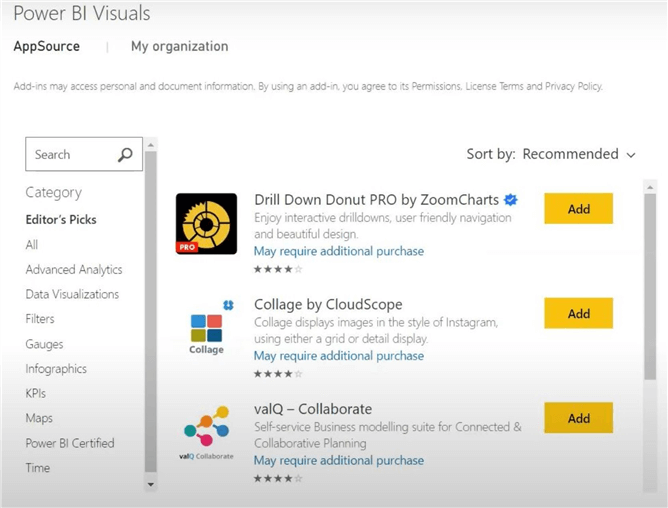
Step 7
A Sankey chart extension will appear. It is apparent from the blue verification tick that Power BI itself endorses this extension. We can further click on the extension name for more information regarding its functionality and developer information. In our case, this Sankey chart is developed by Microsoft itself.
Step 8
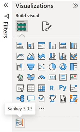
If the installation has been successful, a new icon will appear under the visualization panel in the main interface of Power BI. To create our Sankey chart, click on it as shown below.
Step 9
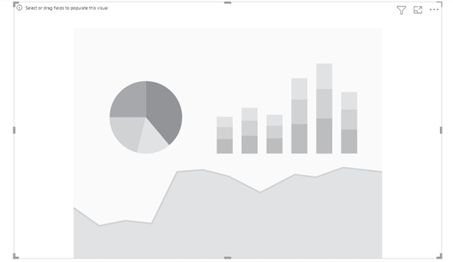
This will create an empty visualization in our main interface. Drag its corners and reposition it using the cursor until the borders are adequate.
Step 10
To populate our Sankey chart, we will drag the “assets” column from under the fields section and insert it into the “Source” section, as shown below. This measure will create our first nodes of the chart naming the three major categories of assets: PPE, supplies, and inventory.
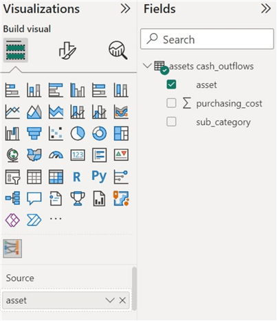
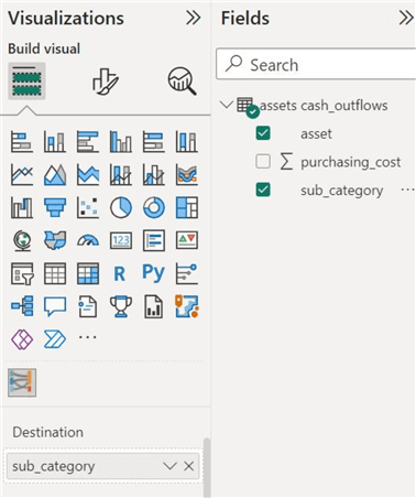
Step 11
Now drag the “sub_category” column from the fields panel and insert it into the “Destination” section, as shown below. This step will create our second nodes in the chart and will label the subcategory of assets.
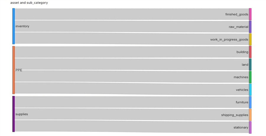
For now, our chart looks like this:

Although the weights to each individual link have not yet been applied, we can see that the assets link to the correct subcategories.
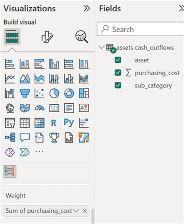
Step 12
To apply the weights to the links, we will drag the “purchasing_cost” column and insert it into the “Weight” section. Now we can see which main asset category links to the subcategory generating the most cash outflows and vice versa.
As we can see below, we have now successfully created our Sankey chart. It is complete with all of its nodes and links, and we can easily judge the relative differences in the cash outflows generated by each category.
Customizations
But wait…we can't be done yet! This visualization tool offers many modifications to make our chart more desirable and practical. These measures also ensure flexibility and a hint of personalization in creating these visuals.
Visual Formatting
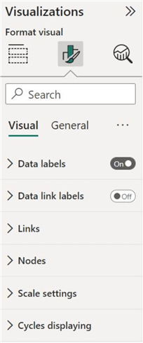
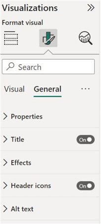
Under the visualizations panel, we will observe the two editing streams: “Visual” and “General.” Firstly, we will go through the visual settings. As we can see below, we can edit various metrics, including data labels, links, nodes, and so on.
Data labels. It is obvious from the name that under the “Data labels” category, we can change the color, font, and size of the labels on each node. To make the labels more apparent, we have increased the font size to 14.
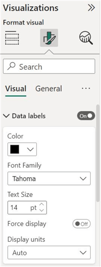
Data link labels. To make our diagram more transparent, we can also enable the “Data link labels,” which will label how much weight each link carries. This tool also allows the option of changing its color and size.
Links. Under the “Links” category, we have the option of altering the color of each of the links in the diagram. For simplicity purposes, we will be leaving it transparent.
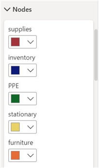
Nodes. Similarly, this tool also offers the ability to change the nodes’ color on both sides. For our visualization, we have changed the colors to ensure a uniform color scheme linking each asset category to its subcategories.
General Formatting
Moving onto the “General” header, we can modify the chart’s properties, title, and other effects, as shown below.
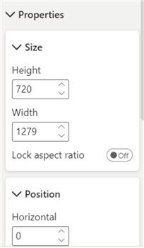
Properties. Below the “Properties” section, we can alter the dimensions and position of our visualization. However, we have already demonstrated that before using our cursor to adjust the visualization. We can also achieve the same outcome here, which will be more precise.
Title. The “Title” header gives our diagram a meaningful title that briefly explains its purpose to the users. We can also change the font style and embolden it to make it more conspicuous and professional.

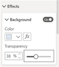
Effects. Under the “Effects” category, we have altered the background color of the visualization to give it more depth and make it less monotonous. However, it should be noted that the color shouldn’t be too dark or bright to take away from the main essence of our Sankey chart.
As for our last step, we manually arranged the nodes in a descending order (from the top) using our cursor. Our Sankey chart is now as follows:
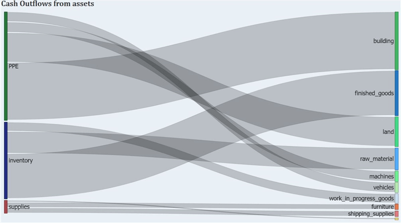
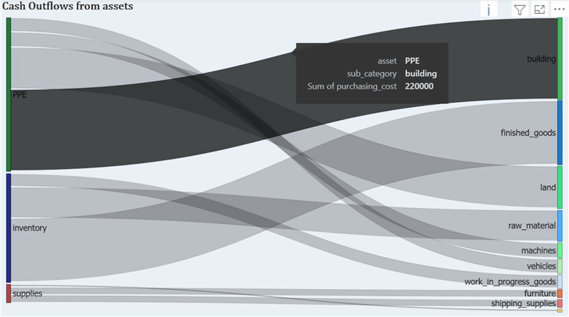
Our visualization resembles a typical Sankey chart compared to our prototype diagram before any visual and general modifications. We also have disabled data link labels to avoid overcrowding and clustering in the diagram. As a remedy, we can still hover over each of the individual links to gain additional information, as shown below:
Conduct Analysis
Now that we are done with creating and modifying our Sankey chart, we can finally decipher the insights from the diagram and reach some conclusions. At a glance, it is apparent that the business has most of its annual investments pooled in property, plant, and equipment, followed by inventory and then supplies. On the other side of the diagram, we can also see that the investment has specifically been the largest in buildings, then finished goods, and so on.
What can we infer from this information? It is likely that this specific business is looking for a step up in its operations and is increasing the scale of its production in the coming year, given the increased investment in new buildings, land, and finished goods. To reach a conclusive assessment, we will need to compare the current year’s trend with the previous year’s and industry standard practices. Rather than staring at monotonous, complex, and bulky statements of financial position and cash flows, investors, managers, and creditors can easily use this Sankey chart visual to derive essential insights.
This article thoroughly explored the basics and purpose of Sankey chart visualization, its importance, and various use cases. We have also offered a tutorial on creating your own Sankey chart using Power BI and MySQL.
Next Steps
- Check out all the Power BI Tips on MSSQLTips.com

Harris Amjad currently works as a Software Engineer at Strategic Systems International. He is Microsoft Certified Data Analyst and Microsoft Certified Trainer. A rigorous, task-driven Data Enthusiast with substantial experience in Data Science, Data Analysis, and Data Engineering.
- MSSQLTips Awards: Trendsetter (25+ tips) – 2024 | Author Contender – 2023, 2024 | Rookie Contender – 2022
