Problem
Data is present in many different forms and analysis of this data gives valuable and actionable insights for organizations. Certain sectors in several industries make use of geographical and location data to make informed decisions in their businesses. We, as users, are dependent upon customized dynamic maps on a day-to-day basis to figure out various patterns like traffic or weather conditions in the areas where we travel. Interactive map visualizations help visualize large datasets by displaying data as locations on maps and also assists in understanding complex trends by providing the most granular detail. In this tip, we will illustrate different map visualizations offered by Power BI Desktop for various scenarios.
Solution
Power BI Desktop, a strong analytics service, supports a handful of interactive map visualizations to gain insights into the geographical data. These visualizations simplify the data presented to the user and pinpoint important aspects based on the analysis. Let’s take a small practical example of a ‘Baby food chain’ that makes use of maps visualization to identify which area is demanding more baby food and based on this information, this chain can open/shut stores and can make further informed decisions to attract more customers.
Before we get started, we need to ensure that Power BI Desktop is installed on the system. In case it is not available, you can download it from here.
This tip will walk you through below three map visualizations supported in Power BI Desktop.
- Map (Bubble) Visualization
- Shape Map Visualization
- Filled Map Visualization
Association of Power BI with Bing Maps
Map and Filled Map in Power BI Desktop are based on Bing maps geocoding engine, where the geographical attributes like Location, Latitude and Longitude are sent to Bing for geocoding processing and is plotted on the map. In short, the Bing engine works under the hood to convert the given input into geographic coordinates to perform geospatial analysis.
Let’s head over to Power BI Desktop and see these maps in action now.
Loading Sample Data in Power BI Desktop
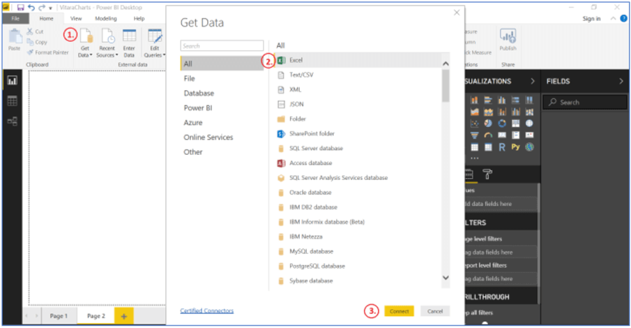
We will load some sample data in Power BI to understand how map visuals actually work. Let’s move forward and click Get Data on the Home ribbon, select Excel and hit the Connect button as shown below.
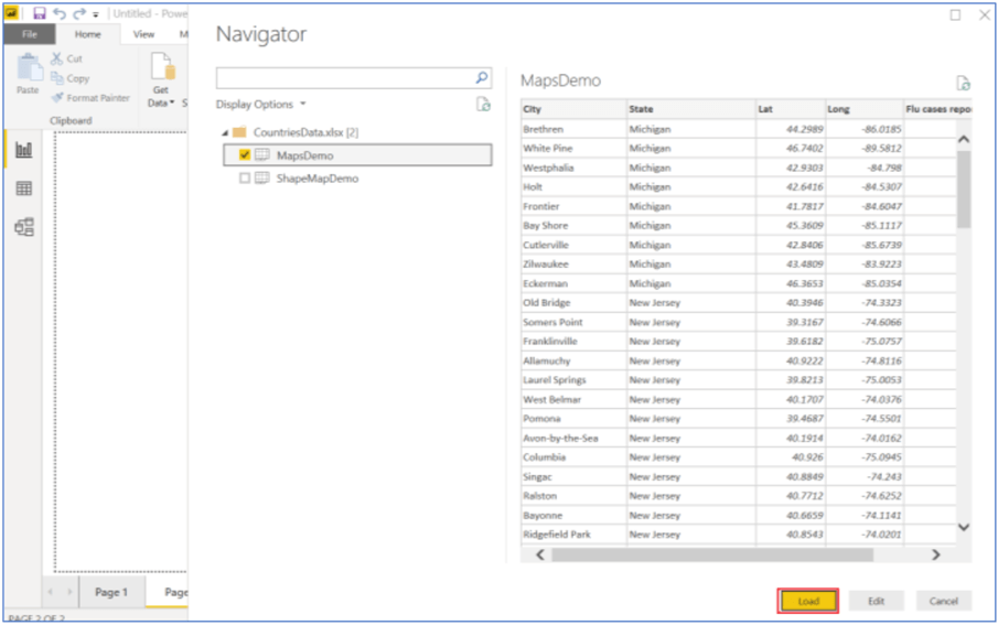
I have prepared 2 different Excel files to demonstrate these map visualizations. You can download this Excel file from here or to use any data file that has geographical information in it. We will browse and navigate to the Excel file present in the system and load MapsDemo file as shown below. You can see the preview of the data that is going to be loaded in Power BI on the right side of the navigator screen.
Bubble Map Visualization in Power BI Desktop
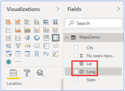
After loading the data, you should be able to see all the fields in the Fields pane on the right side of the Power BI Desktop. Click on the globe icon – Map option (present in the third row) in the Visualizations pane to add this visual to the report, and also expand it to the size of the report layout as shown below.
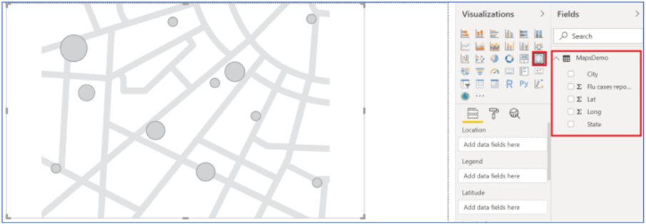
This dataset talks about the mean value of flu cases reported in a few US states and its cities. Before we go ahead and add data to the map buckets, look at the Lat and Long fields above, Power BI considered them as numeric fields and have summarized them.
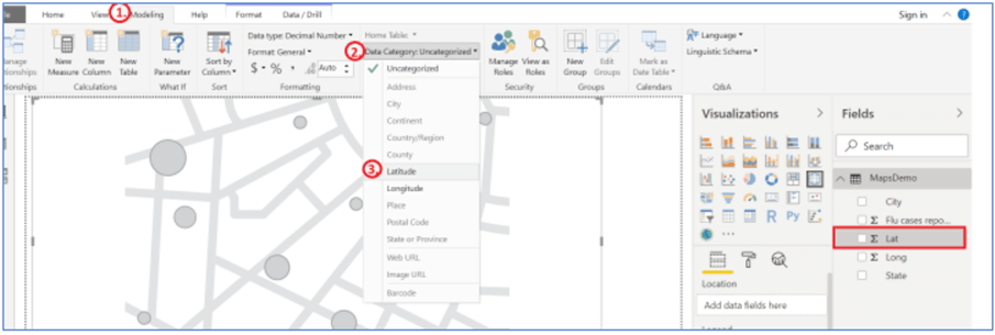
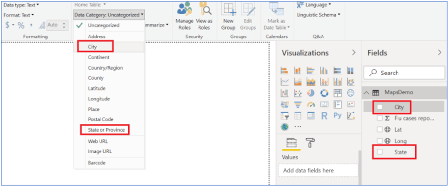
Best Practice 1 – To ensure that Power BI recognizes these values correctly, we need to map them to the respective Latitude and Longitude data categories. To do so, select the field Lat in the Fields pane, go to the Modeling tab, click Data Category and select Latitude. Repeat these steps for Long field as well and point it to Longitude.
After making the above changes, go to the report to see map icons for Lat and Long fields.
To create this map, let’s quickly drag the city field to the Location bucket in the Fields pane to create the below visual. If you notice carefully, our dataset deals with only data related to the United States and here in the map, different spots are plotted in regions other than North America as well. Let’s see what we can do about it.

Best Practice 2 - In real scenarios, we have to deal with ambiguous location data, for e.g., Boston is in the UK and in the US as well. In our dataset, for example, Washington is a state and also a city in DC. To disambiguate this state-city data, the best way is to include Longitude and Latitude values on the map. In case these lat-long values are not available, the best practice is to treat this data correctly is to categorize State and City data manually and more specifically in the modeling tab as shown below.
Also, if you see the map above, the size of the bubble points are the same indicating that same number of flu cases have been reported in the locations, which is practically untrue. To change the size of the bubble based on the number of the value for each map location, we will have to add some value (‘Flu cases reported’ in our case) to the ‘Size’ bucket. The following visualization is created that illustrates bubbles nicely and also is located correctly in the United States map.

Accessing Hierarchy Data with Bubble Map Visualization in Power BI Desktop
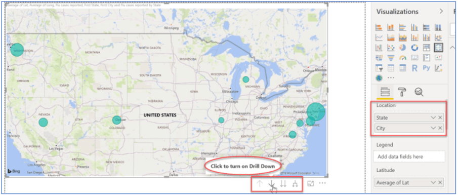
This data looks unclear and incomprehensible, let’s tweak it a little to gain some insights. We will drag the State field to the Location bucket. The map will turn out like below and just with a quick look, we can tell New Jersey has the highest number of flu cases reported and Illinois was the safest.
You can also filter the map using the Filters option in the Fields pane. Additionally, we can add the tooltip to the map to make them more interactive.
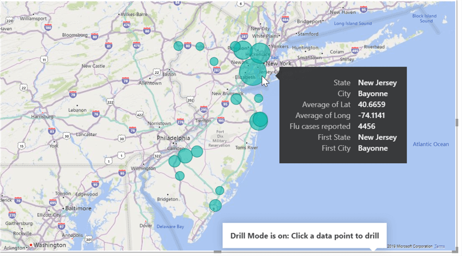
This map offers several drill up and drill down features when hierarchy fields are added to the Location field (see above in red rectangle). We can enable the drill down feature by clicking the downward arrow and select the upward facing arrow icon to drill-up in the hierarchy. Let’s assume, to know which city was majorly hit in New Jersey, we will enable the drill down button and click on the New Jersey bubble. These findings revealed that the city of Bayonne was badly affected and related teams can work on them to take preventive measures.
Formatting Options Supported in Power BI Desktop
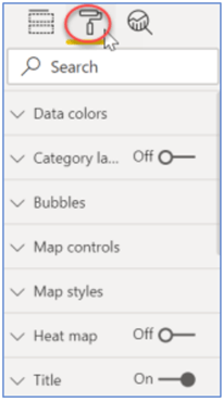
These visuals offer numerous formatting options to polish the map per business needs. All you need to do is go to the Format icon and make amendments. You can change color, size, theme of the bubbles and map, zoom controls, title, heat map, various positioning, etc. For the sake of brevity, I will probably have to skip this demo to explain each formatting in detail.
Quick note – One of my fellow authors has explained this basic map visualization here with other detailed examples on the drill-down feature. I would suggest going through it to have an end to end understanding of this visual.
Filled Map Visualization (choropleths) in Power BI Desktop
Sometimes, we want to represent data in the area form rather than showing in the points or bubbles format. Filled Maps in Power BI addresses this issue. These maps shade the area in the countries based on the number of value.
One such example of these charts is shown below. To learn more about Filled maps, see here.

Let’s head over to the next map visualization supported by Power BI Desktop.
Shape Map Visualization in Power BI Desktop (Preview)
Shape Map is another interesting map visualization in Power BI Desktop which is based on esri/TopoJSON maps that allows creating custom maps as well. This map essentially targets to show relative comparisons of regions using different vivid colors. Such visualizations work the best for Country-level data.
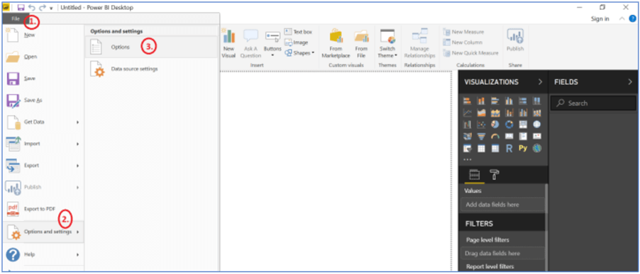
This visual is in preview and we will have to enable it in order to use it. Select File > Options and Settings > Options as shown below.
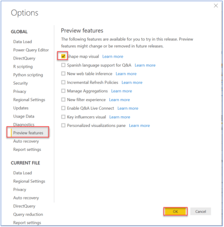
Select Preview features, and check the Shape map visual and click OK.
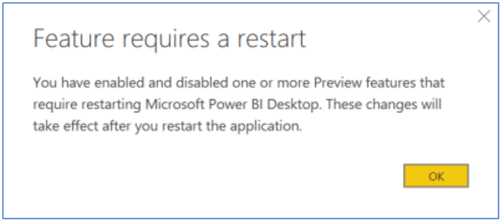
We will have to restart Power BI Desktop to make these changes effective.
Once you have restarted Power BI Desktop, you will be able to see the enabled Shape Map visualization in the visualization pane in Power BI Desktop. Select this Shape Map icon to add an empty Shape Map visual to the report canvas as shown below.

Let’s quickly populate data in Power BI to understand this shape map visualization. You can download the file ‘ShapeMapDemo’ from here. Load this file the same way we uploaded the Excel file for the Map visualization above. Click on the Shape map visual to add this to the canvas and drag the State field in the Location bucket and Population field to Color saturation bucket to create this visual.
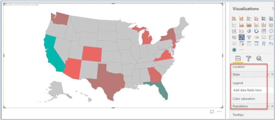
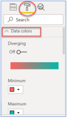
The Shape map visual shows the US map by default. Different colors compare the distribution of the population in various regions. To understand the color gradient, expand Data colors in the Format pane which depicts that red color shows the population on lower side and green color is for the population on the higher side. You can make color changes by toggling Diverging to On and selecting colors.
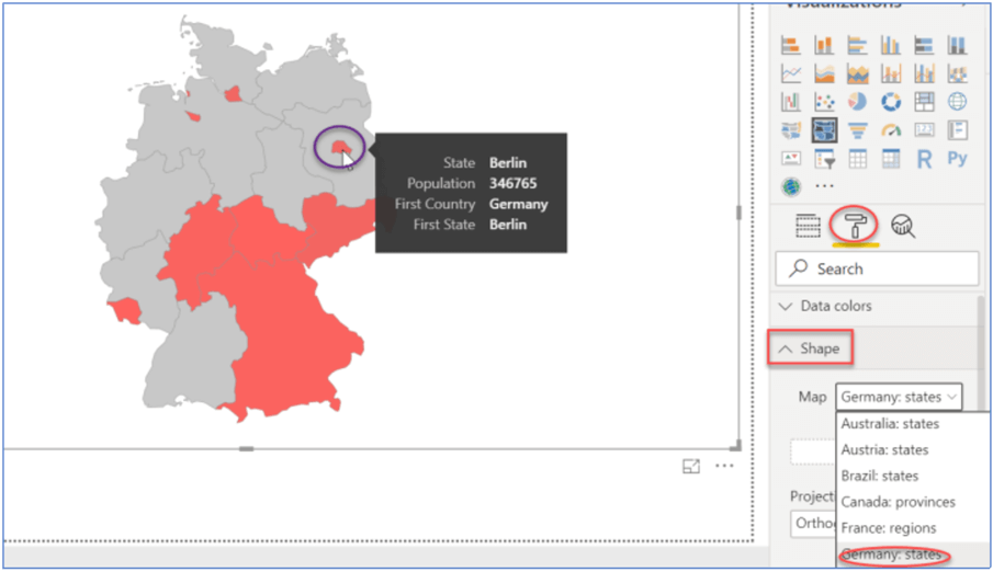
This visualization provides a list of a few standard maps that allow you to pick up a map from. To do so, expand Format pane, select any map from the ‘Map’ dropdown under ‘Shape’ heading. One such example is shown below where we are looking at the population of various states in Germany map.
Custom Maps with Shape Map Visualization in Power BI Desktop
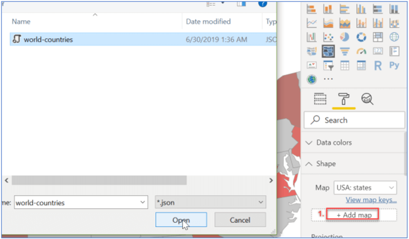
This Shape visual also lets you add custom maps like world, Countries, Continents etc. to the default visualization. You can add them directly if they are in TopoJSON format or have to use some online map tools to convert the file into TopoJSON format first to add a custom map.
In order to add a custom map, click on Format pane, expand the Shape section and select +Add map as shown below. I am going to refer to the World-countries json file to import a custom world map. You can download this file from here.
Once added, you can see the below world map being added to the report. Click on ‘View map keys’ hyperlink (marked in red below) to see what all map keys this world map is referring to map with our data.
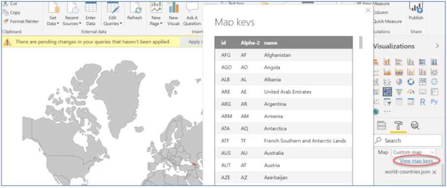
The iso code used for countries is in 3 digits whereas the code that we are referring to in the dataset is 2-digit. So, making this conversion from 2-digit to 3-digit iso code will address this issue and visualize the world map in a better way. You can continue reading more about Shape Map Visualization here.
Best practice 3 – There is one more way to resolve issues related to ambiguous location data. Combine two or more columns into one and pass it as Location and bucket in the visual. You can manually add the state to the zip codes by concatenating with a calculated column, for e.g. 07029, New Jersey or you can concatenate the City column as ‘City’ & ‘Country’ to rule out any uncertainty to the Bing maps. For e.g., Boston, UK or Boston, Massachusetts.
Bonus Tip for Power BI Desktop Map Visualizations
The below table provides a quick summary of different maps visualizations in Power BI Desktop.
| Power BI Map Visualizations | ||
|---|---|---|
| Bubble Map | Filled Map | Shape Map (Preview) |
| Draws a bubble over a geographic point in the world map. | Rather than representing data in points, It fills the countries in the visualizations. | Shows relative comparison of different regions using various colors, actually shows the outline of the area we want to visualize. |
| Complicated to use when dealing with huge data. | It comes with many limitations, but is useful when dealing with clear boundaries data like country, state. | Allows to make custom Country, Continent maps and fill in specific regions. |
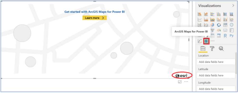
Last but not least, ArcGIS Maps for Power BI is the cutting edge map visualization provided by Esri with enhanced features of mapping for better decision making. It is out of the scope of this tip, and I hope to cover it in my future tips, but for now, you can refer here to get familiar with this.
Summary
The intention of this tip was to get you up to speed with the basic Power BI map visualizations to quickly analyze geographical data. We observed how these insights help to draw conclusions about data with just a few clicks. I hope, this tip helped understand different map visualizations (Bubble, Shape and Filled) in Power BI Desktop.
We also covered some of the best practices that we should adhere to while working on map visualizations in Power BI.
Next Steps
- Try implementing these visuals on the geographical data you have to create striking informative map visualizations in Power BI Desktop.
- You can continue your learning on Power BI with these other Power BI tips.

Gauri Mahajan is a SQL Server Professional with 6+ years of experience of working with global multinational consulting and technology organizations. She is very passionate about SQL Server Reporting Services, R, Python, Power BI, Database engine, etc. She has years of experience in technical documentation and enjoys writing. She has deep experience in designing data and analytics solutions and ensuring its stability, reliability, and performance. She is also certified in SQL Server and has passed the 70-463: Implementing Data Warehouses with Microsoft SQL Server exam.
- MSSQLTips Awards: Author of the Year Contender – 2019

Very nice post. The trouble is, the Power Bi map only allows for 2 layers ( like shape + bubbles ), while the arcGIS visualisation is filled with bugs.
Hopefully in a few years time, both visualizationswill improve