Problem
Recently, I was working on a project where as part of the business requirement, stakeholders wanted to be able to only see default information on a line chart when no slicer selection is made, and only see the visual values when a slicer selection is made. The reason for this was that it seemed confusing for the report end users when they see the values on a line chart when no slicer selection is made, as it seems to summarize all values together, and thus was confusing what the chart was displaying by default.
So, to resolve this, the best option was to display default text that asks the end users to select a slicer selection in order to display the values on the Line Chart. This technique is not new, I only added some additional ideas and tricks in this case. Please see the “Next Steps” section at the end of this article to learn more about how others have approached this technique. Let’s see the steps taken to achieve this.
Solution
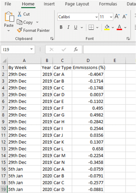
For demonstration purposes, in this article, I have used the dataset shown in the snapshot below. The dataset only has four columns with the columns containing vehicle emissions on different dates. Your dataset might be totally different to this, but the requirement should be the same to use this approach. So, the approach is that we need to create a line chart that shows the weekly emissions registered for each car over time, and we only want to display the weekly emissions for any car we select in the slicer, we do not want the chart to summarize all emissions for all cars at the same time on the line chart.
After importing this data into Power BI, we will follow the following steps to solve the problem.
- Display the emissions percentage data in a line chart visual
- Create a measure to display the emissions data for each week when a slicer selection is made
- Create a Card visual to display an alternative text for the line chart visual when no slicer selection is made and create a measure to display a text message for the car visual
- Adjust the size of the font of the text message and remove the category label before placing the Card visual at the front of the Line Chart visual
- Create a transparent measure and apply this to the Line Chart
STEP 1 – Display the emissions percentage data in a line chart visual
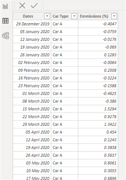
After transformation in Power Query, the above dataset is now as shown in the diagram below with date columns prepared for reporting. To see how these transformations were completed please take some time to go through my article on transforming data in Power Query.
Please note that for the purpose of this demonstration I have not created a Date Calendar table as I can utilize the Dates column in the data we have here since we do not require any time intelligence calculation.
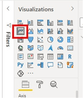
To create the line chart, just click on the line chart visual on your Power BI Desktop as seen in the diagram below.
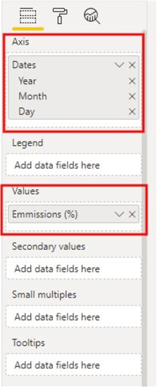
Then, either click down and drag or check the date column into the line visual Axis section and the emissions values into the “Values” section as shown in the diagram below.
We will create a new measure for the emissions later. We can also add a slicer for the Cars now. See the initial look of the line chart as seen in the diagram below.
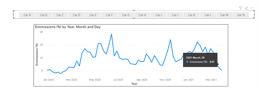
You can see that we have an emission of about 47% on March 28th, 2021. However, this is a summary or sum of all emissions on that date as we did not select a Car on the slicer. So, we want to prevent that confusion for users, so they only see the emissions values when a slicer is selected and only related to a particular Car at a particular date. That takes us to step 2.
STEP 2 – Create a measure to display the emissions data for each week when a slicer selection is made
This measure is quite straight forward as shown below.
Car Selection =
IF (
    ISFILTERED ( EmmissionsData[Car Type] ),
    SUM ( EmmissionsData[Emmissions (%)] ),
    BLANK()
)
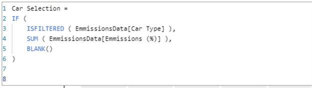
What the measure is saying is, if we select a car in the slicer, then show us the sum of the emissions (%) for that car, otherwise, return a blank. You can learn more about the ISFILTERED function here.
Next, we need to replace the emissions (%) field we used earlier in the line chart with this “Car Selection” measure as seen in the diagram below.
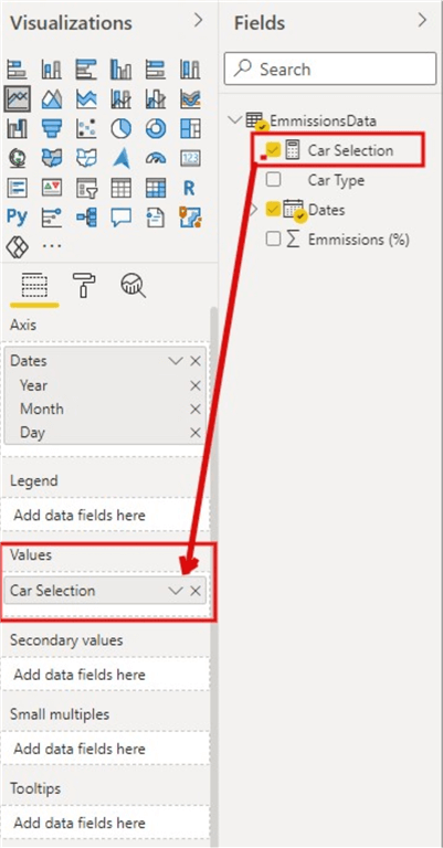
Once the measure has been applied on the Values section, you would observe that you cannot see the values and the line on the Line Chart anymore unless you select a car on the slicer. We are getting there. We need to go to step three now.
STEP 3 – Create a Card visual to display alternative text for the line chart visual when no slicer selection is made and create a measure to display a text message for the car visual
Here, instead of leaving the Line Chart space blank and empty when no slicer selection is made, which can be a bit confusing to the end users, we will create a card visual on top of the Line Chart visual to display a message to let the users know what to do to display the car emissions information of a particular car selected in the slicer on the Line Chart.
First, we create the measure as seen below.
Message Text =
IF (
    ISFILTERED ( EmmissionsData[Car Type] ),
    "",
    "You must first select a Car Type from the slicer above to see emissions values for the Car"
)

The measure simply says if a Car Type is selected in the slicer, then return an empty chart, otherwise, when no slicer value is selected, then return the text "You must first select a Car Type from the slicer above to see emissions values for the Car".
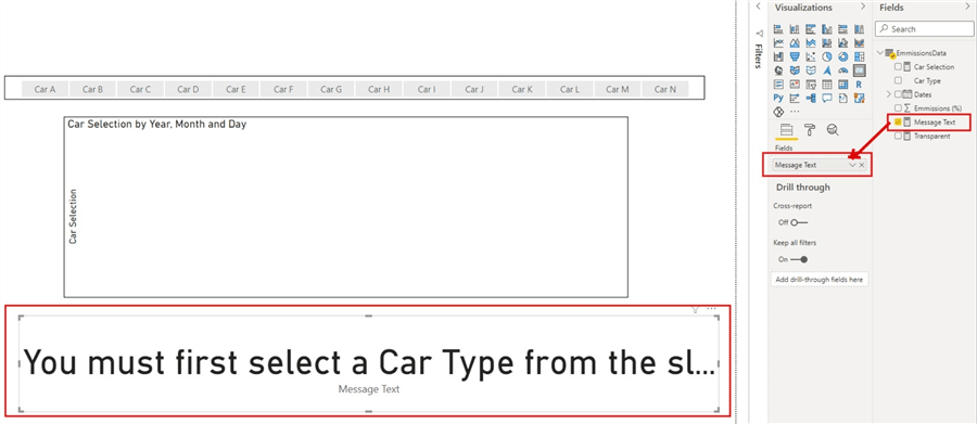
Next, we select a card visual type and drag in the new “Message Text” measure into the card visual as seen in the diagram below.
STEP 4 – Adjust the size of the font of the text message and remove the category label before placing the Card visual at the front of the Line Chart visual
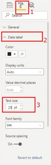
We now need to make the Card visual look more appealing to meet the purpose of the task. First, we need to reduce the font size of the text in the card. To do this, click on the Card visual, go to the “Format” pane, expand the “Data label” section, change the “Text size” to like 25 (you can change it to any value that suits your particular need).
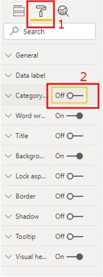
Next, we need to remove the category label (i.e. “Message Text” label at the bottom of the Card visual). To do this, go to the “Format” pane, navigate to the “Category label” on the pane and deactivate it as seen in the diagram below.
Next, we now need to place the Card visual on top of the Line Chart as seen in the diagram below.
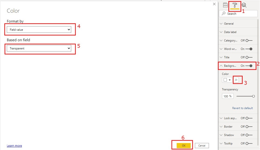
STEP 5 – Create a transparent measure and apply this to the Line Chart
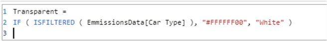
The next step is to create a measure that would ensure that when there is a value selected in the slicer, then the background color would be transparent, otherwise it would be a white background color.
The measure is created as shown below.
Transparent =
IF ( ISFILTERED ( EmmissionsData[Car Type] ), "#FFFFFF00", "White" )
Next, we need to apply this measure on the Card visual (Note: not the Line Chart visual). To do this, click on the Card visual with the Line Chart visual, then navigate to the “Format” pane, expand the “Background” section, select the conditional format icon. To configure the conditional formatting window, follow the diagram below and ensure the transparency is set to 100 (although you can adjust this as it fits your requirements).
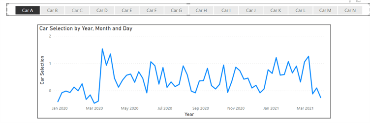
Once these steps are completed, the task is now complete (you can continue to add other formatting as you like). You should now be able to see that when you select a Car Type on the slicer, the Line Chart renders the emissions values accordingly as seen in the diagram below.
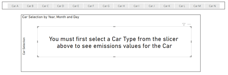
On the other hand, when no slicer selection is made, the Card visual text is rendered as seen in the diagram below.

In summary, it is worth noting that this technique can be applied to most visuals in Power BI, you might just need to change some bits of the approach in some visuals if its not straight-forward, but the approach should always work.
Next Steps
- See this YouTube video from Excel Basement Private here.
- Checkout this similar article by Excellerator BI here.
- Checkout this article by SQLSkull here.
- Try this tip out on your own data as business requires.

Kenneth A. Omorodion is a Microsoft Certified Solutions Associate (MCSA) with 12+ years of enterprise application experience in Power BI, DAX, Microsoft Fabric, Business Intelligence, data warehousing, SSRS, T-SQL, and Azure. Beyond his technical skills, Kenneth has expertise working with stakeholders’ and business leaders to help them better understand key insights. He has a great track record of successfully delivering full life cycle Business Intelligence and data solutions to organizations with measurable business impact.
- MSSQLTips Awards
- Achiever Award (75+ Tips) – 2025
- Author of the Year-2021
- Author Contender-2022/2023/2024

Very helpful. Thanks for compiling the article.
Hi there,
Thank you for your article. However I have a small question: how can we do so that the measurement
Message Text = IF (ISFILTERED ( EmmissionsData[Car Type] ), “”, “You must first select a Car Type from the slicer above to see emissions values for the Car” )
accept multiple transparency settings?
In my case, I am modifying a project management site and I want my title to display when in the filters I have either selected ‘title’ or ‘DE’ which corresponds to the code of the project, otherwise display ‘You must first select a project’. I tried to do
Message Text = IF ( ISFILTERED ( Project[Title] ), ISFILTERED (Project[DE]), “”, “You must first select a project” )
but it does not accept more than 3 arguments… Do you have any idea how I could do it? Thanks in advance !
Hi Mohnish,
If i understand your requirement properly, you wish to be able to access the tooltip information on the Line visual without the Balnk card visual overlaying it. If thats the case, although the purpose of this article was to ensure that only when a slicer selection is made should a line visual reflecting the selection show. When you make a selection, the line chart that renders allows you to interact by viewing the tootip, without selection nothing renders and hence no tooltip expected.
But if you wish to send the Blank screen back, am not sure how DAX could help on that though, and it will totally overhaul the purpose of this requirement. But you can send visuals back using the “Send Backwards” feature in Power BI Desktop.
Thanks,
Ken.
Thank you for this article.
Further to this, I’m facing another problem.
As the Message/Transparent card is in front of the Line chart (original visual), it disable interacting with the original visual like showing Tooltip, clicking on the original visual etc…
Any suggestion to send the Message/Transparent card to the Back of the original visual. Can we send the visual to Back/Backward using DAX?
Great question. Same for me. Solution is really unusable without the ability to interact with the visual. Still investigating a work around. Nothing yet.
Hi Thanks for the workaround. When I make multi vaue selections in the same field. I’m unable to see table values. Please suggest