Problem
Microsoft Power BI Desktop is a comprehensive data visualization tool and using a sunburst chart is very useful for comprehending hierarchical data structures. One ring or circle represents each level of the hierarchy, with the innermost circle serving as the hierarchy’s top level. Without hierarchical information (only one level of categories), a sunburst chart resembles a doughnut chart. This article will highlight the importance and steps of creating a sunburst chart in Power BI Desktop.
Solution
In this tutorial, we look at how to visualize data by displaying hierarchical data sets in a sunburst chart (a.k.a. the radial tree map, ring chart, multilevel pie chart, and belt chart).
In many different scenarios, from business use cases to research work, pie charts often spring up when one needs to analyze the content of a category—for instance, using pie charts to visualize total sales by different product categories. However, when we are posed with multi-level, hierarchical datasets, a typical pie chart does not suffice. This is why using a sunburst chart as shown below provides deeper insight.
What is a Hierarchical Dataset?
We usually associate the term hierarchy with different levels. Similarly, hierarchical data comprise datasets with a nested, tree-like structure with a parent-child relationship. The child record only has one parent, while the parent record has one or more children. A good example to understand the concept is that an employee can be a child of a department or a division, and the division itself is a child of the company – hierarchical levels. Now, we need to consider its components to see how a sunburst chart can visualize such hierarchical relationships.
Anatomy of a Typical Sunburst Chart
A sunburst chart consists of the following:
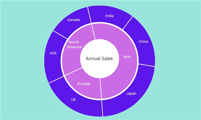
- Root node: The central circle of the sunburst chart represents the root nodes, the highest node in the dataset. It has no parent nodes as it represents the highest level in the hierarchy, although it can have multiple child nodes. As shown in the illustration above, Annual Sales form the root node of the sunburst chart.
- Rings: The rings or concentric circles represent different levels of hierarchy in the dataset, with the innermost ring forming the first level and the outermost ring being the lowest level. In our sunburst chart illustration above, the purple ring represents continental regions, creating the first level of the hierarchy, followed by the blue region, which encodes the different countries.
- Sectors: These form the individual sections of the sunburst chart and illustrate the parent-child relationship in the dataset. In our example above, Annual Sales is one sector that is a parent node of North America, Asia, and Europe. The three purple sectors are the child nodes with the white parent node. However, moving down the hierarchy, North America is the parent node of Canada and the USA. The hierarchy moves outwards from the center, and the size of a sector is directly proportional to the amount it is encoding. Analyzing the example above, we can be certain that Asia has a greater weight of annual sales than Europe.
Additionally, sunburst charts are usually color encoded. Each sector also has its text label and the numerical quantity it encodes.
To understand the importance of a sunburst visualization, we should consider that:
- It is a highly compact visualization that sums up the data from multiple pie charts into one sunburst chart.
- They are also intuitive and easier to understand. Information can be easily absorbed, even immediately.
- Color encodings also allow categories to be differentiated or to highlight and bring attention to a specific trend.
- It is a multivariate visualization representing relationships between multiple variables compressed into a single visual.
Now that we have covered the fundamentals of a sunburst chart, it’s time for a more practical demonstration using MySQL Workbench and Microsoft’s Power BI.
Creating a Source Table in MySQL
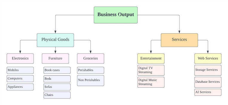
We will be creating our source table in My SQL Workbench. It will encode a conglomerate entity’s monthly sales by product, with a three-tier hierarchy comprising of type of output, the main product categories, and their subcategories as shown in the diagram below:
To get started, we will first create our database and then access it using the following commands:
CREATE DATABASE products;
USE products;
We will now create our source table by executing the following statements:
CREATE TABLE sales_by_products
(
    sub_category varchar(40),
    sales int unsigned,
    main_category varchar(40),
    product_type varchar(40)
);
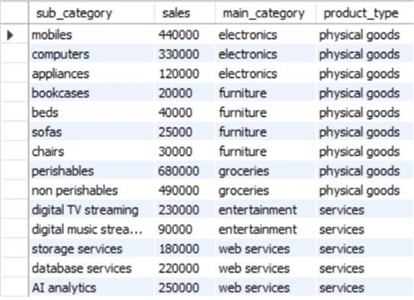
If we notice the syntax, our table will consist of four columns representing the subcategory and its amassed total monthly sales, alongside its main category and the product type. Now, to populate our table with relevant values, we will run the following statements:
INSERT INTO sales_by_products VALUES
("mobiles", 440000, "electronics", "physical goods"),
("computers", 330000, "electronics", "physical goods"),
("appliances", 120000, "electronics", "physical goods"),
("bookcases", 20000, "furniture", "physical goods"),
("beds", 40000, "furniture", "physical goods"),
("sofas", 25000, "furniture", "physical goods"),
("chairs", 30000, "furniture", "physical goods"),
("perishables", 680000, "groceries", "physical goods"),
("non perishables", 490000, "groceries", "physical goods"),
("digital TV streaming", 230000, "entertainment", "services"),
("digital music streaming", 90000, "entertainment", "services"),
("storage services", 180000, "web services", "services"),
("database services", 220000, "web services", "services"),
("AI analytics", 250000, "web services", "services");
To view our populated source table, we will execute the following command:
SELECT * FROM products.sales_by_products;
This will output our table, which looks like this:
Creating Sunburst Diagram in Power BI
Now that we have created our hierarchical dataset, with multiple parent-child relationships between the variables, we are ready to import our data to Power BI and construct a sunburst chart visualization.
Launch Power BI and implement the following series of steps:
Step 1
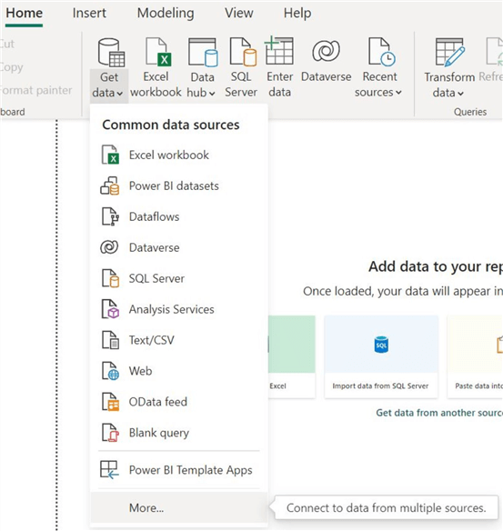
In the “Home” section, click on “Get Data” in the “Data” tab, and proceed to click on “More…” as shown below. We can see multiple data sources in the list below from which we can import our dataset. However, to view the extensive list, we need to click on “More”.
Step 2
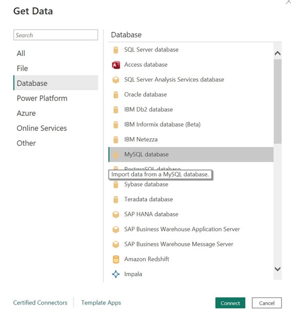
The “Get Data” window will appear. Click on “Database” below the search bar and find “MySQL database” towards the right, as shown below. Then click on “Connect” at the bottom of the window.
Step 3
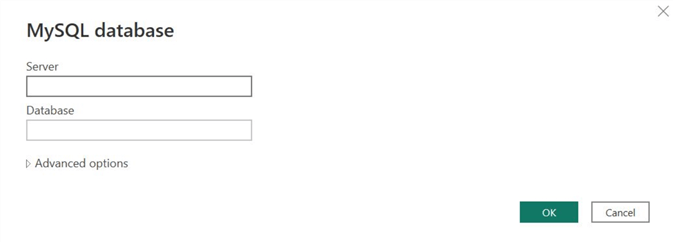
The “MySQL database” window will appear. Enter the relevant credentials related to your database and server and click “OK” at the bottom of the window.
Step 4
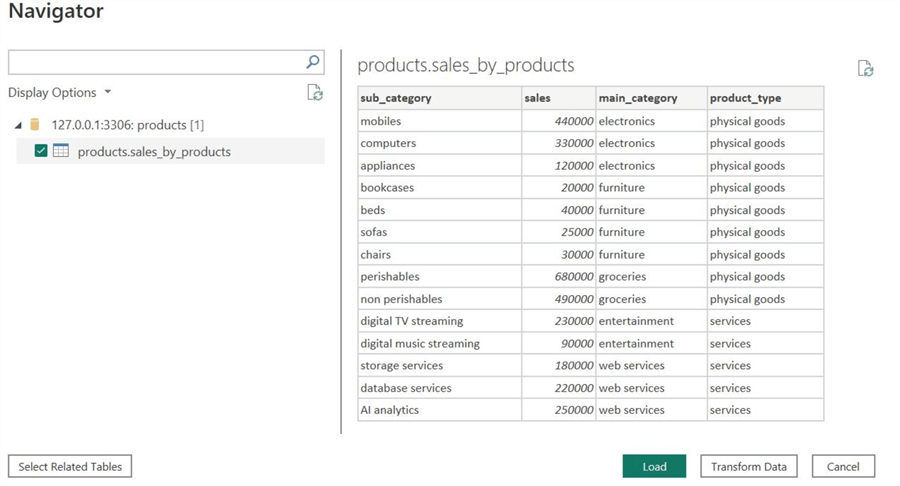
The “Navigator” window will appear if Power BI successfully establishes a connection with your database. Below the “Display Options,” select the table and click on “Load” at the bottom as shown. Power BI also allows us to preview our dataset at this stage and transform data if there is any anomaly in it. Since our dataset is clean and complete, we don’t need to go through this stage.
Step 5
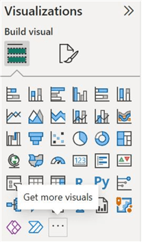
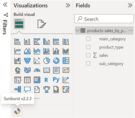
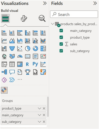
Once the dataset has been successfully loaded, under the “Visualizations” panel, click on the “…” as shown below to get more visuals. Power BI does not natively support a sunburst chart tool; therefore, we will need to install a third-party extension.
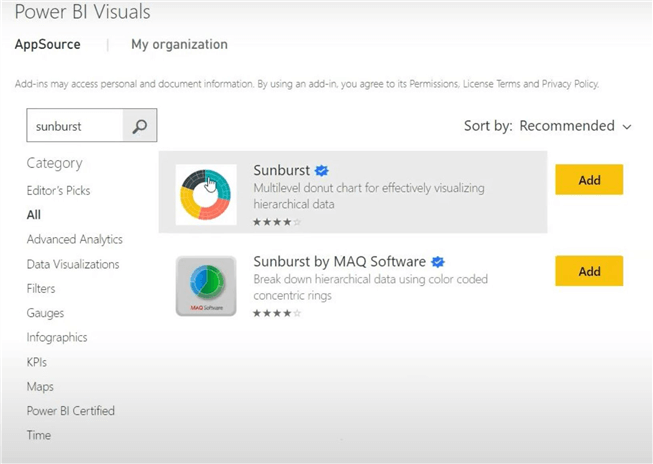
Step 6
The “Power BI Visuals” window will open. In the search bar, type “sunburst” and select the resultant option shown below. Click on “Add” to install the visual. To get more information about this visualization, we can click on its name and learn more about its functionality and developer information. In our case, this visual is verified by Power BI and created by Microsoft.
Step 7
Under the “Visualizations” panel, click on the sunburst chart icon, as shown below. This will create an empty outline of your visualization in the main working space of Power BI. Using our cursor, we can drag its corner and move it around to bring it to an ideal shape, size, and position.
Step 8
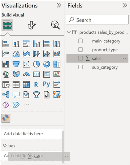
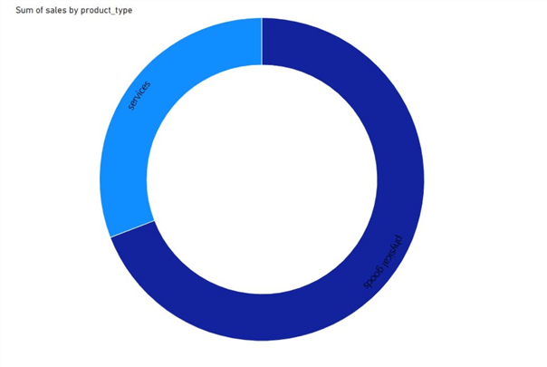
From the “Fields” panel, drag the “sales” column and insert it in the “Values” section, as shown below. This will represent the parent node of our sunburst visual.
Step 9
Similarly, insert the “product_type” column from the “Fields” panel into the “Groups” section, as shown below.
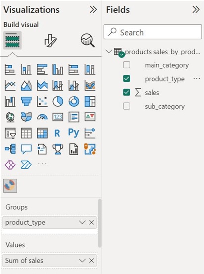
As shown below in the main working space of Power BI, this will form one of the concentric circles of our sunburst chart, representing a single level of hierarchy.
Step 10
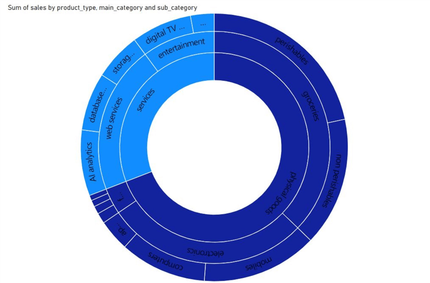
Insert the “main_category” column, followed by the “sub_category” column in the “Groups” section. Note: The order is important, and you should insert these categories ordinally, according to their rank in the dataset hierarchy.
We are now done with the major steps required to create a sunburst chart visualization in Power BI. We can observe our sunburst chart below. It is completed with all of its sectors and rings.
Customizations
If the above visualization left a bad taste in your mouth, it is completely justified since we are not done yet! This visualization tool offers a lot of customizations and formatting tools to ensure freedom in creating these visuals for practical purposes and to make them more desirable. To get started, under the “Visualizations” panel, click on the format icon, as shown below. Power BI has classified the formatting tools under visual and general categories.
Visual Formatting
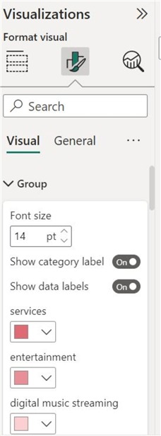
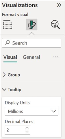
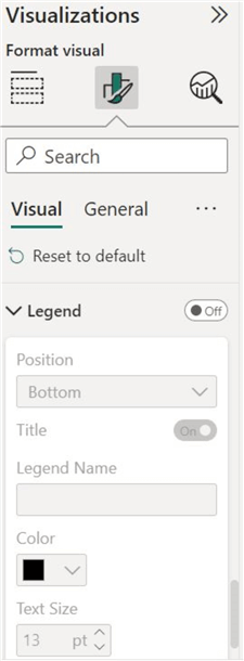
Under the visual category, we can modify groups, tooltips, and the chart’s legend, as shown below.
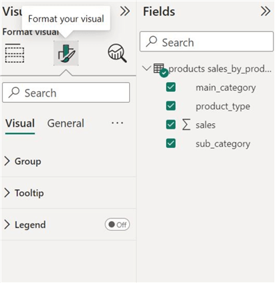
Group. We can enable or disable the category and data labels and change their font size. To make the visual more desirable, we have also altered the color scheming of the chart using this option.
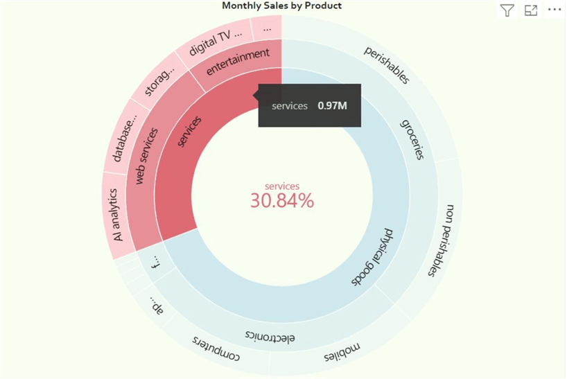
Tooltip. For readability purposes, we have changed the display units of sales to millions with an appropriate number of decimal places.
Legend. Here, we can change whether we want our diagram to have a key. Since our sunburst chart’s color scheme is self-explanatory, we are not enabling the legend.
General Formatting
Under the general header, we can alter the chart’s properties, title, header icons, and so on, as shown below.
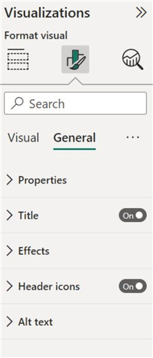
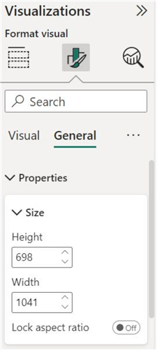
Properties. Under this section, we can change the dimension and the position of our visual with more precision.
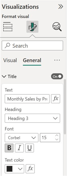
Title. Here, we can give our chart a more meaningful and descriptive title. We can also change the title’s font, size, and color, as shown below.
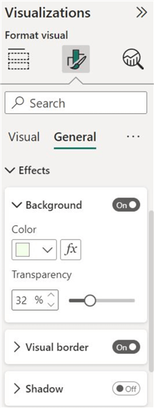
Effects. Under this section, we can give our sunburst visual a different background color than the default white. We also have the option of introducing border effects.
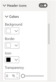
Header icons. Here, we can enable or disable header icons and change their appearance.
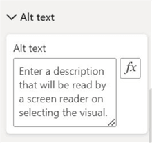
Alt text. We can also write an alternative description to our sunburst chart here.
Now, we are ready to view the finalized version of our sunburst chart:

It is much easier on the eyes, and the color scheme does not interfere with the text labels of different sectors.
We can also click on any sector to get more qualitative metrics. Clicking on a sector will highlight all of the branches of that node, as shown below:
Conduct Analysis
Now, we are finally in a position to analyze the entity’s monthly sales by product categories. At a glance, we can confidently state that physical goods form this enterprise’s major chunk of sales. The enterprise also performs greatly in grocery, electronics, and web services sales. Relative to all other categories, the furniture category yields the lowest sales.
It is important to note that all the comparison above is made in isolation. To enhance analysis, these performance metrics are usually compared with the metrics of other firms and industry averages.
To summarize, in this article, we have demonstrated the fundamentals of the sunburst chart alongside its components and importance. We then presented the steps to create a hierarchical dataset in MySQL. Then we built a sunburst visualization atop that dataset in Microsoft’s Power BI, with an analysis of the outcome. This could also be done using any other data platform such as SQL Server.
Next Steps
- Check out all the Power BI Tips on MSSQLTips.com

Harris Amjad currently works as a Software Engineer at Strategic Systems International. He is Microsoft Certified Data Analyst and Microsoft Certified Trainer. A rigorous, task-driven Data Enthusiast with substantial experience in Data Science, Data Analysis, and Data Engineering.
- MSSQLTips Awards: Trendsetter (25+ tips) – 2024 | Author Contender – 2023, 2024 | Rookie Contender – 2022
