Problem
In the last tip, we learned how to forecast on time series based data using Power BI Desktop. Another important aspect of analyze time based data is finding trends. From a reporting perspective, a trend may be just a smooth lasso curve on the data points or just a line chart connection data points spread over time. From an analytics perspective the trend can have different interpretations. In this tip, we will learn how to analyze trends in data from an analytics perspective using Power BI Desktop.
Solution
Power BI provides options to draw a trend line for visualizations using scatter plot charts and line charts.
First, we need data to populate a visualization on which we will create reference lines. I recommend installing the AdventureWorks sample database, which has a number of tables to populate visualizations with sample data. Assuming that the sample data is available, open the Power BI Desktop and click on the Get Data menu. We need to connect to the data source where you have the sample data and import the same. In this tip, we will be using the FactInternetSales table from the AdventureWorks database by following the steps mentioned below.
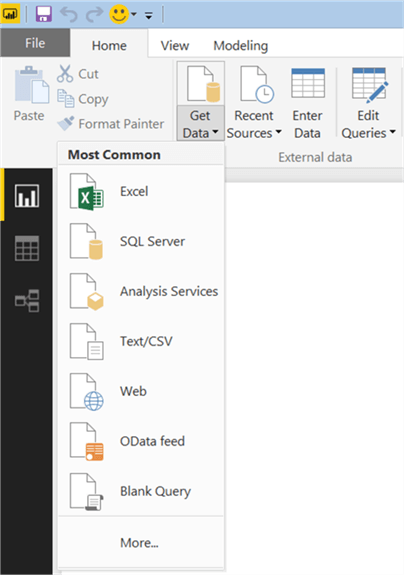
Click on the Get Data menu in the Power BI user interface as shown below. This should bring up options to select from a list of different data sources. In this case, the data is hosted in SQL Server in the AdventureWorks database. Therefore, we will select SQL Server as the data source.
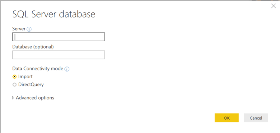
After selecting the data source, the next step is to provide connection details / authentication credentials as shown below. Provide the server name and optionally the database name on which the data is hosted. It is recommended to provide the database name as the connecting string to SQL Server needs to be part of the connection. The next option is Data Connectivity mode for which there are two options. Either we can import data into the Power BI or the data can be read directly from the data source while the report is being processed. There are certain options Power BI options that require data in a specific format to enable analytics related features. So consider selecting the Import option for now.
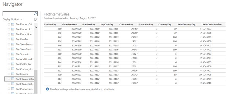
After you select the same, you will be presented with a list of different tables and views hosted in the database to which the connection has been made. Select and load the FactInternetSales table as shown below.
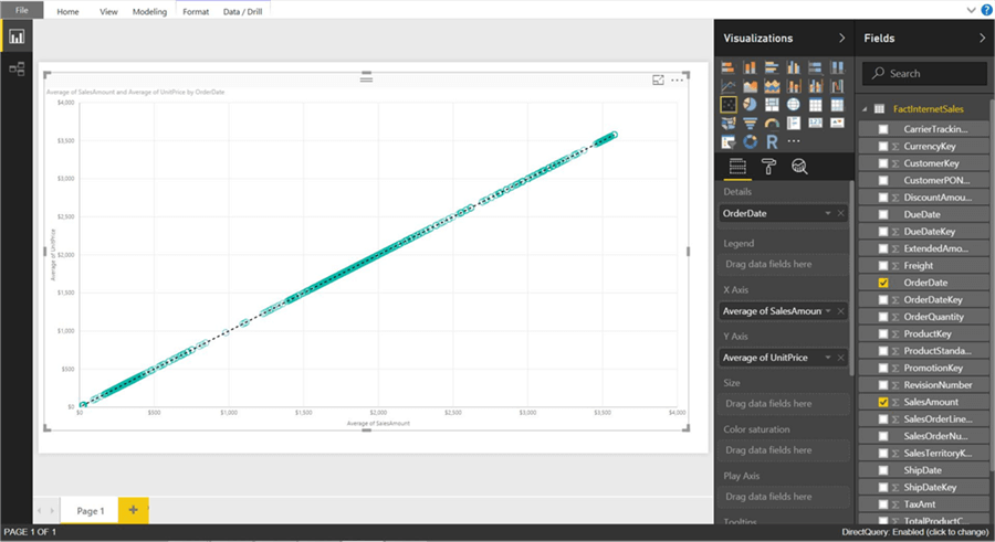
One standard method of analyzing two numerical values on a graph is by using scatterplot graph. In a scatterplot, each value has an X-axis and Y-axis and is plotted on the graph using the values of two scales. We can use the fields as Average of UnitPrice and Average of SalesAmount. We also want to see this comparison over time, so select the OrderDate field in the Details section. The reason for selecting the same is that we want to project data over time. So select the scatterplot icon from the visualizations pane and create a blank scatterplot graph on the report layout. Select this blank graph, and add the fields as discussed above. This will create a scatterplot chart of average of unit price vs average of sales amount over time.
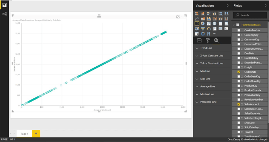
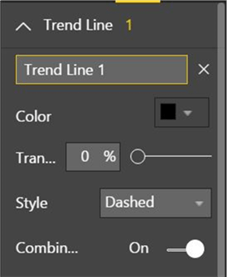
Here the chart seems to show linear relationship as the points seems to be organized in a straight linear line, but we cannot be sure just by reviewing visually. The chart seems to show a series of points that are closely overlaid near or on the top of each other. We need an explicit indicator of the same, like a project trend line on this data. Power BI provides options to draw a trend line by studying the data in the graph. To accomplish the same, click on the analytics pane, and you should find a trend-line option as shown above. Click on Add to create a new trend line. You can format the different options as shown below.
After adding the trend line, the graph should look as shown below. This looks very trivial as we can create a trend using a line chart. However, this trend is more like a linear trend line used in linear regression methods where the best-fit line passes through the minimum of squares distance / variance from all the points in the plot. This may sound statistical and may be confusing too. However, here you do not have to learn the linear regression formula to find best-fit line and draw trends, so do not bother about the statistics behind it. If you are interested in linear regression, you may want to refer the Machine Learning Tutorial where statistics and linear regression using SQL Server and R have been discussed.
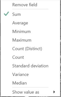
Now let’s try a different aggregation to look at a different trend. Instead of average of Sales Amount, change the aggregation to Sum of Sales Amount. To change the aggregation, you just need to right-click on the field and select the aggregation of choice from the menu as shown below.
After making the change, the trend would look as shown below. This shows that the trend is negative. As the average of unit price decreases, the sum of sales amount increases.
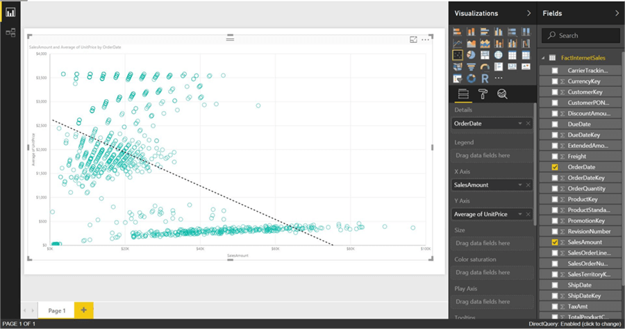
From this limited trend analysis, without looking at the data, one can make an initial assumption that as the average of unit price of products increases, the sum total of overall sales decreases, but the average of sales increases. This indicates that for expensive products the total sales is low. As the number of products sold are less and the unit price is high, the average keeps on increasing shown a linear positive trend. In this way, trend lines enables quick interpretation of data using different aggregations with trend lines.
In the next part of the Power BI Analytics tip series, we would learn how to classify data in clusters using Power BI Desktop.
Next Steps
- Try applying trends on your data of interest to make high-level derivations without looking at individual data transactions.

Siddharth has more than 14 years of experience in the IT Industry, with more than a decade of experience in Business Intelligence and Analytics, for clients banking, logistics, government, Media Entertainment, products, life sciences and other domains. He has been a lead architect for a portfolio of 40+ apps, containing apps in web, mobile, BI, Analytics, data warehousing, reporting, collaboration, CMS, NoSQL and other technologies. He has several certifications and is a published author for online and print-media publications, as well as the MSDN Library.
In his present role, he remains responsible for architecture design, technology stack selection, infrastructure design, 3rd party products evaluation and procurement, and performance engineering. These applications use technologies like Elasticsearch / Lucene, MongoDB, SharePoint 2013 and 2010, jQuery-based framework like Highcharts and GoJS, SQL Server and the Microsoft Business Intelligence stack (SSIS, SSAS, SSRS, MDX, PowerPivot, PowerView), jQueryMobile, Bootstrap, iOS xCode framework, and many others.
- MSSQLTips Awards: Champion (100+ tips) – 2018 | Author of the Year – 2017 | Author Contender – 2016, 2018-2019

I think it is called “Ratio line” now. Did you try that option to see if that works?
Please use dates for your articles so we can see if they are relevant for our versions of PowerBi. It seems this solution is no longer useable in 2023.