Problem
Microsoft Power BI Desktop provides a wide variety of certified custom visuals. Sometimes one wants to highlight the key performance indicators, justifications, and supporting evidence; in that case, Power KPI visual provides all the support to fulfill this need. It has many key elements like KPI status along with support for line charts, forecast lines, and comparisons as well. The wide variety of options makes it easier to get the requirements fulfilled. In this tip, we will use this custom visual and guide you through each step to maximize the usage of this visual.
Solution
With the large influx of information in our current digital atmosphere, organizations are likely unable to fare well if they delve into the collected data without leveraging appropriate data visualization techniques. When visuals are channeled through a sense-making lens, they derive a story and help make sense of the data available to important business stakeholders. How much revenue has the business generated? How satisfied are the customers with their products or services? Is the business market share increasing? All of these questions raised by stakeholders can be addressed by interpreting the data through a Key Performance Indicator (KPI) visual.
A KPI evaluates how an organization is performing in different aspects by analyzing quantifiable actual values available from the data against a target determined by the stakeholders. A KPI visual communicates the same information graphically – how much progress (or regression) a business has made towards a measurable goal. A typical KPI visual is illustrated below:

Now that we have introduced the basics let's deconstruct the different parts of a typical KPI visual:
- Actual Value: It is the base value that is being measured and tested against the set target value. Data may be in a categorical or continuous form and is generally encoded as numbers or percentages. For example, considering the above illustration of a KPI visual, we can see that it’s mapping the prior year’s sales of an entity, with the actual sales reaching 400.
- Target: As suggested by the name, this measure forms the absolute value which the actual value is compared against. In short, it represents the performance level a business aims to attain for a certain KPI and is used as a benchmark to assess whether the actual performance meets expectations. The above visual shows that the target set for prior year sales was 350.
- KPI Index: This metric categorically encodes the relationship between the target and actual value. For example, if the actual value exceeds the target, the KPI index can be encoded as 1; otherwise, it can be set to 0.
- Status Indicator: This is a color-coded status indicator that provides a quick way to interpret the performance of the KPI based on the KPI index. Building upon the previous example, if our KPI index for a particular month's sale is ‘1’, we can use a green symbol to indicate that the KPI exceeds targets.
KPIs are very useful in assessing the overall standing of a business entity. They evaluate in which department the KPIs are being met and in which the performance is rather lackluster. Not only that, but at a micro level, KPIs are useful to measure the relative performance of different metrics and map their rate of progress. The visual is also important for the following reasons:
- It simplifies complex datasets and condenses information in a clear and easy-to-understand format, allowing decision-makers to quickly grasp the key insights and make informed decisions.
- It is likely to fish out patterns and trends that may need to be more apparent from a table of numbers.
- It effectively communicates insights to others, saving time when engaging stakeholders and communicating key messages.
Now that we have covered the basics and importance of a KPI visual, we will move to a more practical demonstration. First, we will create a source table in MySQL Workbench and then work with that dataset in Microsoft’s Power BI to create a KPI visual.
Creating a Source Table in SQL
For analytical purposes, we will be considering a certain entity’s sales. Our SQL schema will comprise the monthly dates at which the sales data was computed, actual and target sales for that period, and the previous year’s sales.
To get started, we will first create our database and then access it using the following commands:
CREATE DATABASE kpi_sales;
USE kpi_sales;
After completing this step, we can create our table to store the relevant sales data for the entity’s flagship product. The column names tell much about the data that we are capturing. The following command will be executed:
CREATE TABLE annual_sales
(
    sales_date date,
    actual_sales int unsigned,
    target_sales int unsigned,
    prior_year_sales int unsigned
);
We can now populate our table with relevant data points by running the following command:
INSERT INTO annual_sales VALUES
("2021-01-31", 100000, 100000, 60000),
("2021-02-28", 110000, 102000, 55000),
("2021-03-31", 190000, 103500, 57000),
("2021-04-30", 180000, 105000, 55000),
("2021-05-31", 200000, 110000, 62000),
("2021-06-30", 250000, 113000, 67000),
("2021-07-31", 290000, 152000, 70000),
("2021-08-31", 360000, 187000, 78000),
("2021-09-30", 400000, 240000, 80000),
("2021-10-31", 401000, 330000, 89000),
("2021-11-30", 402000, 340000, 98000),
("2021-12-31", 405000, 350000, 102000);
To view our populated table, we will run the following command:
SELECT * FROM sales.annual_sales;
This will output our source table on the screen, which looks like this:

Creating Custom Power KPI Visual in Power BI
Now that we have created a dataset, we will export it from MySQL to Power BI to create a KPI visual.
Step 1
In the “Home” ribbon of the Power BI main interface, click the “Get data” option in the “Data” section, and then click “More…” as shown below. This will yield a variety of sources from which you can import your dataset.

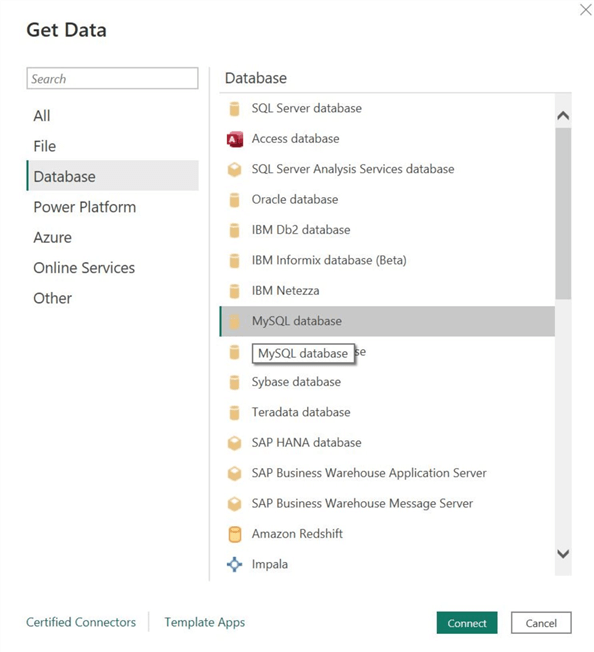
Step 2
The “Get Data” dialog box will appear. Click on “Database” below the search box, and then click “MySQL database,” as shown below. Then click “Connect” at the bottom of the window.
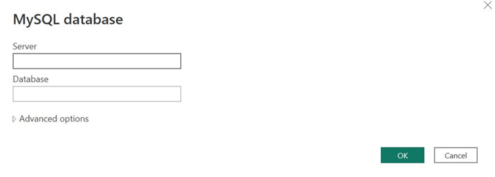
Step 3
Another dialog box will pop up and prompt you to enter your MySQL database server details. Enter the server IP and database name, and click “OK.”
Step 4
When Power BI has successfully established a connection with your database, the “Navigator” window will appear. Below the “Display Options,” select the relevant table (kpi_sales.annual_sales in this case). Power BI will also allow us to preview the selected table(s). If there are any anomalies in the dataset at this stage, we can use the “Transform Data” option instead of loading. Although no wrongful or missing data points exist in this case, we still need a column representing the KPI indicator index. Therefore, we must click “Transform Data,” as shown below.

Step 5
This will prompt the “Power Query Editor” to launch. Ensure that the correct table is selected under the “Queries” panel. Afterward, click the table icon and select the “Add Custom Column…” option, as shown below.
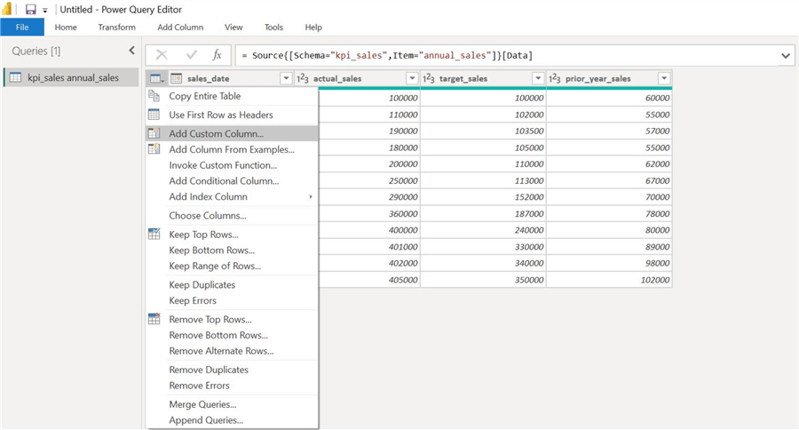
Step 6
The “Custom Column” dialog box will open. We will name our new column “KPI_index” in the “New column name” input field. Then, we will utilize the following formula in the “Custom column formula” field:

This code snippet belongs to Data Analysis Expressions (DAX), a formula expression language used in Power BI. The above formula is simply categorically encoding the continuous actual_sales and target_sales variables. If the ratio of actual_sales and target_sales is greater than 1, our KPI index will hold the value 1; if the ratio is equal to 1, KPI_index will hold the value of 2; if the ratio is less than 1, the value in the new column will be 3.
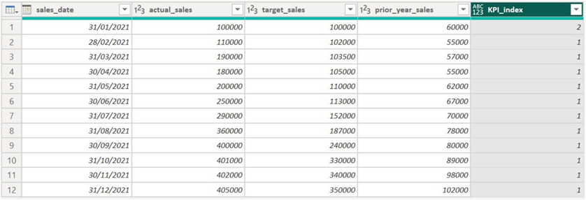
After clicking “OK,” we can observe the new column in the “Power Query Editor”:
Step 7
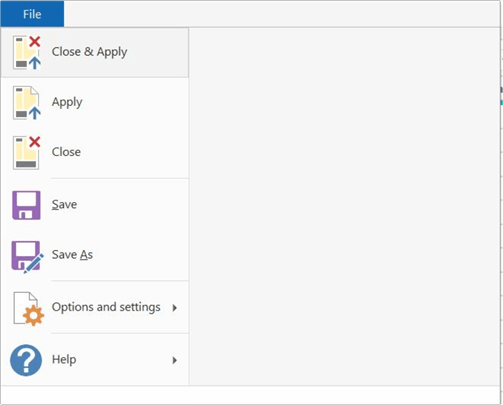
With the data manipulation complete, we can exit from the query editor and load the dataset in the main interface of Power BI. As shown below, click “File” at the top left and click “Close & Apply.”
Step 8
Although Power BI offers a native version of a KPI visual, we will instead employ the Power KPI visual, which is an added extension. To get Power KPI, in the “Visualizations” section, click on “…” and then “Get more visuals,” as shown below.

Step 9
The “Power BI Visuals” window will appear. Search for “Power KPI” in the search box and add the first option, as shown below. Note: The Power KPI visual is verified by Power BI and developed by Microsoft.

Step 10
To create our visual, select the Power KPI icon in the “Visualizations” section, as shown below. This will create an empty visual in the main workspace of Power BI. Now, we will reshape it and change its position using our cursor to make the visual appearance more appropriate.

Step 11
Now we are ready to populate our visual. As shown below, in the “Axis” field, we will input the “sales_date” column as we need to observe our sales data series over a period of time.

For the “Values” field, we will input the “actual_sales,” “target_sales,” and “prior_year_sales” columns. We are interested in observing the relationship between these variables.

Lastly, we will add our “KPI_index” column in the “KPI Indicator Index” field.

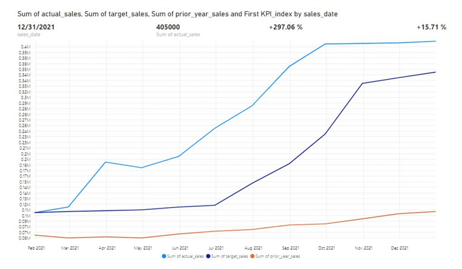
We can now observe a prototype version of our KPI visual below. We can see in the legend that the light blue line encodes the actual sales for 2021, and the red line represents the previous year’s sales data points. We can also observe the dark blue target sales trend. At the top of the graph, KPI for this year is present in green, alongside another KPI metric in black, which compares the current year’s data points with the previous year’s.
Customizations
However, we are not yet done! The Power KPI offers many modifications and formatting tools, allowing a more flexible, context-based visual. In the “Visualizations” panel, there are two main streams for formatting in the “Format your visual” option.
Visual Formatting
Under this section, we find numerous parameters to alter and directly affect how the visual conveys the information. Since there are numerous editing options, we will review a select few that are suited to edit for our current visual.

KPI Indicator. This allows us to alter the presentation of our KPI indicator in the visual. We can change the size, position, and the KPI's symbol and color. Moreover, we can have up to 5 distinct KPIs in our visual.

Line. Here we can alter the color, thickness, and opacity of the line. It is important to ensure a uniform color scheme with the actual data points and contrast them with the target trend. We can also choose to have an area graph instead of a line one by changing the “Type” field, as shown below:

Legend. Here we can enable or disable a key for our diagram. If enabled, we can also alter its size, font, and positioning in the diagram.

X Axis. Apart from altering the formatting of our x-axis, this section also allows us to set whether the variable encoded in the x-axis is categorical or continuous.

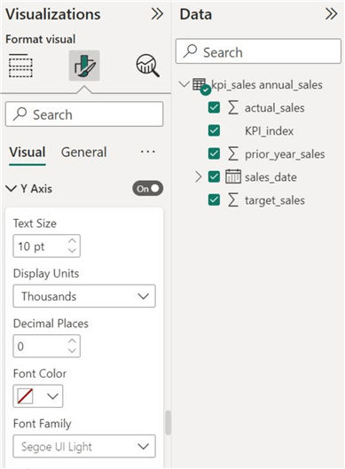
Y Axis. Similarly, we can also alter the formatting style of the y-axis, alongside changing the display units and the required number of decimal places for our sales data, as shown below:
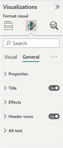
General Formatting
Under this formatting stream, we can edit the attributes of our chart that are generally common to all of the visuals. These attributes are shown below:
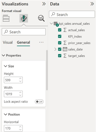
Properties. This section allows us to alter the size and position of our chart more precisely.
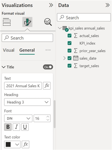
Title. We can also choose to give our chart a more descriptive and concise name, as shown below:
Effects. To make our visual less ‘plain’ and differentiate it from the rest of the workspace, we can also give it a background color. Bright and dark colors should be avoided.

Now our visual resembles a well-formatted KPI visual. The color scheme is more appropriate now, making it easier to differentiate between the target and actual data points. The axis presentation and title are also enhanced.

Conduct Analysis
Now we are finally ready to understand the story that is being conveyed by our dataset. Considering the prior year’s result, we see that although the business struggled in the initial months of the year, it managed to maintain a steady climb in its sales increased until the end of the year. Then shown by the 2021 data points, the business performed astoundingly well, with an exponential rise in the revenue collected. However, towards year’s end, exponential growth slowed, and the revenue remained around 15.7%, well above the target levels. Thus, our KPI visual tells us that the business has exceeded its sales goals.
In this tip, we have assessed the basics and importance of a KPI visual to a business entity. We demonstrated how to create our dataset in MYSQL Workbench and then created our KPI visual in Power BI.
Next Steps
- Check out all the Power BI Tips on MSSQLTips.com

Harris Amjad currently works as a Software Engineer at Strategic Systems International. He is Microsoft Certified Data Analyst and Microsoft Certified Trainer. A rigorous, task-driven Data Enthusiast with substantial experience in Data Science, Data Analysis, and Data Engineering.
- MSSQLTips Awards: Trendsetter (25+ tips) – 2024 | Author Contender – 2023, 2024 | Rookie Contender – 2022