Problem
By default, card visuals in Power BI do not slice information on a report page. They only show aggregated information (measures) about a KPI or metric. This aggregated information on the card visuals is usually dynamic in nature and changes based on a selected value on a slicer visual or a selected data point on the report page.
However, there are certain business report design requirements where the end users require that the card visuals act as the slicers on the report page rather than having a slicer visual. This may be due to several reasons, including simplicity of use of the report page, specific business requirements, space management of the report page, etc. In this article, I will demonstrate how you can turn your Power BI card visuals into slicers.
Solution
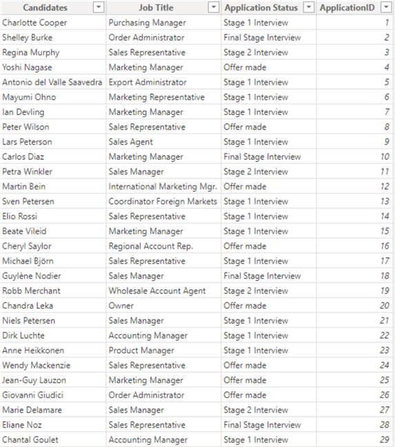
For demonstration purposes, I will use the sample dataset below with four columns containing information about the different stages of a candidate’s application process to get a job.
We will create card visuals for each “Application Status” and show information on aggregated values of the count of applications that fall into each application status. Then we will configure the card visuals to act like a slicer. We expect that once a card visual is selected, on the details visual (table visual) at the bottom of the page, only information relating to the selected card visual should be rendered, just like the usual slicer visual would do.
To help make this easy to follow, I will now break each task into steps as follows.
- Create a measure to calculate total applications.
- Create a measure to calculate applications for each application status.
- Add a card visual for each application status measure created in step 2.
- Overlay each card visual with a Blank button.
- Create a bookmark for each application status and link it.
- Configure the action on each card visual when selected.
Step 1: Create a Measure to Calculate Total Applications
This step creates the measure that calculates (aggregates) the metric you will show on the card visuals. In this example, we are aggregating the total number of ApplicationID, as seen in the code below.
Cnt App = COUNTX('Job Application Data', 'Job Application Data'[ApplicationID])
Note: You could also use the COUNT function to achieve the same result.
Step 2: Create a Measure to Calculate Applications for Each Application Status
Here, we need to create four measures; each will leverage the initial measure we created in Step 1, as seen in the codes below.
Stage 1 = CALCULATE([Cnt App], 'Job Application Data'[Application Status] = "Stage 1 Interview")
Stage 2 = CALCULATE([Cnt App], 'Job Application Data'[Application Status] = "Stage 2 Interview")
Final Stage = CALCULATE([Cnt App], 'Job Application Data'[Application Status] = "Final Stage Interview")
Offer Made = CALCULATE([Cnt App], 'Job Application Data'[Application Status] = "Offer made")
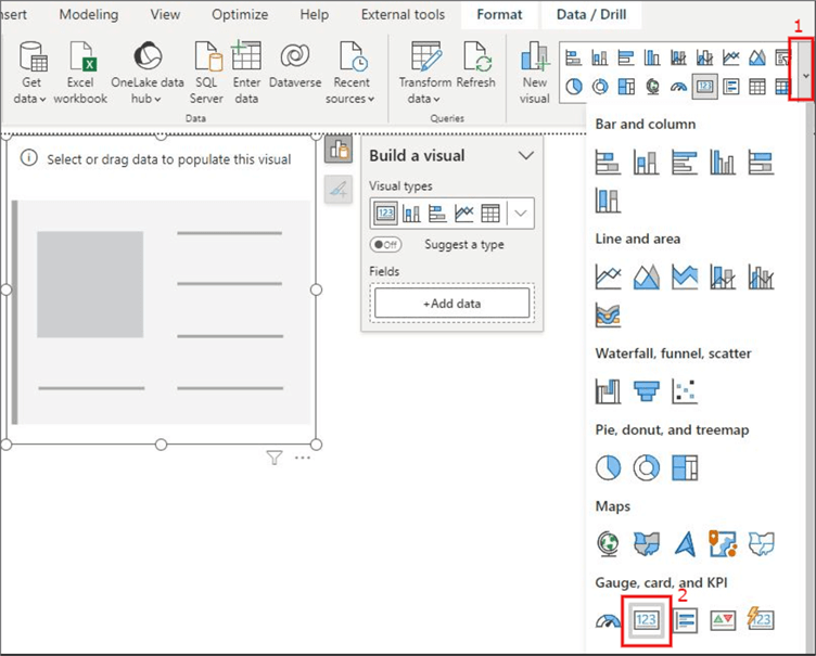
Step 3: Add a Card Visual for Each Application Status Measure Created in Step 2
In this step, we will add a card visual for each measure created in Step 2. Follow the descriptions on the image below to see how you can add a card visual to the page.
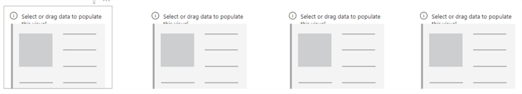
Once the first card visual is added, you can select the visual and press Ctrl + C on your keyboard to copy it and next Ctrl + V to paste the copied visual, as seen in the image below.
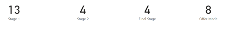
Next, we need to add the measures created in Step 2 into each visual to display the values, as seen in the image below. You may need to click on each visual first before attempting to include the appropriate measure.
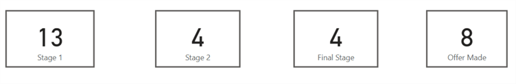
At this stage, you should format the name of each card visual and add a title as required.
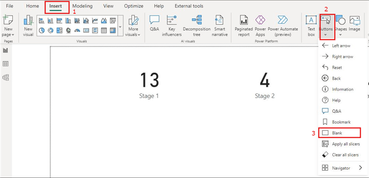
Step 4: Overlay Each Card Visual with a Blank Button
We need to get the “Blank button” and overlay it on each card visual. To get the Blank button, follow the instructs in the image below.
Like in Step 3, when we brought in the card visual, duplicate the Blank button to overlay each card visual, as seen in the image below.
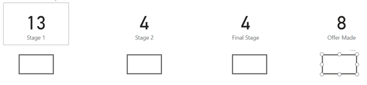
Next, as seen in the image below, we will overlay the Blank button on each card visual.
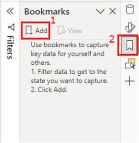
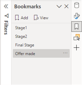
Step 5: Create a Bookmark for Each Application Status and Link It
Let’s create four bookmarks to represent our four card visuals. To make these bookmarks, follow the instructions in the image below. Please see this Microsoft documentation for more information on what bookmarks are for or how to create them.
If you cannot see the bookmark symbol in step 2 on the image above, all you need to do to display it is shown below. Likewise, You can display the “Selection” symbol, as you might need it later.

Once you click on the “Add” section on step 1 in the first image above, a new bookmark will be created called “Bookmark 1.” You might need to rename it accordingly. See the image below on the four bookmarks I have created and renamed for this demo.
Next, we need to link each bookmark created to each card visual and make them behave as we desire. To do this, we must first create a slicer visual for the “Application Status” column, as seen in the image below.
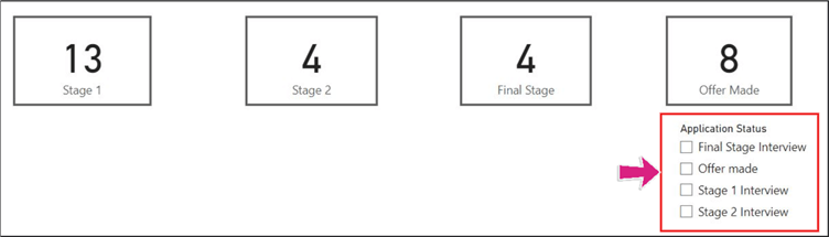
We also need to add a details table visual to let us see the output when the card visuals are used as slicers. See the table details visual in the image below.
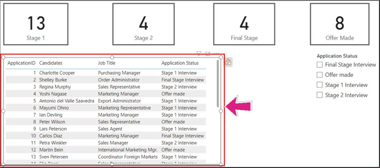
To link the card visuals to the bookmark and make it behave in a certain way, we need to select the slicer visual for each application status accordingly and then update it on the bookmark. The image below shows the desired behavior when we select the “Stage 1 Interview” on the slicer.
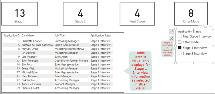
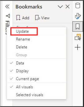
The image above is our desired behavior when we select the “Stage 1” card visual. Thus, we now need to update it on the bookmark. You might want to hide the slicer visual before updating it. To update each bookmark, either right-click on the bookmark name or click on the ellipses (…) at the end of the bookmark name. See the image below on how to update the bookmark for each card visual.
The above should steps be repeated for each card visual by first selecting the “Application Status” accordingly on the slicer visual. Once this is done, the linking is now completed.
Step 6: Configure the Action on Each Card Visual When Selected
The next step is to go back to the Format pane. Select the first card visual, and you should see the “Action” section of the Format pane displayed like in the image below.
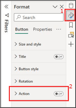
Note: You must select one of the card visuals to reveal the above image view.
Next, we need to activate the “Action” section by clicking on point 2 (image above), then expand the “Action” section to reveal other settings.
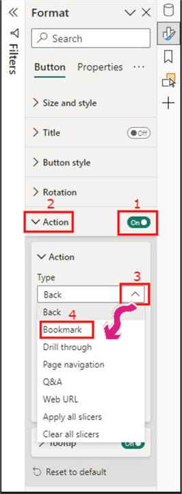
Then, on the “Type” dropdown under the “Action” subsection, click on the dropdown and select “Bookmark,” as shown in the image below.
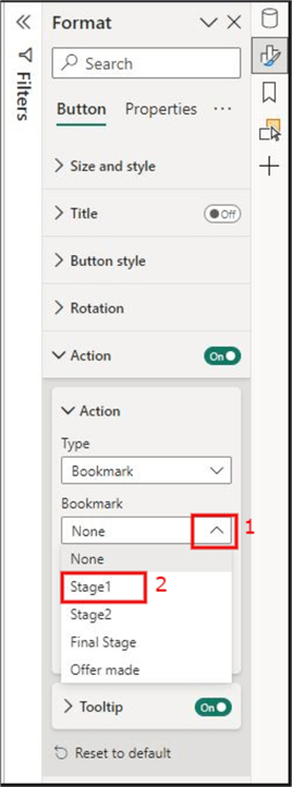
On the “Bookmark” dropdown under the “Action” subsection, click the dropdown and select the bookmark’s name associated with the card visual you chose earlier. In this case, we chose the “Stage 1” card visual earlier and need to select the associated bookmark as well. See the image below for more details.
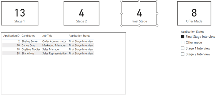
This process should be repeated for all card visual settings accordingly. Once this is completed, you can now try out the configuration. To do this, Ctrl + Click on each card visual to see how they now act like a slicer. For example, I have Ctrl + Clicked on the “Final Stage” card visual; the output is as seen in the image below.
In this article, I have demonstrated how to turn your card visuals into slicers in Power BI. The demo has been divided into six easy-to-follow steps. There are many ways to enhance this further. You may want to change the default tooltip on the card visual after the configuration. You may want the card visual to change colors on hover or on select. You might want to add a “Clear all slicers” button to ensure you can return to default settings when nothing is selected. You may also want to delete the slicer visual itself since it’s not required anymore. There are many enhancements to consider.
It is also worth considering overall model performance when choosing this technique, as it is known that the higher the number of visuals in your Power BI page or report can affect performance, particularly with larger models. This is impacted as we have added buttons on each card visual where we could have used a single slicer visual. I recommend this approach when only a few visuals are already on your report page(s). How “many visuals” is subjective!
Next Steps
- Read more about Bookmarks in the Microsoft documentation.
- You can see this Microsoft documentation for more details on card visuals.
- Read more about Power BI buttons in this Microsoft documentation.
- Check out Chris Webb’s article: Power BI Report Performance And The Number Of Visuals On A Page.
- Try this tip out in your own data as business requires.

Kenneth A. Omorodion is a Microsoft Certified Solutions Associate (MCSA) with 12+ years of enterprise application experience in Power BI, DAX, Microsoft Fabric, Business Intelligence, data warehousing, SSRS, T-SQL, and Azure. Beyond his technical skills, Kenneth has expertise working with stakeholders’ and business leaders to help them better understand key insights. He has a great track record of successfully delivering full life cycle Business Intelligence and data solutions to organizations with measurable business impact.
- MSSQLTips Awards
- Achiever Award (75+ Tips) – 2025
- Author of the Year-2021
- Author Contender-2022/2023/2024