Problem
R is a popular data modelling, analysis and plotting framework that can be used to work with data from a variety of sources. In this tip, we will follow on from SQL Server Data Access using R - Part 1 and show how to perform further data analysis and refinements, demonstrate more R functions, and show how to overlay and multi-plot R graphs. We’ll cover the methods seq, difftime, min and max, the vector object, the colnames method, implicit and explicit type conversions, the match method, for and if loops in R, the nrow and unlist methods, the sqldf package, overlaying graphs in R, multiplot, the concept of functions, the cbind method and using the dplyr methods to JOIN data.
Solution
Configuring the Environment
If you haven’t done so already, you’ll need to follow the steps in SQL Server Data Access Using R - Part 1 to install and configure your R/RStudio environment. You’ll also benefit from following the steps to import and refine the data before following along with the steps provided here. For your convenience, you can also run the R code given below, which will prepare your R environment for the rest of this tip.
install.packages("RODBC")
install.packages("dplyr")
install.packages("ggplot2")
library("RODBC")
library("dplyr")
library("ggplot2")
conn <- odbcDriverConnect('driver={SQL Server};server=localhost;database=AdventureWorks2012;trusted_connection=true')
data <- sqlQuery(conn, "SELECT * FROM Production.TransactionHistoryArchive;")
data <- select(data, TransactionID, TransactionDate, TransactionType, Quantity, ActualCost)
data <- select(data, TransactionDate, ActualCost)
data <- group_by(data, TransactionDate)
data <- summarize(data, sum(ActualCost))
data <- arrange(data, TransactionDate) %>% as.data.frame
data <- mutate(data, TransactionDate = as.Date(TransactionDate) )
plot(data$"sum(ActualCost)"~data$TransactionDate, type="h")
colnames(data)[2] <- "TotalCost"
s <- sd(data$TotalCost)
m <- mean(data$TotalCost)
data <- mutate(data, Deviation = TotalCost - m )
plot(data$Deviation~data$TransactionDate, type="h", ylim=c(-100000, 100000))
threshold <- 50000
lowData <- filter(data, TotalCost <= threshold)
highData <- filter(data, TotalCost > threshold)
plot(lowData$TotalCost~lowData$TransactionDate, type="h", ylim=c(min(lowData$TotalCost), max(lowData$TotalCost)))
plot(highData$TotalCost~highData$TransactionDate, type="h", ylim=c(min(highData$TotalCost), max(highData$TotalCost)))
lowPlot <- ggplot(lowData, aes(TransactionDate, TotalCost, fill=TotalCost)) + geom_line(colour="Orange")
lowPlot <- lowPlot + geom_smooth(span = 0.5, colour="Black", show.legend=FALSE)
lowPlot <- lowPlot + geom_smooth(method=lm, colour="Blue", show.legend=FALSE)
lowPlot
Data Analysis
As the avid reader will recall, in the previous tip we left the dataset as a set of three memory-resident data frame objects in R - one containing low-value transactions, one containing high-value transactions, and one containing all transactions, for a select number of columns from the TransactionHistoryArchive table, aggregated day-to-day. We identified an interesting growth trend, and also identified an anomaly where there would be regular days where very large monetary amounts were processed, tens to hundreds of times larger than the norm - this, we partitioned off to the data frame highData for further investigation. It is this anomaly that concerns us today - let us try to find a cause for the regular pattern of these high-value peaks.
To get started, click on the highData environment variable (top-right window), and let’s take a look at the dataset in the Data Explorer tab which opens. Here are the top ten rows:
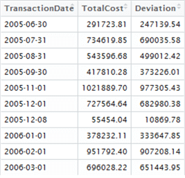
Notice anything interesting? We can visually inspect the data and see there’s a gap of approximately 1 calendar month between these high-value sets. We might establish a hypothetical question that is testable - are these regular spikes of transactional activity monthly, or does it only appear that way from a short sample?
First, create a vector containing every single possible day between the minimum and maximum values in our highData data set
datesSequence <- seq(as.Date(min(highData$TransactionDate), format = "%d/%m/%Y"), by = "days", length = (difftime(max(highData$TransactionDate), min(highData$TransactionDate), units="days")))
This results in a one-dimensional vector called datesSequence. You can see from the code we are using a method called seq - this method simply generates a sequence according to the parameters we feed into it. Here, we are asking for a date range, starting from the minimum date in the highData data set, delineated by days, and with the length equal to the number of days between the minimum and maximum dates in the highData data set (the range). For more information on seq, type ?seq into the console window.
Now let’s extract our dates from the highData data set into another object called knownDates. We don’t strictly need to do this but it’s easier to work with.
knownDates <- c(highData$TransactionDate)
Great, so we now have two objects, datesSequence and knownDates, and we’d like to analyse these in some way to compare the knownDates against the datesSequence to illustrate when these transactions occurred - just like marking a calendar.
There’s a few ways of doing this so let’s use our imagination and take the long route for clarity and experimentation. We’re going to combine the two objects into a single data frame, two columns - one column containing every date in datesSequence, and the other column indicating 0 if no high-value transactions are recorded on that day, and 1 if they are. Not particularly efficient to store, but easy to analyse as it sets us up to measure the average interval gap.
First create a new object of type vector, and initialise it to the correct length. This length is the range of our data set. We’re using vector() here instead of c(), as c() is simply a concatenation function but vector can be used for initialisation too. Note that the default fill for a vector is logical FALSE. Type ?vector for more information.
zeros <- vector(,difftime(max(highData$TransactionDate), min(highData$TransactionDate), units="days"))
Now we can combine our datesSequence vector, containing every date in our range, with our new zeros vector, which are the same length:
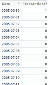
highDates <- data.frame(datesSequence, zeros)
colnames(highDates) <- c("Date", "Transactions?")
And finally, let’s combine this new highDates data frame with our knownDates vector containing the dates on which transactions were recorded. In SQL, this is a LEFT JOIN between the two, but in R we can achieve the same effect using the match method:
highDates$"Transactions?"<-match(highDates$Date, knownDates)
highDates$"Transactions?"[is.na(highDates$"Transactions?")] <- 0
highDates$"Transactions?"[highDates$"Transactions?">0] <- 1
What are we doing in the code above? First, we use the match function to replace the values in the “Transactions?” column with an incrementing numeric value if the date was matched. For non-matching dates, the N/A value is entered by default - R’s equivalent to NULL. Next, for every value in the “Transactions?” column in our data frame that is N/A replace it with 0. And finally, for every value that is greater than 0, replace it with 1.
Here’s the first few lines of the resulting data set:
Now, we need to work out the average gap between “1”s in our resulting data set. In other words, we are analyzing the gaps between the 1s to work out the average. This can be done either by iterating over the set, or using calculus. In the name of simplicity, we shall iterate over each row in the data set and simply count the gaps between 1s to find our intervals, then take the mean of the intervals to check if transactions do occur monthly or not. We’re able to get away with this as our result set is quite small, but for larger data sets you may want to consider the lga package instead - linear grouping analysis - which you can find out more about here -> https://cran.r-project.org/web/packages/lga/index.html.
highDates$"Transactions?" <- as.numeric(unlist(highDates$"Transactions?"))
count = 0
intervals = c()
lastPoint = 0
for (i in 1:nrow(highDates)) {
  thisRow <- highDates[i,]
  count = count + 1
  if (thisRow[2] > lastPoint) {
    intervals <- c(intervals, count)
    count = 0
    lastPoint = 0
  }
}
intervals
print(mean(intervals))
There’s quite a lot going on here. This code snippet demonstrates the use of the for loop and if statement in R, and how to assign variables. We first unlist the “Transactions?” column in the data frame. Unlisting transforms a list of elements into a single vector of elements - these two concepts are not quite the same thing – and by using as.numeric, we can ensure each element is in the correct data type. Note with the for loop as applied to data frames, it is necessary to use nrow to get the number of rows in the data frame as a range for the loop. Then, for each row i, we assign it to new variable thisRow, which becomes a two-element list that we can reference using indexes [1] and [2]. We count the 0s, and when a 1 is found the count is recorded in the intervals list and the counts reset until all rows have been processed. Finally, we print the intervals list, and the mean of all values recorded.
This results in:

Except a couple of outliers, we can determine from these results that these transactions do indeed occur on a rough monthly basis, although not exactly, which is contraindicative of an automatic process. Something is going on here, and we’ll need to dig back into the TransactionArchiveHistory table to find out what this is.
Before we do this, we need to clean up. Our environment is now cluttered with variables we no longer need and these occupy valuable memory, so let’s de-clutter. We can use rm() to do this on a one-by-one basis; rm(list=ls()) or the Clear All button (the small brush icon) in RStudio to clear the whole environment. Let’s clear the whole environment and go back to a clean slate.
Now go back and interrogate TransactionHistoryArchive again. This time, we’ll use the package sqldf, which allows us to run SQL-like commands within R against a data frame.
First, run the following to reconnect and fetch our TransactionHistoryArchive data, unsummarised:
conn <- odbcDriverConnect('driver={SQL Server};server=localhost;database=AdventureWorks2012;trusted_connection=true')
data <- sqlQuery(conn, "SELECT * FROM Production.TransactionHistoryArchive;")
data <- select(data, TransactionID, TransactionDate, TransactionType, Quantity, ActualCost)
Install and load into memory the sqldf package:
install.packages("sqldf")
library("sqldf")
Now, let’s play detective. There must be some differentiator between a transaction that occurs outside of the monthly spike, and a transaction that occurs in a monthly spike. Is it the value of the transaction? Is it the type of the transaction? Or is it simply the sheer volume of transactions? Do they belong to one customer? There could be any explanation.
At this point you should have two items in your Environment - data, and conn. Let’s query the top 10 rows from data to see if we can see anything that might differentiate the transaction:
sqldf("SELECT * FROM data LIMIT(10)")
Note that the syntax is closer to ANSI-SQL than T-SQL - instead of using TOP, we have to use LIMIT. If you are going to experiment with sqldf, note that many T-SQL features are not available in the language - it’s very much a light version.
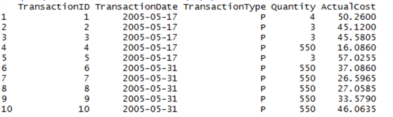
Okay, this is interesting - what is TransactionType? This might be our differentiator. Let’s query the SQL Server database (not our data frame) for a table that might give more detail on what this Type could mean:
sqlQuery(conn, "SELECT name FROM sys.tables WHERE name LIKE ('%Type%') AND type = 'U'"))

There’s no TransactionType table here, or any table which might indicate what the transaction means.
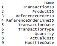
Did we miss something in the original table? Get the list of columns and take a look:
sqlQuery(conn, "SELECT name FROM sys.columns WHERE object_id = OBJECT_ID('Production.TransactionHistoryArchive') ORDER BY column_id ASC")
Look at the ReferenceOrderID - could it be there are different types of order, and these inform the different types of transaction?
Use sqldf to query the data frame for the distinct types of TransactionType:
sqldf("SELECT DISTINCT TransactionType FROM data")

Now query the original SQL Server database for tables like ‘%Order%’:
sqlQuery(conn, "SELECT name FROM sys.tables WHERE name LIKE ('%ORDER%') AND type = 'U'")
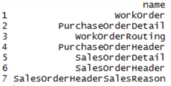
Notice anything? There are three types of transaction - P, S and W. And when we looked at order tables, there are three types - Purchase, Sales and Work. This gives us a new hypothesis - the transactions in the TransactionHistoryArchive table can be mapped to these three types of order. Let’s cover some ground we’ve already touched upon in the previous tip, but this time we’ll separate out the P, S and W types of transaction, group and summarise them and put the data into three separate data frames:
pData <- sqlQuery(conn, "SELECT * FROM Production.TransactionHistoryArchive WHERE TransactionType = 'P';")
pData <- select(pData, TransactionDate, ActualCost)
pData <- group_by(pData, TransactionDate)
pData <- summarize(pData, sum(ActualCost))
pData <- arrange(pData, TransactionDate) %>% as.data.frame
pData <- mutate(pData, TransactionDate = as.Date(TransactionDate) )
colnames(pData)[2] <- "TotalCost"
sData <- sqlQuery(conn, "SELECT * FROM Production.TransactionHistoryArchive WHERE TransactionType = 'S';")
sData <- select(sData, TransactionDate, ActualCost)
sData <- group_by(sData, TransactionDate)
sData <- summarize(sData, sum(ActualCost))
sData <- arrange(sData, TransactionDate) %>% as.data.frame
sData <- mutate(sData, TransactionDate = as.Date(TransactionDate) )
colnames(sData)[2] <- "TotalCost"
wData <- sqlQuery(conn, "SELECT * FROM Production.TransactionHistoryArchive WHERE TransactionType = 'W';")
wData <- select(wData, TransactionDate, ActualCost)
wData <- group_by(wData, TransactionDate)
wData <- summarize(wData, sum(ActualCost))
wData <- arrange(wData, TransactionDate) %>% as.data.frame
wData <- mutate(wData, TransactionDate = as.Date(TransactionDate) )
colnames(wData)[2] <- "TotalCost"
Now here’s where we can use ggplot2 to plot this information out. Here’s a great opportunity to show how to overlay plots using ggplot2; how to set custom axes; and how to display multiple plots at the same time.
Let’s first try overlaying the plots. In ggplot2, one can add additional layers by using the geom_* types. Here’s a simple example with the columns defined in the aes argument, and three geom_line objects overlaid on the graph. Note that the data source for each is explicitly specified using the data= argument:
ggplot(pData, aes(TransactionDate, TotalCost, fill=TotalCost)) +
geom_line(data=pData, colour="Orange") +
geom_line(data=sData, colour="Blue") +
geom_line(data=wData, colour="Red")

Okay, this looks familiar, but we can’t see the orange (Purchase) or red (Work) lines. This is likely because the range on the Y axis for blue (Sales) is so high. We can display multiple plots on the same page in RStudio to compare the difference. To do this, we’ll use a function called multiplot, first published in the R-Cookbook at http://www.cookbook-r.com/Graphs/Multiple_graphs_on_one_page_%28ggplot2%29/ by Winston Chang. This function uses methods from the grid package.
This is an excellent time to introduce functions. Functions are snippets of code which take inputs and produce outputs, and can be referred to by a single name. Thus, using the multiplot function below, we can feed inputs into it (our plots and the number of columns we want). First, define the function - run the following:
multiplot <- function(..., plotlist = NULL, file, cols = 1, layout = NULL) {
require(grid)
plots <- c(list(...), plotlist)
numPlots = length(plots)
if (is.null(layout)) {
  layout <- matrix(seq(1, cols * ceiling(numPlots/cols)),
                  ncol = cols, nrow = ceiling(numPlots/cols))
}
if (numPlots == 1) {
  print(plots[[1]])
} else {
  grid.newpage()
  pushViewport(viewport(layout = grid.layout(nrow(layout), ncol(layout))))
  for (i in 1:numPlots) {
    matchidx <- as.data.frame(which(layout == i, arr.ind = TRUE))
    print(plots[[i]], vp = viewport(layout.pos.row = matchidx$row,
                                    layout.pos.col = matchidx$col))
  }
}
}
Now run the following to first define our plots, then display our plots side-by-side:
pPlot <- ggplot(pData, aes(TransactionDate, TotalCost, fill=TotalCost)) + geom_line(data=pData, colour="Orange")
sPlot <- ggplot(sData, aes(TransactionDate, TotalCost, fill=TotalCost)) + geom_line(data=sData, colour="Blue")
wPlot <- ggplot(wData, aes(TransactionDate, TotalCost, fill=TotalCost)) + geom_line(data=wData, colour="Red")
multiplot(pPlot, sPlot, wPlot, cols=3)

Okay, we can definitely say now that these are three different data sets combined into one table. The scales are radically different, and we can isolate Sales orders as the sole type of order causing large monthly volumes.
Time for one final investigation before we conclude. Clearly the cause of our data spiking pattern is not with the type of transaction, otherwise it would have been shown above. It must be instead, either with the volume of transactions, or the transaction cost values. In other words, are these transactions being batched together and executed monthly, or are there high transaction order values from customers at the end of every month?
We can query either the ‘data’ object, which is our full data frame, or the original database, to get our answer.
Let’s first get the counts of transactions that occurred each day for sales orders into an object, groupedCounts:
groupedCounts <- sqlQuery(conn, "SELECT TransactionDate, COUNT(*) FROM Production.TransactionHistoryArchive WHERE TransactionType = 'S' GROUP BY TransactionDate ")
colnames(groupedCounts)[2] = "TransactionCount"
Now let’s add a new column to our ‘sData’ object (which contains aggregated transactions for sales orders) of type integer using the method cbind (type ?cbind for more information). This method can combine columns, and rbind can combine rows.
sData<- cbind(sData, vector(length=nrow(sData), mode="integer") )
Finally, let’s update this new column with the transaction counts we’ve just fetched by matching:
colnames(sData)[3] = "TransactionCount"
sData$TransactionCount<-match(sData$TransactionCount, groupedCounts$TransactionCount)
Now let’s take a look at this data by plotting it using ggplot2 to see if transaction counts are responsible for the spikes. We’ll first explicitly convert the TransactionDate columns to Date, then we’ll use the dplyr method left_join (dplyr was introduced in the previous tip) to perform a simple LEFT JOIN SQL operation. Note we can also do this using match Yes - we’ve confirmed our hypothesis that it is the sheer number of transactions that are causing the spike, not the value of each transaction. This means sales orders are being processed in batches rather than receiving large individual order volumes. We’ve also established that these are sales transactions only, and that purchase orders and work orders are being mixed into the TransactionHistoryArchive table unnecessarily - something we can take up with our DBA! We’ve established (in the previous tip) that growth of such orders is growing. In the graph above, we’ve added a regression line to show a modest growth across all sales orders. In the next tip, we’ll dispense with AdventureWorks transactions and take a look at more R features, including more packages, methods, and further integration of R with SQL Server. We’ll race a query on a SQL Server 2016 in-memory table against an R data frame. We’ll also look at how to work with MongoDB collections directly from R in the new Azure Cosmos DB service, and how to use R as the ETL layer between SQL Server and MongoDB. Next Steps Dr. Derek Colley is the lead technical consultant for Optimal Computing, a boutique data consultancy based in the UK NW helping clients troubleshoot, configure, plan and deploy their data platforms. He specializes in data integration and database performance optimization, and is a PhD candidate with Staffordshire University, looking into methods of integrating AL query selection algorithms with the cost-based query optimizer. In his spare time, he enjoys building robots, going outdoors, and spending time with his four children.sData$TransactionDate <- sData$TransactionDate %>% as.Date
groupedCounts$TransactionDate <- groupedCounts$TransactionDate %>% as.Date
sData <- left_join(sData, groupedCounts, by=c("TransactionDate"))
ggplot(sData, aes(TransactionDate, TransactionCount.y, fill=TransactionCount.y)) +
geom_line(data=sData, colour="Blue") +
geom_smooth(data=sData, method=lm, colour="Red", show.legend=FALSE)