Problem
How can I make use of Data Insights in Power BI?
Solution
Power BI Data Insights is a new addition to the Power BI arsenal of innovative tools and features. Currently, Data Insights is still in beta or preview mode, but the potential for this technology is enormous as Data Insights provides a way to compare one data point on a data visualization with a previous data point in the same series and category. The Insight tool’s significance stems from being able to quickly analyze a large number of variables in a very short time frame. Power BI is completing the heaving analytical work for you via its integrated machine learning algorithms. These algorithms search for influential changes in the data points selected and then report them to you in a visual format.
Using Data Insights in Power BI
To get started Data Insights you will need to download the most recent version Power BI Desktop from https://powerbi.microsoft.com/en-us/desktop/. Power BI Desktop is the client application that is available for you to design Power BI Dashboards on a local desktop. Furthermore, we are going to make use of the Wide World Importers SQL 2016 database for our sample data. You can download the Wide World Importers databases from https://github.com/Microsoft/sql-server-samples/tree/master/samples/databases/wide-world-importers.
Once Power BI Desktop is installed and ready to use, a new ribbon chart is created using the Wide World Importer database and adding Customer Category as the Series and Legend, Quantity as the Value, and Order Date on the Axis from the Sales.CustomerCategory, Sales.OrderLines, and Sales.Order tables respectively.
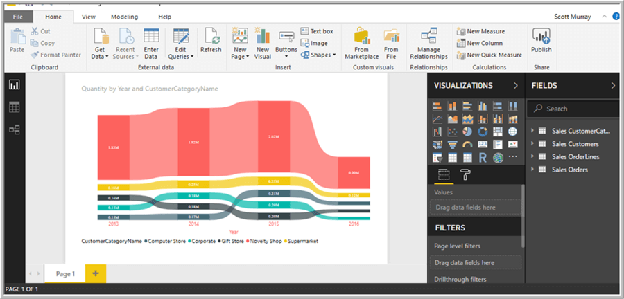
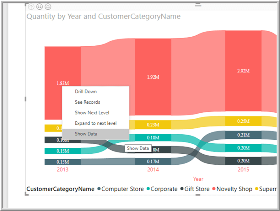
Thus, the ribbon visualization has data points for each category and each year, and these data points can be used as the basis for creating the data insights. Remember, the comparison is made to the prior value or data point in the axis; thus, the first value will not have the Analyze option, as illustrated below.
However, if we move one data point to the right on the chart, the analyze option is now available along with selection to “Explain the increase”.
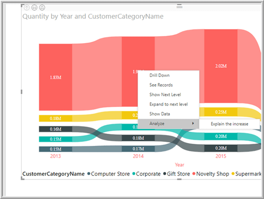
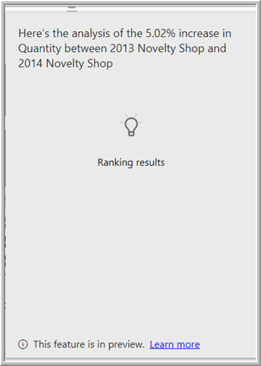
Power BI recognizes that the prior data point is less than the current data point, so it knows the current value is an increase. If a decrease was noted, then the option would say Explain the decrease. Selecting this option initiates the machine learning algorithm for reviewing the patterns and trends being noted in the data changes. As the data is being reviewed and processed, the screen will show the following progress window.
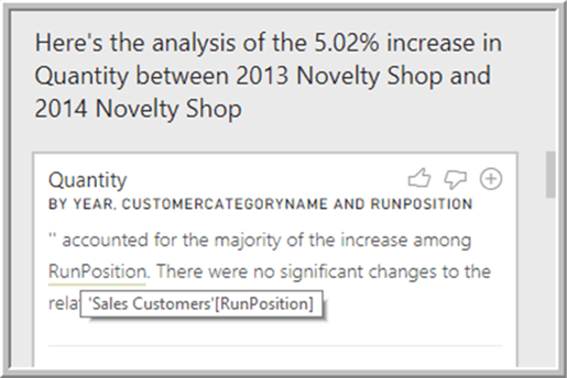
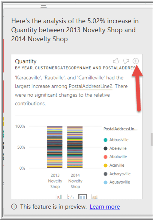
Upon completion of the analysis, Power BI presents a whole sundry of different reasons for the increase. It reviews all the data included in the data source for the analysis. The first analysis displayed reviews the change in values supported by adjustments to the RunPosition. In this particular example, the major changes in quantity is actually related to blank or null data values in the Run Position.

You may also notice that the field name is underlined in the narrative, and we can hover over it to see its source, Sales Customers.RunPosition in this example.
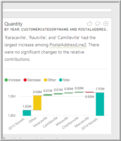
Another noteworthy item is that the list of data values analyzed is actually quite substantial and each studied item can be reviewed by using the scroll bar on the right side. In the below example, we can see that three towns actually contributed the most to the increase in quantity based on the PostAddressLine2 field.
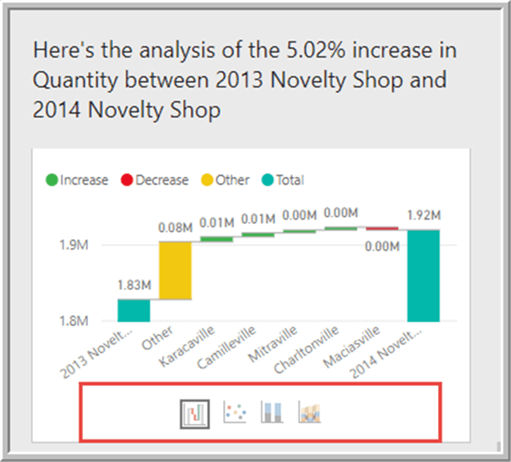
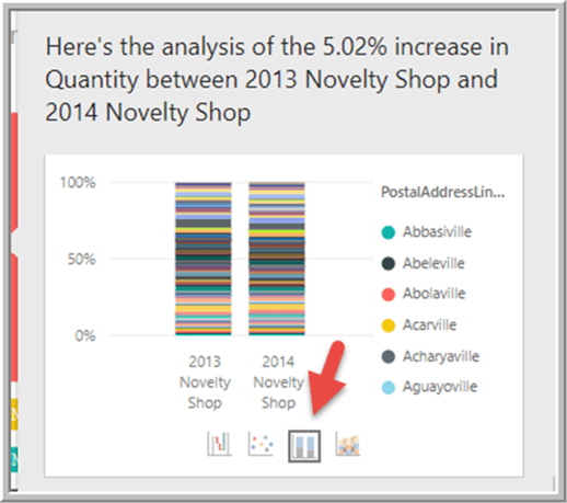
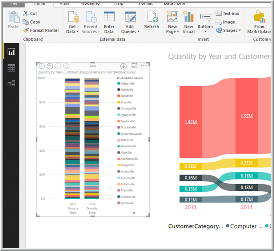
If the default waterfall chart shown is not sufficient, the chart type can easily be changed to a scatter plot, a stacked column, or a ribbon chart.
Finally, a particular insight may prove to be very informative, and thus you can easily add it to your Power BI report using the plus button shown below.
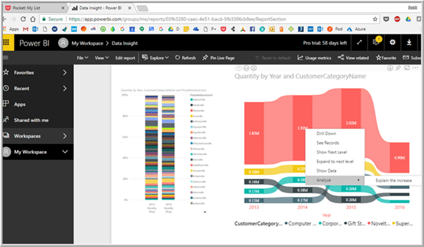
Now the selected visual is part of the report and can be modified and adjusted just as any other chart on the report.
Since the Data Insights feature is in preview mode, I would be remiss in not mentioning a few of the caveats with the feature. Data Insights does not work with:
- Many of the filter functions such as Top N and measure filters
- Non-numeric measures; you need a numeric value for the processing to complete its analysis
- Certain live and direct query data models
The functionality does work, though not just in Power BI Desktop, but also within Power BI online.
I expect many great additions to this feature as Power BI continues to grow.
Next Steps
- See all Power BI Tips: https://www.mssqltips.com/category/power-bi/
- Power BI Ribbon Visualization: https://www.mssqltips.com/sqlservertip/5285/power-bi-ribbon-charts/

I have a passion for crafting Business Intelligence Solutions for my user groups. My experience includes almost 15 years of SQL Server involvement with the last 12 years focused specifically on Business Intelligence, SharePoint, OLAP, SSRS, and Decision Support solutions. Currently, I am a Business Intelligence Architect in the healthcare industry, and I also teach database and analytics classes for Kennesaw State University, Southern New Hampshire University, and Reinhardt University. My education includes an MBA and an undergraduate in Accounting (yes I am a reformed accountant!), both from Kennesaw State University. I enjoy every day by trying to grow my faith and spend precious time with my family. I have been happily married to my wife of over 20 years, and we have two teenagers one who we home school with the help of a University Model School, Cornerstone Prep in Acworth, GA (cornerstoneprep.org). Our other child is a Construction Management major at KSU’s Southern Poly / Marietta campus. We are a soccer and Cross Country (XC) family who play, coach, and referee soccer or run for fun most every day. For several years, our family has volunteered (and played with the dogs and cats) at Etowah Valley Humane Society in Cartersville, GA.
- MSSQLTips Awards: Champion (100+tips) – 2016 | Author of the Year – 2015 | Author Contender – 2014, 2016-2021