Problem
Python is one of the most prominent languages used for data science apart from R. Python is a very versatile language and can be used for a variety of purposes ranging from web programming to data science applications. Diverse types of charts and graphs make the analysis faster and easier compared to analyzing data by statistics alone. A large number of reporting tools offer a wide variety of visualizations, but when the analysis is in the preliminary phase, these reporting tools may not be of much use as the data analysis would be just in exploratory phase.
For exploratory data analysis, some of the fundamental visualizations are used like Histogram, Scatterplot, Box and Whisker plot, Density plot, pie charts, bar charts, column charts, etc. For data science applications, the most commonly used visualizations for graphical exploratory analysis are – Histogram, Density Plot, Box Plot and Scatterplot.
In this tip, we will learn how to generate diverse types of basic charts used in data science applications by using a sample dataset and Python in SQL Server 2017.
Solution
Python ships with a built-in library named matplotlib for rending graphs and charts. In this tip we will use a sample dataset and will explore the data using the above-mentioned chart types and we will generate these charts using Python and SQL Server 2017.
It is assumed that SQL Server 2017 is installed along with Python on the development machine. If you are new to using Python with T-SQL in SQL Server, it’s highly recommended that you go through the SQL Server 2017 and Python Basics tutorial before proceeding with this tip. Follow the steps mentioned below to use Python for generating charts and graphs discussed in this tip.
Step 1 – We need a sample dataset before we can start charts and graphs as these visualizations would need some source data to generate the visual. You can use any data that you may already have. In this tip we are using the sample data from NFL playoff records, and below is how the data would look. Create a table with this sample data and name it something relevant. In this tip, we will be using the table name NFLTest.

Creating a Histogram Chart
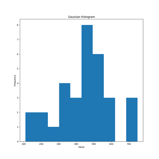
A histogram chart is like a bar chart and is used to understand the spread of data in a range of values which is known as a “bin” in data science terminology. It shows the record counts in any given range, and each range is represented by a bar in the histogram. Histograms generally are the very first visualization used to study the spread of data. The limitation is that histograms can represent only one field in the chart. The below example demonstrates the method of creating a histogram chart on the Won field from NFLTest table.
execute sp_execute_external_script
@language = N'Python',
@script = N'
import matplotlib
matplotlib.use("Agg")
import matplotlib.pyplot as plt
import pandas as pd
import numpy as np
# Histogram
fig1_handle = plt.figure(figsize=(10,10))
plt.hist(InputDataSet.Won)
plt.title("Gaussian Histogram")
plt.xlabel("Value")
plt.ylabel("Frequency")
plt.savefig("c:\\Temp\\histogram.png")

',
@input_data_1 = N'SELECT Won, Team, Division, TotalGames FROM NFLTest'
Here we are using the pyplot package in matplotlib library which has distinct functions to create charts along with details of the resolution. We are importing other packages like pandas and numpy which are used for data processing and numerical calculations. First, we create the handle of the figure where we specify the resolution or size of the plot. Then we are using hist plotting function to create the histogram chart. The dataset being used is passed by the @sqlquery parameter where we are just reading the fields from a table. To use this data inside the Python script, we are using the default dataset name – InputDataSet and referring to the fields inside this data frame. Inside the charting functions, we are providing charting related details like title and label. When you execute this code, the savefig function saves the graphic device to which the plotting functions renders the output and a png file with the histogram chart is saved in the file path specified in the code. The same logic is used in all the charts below, only the functions and parameters change respectively.
Creating a Kernel Density Plot
To visualize a more clear and precise shape of the spread of data, the Kernel Density plot is used. The Kernel Density Plot can be perceived as a smooth histogram. Many complex formulas are involved to derive the curve and shape of kernel density plot. Gaussian_KDE function in the scipy.stats package encapsulates all the logic required to calculate kernel density. You can read more about kernel density estimation from here.
execute sp_execute_external_script @language = N'Python',
@script = N'
import matplotlib
matplotlib.use("Agg")
import matplotlib.pyplot as plt
import pandas as pd
import numpy as np
from scipy.stats import gaussian_kde
# Kernel Density Plot
fig2_handle = plt.figure(figsize=(8,8))
density = gaussian_kde(InputDataSet.Won)
xs = np.linspace(0,1000,200)
plt.plot(xs,density(xs))
plt.title("Kernel Density Plot")
plt.xlabel("Wins")
plt.ylabel("Density")
plt.savefig("c:\\Temp\\KernelDensityPlot.png")
',
@input_data_1 = N'SELECT Won, Team, Division, TotalGames FROM NFLTest'

Creating a Box-plot Chart
The box-plot chart is used for outlier analysis, so that data points that are far off from the inter-quartile range are identified. This chart is not ideal if the focus in on individual data points. But this is the first chart that would generally get considered for outlier analysis on multi-variate data. In the below example, we are creating four collections using the random function from the numpy library. In real applications, each collection would be a field from a database. Using the four collections, we are creating four box-and-whiskers, one for each collection. Since we have a collection of box-plots, first we create a subplot and then add it as a parameter to the boxplot function to create one consolidated boxplot chart.
execute sp_execute_external_script language = N'Python',
@script = N'
import matplotlib
matplotlib.use("Agg")
import matplotlib.pyplot as plt
import pandas as pd
import numpy as np
# Box and Whisker Plot
fig3_handle = plt.figure(figsize=(10,10))
np.random.seed(10)
collection_1 = np.random.normal(100, 10, 200)
collection_2 = np.random.normal(80, 30, 200)
collection_3 = np.random.normal(90, 20, 200)
collection_4 = np.random.normal(70, 25, 200)
data_to_plot = [collection_1, collection_2, collection_3, collection_4]
ax = fig3_handle.add_subplot(111)
bp = ax.boxplot(data_to_plot)
fig3_handle.savefig("c:\\Temp\\Boxplot.png")
'

Creating a Scatterplot Chart
Any exploratory data analysis is incomplete without a scatterplot chart. This is a visualization that explains the measure of association to analyze the correlation between two numerical variables. Below is an example of a scatterplot with Total Games on the Y-axis and Total Wins on X-axis. This plot shows a near linear relationship between the two variables. The scatter function is used to create a scatterplot.
execute sp_execute_external_script language = N'Python',
@script = N'
import matplotlib
matplotlib.use("Agg")
import matplotlib.pyplot as plt
import pandas as pd
import numpy as np
# Scatterplot
colors = (0,0,0)
area = np.pi*3
fig_handle = plt.figure(figsize=(10,10))
plt.scatter(InputDataSet.Won, InputDataSet.TotalGames, s=area, c=colors, alpha=0.5)
plt.title("Scatter plot example")
plt.xlabel("Won")
plt.ylabel("Total Games")
plt.savefig("c:\\Temp\\scatterplot.png")
',
@input_data_1 = N'SELECT Won, Team, Division, TotalGames FROM NFLTest'

In this way, we can use distinct functions from the matplotlib library in Python and use the same with T-SQL in SQL Server to generate and save charts without using any external reporting tools or technologies.
Next Steps
- Consider reading more about the matplotlib library and try out different formation options and chart related functions in this library for exploratory data analysis.

Siddharth has more than 14 years of experience in the IT Industry, with more than a decade of experience in Business Intelligence and Analytics, for clients banking, logistics, government, Media Entertainment, products, life sciences and other domains. He has been a lead architect for a portfolio of 40+ apps, containing apps in web, mobile, BI, Analytics, data warehousing, reporting, collaboration, CMS, NoSQL and other technologies. He has several certifications and is a published author for online and print-media publications, as well as the MSDN Library.
In his present role, he remains responsible for architecture design, technology stack selection, infrastructure design, 3rd party products evaluation and procurement, and performance engineering. These applications use technologies like Elasticsearch / Lucene, MongoDB, SharePoint 2013 and 2010, jQuery-based framework like Highcharts and GoJS, SQL Server and the Microsoft Business Intelligence stack (SSIS, SSAS, SSRS, MDX, PowerPivot, PowerView), jQueryMobile, Bootstrap, iOS xCode framework, and many others.
- MSSQLTips Awards: Champion (100+ tips) – 2018 | Author of the Year – 2017 | Author Contender – 2016, 2018-2019


