Problem
Looking at logs is very critical. It helps us determine if our systems are doing well and if we can make them faster. We must watch out for warnings and errors in these logs. These little messages can be troublemakers, so we need to watch them to keep everything running smoothly.
Solution
In this article, I’ll show you how to check out an app’s log using the Python Matplotlib library and see when warnings and errors happen.
Data Set
This tutorial analyzes a log file exported from a data pipeline application in a CSV format containing the following information:
| Column | Data Type | Description |
|---|---|---|
| Timestamp | Date and Time | Collection date and time |
| Execution ID | Integer | An auto-increment ID related to the data pipeline job |
| Event type | Text | Error: This log entry is generated once an error occurs during the data pipeline execution Warning: This log entry is raised when some non-critical issues may cause a defect in the processed data or affect the data pipeline performance. Information: This log entry is to inform about a regular activity |
| Details | Text | The additional information about the log entry (Exception thrown, warning message, …) |
Visualizing the Application Log
To parse the log data from a CSV file into a Pandas DataFrame with four columns (timestamp, warning count, information count, error count) and then plot these values on a Matplotlib line chart, you can follow these steps:
Step 1: Import Libraries
Start by importing the necessary libraries:
import pandas as pd
import matplotlib.pyplot as plt
from datetime import datetime
Step 2: Read the CSV File
Read the CSV file containing the log data into a Pandas DataFrame:
df = pd.read_csv('log_data.csv', delimiter=';', header=None, names=['Timestamp', 'Execution ID', 'MessageType', 'Message'])
Step 3: Convert Timestamp to DateTime
Convert the 'Timestamp' column to a datetime format to be used as an index:
df['Timestamp'] = pd.to_datetime(df['Timestamp'], format='%Y-%m-%d %H:%M:%S')
Step 4: Create a Pivot Table
A QUICK REMINDER: The term “pivot” generally refers to a pin or shaft on which something turns. In data terms, the data pivot is a data processing technique employed in table reshaping by changing the rows into columns.
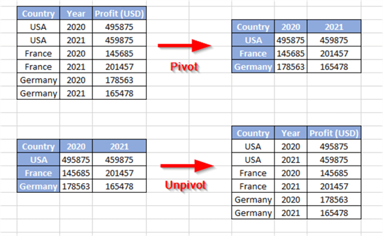
Pivoting is mainly used for data visualization and analysis. The reverse action of pivoting is unpivoting, in which the columns are converted into rows (see the image above).
And now, back to our tutorial…
Use Pandas pivot_table function to change the format of the data into a desirable format.
pivot_df = df.pivot_table(index='Timestamp', columns='MessageType', values='Message', aggfunc='count', fill_value=0)
This will create a DataFrame with a time stamp as an index and a column for each message type (Warning, Information, Error), with counts as values.
Step 5: Reset Index
Resetting index of pivot DataFrame. Now, the TimeStamp will come back like any other column. This simplifies accessing and plotting data because you can use it directly as pivot_df [‘Timestamp’].
pivot_df.reset_index(inplace=True)
Step 6: Plotting the Data
Now, we can plot the data using the Matplotlib library.
First, let’s create an empty plot with this command:
plt.figure(figsize=(12, 6))
- plt.figure(): Generates a new figure or plot in Matplotlib. A figure is similar to a painting panel or an opening where one can place one or more plots (for example, straight line graphs, bar charts, scatter plots, etc.).
- figsize=(12, 6): Specifies the width and height of the figure in inches. In this case, (12, 6) means the figure will be 12 inches wide and 6 inches tall. You can adjust these values to control the size of the figure based on your preferences.
Let’s plot each series on a separate line with errors in red (critical), warnings in orange (less critical), and information in blue.
plt.plot(pivot_df['Timestamp'], pivot_df['warning'], label='Warning', marker='o', color='orange')
plt.plot(pivot_df['Timestamp'], pivot_df['information'], label='Information', marker='s', color= 'blue')
plt.plot(pivot_df['Timestamp'], pivot_df['error'], label='Error', marker='x', color='red')
Now, we should add a title and labels to our axes. Using "Count" for the Y-Axis is good because there are multiple categories.
plt.xlabel('Timestamp')
plt.ylabel('Count')
plt.title('Log Counts Over Time')
Next, we should customize our plot to show the legend and the gridlines.
plt.legend()
plt.grid(True)
To make it easy to read (as date and time may occupy much space), one can turn the X-axis values around to have more room.
plt.xticks(rotation=45)
The plt.tight_layout() function in Matplotlib automatically adjusts the spacing between subplots and other elements within a figure to ensure they fit within the figure area without overlapping. It helps improve the layout and readability of multi-plot figures by optimizing the arrangement of subplots and labels.
plt.tight_layout()
plt.show()
This code reads the log data from the CSV file, converts the timestamp to a datetime index, creates a pivot table to count the occurrences of each message type at each timestamp, and then plots the data using Matplotlib.

The visualized data is not very clear since the lines overlap and cannot be read easily. Since the three lines have the same measurement unit, plotting on a second Y-axis will not affect the plotted lines. Separating these lines might make it easier to interpret them.
Plotting Each Data Series on a Separate Subplot (Create Facet)
Let's try to plot our data series differently.
A QUICK REMINDER: Data visualizations may include several related plots or charts within a single figure or visualization space through facets or subplots in cases where you want to compare and analyze multiple dimensions of your data at the same time.
Faceting involves dividing the dataset into smaller subsets that can be more easily visualized with individual plots or charts. Each plot usually represents a different subset of the data based on one or more categorical variables.

Therefore, we will create three separate subplots in this section, one for each message type (Warning, Information, Error), along with their Y-axes. On each subplot, there is a corresponding line graph as well as common x-axis labels among subplots for consistency. This necessitates copying the previous code into a new Python script and replacing the lines of code, creating the plot in the preceding section with the code below.
First of all, we should create three empty subplots using the following command:
fig, axes = plt.subplots(nrows=3, ncols=1, figsize=(12, 12), sharex=True)
In this command, we specify that the facet we are creating consists of three subplots arranged vertically and share the same X-axis. We should note that the subplots function return two objects:
- fig: Represents the whole figure.
- axes: The array that contains the three created subplots.
Now, we should plot each time series on the relevant subplot.
We will first plot the error log entries, as it is the most critical component:
axes[0].plot(pivot_df['Timestamp'], pivot_df["error"], marker='o', label="Error", color="red")
axes[0].set_ylabel('Count')
axes[0].set_title(f'Error Counts Over Time')
axes[0].grid(True)
Next, we will plot the warnings log entries on the second subplot.
axes[1].plot(pivot_df['Timestamp'], pivot_df["warning"], marker='o', label="Warning", color="orange")
axes[1].set_ylabel('Count')
axes[1].set_title(f'Warning Counts Over Time')
axes[1].grid(True)
Finally, we will plot the information log entries.
axes[2].plot(pivot_df['Timestamp'], pivot_df["information"], marker='o', label="Information")
axes[2].set_ylabel('Count')
axes[2].set_title(f'Information Counts Over Time')
axes[2].grid(True)

Next Steps
- You can learn how to visualize time series data with the Python Plotly library from the following article: Plotly to Visualize Time Series Data in Python (mssqltips.com).
- Also, you can learn about more advanced visual analysis in the following article: Plotting in Python Financial Time Series from SQL Server (mssqltips.com)

Hadi Fadlallah is an SQL Server professional with more than 10 years of experience. His main expertise is in data integration. He’s one of Stackoverflow.com’s top ETL and SQL Server Integration Services contributors. Also, he is a university lecturer and writes scientific and technical articles on several blogs. On the academic level, he holds a Ph.D. degree in data science focusing on context-aware big data quality and two master’s degrees in computer science and business computing.
- MSSQLTips Awards: Trendsetter (25+ tips) – 2025 | Author of the Year Contender – 2023 | Rookie of the Year – 2022


