By: Rick Dobson | Updated: 2021-12-03 | Comments (3) | Related: > Python
Problem
Treemap charts can be extremely helpful to visualize categorical data. In this tutorial we look at how to use SQL Server and Python for creating treemap charts from SQL data sources, along with what colormaps are and how to apply them to treemap chart elements.
Solution
A treemap chart is composed of rectangular tiles that can reflect the percentage change or counts in an underlying data source. For example, if a query returns a results set value for each of six categories, the treemap chart would display six rectangular tiles where each tile is sized proportionally to its corresponding results set value. In this sense, a treemap chart can function in a parallel way to a bar chart or a pie chart. This is because the height of bars in a bar chart or the size of slices in a pie chart can also be dependent on the counts or percentage change values for underlying data from a SQL Server query.
Python can generate treemap charts with the help of the squarify and matplotlib external libraries. The squarify library can accept a positive number for each category in a set and transform the set of numbers into coordinates for rectangles. The matplotlib library can display a treemap chart filled with the rectangles from squarify. In addition to positive numbers that can be normalized to the size of rectangular tiles for each category, the plot method in the squarify library can also accept other parameters for specifying labels and colors for the tiles in a treemap chart. Labels and colors in treemap charts can reveal tiles as belonging to a type of category or emphasize significance of the size of tiles.
Treemap charts are a relatively rich data visualization tool that can also display hierarchical data values. This capability is not implemented by the squarify and matplotlib external libraries for Python. Displaying hierarchical relationships with a treemap chart can be implemented by the plotly external library to Python (see here and here for more detail). A future tip may illustrate how to display treemap charts for hierarchically organized data.
SQL source data for this tip
The following SQL Server Results tab reveals two query results sets that are used as source data points for treemap charts in this tip.
- Both results sets show the performance score for each of six stock market symbols. The performance score is a percentage point change value from a start date through an end date.
- The last column in the top pane shows the performance score during the first quarter of 2020. Stock prices were negatively impacted in this timeframe by the onset of coronavirus in the United States. As a consequence, all the performance scores are negative – from -2 for Microsoft (MSFT) through -68 for a triple levered exchange traded fund based on the Dow Jones Industrial Average (UDOW).
- The bottom pane shows the performance scores for the same six symbols during the second quarter of 2020. Stock prices began recovering during this quarter. As a consequence, all the performance scores are positive from 34 for MSFT through 134 for TQQQ.
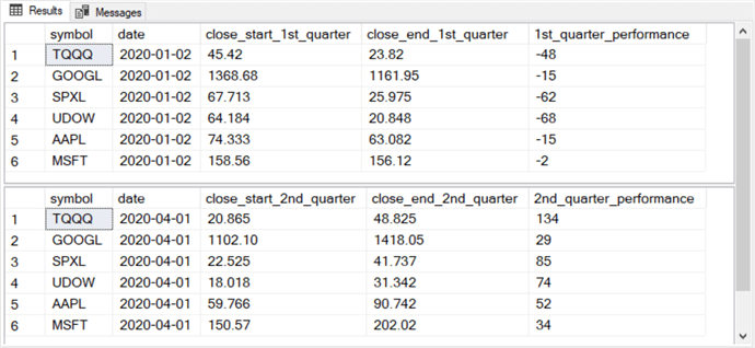
The following script excerpt shows the T-SQL code for extracting symbol stock prices for the start and end of the first quarter as well as the performance score from the start through the end prices. Notice that the performance score is the difference from the start through end price in a quarter divided by the start price in a quarter. The source data for the queries below follow from the DataScience.dbo.stooq_prices table. A prior tip describes the process for creating and populating this table.
The download for this tip contains the code excerpt below as well as an analogous code segment for computing performance during the second quarter.
use DataScience
go

-- 1st quarter performances
select
 start_1st_quarter.symbol
,start_1st_quarter.date
,start_1st_quarter.close_start_1st_quarter
,end_1st_quarter.close_end_1st_quarter
,cast((
 (end_1st_quarter.close_end_1st_quarter - start_1st_quarter.close_start_1st_quarter)
  /
  start_1st_quarter.close_start_1st_quarter
 )*100 as int) [1st_quarter_performance]
from
(
select symbol, date, [close] close_start_1st_quarter
from [DataScience].[dbo].[stooq_prices]
where date = '2020-01-02'
) start_1st_quarter

join

(
select symbol, date, [close] close_end_1st_quarter
from [DataScience].[dbo].[stooq_prices]
where  date = '2020-03-31'
) end_1st_quarter

on start_1st_quarter.symbol = end_1st_quarter.symbol
Python scripts for a basic treemap chart
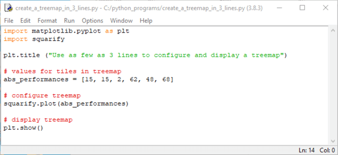
You can create a treemap chart with a handful of code lines.
- The following Python script shows in an Idle window the minimal lines required to create a treemap. The Idle application downloads automatically when you install Python from Python.org. Idle is to Python as SSMS is to T-SQL.
- The script begins with two import statements for the matplotlib and squarify external Python libraries. These two libraries enable Python code to create and show a treemap chart for a dataset. Plt is designated as an alias for the pyplot application programming interface (api) in the matplotlib library. An api can facilitate the interface of one software application, such as Python, with another software application, such as matplotlib.
- After the import statements, the title property of the plt api is assigned the string value "Use as few as 3 lines to configure and display a treemap".
- The remaining three lines in the script create and display the treemap chart.
- An assignment statement transfers an array of values to the abs_performances object. An array is defined by a ordered sequence of values in square brackets ([]). Within this tip section, the values in the array correspond to the absolute values of the numbers in the 1st_quarter_performance column of the first results set from the "SQL source data for this tip" section. Absolute values are used because a treemap chart only shows results for an array of positive numbers.
- Next, the plot method from the squarify library is invoked for the values in the abs_performances object.
- The last line invokes the show method from the plt api. This method displays the treemap chart created by the plot method of the squarify library.
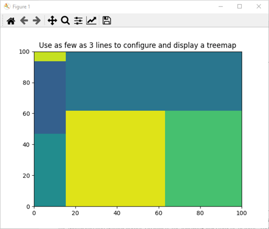
After running the code in the preceding Idle window, Python responds by showing the following display window. There are two main points to note about the display window.
- The chart contains six colored tiles. The colors for the tiles will change from one run of the code to the next because the code does not explicitly specify a rule for assigning colors to the tiles for each of the six symbols.
- The chart shows along its bottom and left vertical borders horizontal and vertical scale axis values of 0 through 100.
The abs_performances array values are normalized by the squarify library in Python.
- The smallest value is 2 for the MSFT symbol. This corresponds to the tile in the top left corner of the treemap chart.
- The AAPL and GOOGL symbols both have abs_performances values of 15. The tiles for these two symbols touch the left edge of the chart. The rectangle for GOOGL appears below MSFT, and the rectangle for AAPL appears below GOOGL.
- The biggest tile is the top right one. This tile is for the UDOW symbol. This symbol has the largest tile because its abs_performances value is the largest of any symbol.
- The remaining two tiles are for SPXL and TQQQ. The tile for SPXL is larger than the tile for TQQQ.
If it was not immediately obvious to you which tiles are for which symbols, you are normal. First, there are no tile labels linking the tiles to symbols. Second, it is not so easy for humans to relate areas to values. Bar charts are better than treemap charts when you need to precisely link values to chart elements. Lastly, if two the tiles, which both have the same size, are for different symbols then there is no way to tell which tile is for which symbol. The next section shows how to address these issues by assigning labels to tiles.
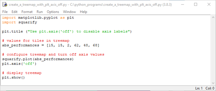
It is common to show treemap charts without showing the axis scale values. You can do this with a single line of code. The following Idle window shows the code directly below the line invoking the plot method from the squarify library.
The line is plt.axis('off'). This line sets the axis property from the pyplot api to off for the treemap chart. This axis property is set to on by default.
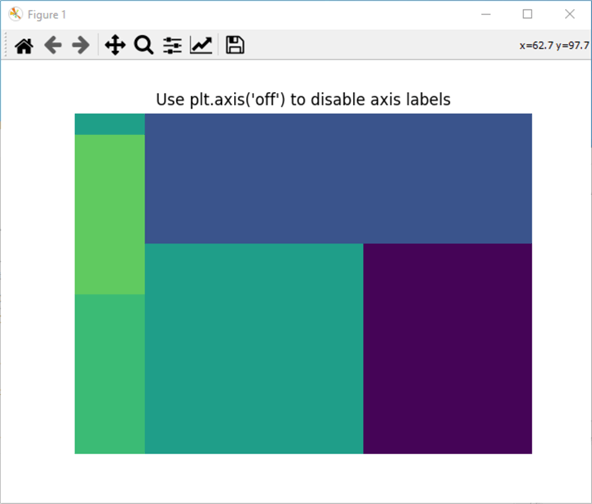
Here's the chart that displays when you run the preceding script. While the tiles are different colors, they appear to be same size. The most important point, of course, is that there are no scale axis values on the treemap chart below.
Adding tile labels and pads between tiles to treemap charts
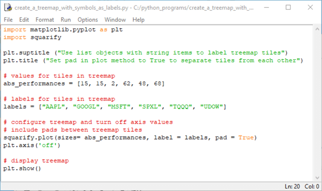
The prior two treemap charts failed to identify the symbol performance represented by each tile. Also, it is possible for tiles to become difficult to distinguish when their colors are nearly the same and the tiles are contiguous. The following script addresses these issues in two ways.
- First, a list of label values is defined based on the symbol for each tile. Then, this list is added as a parameter value to the plot method from the squarify library.
- Second, another parameter is added to the plot method from the squarify library. This parameter adds white padding around the borders of the tiles within the treemap chart. Therefore, even if contiguous tiles have nearly identical color shades, the tile borders are easily distinguishable.
The name for the list of symbols in the following Python script is labels. List is a Python object type for a sequence of ordered string values. The order of the strings in the labels list object corresponds to the order of the numeric values in the abs_performances array. For example, the third string in labels is MSFT, which has a performance score of -2 and a value of 2 in the abs_performances array.
The second argument to the plot method for the squarify library assigns the labels list object to the label argument for the plot method. The third argument for the plot method assigns a value of True to the pad parameter for the plot method. This parameter is False by default. When you set pad to True, a white border is placed around the tiles in a treemap chart.
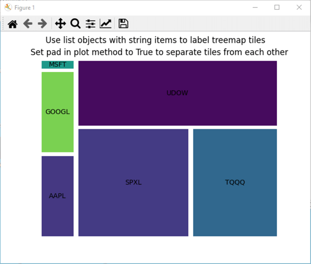
Here's an image of the display window when you run the preceding Python script. Each tile has a label that corresponds to the symbol that it represents. Also, there is white border around each tile. This border feature is especially convenient for distinguishing between the tiles for AAPL and SPXL symbols, which have very similar colors.
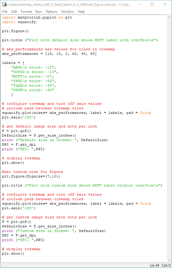
The next Idle window shows a Python script that creates labels for the treemap tiles with both symbol values and their performance score values. The labels display the performance score values for symbols as negative numbers, which they are, in fact, because stock market performance declines precipitously in response to the coronavirus outbreak in the first quarter of 2020. While the labels specify the performance scores as negative numbers, it may be worth re-stating that the sizes parameter for the squarify plot method must contain positive numbers. The script represents performance scores with string values instead of numeric values. In contrast, the sizes parameter are represented with numeric values from the abs_performances array. The \n in the string values for tile labels generates a linefeed to separate the symbol values from their corresponding performance scores.
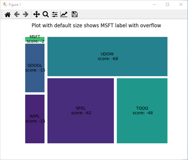
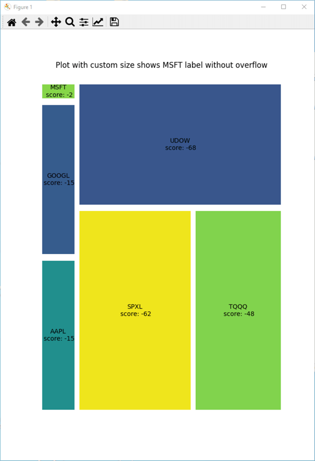
If you examine the script below, you can observe that it contains two statements with plt.show() functions: one for an initial treemap chart, and a second one with code for a second treemap chart. The second chart displays a better looking treemap chart with label values for both symbols and performance score values. The difference is that the first treemap uses default settings for the size of the chart, and the second treemap uses custom settings for the size of the chart. The reason for the difference is the tile labels sometimes overflow their tile borders with the default figure size settings. By using a custom figure size setting, the code for the second treemap chart is able to display all tiles without labels overflowing border boundaries.
The third major feature of the following script is that it writes values to the Python Shell window. The Python Shell window opens automatically when a script is run if it is not already open. The following Python script writes to the Shell window with print function statements that display the figure size and dots per inch resolution within a treemap chart.
Here's the treemap chart from the first plt.show() statement. Notice that the labels for the MSFT, GOOGL, and AAPL tiles overflow their border boundaries. This is especially noticeable for the MSFT tile.
Here's the treemap chart from the second plt.show() statement. Notice how there is no overflow for the labels beyond tile borders for the MSFT, GOOGL, and AAPL tiles.
Here's the Python Shell window showing the output for figure size and dots per inch resolution for the first and second treemap charts, respectively. The first couple of lines in blue are for the first treemap chart, and the last couple of lines in blue are for the second treemap chart. Notice that the Custom size in Inches value for the last couple of lines is larger than the Default size in inches within the first couple of lines.

Assigning custom colors to tiles within treemap charts
This section demonstrates two different approaches to assigning colors to treemap tiles.
- The first method is to assign a set of fixed colors, defined by color names or color values, to the labels for a set of tiles. See this web page for a list of color names in matplotlib, and see this web page for an introduction to color values in matplotlib. Recall that matplotlib is the external library used for showing charts with Python in this tip. When you use the first approach each tile (or group of tiles defined by a common label) has a distinct color.
- The second method assigns colors to a tile based on the size value associated with a tile. With this approach, if two different tiles that belong to different groups happen to have the same size value, then they appear with the same color.
- To help you use the approach that works best for your needs, this section presents sample code for both approaches.
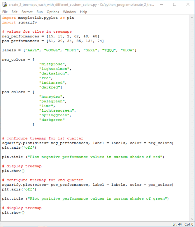
The first method for assigning colors to tiles is illustrated in the following Python script file. The script displays two treemap charts.
- The first treemap chart is for the symbols during the first quarter of 2020. All the tiles in this quarter had negative performance scores that are converted to positive numbers when they are submitted to the plot method in the squarify library. The conversion relies on basing the size value for a tile on the absolute value of the difference of the last day in a quarter less the first date in a quarter. Therefore, the larger the size value for a tile, the more negative the performance in the first quarter.
- The second treemap chart is for the symbols that already have all positive numbers with larger numbers indicating superior performance. Therefore, the larger the size value for a tile, the more positive the performance in the second quarter.
After the import statements, the code for the first treemap chart begins by assigning an array of size values to neg_performances. This array is for symbol performances in the first quarter. Another assignment statement assigns an array of size values to pos_performances; this assignment is for the second treemap chart, which is for second quarter performance values.
The list object, which is named labels, holds the symbol values for each ticker symbol in the sample data. There is only one list object because the same set of symbols are tracked in the first and second quarters.
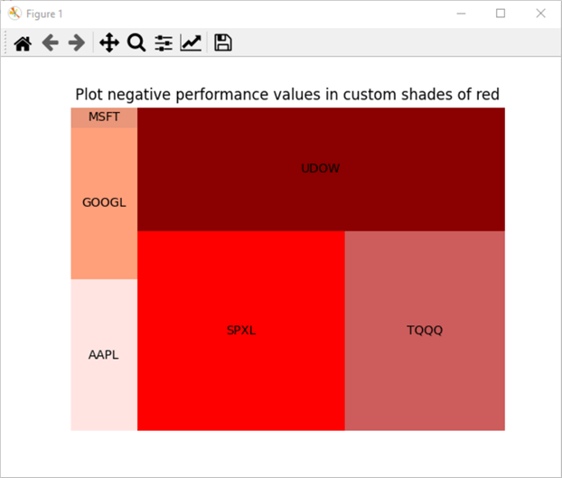
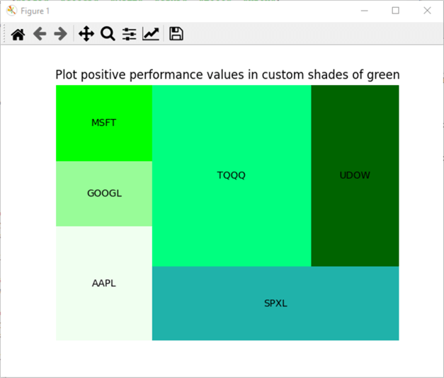
Just as there are two sets of size values (neg_performances and pos_performances), there are two sets of colors. The neg_colors set are for neg_performances size values. Because the size values are all negative in the first treemap chart, the color names are all for various shades of red from mistyrose through to darkred. In contrast, the pos_colors set in the second treemap chart are for pos_performances size values. Because the size values are all positive, the color names are all for various shades of green from honeydew through to darkgreen.
The squarify.plot() statement for the first quarter sets sizes equal to the neg_performances array and color equals to neg_colors list. A plt.title() statement adds a title to the treemap chart and a plt.show() statement displays the treemap chart.
The treemap chart code for the second quarter follows the same design as for the first quarter, except it assigns pos_performances to sizes and pos_colors to color. Additionally, the treemap chart title is updated to reflect that the chart is for positive performance values.
Here's what the treemap chart for the first quarter looks like.
- Notice that the GOOGL and AAPL tiles have different shades of red although they both have the same neg_performances value. This is because with the first approach colors are assigned based on label values and not on sizes values.
- No other tiles in the treemap have the same neg_performances value.
- In addition, there is just one tile per label so each tile has a different shade of red.
Here's what the treemap chart for the second quarter looks like. All the tiles for this treemap chart are different shades of green.
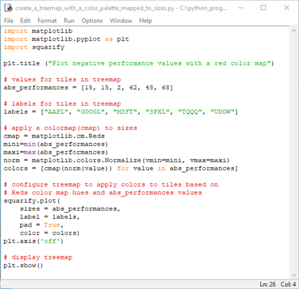
As indicated above, the second approach for assigning colors to tiles in a treemap chart assigns colors based on size values instead of label values associated with tiles. The code for this second treemap chart also illustrates the use of a colormap. A colormap is like a built-in color palette. Matplotlib can use a moderate sized collection of colormaps. The script below illustrates the use of the Reds colormap, which has an extensive collection of sequentially arranged red hues.
This following script matches the indices for hues in the Reds colormap to the values in abs_performances array. The key sections of the script are preceded by comments of "apply a colormap(cmap) to sizes" and "configure treemap to apply colors to tiles based on Reds colormap hues and abs_performances values". The basic logic of the approach is as follows
- Reference the Reds colormap
- Find the minimum and maximum abs_performances values
- Normalize the abs_performances values to the Reds colormap index values
- Assign the normalized Reds hue index values to an array named colors
- Invoke the plot method from the squarify library with its color parameter set to the colors array
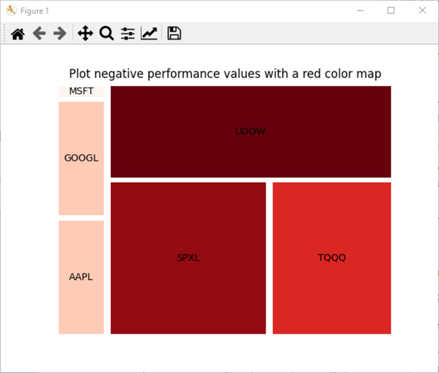
Here's what the treemap chart from the preceding script looks like.
- Notice that the lightest hue is assigned to the MSFT tile. This tile has the smallest size of any tile in the treemap chart.
- In contrast, the UDOW tile has the darkest shade of red. This tile has the largest size of any tile in the treemap chart.
- The GOOGL and AAPL tiles have the same shade of red. Both tiles have a size value of 15.
- The darkness of the red hue for the SPXL and TQQQ tiles is based on sizes value for each tile. The TQQQ tile has a lighter shade than the SPXL tile because the TQQQ tile has a smaller size than the SPXL tile.
Next Steps
This tip presents and describes a collection of Python scripts for implementing a basic treemap chart and selected intermediate and advanced features for creating and displaying treemap charts with Python. The treemap charts show data based on a SQL Server results set. An effort has been made to present content in a way that enables you to replace the sample data in scripts with your own data. Therefore, one next step is to use the templates with your own data.
Python along with squarify and matplotlib external libraries are a powerful way to create and display treemap charts based on categorical data from SQL Server and other data archives. The matplotlib library is a very rich (highly configurable and potentially complex) development environment for creating charts. If you wish to learn more about creating treemap charts and other kinds of charts with Python than are presented in this tip, you will need to learn more about how to program Python and the Matplotlib library. Here are some links for getting started on learning more (here, here, here, and here).
The download for this tip includes six python script files with the sample data embedded in each file. You can modify the script files by replacing the data used in this tip with your organization's custom data.
About the author
 Rick Dobson is an author and an individual trader. He is also a SQL Server professional with decades of T-SQL experience that includes authoring books, running a national seminar practice, working for businesses on finance and healthcare development projects, and serving as a regular contributor to MSSQLTips.com. He has been growing his Python skills for more than the past half decade -- especially for data visualization and ETL tasks with JSON and CSV files. His most recent professional passions include financial time series data and analyses, AI models, and statistics. He believes the proper application of these skills can help traders and investors to make more profitable decisions.
This author pledges the content of this article is based on professional experience and not AI generated.
View all my tips
Article Last Updated: 2021-12-03


