By: Hristo Hristov | Updated: 2023-02-22 | Comments | Related: > Python
Problem
As a data professional, you must be able to extract, curate, analyze, and visualize your data. How do you approach data visualization if your dataset is ready to be visualized?
Solution
In this tutorial, we will examine the matplotlib data visualization library for Python. There are other libraries, too, e.g., Plotly, seaborn, yt among others. Each has some strengths, but matplotlib is a preferred choice for static visualizations - plots that do not offer interaction.
Python matplotlib Installation
If you have a fresh conda environment, install the module by running
pip install matplotlib or conda
install matplotlib, depending on your package manager.
Basic Line Plot
As a first example, let us see how to plot a variable
x vs. a variable y.
1: import matplotlib.pyplot as plt
2: import numpy as np
3:
4: x = np.linspace(0, 10, 100)
5: y = np.sqrt(x)
6:
7: fig, ax = plt.subplots()
8: ax.plot(x, y)
9: plt.show()
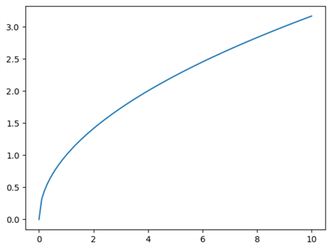
First, we create a one-dimensional array, x, consisting
of 100 data points between 1 and 10. On the other hand, Y
returned the non-negative square root of the array, elementwise. Plotting these
variables results in the following:

Anatomy
Let us examine lines 7 to 9 more closely:
- 7: A figure
on which matplotlib charts our data and a single axis. By providing additional
parameters to
subplots, we can create a grid of axes, e.g., a 2x2. - 8: On the single
axes
ax, we create a plot. Specific plots can be called, e.g.,scatter. Here,plotautomatically determines the resulting plot based on the input variables. - 9: Finally, we show the plot. Alternatively, we can save it to the current
working directory by calling
plt.savefig('foo.png')
There are many properties available to the axes object, and a good knowledge of them is required to develop impactful visuals. I recommend checking out the anatomy of a matplotlib figure for additional information.
Inputs
Generally, the expected input to the variables being plotted should be
numpy.array or a data object than can be parsed to it by using
numpy.asarray. In practice, you may find yourself
using Pandas dataframes directly as x and y arguments, but they may not always work
as expected. On such occasions, try parsing your dataframe to a numpy array.
Styles
There are two coding styles available:
- The OO-style (object-oriented): Explicitly create your figure and axes and call the related methods as needed. This is what we did in the example above.
- Pyplot-style: Relies on pyplot internals to implicitly create and manage figure and axes objects. The same example would look like this:
1: plt.figure()
2: plt.plot(x,y)
In this tutorial, I will stick to the OO style.
Scatter Plot
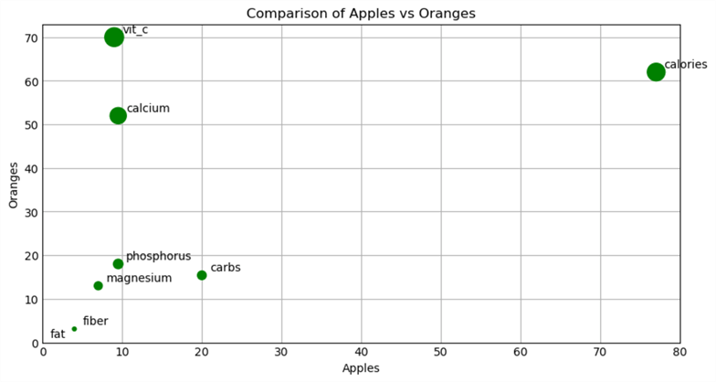
Let us expand the first example by specifically creating a scatter plot. The data I will use represent a comparison of the nutritional values of apples and oranges. We start with a dictionary that we convert to a Pandas dataframe with this syntax:
01: d = {'magnesium':[7,13],
02:     'calcium':[9.5,52],
03:     'phosphorus':[9.5,18],
04:     'vit_c':[9,70],
05:     'fat':[0,0.2],
06:     'fiber':[4,3.1],
07:     'calories':[77,62],
08:     'carbs': [20, 15.4]
09:     }
10: df = pd.DataFrame(data=d)
Here is how we can compare the nutritional content of the two fruits with a matplotlib scatter plot:
01: fig, ax = plt.subplots(figsize=(8, 4), dpi=100)
02:
03: x = np.array(df.iloc[0])
04: y = np.array(df.iloc[1])
05:
06: ax.scatter(x, y, size=np.int16(y*4), color='g')
07:
08: ax.set(xlim=(0,np.max(x)+3),
09:         ylim=(0,np.max(y)+3),
10:         xlabel='Apples',
11:         ylabel='Oranges',
12:         title='Comparison of Apples vs Oranges')
13:
14: ax.grid(True)
15:
16: for i,n in enumerate(d):
17:         ax.annotate(n, (d[n][0], d[n][1]), xytext=(x[i]+1, y[i]+1))
18:
19: plt.show()
First, we create a Figure and an Axes (line 1). Then, we create x and y variables
by parsing the rows of the dataframe to numpy arrays (lines 3 and 4). Next,
we create the scatter plot (6) by passing x and y as variables to the plot. Additionally,
we pass the y array converted to integer values and multiply them by 4 to serve
as the size for the dots. We also pass 'g'
as a single color, denoting green. Next (8), using the set
method, we pass several properties to the plot, such as axis limits, labels, and
plot title. On line 14, we instruct matplotlib to display the grid lines. On lines
16 and 17, we iterate over the dictionary and pass the keys along with the data
points to the annotated method, so we can see which fruit property we are analyzing.
Finally (19), we show the plot.
The result is:

Numeric and Categorical Data
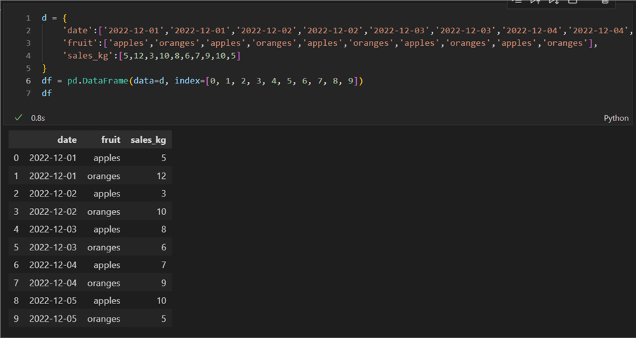
In the examples so far in this Python tutorial, we plotted only two numeric variables. What if we had to plot two categorical variables against one numerical? One way to achieve a good result is a parallel bar plot. Let us first create a small dataset representing sales of apples and oranges:
1: d = {
2:     'date':['2022-12-01','2022-12-01','2022-12-02','2022-12-02','2022-12-03','2022-12-03','2022-12-04','2022-12-04','2022-12-05','2022-12-05'],
3:     'fruit':['apples','oranges','apples','oranges','apples','oranges','apples','oranges','apples','oranges'],
4:     'sales_kg':[5,12,3,10,8,6,7,9,10,5]
5: }
6: df = pd.DataFrame(data=d, index=[0, 1, 2, 3, 4, 5, 6, 7, 8, 9])
7: df

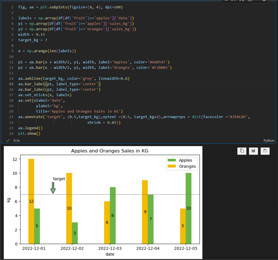
The first categorical variable is "date," which we will use as the x-axis. Against it, on the y-axis, we will plot the sales in kilograms (kg). The fruit variables will be used for a legend.
01: fig, ax = plt.subplots(figsize=(8, 4), dpi=100)
02:
03: labels = np.array(df[df['fruit']=='apples']['date'])
04: y1 = np.array(df[df['fruit']=='apples']['sales_kg'])
05: y2 = np.array(df[df['fruit']=='oranges']['sales_kg'])
06: width = 0.15
07: target_kg = 7
08:
09: x = np.arange(len(labels))
10:
11: p1 = ax.bar(x + width/2, y1, width, label='Apples', color='#6AB547')
12: p2 = ax.bar(x - width/2, y2, width, label='Oranges', color='#F2BB05')
13:
14: ax.axhline(target_kg, color='grey', linewidth=0.8)
15: ax.bar_label(p1, label_type='center')
16: ax.bar_label(p2, label_type='center')
17: ax.set_xticks(x, labels)
18: ax.set(xlabel='date',
19:         ylabel='kg',
20:         title='Apples and Oranges Sales in KG')
21: ax.annotate('target', (0.5,target_kg),xytext =(0.5, target_kg+2),arrowprops = dict(facecolor ='#7EBC89',
22:                                shrink = 0.05))
23: ax.legend()
24: plt.show()
Let us break this down, line by line:
- 1: Creating a figure and a single axis with a size of 8x4 inches and a DPI of 100.
- 3: Casting to numpy array the labels we need for the x-axis.
- 4 & 5: Creating y variables. There are two because we have two types of fruits.
- 6: Setting the width of the bar.
- 7: Setting a sales target which will be used to display a constant horizontal line on the plot.
- 9: Create an array of length equal to the number of labels we have, so 5.
- 11 & 12:
Create two bar plots, passing values for x, then corresponding y, the width,
a label, and a desired color. The results are assigned to variables
p1andp2of typematplotlib.container.BarContainer. - 14:Add a constant
horizontal line with the value
target_kg. - 15 & 16:
Using the bar_label method, we can display the data point's value inside
the bar. We pass p1 and p2, and the bar label automatically uses their
datavalueproperty. - 17: Need to
explicitly set the ticks of the x-axis. X is an array [0,1,2,3,5], but we need
the dates.
set_xticksallows to pass an array and the corresponding labels. - 18 - 20: Use the set method to set some additional properties.
- 21 & 22: Using annotate, we can add text and point to a specific area on the plot. Here we want to explain what the horizontal line is.
- 23: display the legend.
- 24: show the plot.
The result is the following bar chart:

Conclusion
Using some synthetic data, we showcased how to get started with two basic types of plots available in the matplotlib python package: a scatter plot and a parallel bar plot. You can reuse these examples and plug your data from a database or an API. Matplotlib supports many other types of plots, such as statistics plots and 3D plots.
Next Steps
- Matplotlib axes bar
- Matplotlib axes bar label
- Matplotlib axes set
- Matplotlib axes annotate
- Matplotlib plot types
About the author
 Hristo Hristov is a Data Scientist and Power Platform engineer with more than 12 years of experience. Between 2009 and 2016 he was a web engineering consultant working on projects for local and international clients. Since 2017, he has been working for Atlas Copco Airpower in Flanders, Belgium where he has tackled successfully multiple end-to-end digital transformation challenges. His focus is delivering advanced solutions in the analytics domain with predominantly Azure cloud technologies and Python. Hristo's real passion is predictive analytics and statistical analysis. He holds a masters degree in Data Science and multiple Microsoft certifications covering SQL Server, Power BI, Azure Data Factory and related technologies.
This author pledges the content of this article is based on professional experience and not AI generated.
View all my tips
Article Last Updated: 2023-02-22


