By: Hristo Hristov | Updated: 2023-03-21 | Comments | Related: > Python
Problem
When you have a curated dataset, it is important to be able to visualize and explain it the perform data analysis. If your data are ready to be visualized, how can you create interactive plots with matplotlib and Python in VS Code?
Solution
In this tutorial, we present a step-by-step guide on how to present your data interactively with matplotlib plots. In a previous tip, we examined static visualizations, which do not allow user interaction. On the other hand, by creating interactive data visualizations, the user can scroll across the plot and zoom in on specific data points. This interaction provides a more detailed view of the data.
Setup
We will use a Jupyter notebook with a conda virtual environment in VS code. First, let us import the packages we need:
import matplotlib.pyplot as plt
import numpy as np
import pandas as pd
In case you don't have these installed yet, please install them before you begin. Next, we must configure matplotlib to use the correct visualization backend. Since we are using a Jupyter notebook environment, we can use the following:
%matplotlib widget
Here is how it all looks in the notebook:

Running the last cell will generate an ipywidget
which will render plots in an interactive control. Multiple plots and zooming
are supported. However, when you run this line for the first time, you may get an
error:

Ipympl is a type of backend that enables the interactive features of matplotlib in a Jupyter notebook. It needs to be installed separately using the Anaconda prompt:

Note: You may need to run the prompt "as Administrator" depending on your system's settings. With that done, you should be all set to start generating interactive plots in VS Code!
Statistics Plot
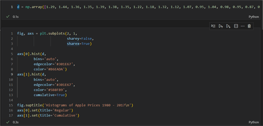
As a first example, let us create an interactive histogram. For the input data, we will use the apple prices per lb. in USD between 1980 and 2017. First, we create a numpy array with the data:
d = np.array([1.29, 1.44, 1.36, 1.35, 1.39, 1.38, 1.35, 1.22, 1.18, 1.32, 1.12, 1.07, 0.95, 1.04, 0.98, 0.95, 0.87, 0.92, 0.90, 0.94, 0.91, 0.93, 0.83, 0.80, 0.83, 0.89, 0.89, 0.72, 0.69, 0.73, 0.73, 0.77, 0.68, 0.66, 0.59, 0.64, 0.57, 0.63])
Then we create two histograms:
01: fig, axs = plt.subplots(2, 1,
02:                         sharey=False,
03:                         sharex=True)
04:
05: axs[0].hist(d,
06:         bins='auto',
07:         edgecolor='#301E67',
08:         color='#B6EADA')
09: axs[1].hist(d,
10:         bins='auto',
11:         edgecolor='#301E67',
12:         color='#5B8FB9',
13:         cumulative=True)
14:
15: fig.suptitle('Histograms of Apple Prices 1980 - 2017\n')
16: axs[0].set(title='Regular')
17: axs[1].set(title='Cumulative')
Let us break it down:
- 01 – 03: We create one figure and two axes, one on top of the other specified by the array size (2,1). You can think of this pair of arguments as two rows and a single column. Had we switched the row and column sizes, e.g. (1,2), we would have had a single row with two columns. Additionally, we specify not to share the y-axis but the x-axis.
- 05 – 08:
We use the first axis to create a histogram using the
hist()method. As arguments, we provide the data and the number of bins and set the color of the edges and bars of the histogram. The possible values for thebinsargument, you can examine here. - 09 – 13: This time, we do the same but make a cumulative histogram. It computes the histogram so that each bin gives the counts in that bin plus all bins for smaller values. The last bin gives the total number of data points.
- 15: We set a general title of the figure for both histograms.
- 16 and 17: We set separate titles for the two histograms.
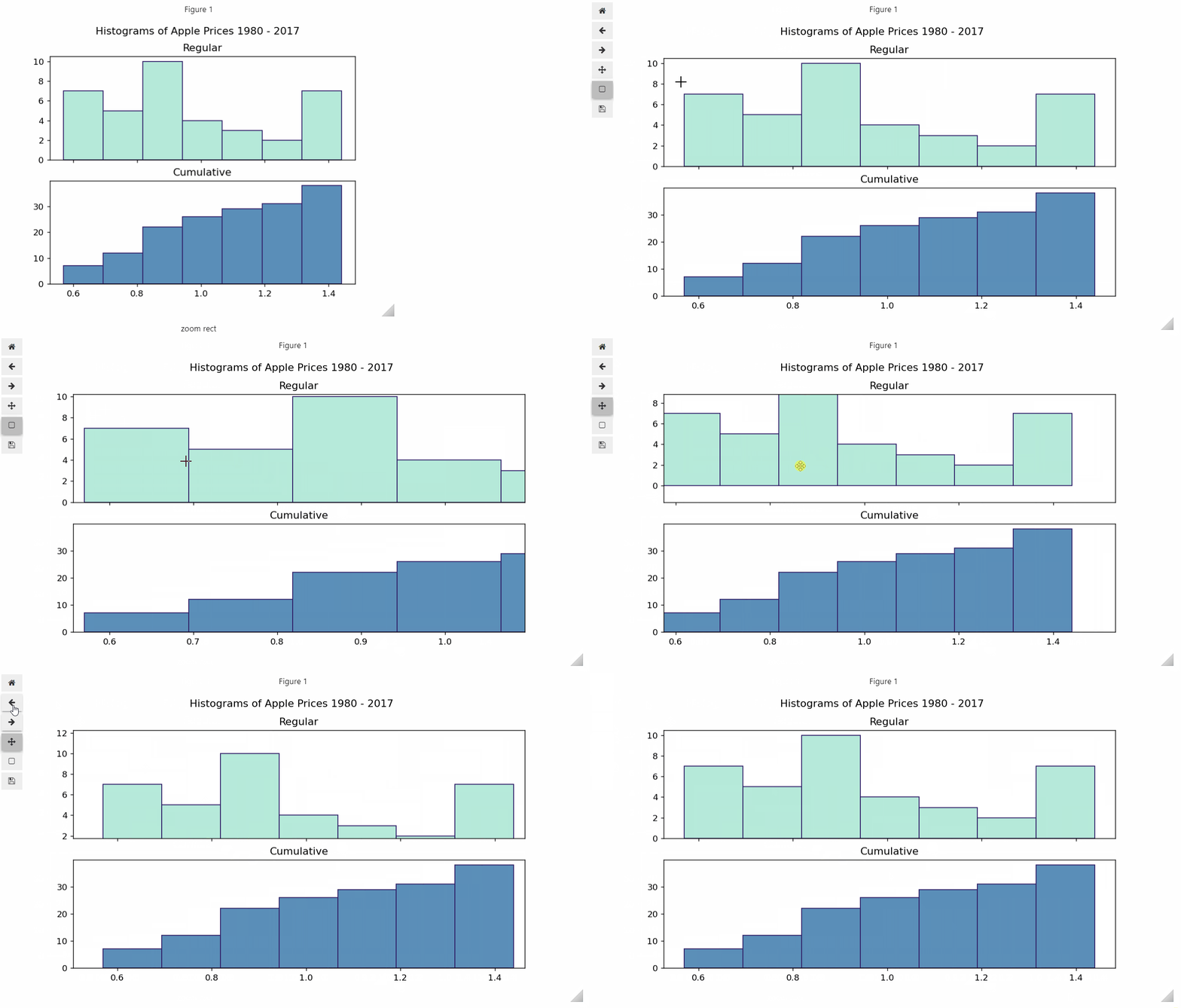
The result is:
Unlike static plots, notice the additional control we get:
- Options to interact with the plot on the left-hand side of the figure. We can zoom in on an area of the plot, return to the initial state or go through selection states. The save icon allows you to export the plot as a png file with the current zoom setting.
- An option to change the size of the figure dynamically by using the triangle on the right-hand side of the screen. You can expand or contract the figure, while the contents of the plot will adjust accordingly.
3D Plot
Let us reveal the real power of the interactive plot by creating a 3D scatter plot. Plotting the extra variable creates another dimension that may be difficult to see or grasp in a static plot. The 3D plot is usually required when comparing three series of numerical values. To demonstrate, I will use data for the nutritional values of pears, apples, and oranges (source):
1: labels = np.array(['calories','fat','carbohydrate','protein','fiber','sugar', 'iron', 'calcium','potassium'])
2: x = np.array([4,0,7,1,16,27,1,1,3]) # pears
3: y = np.array([3,0,6,1,11,26,1,1,3]) # apples
4: z = np.array([4,0,7,3,15,34,1,6,7]) # oranges
5:
6: points = list(zip(x, y, z, labels))
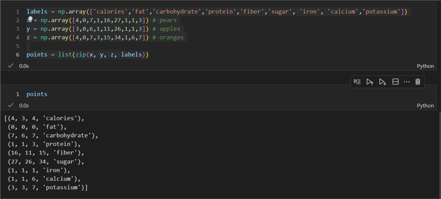
We create three arrays that contain a series of values for each fruit. On line 6, we zip the values together, creating a list of tuples, each containing four elements. Here is the result:
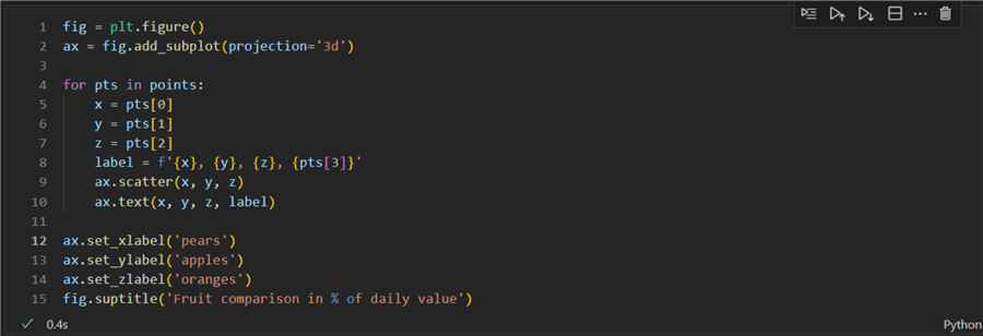
Next, we can use the data to create the 3D plot:
01: fig = plt.figure()
02: ax = fig.add_subplot(projection='3d')
03:
04: for pts in points:
05:     x = pts[0]
06:     y = pts[1]
07:     z = pts[2]
08:     label = f'{x}, {y}, {z}, {pts[3]}'
09:     ax.scatter(x, y, z)
10:     ax.text(x, y, z, label)
11:
12: ax.set_xlabel('pears')
14: ax.set_ylabel('apples')
15: ax.set_zlabel('oranges')
16: fig.suptitle('Fruit comparison in % of daily value')
Let us break it down:
- 01 & 02: Creating a figure object and a single axis, with a custom-defined projection '3d'. The default is 'None,' resulting in a 'rectilinear' projection.
- 04 – 10: For every tuple in the list of values created previously, we define the current coordinates (x, y, z) by taking the first, second, and third tuple element. Similarly, we define the label value by using the last tuple element. On line 9, we chart a scatter plot. Then, on line 10, we use the text method to add a text annotation to each point.
- 12 – 15: Add data labels accordingly using the corresponding axis method.
- 16: Add an informative title to our figure.
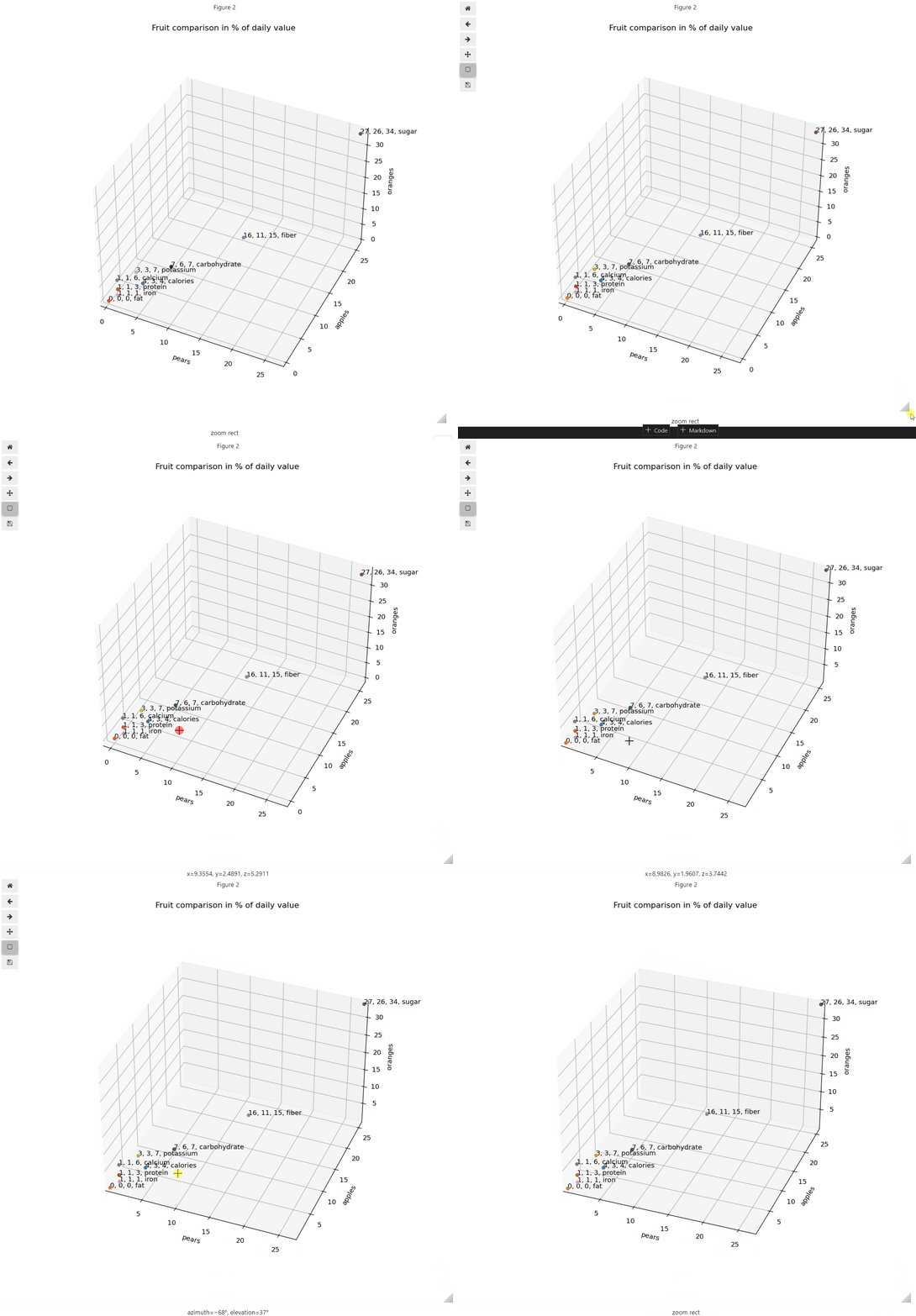
The result is:
Now that we have a 3D projection, you can use the left mouse button to pan the plot and the right mouse to zoom in and out by holding it and moving the mouse.
Conclusion
We can plot interactive plots using the 3D projection option provided by matplotlib. These can be anything from simple histograms to more complex 3D plots. Depending on the type (numerical or categorical) and the number of input variables (two, three, or more), we can use a suitable plot and project it in 3D space. This projection will allow interactions such as panning, zooming, and data point selection.
Next Steps
- Using %matplotlib widget instead of %matplotlib notebook, tk, etc.
- Matplotlib histogram
- 3D plotting
- 3D scatter plot
About the author
 Hristo Hristov is a Data Scientist and Power Platform engineer with more than 12 years of experience. Between 2009 and 2016 he was a web engineering consultant working on projects for local and international clients. Since 2017, he has been working for Atlas Copco Airpower in Flanders, Belgium where he has tackled successfully multiple end-to-end digital transformation challenges. His focus is delivering advanced solutions in the analytics domain with predominantly Azure cloud technologies and Python. Hristo's real passion is predictive analytics and statistical analysis. He holds a masters degree in Data Science and multiple Microsoft certifications covering SQL Server, Power BI, Azure Data Factory and related technologies.
This author pledges the content of this article is based on professional experience and not AI generated.
View all my tips
Article Last Updated: 2023-03-21


