By: Hristo Hristov | Updated: 2023-05-23 | Comments (2) | Related: > Python
Problem
A time series dataset is a dataset that has at least one attribute (column) denoting a point in time and acting as an index. The unit can be an hour and a minute or a complete timestamp with date and time. In terms of frequency, the data can range from milliseconds to months and years. Plotting the data points onto an axis representing the timeline based on the timestamp can uncover interesting trends. If you have a time series dataset, how could you visualize it?
Solution
We can use the open-source Plotly library to visualize time series data in Python. Plotly's Python graphing library helps you develop interactive, high-quality graphs. There are many different charts that you can generate, e.g., line plots, scatter plots, area charts, bar charts, pie chart, error bars, box plot, histogram and more. In this tutorial, we will focus on visualizing time series data with a line chart and adding interactivity.
Getting Started
Install Plotly
First, you must install the package by using pip or conda:
$ pip install plotly==5.14.1
With Plotly, you can generate your plot in a Jupyter Notebook, create an interactive HTML plot or save it to a static image. This tip will focus on working inside a Jupyter Notebook. In an existing environment, if you had just imported the Plotly package, you may get an error like this one:
Nbformat is the base implementation of the Jupyter Notebook format, and the most up-to-date version is required for Plotly to run. So, make sure to update the package by running the following:
$ pip install --upgrade nbformat
Data
For this experiment, we will use the Appliances energy prediction data set from the UCI Machine Learning repository. We will only focus on two columns: date (timestamp) and Appliances (energy use in Wh). After loading the data, I will select only the necessary columns and check their data types:
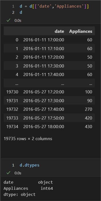
The date column is of type object; therefore, we must convert it to a Pandas datetime type. In turn, Plotly auto-sets the axis type to a date format when the corresponding data are either ISO-formatted date strings or if they are a date pandas column or datetime NumPy array. So let us convert to Pandas datetime:
d.date = pd.to_datetime(d.date)
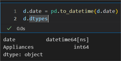
Before we plot, let's also gain a quick insight into how many rows we have.
We would also like to know the frequency of the time series. To get the frequency,
we can use the infer_freq function and pass to it
the timestamp column:
pd.infer_freq(d.date)
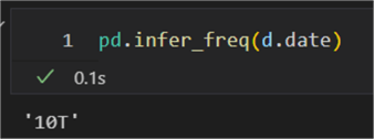
The dataset is evenly sampled in 10 minutes. Next, let's get a profile:
d.describe(include='all',
        datetime_is_numeric=True)
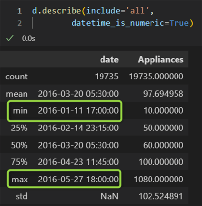
This profile tells us there are 19735 rows, and we have energy consumption data for about four and a half months.
Plot
Let's explore creating two interactive plots: a simple one and one with more filtering options.
Simple Line Plot
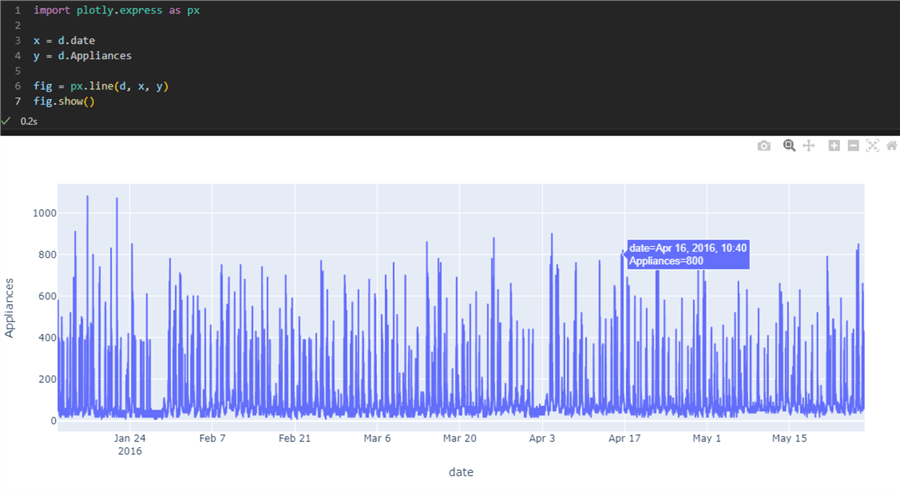
To plot the data straightaway, we can call the line function on the imported plotly.express object:
1: import plotly.express as px
2:
3: x = d.date
4: y = d.Appliances
5:
6: fig = px.line(d, x, y)
7: fig.show()
The line function is straightforward to use. It
requires you to pass a dataframe, an array, or a dictionary first. In this example,
this is the variable d. Then we have
x and y, which can be
series or array-like. In our case, x is the date column, and y is the column Appliances.
The result is a basic plot with default embedded interactivity in the top right-hand
corner allowing you to either download as png, zoom, pan, auto-scale, or reset the
view:
Plot with Range Selectors
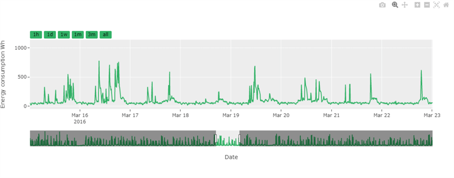
With the previous code block giving us a taste of Plotly, let's improve our plot. I want to add some improvements to enhance the user experience. Here is an example that I will break down line by line:
01: import plotly.graph_objs as go
02:
03: fig = go.Figure()
04:
05: fig.add_trace(go.Scatter(x=x, y=y, marker=dict(color='#32B166')))
06:
07: fig.update_layout(
08:     xaxis=dict(
09:         rangeselector=dict(
10:             buttons=list([
11:                 dict(count=1,
12:                      label="1h",
13:                      step="hour",
14:                      stepmode="backward"),
15:                 dict(count=1,
16:                      label="1d",
17:                      step="day",
18:                      stepmode="backward"),
19:                 dict(count=7,
20:                      label="1w",
21:                      step="day",
22:                      stepmode="backward"),
23:                 dict(count=1,
24:                      label="1m",
25:                      step="month",
26:                      stepmode="backward"),
27:                 dict(count=3,
28:                      label="3m",
29:                      step="month",
30:                      stepmode="backward"),
31:                 dict(step="all")
32:                 ])
33:                ),
34:         rangeslider=dict(
35:             visible=True
36:        ),
37:         title='Date'
38:     ),
39:     yaxis=dict(
40:         title='Energy consumption Wh'
41:     ),
42:     xaxis_rangeselector_font_color='black',
43:     xaxis_rangeselector_activecolor='gray',
44:     xaxis_rangeselector_bgcolor='#32B166',
45:     template='ggplot2'
46: )
47: fig.show()
- 1: Import the plotly.graph_objects module, which contains an automatically-generated hierarchy of Python classes
- 3: Make an instance of the Figure class. This class helps draw the desired plot by providing numerous convenience methods.
- 5: Using
add_trace,we can add a "trace" or, in other words, a specific type of chart. From the list of available trace classes (charts), we needScatter. Note: there is no "line" chart per se. - 7: Using the
update_layouton the Figure object, we can update the plot with multiple properties using dictionaries and keyword arguments.- 8: Using the
xaxisproperty, we can dynamically set many different attributes of the current figure. - 9 - 33: We create a range filter with the
rangeselectorkeyword. Additionally, we add sixbuttons. We use a similar configuration for each button: a dictionary containing keywords. In this example, each button has a filter frequency (set bycount), a name (set bylabel), a time frequency step (set bystep), and a stepmode that will filter either from the start or end of the datasets (set bystepmode). Backward means the filter will be applied from the end of the data set. - 34 – 36: We add a slider for the time range. This slider acts as an overview of the whole period so that certain trends can be spotted, and longer periods are easier to select by dragging the start and end lines.
- 38: Give the x axis a title "Date."
- 39 – 41: Similarly, but with fewer configurations, we manipulate
the
yaxis. Here we specify its title. - 42: The font color of the labels of the range selector.
- 43: The selection color of the selected range button.
- 44: The background color of the range buttons that are not selected.
- 45: Set the template option. There are several available. This one has a white plot background and a light gray grid background.
- 47: Show the figure by using the default renderer. This is good for most occasions and allows manual export to a png image file.
- 8: Using the
The result is:
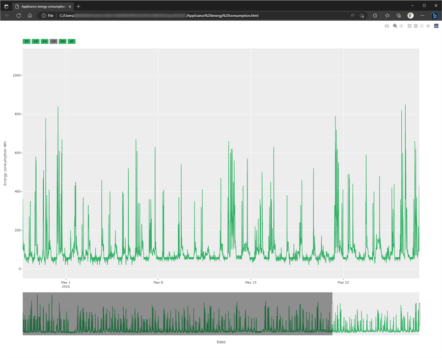
Instead of rendering the figure in the notebook, we can also show our plot in
the browser. Use the write_html function:
fig.write_html('Appliances energy consumption.html', auto_open=True)
The result is a fully interactive HTML page rendered in your default browser:
Conclusion
Plotly is a flexible Python library that allows the data analyst to conveniently plot time series data in a Jupyter Notebook or in the browser. Many dictionary and keyword arguments allow enhancing the plot to include range selectors, a range slider, and changing the colors. Plotly is a great tool next to other similar libraries such as matplotlib or seaborn.
Next Steps
- Introduction to Creating Data Visualizations with Python matplotlib
- Introduction to Creating Interactive Data Visualizations with Python matplotlib in VS Code
- Plotly line plot
- Graph objects
- Plotly add trace
- Range selector buttons
- Plotly template options
- Displaying figures in Python
- Plotly write_html on GitHub
About the author
 Hristo Hristov is a Data Scientist and Power Platform engineer with more than 12 years of experience. Between 2009 and 2016 he was a web engineering consultant working on projects for local and international clients. Since 2017, he has been working for Atlas Copco Airpower in Flanders, Belgium where he has tackled successfully multiple end-to-end digital transformation challenges. His focus is delivering advanced solutions in the analytics domain with predominantly Azure cloud technologies and Python. Hristo's real passion is predictive analytics and statistical analysis. He holds a masters degree in Data Science and multiple Microsoft certifications covering SQL Server, Power BI, Azure Data Factory and related technologies.
This author pledges the content of this article is based on professional experience and not AI generated.
View all my tips
Article Last Updated: 2023-05-23


