Problem
Demonstrate a process for SQL Server professionals to track relative performance for several different sets of time series data within a database. This tip demonstrates the steps for organizing the data within SQL Server for export to a csv file. It also illustrates how to import the csv file into Python. Then, it shows how to prepare performance charts in Python for the time series data copied as a csv file from SQL Server. This tip also reveals the types of use cases that performance charts can support.
Solution
A performance chart can track the path of multiple time series from a start date through an end date. The performance tracked is the percentage change from a start value through an end value. For example, if the end value is twice as large as the start value, then the performance chart represents a one hundred percentage point gain.
Aside from tracking the percentage change from start through end dates, performance charts are often used for making comparisons of one or more time series to a benchmark. The S&P 500 index (or the SPY exchange traded fund close price) often serves as a benchmark when working with financial securities. You can use any appropriate benchmark for the type of data you are processing with performance charts. For example, the National Oceanic and Atmospheric Administration publishes a large suite of data products that provide information about typical climate conditions for thousands of locations across the United States (U.S. Climate Normals). Many companies set performance targets, such as sales goals, for their sales offices. Performance charts can track performance for different organizational units relative to targets for the units in an organization over time.
You can also use performance charts to compare values from different time series. For example, a performance chart can show which of two, three, or more time series grows the most from a start date through to an end date. By publishing regular updates with data through the most recent quarter or month or week, you can spot changes in performance over time.
Organizing time series in SQL Server for export to csv files
An earlier tip demonstrated how to download from the Stooq.com database historical price and volume data for financial securities. The Stooq.com database downloads as a collection of .txt files populated with a comma separated values (csv) format. The earlier tip demonstrated how to transfer time series values for just 6 securities. The current tip extends and refines the methodology from the earlier tip to accommodate 15 securities or more for performance tracking.
The processing for transferring the Stooq.com .txt file contents to a SQL Server table relies on three tables.
- The [dbo].[path_to_symbol] table is manually populated for the paths to Stooq files with historical price and volume data in csv format. Fifteen files were extracted into a Windows folder as the sample data for this tip from the downloaded Stooq.com data.
- Each file is transferred sequentially into a fresh copy of the [dbo].[performance_from_file] table.
- The sequential transfers occur within a while loop – one pass through the loop per file
- After the transfer into [dbo].[performance_from_file], the rows and columns are filtered and transferred into another SQL Server table. The target table (dbo.performance_for_chart) has three columns and a row for each securities symbol and date.
- The date range starts as soon as the first trading date in 2011 and runs through June 30, 2021.
- The column names are
- Ticker for each security’s symbol
- Date and
- Close for the close price of each security’s symbol on each date
Here is an excerpt from the sql file (for_performance_from_file_to_performance_for_chart.sql) with the code for implementing the above steps.
use DataScience
go

-- create fresh table to store data for current symbol
drop table if exists dbo.performance_from_file;

create table [dbo].[performance_from_file](
 ticker nvarchar(10)
,period_length nvarchar(1)
,date nvarchar(8)
,time nvarchar(8)
,[open] money
,high money
,low money
,[close] money
,volume bigint
,openint nvarchar(1)
)

-- create fresh performance values table
drop table if exists dbo.performance_for_chart;

create table [dbo].[performance_for_chart](
 ticker nvarchar(10)
,[date] date
,[close] money
)


-- create fresh performance values table
drop table if exists dbo.path_to_symbol;

create table [dbo].[path_to_symbol](
 ticker_index int,
 ticker_path nvarchar(100)
)

-- populate path_to_symbol table
insert into [dbo].[path_to_symbol]
select 1, 'c:\DataScienceSamples\tickers_for_modeling_with_ohlcv\aapl.us.txt' [path_to_symbol]
union
select 2, 'c:\DataScienceSamples\tickers_for_modeling_with_ohlcv\dia.us.txt'
union
select 3, 'c:\DataScienceSamples\tickers_for_modeling_with_ohlcv\fas.us.txt'
union
select 4, 'c:\DataScienceSamples\tickers_for_modeling_with_ohlcv\googl.us.txt'
union
select 5, 'c:\DataScienceSamples\tickers_for_modeling_with_ohlcv\iyr.us.txt'
union
select 6, 'c:\DataScienceSamples\tickers_for_modeling_with_ohlcv\mara.us.txt'
union
select 7, 'c:\DataScienceSamples\tickers_for_modeling_with_ohlcv\msft.us.txt'
union
select 8, 'c:\DataScienceSamples\tickers_for_modeling_with_ohlcv\qqq.us.txt'
union
select 9, 'c:\DataScienceSamples\tickers_for_modeling_with_ohlcv\soxl.us.txt'
union
select 10, 'c:\DataScienceSamples\tickers_for_modeling_with_ohlcv\spxl.us.txt'
union
select 11, 'c:\DataScienceSamples\tickers_for_modeling_with_ohlcv\spy.us.txt'
union
select 12, 'c:\DataScienceSamples\tickers_for_modeling_with_ohlcv\tna.us.txt'
union
select 13, 'c:\DataScienceSamples\tickers_for_modeling_with_ohlcv\tqqq.us.txt'
union
select 14, 'c:\DataScienceSamples\tickers_for_modeling_with_ohlcv\udow.us.txt'
union
select 15, 'c:\DataScienceSamples\tickers_for_modeling_with_ohlcv\xop.us.txt'

-------------------------------------------------------------------------------------

-- local variable declarations and assigned
-- values for the while loop that gathers data
-- for performance_for_chart table
declare
 @index int = 1
,@index_max int = 15
,@ticker_path nvarchar(100)
,@sql nvarchar (4000)

-- while loop for pulling data by symbol
while @index <= @index_max
begin

truncate table dbo.performance_from_file

-- set @ticker_path based on current @index value
select @ticker_path = ticker_path from [dbo].[path_to_symbol] where ticker_index = @index

-- dynamic sql for bulk insert to populate dbo.performance_from_file
-- based on @ticker_path
set @sql = 'bulk insert dbo.performance_from_file from '''
   + @ticker_path
   + ''' with (format= ' + '''CSV''' + ', FIRSTROW=2)'
exec(@sql)


-- add filtered and transformed rows to dbo.performance_for_chart
-- based on current data in dbo.performance_from_file
-- filter columns, transform columns, filter rows based on date
insert into dbo.performance_for_chart (ticker, [date], [close])
select
 left(ticker,CHARINDEX( '.US' , ticker)-1) symbol
,convert(date, [date]) [date]
,[close]
from [DataScience].[dbo].[performance_from_file]
where date >= 20110101 and date <= 20210630

-- set up to retrieve data for next symbol from
-- data at @ticker_path
set @index = @index + 1

end
As with any massive data source, the Stooq.com historical security price and volume data has some issues. This tip addresses one of these issues. For company stock securities, all date rows seem to be populated with price and volume data. On the other hand, exchange traded fund securities often, but not always, seem to be missing data for the row with a date of 2011-02-17. In the context of this tip, the missing row for Close column values can be estimated as the average of the Close column values for 2011-02-16 and 2011-02-18. If you have a better method for estimating missing values, then you should use that approach instead.
The following script excerpt is meant to be invoked immediately after the preceding script excerpt. The T-SQL is to verify which symbols have missing date values relative to the AAPL ticker. First, the script confirms that the AAPL ticker has a date row that is missing from the SPY ticker. The missing date row in this case is 2011-02-17. Second, any ticker which has a missing row for 2011-02-17 has its close value estimated as the average of Close column values for 2011-02-16 and 2011-02-18. The code segment confirms the operation of the update for the dbo.performance_for_chart table by displaying the count of the rows before and after the update of the dbo.performance_for_chart table.
-- display count of rows by ticker
-- confirms etf time series are missing row for one date
select ticker, count(* ) performance_row_count_for_ticker
from dbo.performance_for_chart
group by ticker
order by ticker

-- dates in apple not in spy (and many other etf symbols)
-- confirms 2011-02-17 is the missing date from etf time series
select [date] apple_dates from dbo.performance_for_chart where ticker ='AAPL'

except

select [date] spy_dates from dbo.performance_for_chart where ticker = 'SPY'

-- insert missing time series value into symbols that are not
-- AAPL,GOOGL,MSFT,QQQ
insert into dbo.performance_for_chart (ticker, [date], [close])
-- estimate for missing close value in etf time series
-- distinct operator is to remove from results set duplicate
-- averages based on rows for 2011-02-16 and 2011-02-18
select distinct
 ticker
,'2011-02-17' [date]
,avg([close]) over(partition by ticker) [estimate_for_missing_close]
from performance_for_chart
where [date] in ('2011-02-16','2011-02-18')  and ticker not in ('AAPL','GOOGL','MSFT','QQQ')

-- display count of rows by ticker
-- confirms fix of missing date for selected etf time series
select ticker, count(* ) performance_row_count_for_ticker
from dbo.performance_for_chart
group by ticker
order by ticker
The following screen shot displays the results set for the preceding script. Notice there are three windowpanes in the Results tab.
- The first pane displays the count of rows by security symbol before any processing for missing date rows. This pane shows several symbols with a count of 2641 and other rows with a count of 2640 rows. The security symbol of MARA has a different row count than either 2641 or 2640.
- AAPL, GOOGL, and MSFT are each symbols for companies – respectively, Apple, Alphabet, and Microsoft. Additionally, QQQ is a symbol for the NASDAQ composite exchange traded fund. All four of these symbols have 2641 rows.
- All the remaining symbols, except for MARA, have row counts of 2640.
- The MARA symbol is for a company stock, but the company did not become active in the Stooq.com historical data until after the first trading date in 2011. Therefore, the MARA symbol has just 1744 rows. These rows are for the dates since MARA became active as far as the daily buying and selling of shares.
- The second pane shows a date of 2011-02-17. Recall that this is the date for which many exchange traded funds have missing data.
- The third pane displays the row counts after the update for the missing date row. Notice that there are just two row count values.
- 2641 is for the count of rows after symbols with a missing value for 2011-02-17 are fixed as well as those symbols for which a fix was not required.
- 1744 is for the count of rows for the MARA symbol. There are no close prices for the MARA ticker until July 29, 2014, and there are 1744 trading dates from July 29. 2014 through June 30, 2021.

Comparing performance charts for SPY versus SPXL during 2020 and 2021
One especially common technique for displaying a performance chart is to plot performance values for a time series. Recall that performance values or scores are simply the percentage point change from the first value in a time series. In the example within this section, the SPXL security symbol is plotted relative to the SPY security symbol. The SPY symbol is for an exchange traded fund based on the S&P 500 index; daily changes in the SPY close price are proportional and directionally consistent with the S&P 500 index. The difference is that you can buy and sell Spy exchange traded fund shares, but the SP&P 500 index is only a numerical series based on calculated index values. The shares of the index cannot be bought or sold. The close price for the SPY symbol is the benchmark in this example. The SPXL symbol is a triple-levered security based on the S&P 500 index, which is represented by the SPY in this tip. If the SPY close price changes by ten dollars from yesterday, then the SPXL symbol close price changes by 30 dollars from yesterday. The change can be in a positive or negative direction for the SPXL symbol depending on whether the SPY close price increases or decreases from yesterday.
The following table shows two performance charts.
- The top performance chart compares SPY to SPXL for all trading days in 2020.
- The bottom performance chart compares SPY to SPXL for the trading days in the first half of 2021.
During 2020, there was a stock market crash of close prices shortly after the initial discovery of the coronavirus in the US. Wikipedia designates this crash as occurring from February 20 through April 7, 2020.
- The performance chart for 2020 shows a steep decline for both ticker symbols during the coronavirus crash followed by a recovery after the crash.
- Although the performance of both tickers (SPY and SPXL) increased after the crash, the SPY ticker ended the year with a higher performance score.
- This is because the decline for the SPXL ticker was much steeper than for the SPY ticker. Therefore, the SPXL symbol had a handicap relative to the SPY symbol for achieving the same performance score at the end of 2020.
The vertical axis is a scale for denoting performance score values. The performance for the SPXL ticker is portrayed with a cyan-colored line chart with squares. There is a square marker in the performance line chart for each trading day. The performance for the SPY symbol shows as a black-colored line chart with a square marker for each trading day.
The performance during the first half of 2021 for the SPY and SPXL symbols appears in the bottom chart below. Both symbols continue to improve their performance during the first half of 2021 from the coronavirus market crash. By the end of the first half of 2021, SPXL symbol performance substantially exceeds the SPY symbol performance.


As mentioned above, the left, vertical axis of the preceding two charts is for plotting performance scores. The following T-SQL code excerpt from the Performance_comps_for_SPXL_vs_SPY_in_2020_for_charts.sql file shows how the performance scores are computed.
- A nested query implements the performance calculations.
- The outer query returns a results set with three columns with
- performance_SPY.date for the date of a pair of performance scores
- performance_SPY.performance_SPY is the performance score on a date for the SPY ticker
- performance_SPXL.performance_SPXL is the performance score on a date for the SPXL ticker
- The local variables @list_1 and @list_2 are the first close prices for the SPY and SPXL symbols, respectively.
- The subqueries named performance_SPY and performance_SPXL perform the calculation for the performance score
- Within the performance_SPY subquery, the performance_SPY column calculates the performance score
- The #performance_SPY temporary table is an excerpt from the performance_for_chart table in the preceding script where the excerpt is for rows with
- a ticker value of SPY and
- a date value in 2020
- Within the performance_SPXL subquery, the performance_SPXL column calculates the performance score
- The #performance_SPXL temporary table is an excerpt from the performance_for_chart table in the preceding script where the excerpt is for rows with a ticker value of SPXL and a date value in 2020
- Within this tip, performance score results sets are accompanied by a ticker value and a range of dates, such as all the trading dates in 2020.
-- performance_SPY and performance_SPXL with dates for chart
select
 performance_SPY.date
,performance_SPY.performance_SPY
,performance_SPXL.performance_SPXL
from
(select date, (([close]/@list_1)-1)*100 performance_SPY from #performance_range_1) performance_SPY
inner join
(select date, (([close]/@list_2)-1)*100 performance_SPXL from #performance_range_2) performance_SPXL
on performance_SPY.date = performance_SPXL.date
The results set from the preceding query excerpt is saved in the SPXL_vs_SPY_performance_2020.csv file within the c:/DataScienceSamples/performance_charts path. A complementary .csv file for the performance scores for the second performance chart has the name SPXL_vs_SPY_performance_2021.csv.
Now that the data for the performance charts for SPY and SPXL are saved, the data can be read into Python and plotted as a performance chart with the following Python script file (performance_SPXL_SPY_2020.py). The following screen shot displays the code for accomplishing these goals.
- The script begins with two import statements for referencing external libraries to Python. An external library adds functionality to the core, internal Python features.
- The pandas library with an alias of pd is an external library with features for handling data with a format similar to a table of values in a spreadsheet. The pandas library in the following script uses a dataframe object (df) for holding the data from the SPXL_vs_SPY_performance_2020.csv file, which stores the results set from the preceding T-SQL query excerpt. You can learn more about pandas dataframes from this prior tip.
- The pyplot API in the matplotlib library with an alias of plt that enables the preparation of line charts, such as those used to display performance charts. You can learn more about the pyplot API from this page at the matplotlib.org website.
- The read_csv method in the pandas library reads the contents of the SPXL_vs_SPY_performance_2020.csv file into a dataframe object named df. The Python print function following the invocation of the read_csv method displays an excerpt from the df dataframe.
- The next block of code contains four lines.
- The first of these lines specifies that the seaborn style be used in the performance chart. Seaborn is a fancy style within the matplotlib library. It improves the appearance of many types of charts, including line plots in a performance chart.
- The remaining three lines in this code block assign names for referencing the date, performance_SPY, and performance_SPXL columns in the df dataframe.
- The next block of code also contains four lines. These lines of code specify, format, and identify the line charts for the performance of the SPY and SPXL symbols. The details of how to accomplish these goals is demonstrated and explained in a prior MSSQLTips.com article.
- The final lines of code format the overall figure and display the figure with the line charts for performance scores. The methods, parameters, and purpose of this code for a line chart in Python is also explained in the preceding prior article. For example,
- The subtitle title property of the pyplot API (plt) designates the overall title for a line chart
- The title property of the pyplot API designates the subtitle for the performance chart

Overview of files used in this tip
Performance charts in this tip are for comparing two or more tickers over a date range. The preceding section created two performance charts for the SPXL ticker versus the SPY ticker in 2020 and the first half of 2021. One special reason for including two time series in a performance chart is to see how one time series designator (SPXL) compares to a benchmark time series (SPY). A common reason for creating performance scores is to discover if the progression of values within one time series is doing better or worse than in the performance scores in another time series. Another reason for including two or more time series in a performance chart is to see which time series performs the best among a set of time series where no time series is designated as a benchmark. This preceding section is a case study in how to prepare a performance chart that contrasts a comparative time series to benchmark time series. The next section in this tip will present examples of both types of performance charts.
All the performance charts in this tip depend on initial processing of the results set from the for_performance_from_file_to_performance_for_chart.sql file. The sql in this file creates and populates the performance_for_chart table. The table has three columns (ticker, date, and close). The source data for populating the performance_for_chart table comes from the performance_from_file table, which is, in turn, populated by data from .txt files in a comma separated format. The .txt files can be downloaded from Stooq.com (or another source, such as Yahoo Finance).
The data in the performance_for_chart table must be extracted and processed for a specific performance chart. The extraction is for a set of two or more ticker symbols and set of trading dates. The processing is for computing percentage change from the close price for the first date in a set of trading dates for a ticker symbol. These percentage change values are the performance scores plotted in the performance charts. There is a separate .sql file, which returns the data for each chart, in the download for this tip.
You can use a script file like the one named and excerpted in Performance_comps_for_SPXL_vs_SPY_in_2020_for_charts.sql in the preceding section for extracting close prices and computing performance scores. This script file pulls data for a couple of tickers (SPXL and SPY) for the trading dates in 2020. The download for this tip contains another .sql script file named Performance_comps_for_SPXL_vs_SPY_in_2021_for_charts.sql. This second file pulls data for the SPXL and SPY tickers for the trading dates in the first half of 2021. In fact, the download for this tip includes a .sql file for each performance chart shown in this tip. After each .sql file for extracting data and processing data for a file completes, you must transfer the values in the results set from SQL Server to a .csv file.
The last script for a performance chart is a Python script file. The Python script reads the .csv file created based on the final sql script for extracting data and processing the data to performance scores. Then, the Python script creates two or more line charts as a performance chart for the data in the .csv file. The Python file for the first performance chart in the preceding section has the name performance_SPXL_SPY_2020.py. The Python file for the second performance chart in the preceding section has the name performance_SPXL_SPY_2021.py. As with the .sql files for extracting data and computing performance scores, each performance chart in this tip has a separate Python file in the download for this tip.
Additional performance charts with references to their source data files
This section presents a collection of performance charts as well as the source code and data files needed for their preparation along with some commentary about the conclusions that you can draw from the charts. These conclusions illustrate different use cases for performance charts.
Comparing TQQQ performance to SPY performance during 2020 and 2021
The following two screen excerpts display two performance charts that parallel those presented in the preceding section.
- The performance scores are again for 2020 in the top chart and for the first half of 2021 in the bottom chart.
- The difference between the following two performance charts and the performance charts in the “Comparing performance charts for SPY versus SPXL during 2020 and 2021” section is that that the charts below compare the TQQQ ticker to the SPY ticker whereas the prior performance charts compare the SPXL ticker to the SPY ticker.
- To help distinguish the difference, the TQQQ performance scores are represented by a blue line with blue square markers in the charts below in contrast to the SPXL performance scores in the preceding section which denotes SPXL performance scores by a cyan line with cyan square markers.
- The SPY performance scores in the two following charts as well as the SPY performance scores in the prior section are depicted with a black line and black square markers.
The TQQQ performance is superior to SPY performance in both 2020 and 2021. This is different than in the comparison of SPXL performance to SPY performance.
- The TQQQ performance score ends 2020 with a value of about 100. In contrast, the SPY performance score at the end of 2020 is slightly below 20 (about 17). Recall that the SPXL performance score was not able to end the year above the SPY performance score.
- During the first half of 2021, TQQQ and SPXL performance scores had a roughly similar pattern to SPY performance scores.
- In both cases, the final benchmark score (for SPY) was below the final comparison ticker score.
- In addition, there was volatility for the comparison tickers in the early months of 2021 before the comparison tickers advanced their performance to end the evaluation period decisively above the SPY benchmark ticker.


The code and data files for the top chart are
- Performance_comps_for_TQQQ_vs_SPY_in_2020_for_charts.sql
- TQQQ_vs_SPY_performance_2020.csv
- performance_TQQQ_SPY_2020.py
The code and data files for the bottom chart are
- Performance_comps_for_TQQQ_vs_SPY_in_2021_for_charts.sql
- TQQQ_vs_SPY_performance_2021.csv
- performance_TQQQ_SPY_2021.py
Comparing MARA, TQQQ, and SPXL performance for trading dates in 2020 and 2021
The following performance chart compares three tickers from the first trading date in 2020 through the last trading date in June of 2021. The ticker symbols are SPXL, TQQQ, and MARA. The SPXL and TQQQ symbols represent exchange traded funds. The MARA symbol represents a single company that focuses on cryptocurrency mining from the first trading date in 2020 through the last trading date in June of 2021. The volatility for a single company will generally be greater than the volatility for an index-based exchange traded fund. One reason for this is that an index can be based on hundreds or even thousands of funds. Also, cryptocurrency mining companies are known for being highly volatile.
- For the reasons indicated above, the SPXL and TQQQ yield relatively steady growth compared to MARA. There are ALSO significant performance differences between SPXL and TQQQ. For example, the final performance score is 170 for TQQQ, but the final performance score for SPXL is just 57.
- The MARA ticker is much more volatile to the upside and downside.
- Overall, the MARA ticker exhibits drastically higher performance. For example, its final performance score is 2887, which dwarfs the final performance scores of 57 for SPXL and 170 for TQQQ, respectively.
- On the other hand, the MARA performance score peaks at 4757 on April 13, 2021 — just before declining massively to just 1772 on May 13, 2021.
- The main point of these comparisons is that the performance charts are a great tool for reporting changes that took place in the past. When your application calls for a great comparison tool, then performance charts may be a good option to consider.
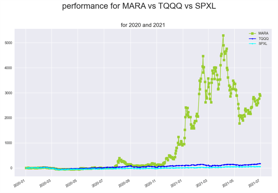
The code and data files for the preceding chart are
- Performance_comps_for_SPXL_vs_TQQQ_vs_MARA_from_2020_thru_2021_for_chart.sql
- MARA_vs_TQQQ_vs_SPXL_performance_2020_2021.csv
- performance_MARA_TQQQ_SPXL_2020_2021.py
Comparing SOXL, TQQQ, and SPXL from 2011 through 2021
The following chart displays performance scores for three tickers (TQQQ, SOXL, and SPXL) from the first trading date in 2011 through the last trading date in June 2021. Up until this point in the tip, the performance of the SOXL ticker has not been shown. The following chart and the underlying .csv file of performance values can reveal conclusions like these:
- The TQQQ symbol ended up with the largest performance score of 7527
- The SOXL symbol ended up with the second largest performance score of 5472
- The SPXL symbol ended up with the lowest performance score of 1682
- The SOXL symbol moved from a lower performance than SPXL to a superior performance than SPXL starting around the middle of November 2016

The code and data files for the preceding chart are
- Performance_comps_for_SOXL_vs_TQQQ__vs_SPXL_from_2011_thru_2021_for_chart.sql
- SOXL_vs_TQQQ_vs_SPXL_performance_2011_2021.csv
- Figure_SOXL_TQQQ_SPXL_performance_2011_2021.py
Next Steps
This tip introduces performance charts to SQL Server analysts. While the application of performance charts in this tip is for changes in security prices over time, you can track any other times series, such as sales by regional sales office, precipitation by geographical coordinates for weather stations, or the compliance for a business to a set of regulatory requirements.
The Results tab at the end of the “Organizing time series in SQL Server for export to csv files” section shows the fifteen symbols available in the download for this tip. Close values for ticker symbols generally start in the first trading date of 2011 and extend through the end of June in 2021. The full set of symbol, date, and close values are in the csv_file_for_performance_for_chart.csv file. This .csv file contains the updated performance_for_chart table values. If you intend to run the examples described in this tip, you should load a SQL Server table with the contents of the csv file.
There are six performance charts displayed in the tip that plot data for five ticker symbols. The ticker symbols are SPY, SPXL, TQQQ, MARA, SOXL.
- Six sql files – one for each of the performance charts – are available in this tip’s download for pulling the data from the performance_for_chart table. The file names are
- Performance_comps_for_SPXL_vs_SPY_in_2020_for_charts.sql
- Performance_comps_for_SPXL_vs_SPY_in_2021_for_charts.sql
- Performance_comps_for_TQQQ_vs_SPY_in_2020_for_charts.sql
- Performance_comps_for_TQQQ_vs_SPY_in_2021_for_charts.sql
- Performance_comps_for_SPXL_vs_TQQQ_vs_MARA_from_2020_thru_2021_for_chart.sql
- Performance_comps_for_SOXL_vs_TQQQ__vs_SPXL_from_2011_thru_2021_for_chart.sql
- After running the sql files in the bulleted list, you can copy their results set as a csv file. Then, you can run a corresponding Python file for each csv file. Each Python file reads a csv file and then displays a corresponding performance chart. The csv files and Python files follow the same general naming conventions as the preceding list of six sql file names.
- After verifying that you can reproduce the six performance charts displayed in this tip, you can increase your familiarity with the techniques for generating performance charts by creating sql files for various combinations of the ten symbols in the download for this tip that were not displayed in a performance chart.
- Finally, you can apply the techniques for generating performance charts described in this tip to your own custom time series data.

Rick Dobson is a SQL Server professional with decades of T-SQL experience that includes authoring books, running a national seminar practice, working for businesses on finance and healthcare development projects, and serving as a regular contributor to MSSQLTips.com. He has been a practicing Python developer for more than the past half decade – with a special emphasis for data visualization and ETL tasks with JSON and CSV files. His most recent professional passions include financial time series data and analyses, AI models, and statistics. If you are interested in growing your skills in any of these areas especially as they relate to financial securities, consider visiting his blog at https://securitytradinganalytics.blogspot.com/2023/12/.
- MSSQLTips Awards: Leadership (200+ tips) – 2025 | Author of the Year Contender – 2017-2024


Hi msamy,
Thank you very much for reading the article and sharing your thoughts about it. You are right that the main focus of the article is how to create performance scores in SQL Server and then export them to Python for charting. Perhaps the title of the tip should have been something more like how to create and use Performance Charts for data in SQL Server with Python.
Before proceeding to more detailed comments, I want to point out that there is an example of Python script for a performance chart in the tip. Also, there is in the download to the article, a Python script for each performance chart shown in the article.
* A performance chart is just a specialized version of a line chart. A performance chart does not show raw time series data, but it shows how the values in a time series changed from some starting period. My focus in the article is to show the special processing in SQL Serve that you can perform and get the processed and then plot it (as well as interpret it).
* At the end of the “Comparing performance charts for SPY versus SPXL during 2020 and 2021” section, there is a Python script for creating a performance chart. The commentary on the script traces the steps from computing performance values in SQL Server through to displaying a chart for performance values.
* Furthermore, the download file for the article includes six Python scripts — one for each performance chart in the article. I did fail to mention the availability of the Python scripts in the download file. I apologize for this oversight on my part as well as for any discomfort that it caused you.
* Finally, I want to mention that I authored a prior article that is an introduction to creating bar and line charts in Python (go to: https://www.mssqltips.com/sqlservertip/6827/python-bar-chart-line-charts-examples/). Perhaps this article will have content that is more suitable to your needs.
I hope this reply helps you as well as others readers of the article.
Cheers,
Rick Dobson
The title is how to create charts with SQL Server and Python
This article only shows that you get the results of a query as csv, then import it.