By: Siddharth Mehta | Comments | Related: > SQL Server 2017
Problem
There are hundreds of visualizations available to visualize data using R. One of the niche types of visualizations are network graphs. This category of visualizations uses nodes and edges to represent relationships from source to target. The data required to generate these graphs is hosted generally in columnar or key-value data store that stores data in JSON format. As relational databases have evolved, there is dedicated support for JSON and other data formats in relational databases and are increasingly being used to store graph related data in the form of nodes and edges. SQL Server also has support for storing graph related data.
Generally reporting tools with key visualization like force-directed graphs are required even to explore and visualize the data. And this can become a bottleneck in basic data exploration while managing graph data. In this tip, we will learn how to visually explore network graphs with SQL Server.
Solution
R contains powerful freely available libraries for interacting with network graphs. We will be using one of these libraries which will create diverse types of network graphs. SQL Server 2017 ships with an option to install and use the R language with T-SQL. In this tip we will use just T-SQL and R along with a freely available R library for the above-mentioned purpose.
Step 1 - Before starting the below mentioned exercise, ensure that the machine has the required software components i.e. SQL Server 2017, SSMS, and R installed as well as configured. If you need to refer the installation steps, you can follow the installation section of R tutorial.
Step 2 - We will need to install a R package named – networkD3. You can read the instructions from this link on how to install packages on a R server.
Force Network Chart Visualization
Step 3 - Once you have installed this package, we are ready to execute our first example. In this example, we using data frames available in the package itself and will be generating a force network chart. You can read about force network graph from here. Open SSMS and open a new T-SQL query window, type or copy the below query and execute the code. Before we execute the code, let’s try to understand this code.
- Sp_execute_external_script is the store procedure indicating which external scripts can be executed in SQL Server.
- @language parameter signifies the script language being used, which is R in this case.
- @script parameter contains the actual R script which will be executed.
- The library function references the networkD3 package for use with rest of the code. Magrittr library is installed when you install the networkD3 library, and the same is being referenced in the code along with networkD3.
- With the data function we are loading two datasets that we will be using to create the network graph. You can look at the data contained in the MisLinks and MisNodes dataset by using the print function.
- Using the forceNetwork function we are creating the first force network graph. You can learn about the syntax of this function and the example itself from the documentation of this networkD3 library. We are passing the fields from the loaded dataset to this function. If this function gets executed successfully, it will create a D3 and Javascript based force network graph.
- Once this graph has been created successfully, we are using the redirection operator %>% to redirect the output of the function to the saveNetwork function from the Magrittr package to save the file at the desired location. We are passing the desired location where we intend to save the graph output in the saveNetwork function.
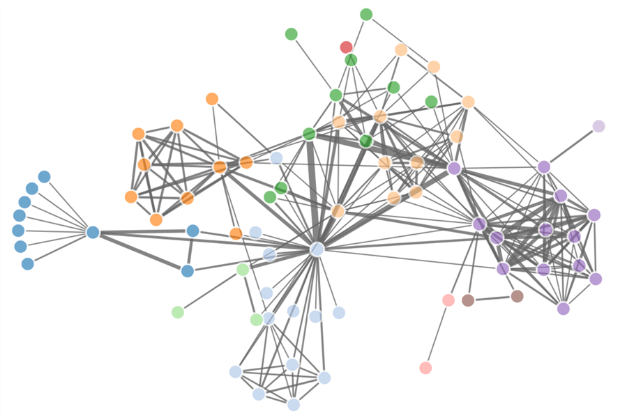
execute sp_execute_external_script
@language = N'R',
@script = N'

library(networkD3)
library(magrittr)

# Load Data
data(MisLinks)
data(MisNodes)

# Create Network Chart and save to file
forceNetwork(Links = MisLinks, Nodes = MisNodes, Source = "source", Target = "target", Value = "value", NodeID = "name", Group = "group", opacity = 0.8) %>%
saveNetwork(file = "C:\\Temp\\Net1.html", FALSE)

'
Step 4 - Once the above code executes successfully, the file should get created in the provided location. Open the file in a browser and the visualization would look as shown below.
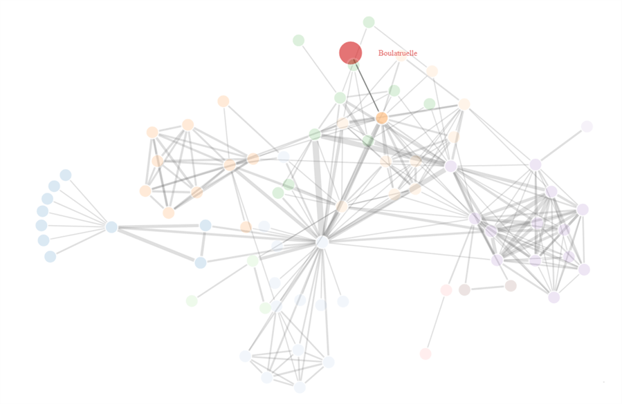
Step 5 - This visualization is interactive and if you hover your mouse over any node or egde, you would find the visualization respond to it as shown below.
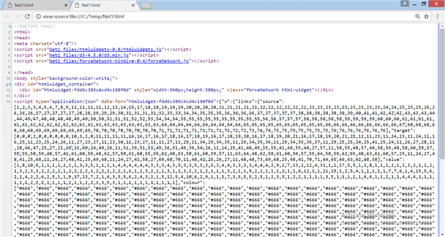
Step 6 - If you right-click on the HTML page and select the view page source menu option, you should be able to see the page source which looks as shown below. If you look at the script tags, you would be able to figure out that this HTML file is using the D3 and Javascript libraries to create an interactive visualization. These scripts and programming of the visualization using the provided data is done by the forceNetwork function in the networkD3 package. This makes it convenient for a data developer or analyst to just pass the data to this function and an interactive web-page with the visualization is created without the need for any reporting tool.
Sankey Chart Visualization
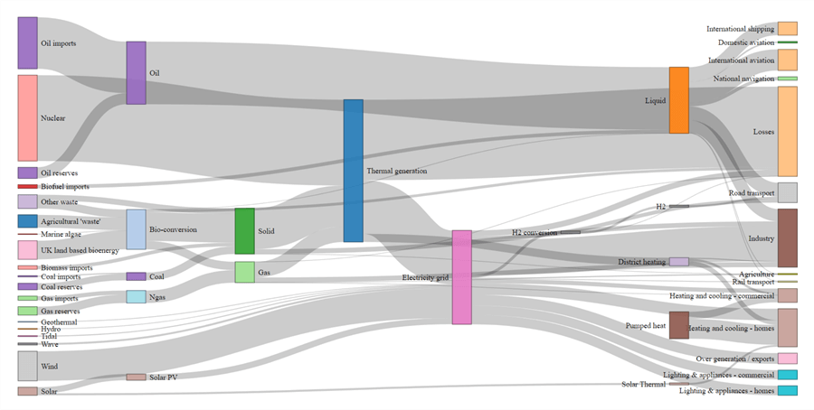
Step 7 - There are four different types of network graphs supported by the network D3 library – force directed network, Sankey chart, Radial network, and Dendograms. Sankey is another very famous network chart used to analyze the flow and distribution from source to target, especially in energy or currency distribution datasets. You can use the below code to create a Sankey diagram. This code has a similar structure to the one explained in point 3, expect the data ingestion part. Here we are reading data from a url using the paste0 function and then converting the json data to list format, before passing it to the function.
execute sp_execute_external_script
@language = N'R',
@script = N'

library(networkD3)
library(magrittr)

# Read data
URL <- paste0("https://cdn.rawgit.com/christophergandrud/networkD3/","master/JSONdata/energy.json")

# Convert to list format
Energy <- jsonlite::fromJSON("https://raw.githubusercontent.com/apache/incubator-echarts/master/test/data/energy.json")

# Create Sankey Chart and save to file
sankeyNetwork(Links = Energy$links, Nodes = Energy$nodes, Source = "source", Target = "target", Value = "value",
NodeID = "name", units = "TWh", fontSize = 12, nodeWidth = 30) %>%
saveNetwork(file = "C:\\Temp\\Net2.html", FALSE)

'
Step 8 - Once the code executes successfully and the file is saved, open the file and you will find an interactive Sankey chart with data as shown below.
Radial Network Visualization
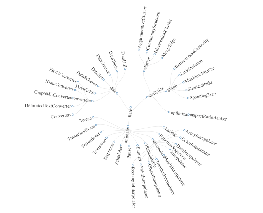
Step 9 - Let’s execute one more example that is available in the package documentation itself, which will create a radial network diagram. Execute the below code to create the file with the visualization. This example too has the same code structure, but uses the RadialNetwork function. Data used in these examples is not the primary focus of this tip, as you can read data from anywhere including SQL Server tables. The core engine which lets you visualize and explore the data is the networkD3 package which is the focus of this tip.
execute sp_execute_external_script
@language = N'R',
@script = N'

library(networkD3)
library(magrittr)

# Read data
URL <- paste0("https://cdn.rawgit.com/christophergandrud/networkD3/","master/JSONdata//flare.json")

# Convert to list format
Flare <- jsonlite::fromJSON(URL, simplifyDataFrame = FALSE)

# Filter Data
Flare$children = Flare$children[1:3]

# Create chart and save to file
radialNetwork(List = Flare, fontSize = 24, opacity = 0.9)  %>%
saveNetwork(file = "C:\\Temp\\Net3.html", FALSE)

'
Step 10 - Once you execute the code successfully, open the file in a browser and you will be able to visualize and interact with the chart as shown below.
In this way, you can use the networkD3 packet in R to create interactive network visualizations on your graph data using a few lines of T-SQL code, without any dependency on specialized visualization tools just to explore your data in SQL Server or any other data repositories hosting data related to graphs or networks.
Next Steps
- Consider exploring more options and network visualization functions from the networkD3 package to extract the maximum benefit of the package.


About the author
 Siddharth Mehta is an Associate Manager with Accenture in the Avanade Division focusing on Business Intelligence.
This author pledges the content of this article is based on professional experience and not AI generated.
View all my tips
