Problem
Data Visualization is a widely used technique in any data analysis process and the market is getting flooded with numerous visualizations. There are several charts, graphs, plots, diagrams, etc. to identify and comprehend complex data. When we have lots of hierarchical data to be displayed in graphs, the treemap visual, with its color-coded proportional data distribution is generally considered an efficient way to visualize large amounts of data. However, at times, problems arise where there is a requirement to make precise comparisons and in such scenarios bar charts or line charts provide much better offerings. Now, if we consider the situations where we need to make categorical comparisons with a large number of categories, bar charts are not as beneficial as we would hope. Under this scenario, a visualization that could address both of these issues would be an ideal solution. The Treemap Bar Chart, in Power BI Desktop, is one such potential data visualization technique and in this tip, we will cover different aspects of it.
Solution
The Treemap Bar Chart is a simple visualization that elucidates all the relevant insights about data in an easy yet efficient way. As the name suggests, this chart is a combination of both Treemap and Bar chart in one visual. It helps in comparing measure values among different categories by using color-coded rectangles or bricks to display hierarchal data. Before we jump into and see the various features of the Treemap Bar Chart visual in Power BI Desktop, let’s quickly see how this visual can be imported in the Power BI Desktop.
Importing the Treemap Bar Chart in Power BI Desktop
To import this visual in Power BI Desktop, we will have to download it first. You can refer to this site and click on GET IT NOW to download it. Once it is downloaded, open the Power BI Desktop application and select the ellipses in the bottom of the visualizations pane. Select the ‘Import from file’ option as shown below.

The following pop up will appear, click the Import button.

Navigate to the folder or a file where you have downloaded the Treemap Bar Chart visual, and select it to import the Power BI visual file (.pbiviz). The below screenshot confirms that the custom visual is successfully imported into the report.

On clicking OK, the Treemap Bar Chart is imported and added as a new icon in the visualization gallery. The tooltip can be seen by hovering over this icon as shown below.

Click on this icon to bring the visual to the report layout. You can adjust the size of this visual by grabbing its bottom right corner and expanding/shrinking it.

Populating Sample Data in the Report
Let’s keep the ball rolling and quickly get some data in the report to see how this interesting visual actually works with the data. Click ‘Get Data’ on the Home ribbon, select Excel and click on the Connect button as shown below.

I have prepared a hypothetical data sample that compares GDP data for different regions and countries of only three continents (Asia, Europe, and North America) for the year 2018. You can download this Excel file from here or you can use any dataset that you like. Browse and navigate to the Excel file you want to load and open it in the Power BI Desktop. Select the Sheet1 tab and click on Load. You can also see the preview of the data that is going to be loaded in Power BI on the right side of the navigator screen.

Once the data is loaded, you will be able to see data columns in the Fields pane on the extreme right side of the screen. Additionally, you can see different roles (marked in red below) supported by the Treemap Bar Chart in the fields section under the Visualizations pane.

Treemap Bar Chart in Power BI Desktop
Let’s go ahead and create a Treemap Bar chart visualization by dropping the ‘Continent’ column in the Axis, the ‘Country’ column in the Legend and GDP($BN) column in the Value buckets in the Fields pane as shown below. These three categories are mandatory to be filled in and other fields like SubLegend, Tooltips are optional in this visual. This visual is rendered as shown below where it takes categorical values (the continents) in the Axis field and shows different countries from the Legend field in the form of color-coded rectangular bricks and finally compares and displays GDP per Country. Hovering over any rectangle will show these values as shown below.
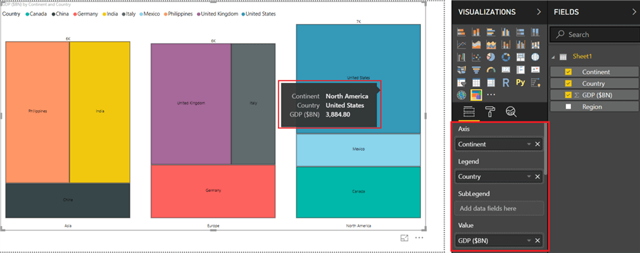
Chart Orientation in Treemap Bar Chart
The Treemap Bar Chart in Power BI supports two kinds of orientations to switch between column and bar charts. These are horizontal and vertical angles. By default, vertical orientation is selected. To switch to horizontal, select Chart orientation as Horizontal in the formatting pane as shown below.

SubLegend and Animations in Treemap Bar Chart
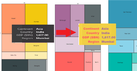
SubLegends in Treemap Bar charts help to breakdown the rectangular bricks into subcategories. For instance, in our case, we can further visualize GDP values for the regions located in a particular country by adding Region field to the SubLegend bucket in the Fields pane. The following example shows such a scenario.

We can also enable Animations in the Treemap Bar Chart by toggling the Animation switch from Off to On. By default, this feature is disabled. You can click on any brick to expand it and one more click on it will take you further down a level. Clicking anywhere outside the brick will zoom out the display and the chart will be reverted to its previous state. Below is an example that helps to examine the visual at the granular level.

Tooltips and Report Page Tooltip in Treemap Bar Chart
A Tooltip is hover text that appears on the visualization and helps visuals speak for themselves by showing statistical information of the area being hovered. A Treemap Bar Chart in Power BI supports plentiful customizations that can be made to the tooltips. All you need to do is go to the ‘Tooltip’ option in the Format pane and make your changes. One cool example after applying customizations is shown below for your reference.
Let’s move further and see how this visual supports the report page tooltip configurations for additional insights to the users. This visual itself can be used as a report tooltip visual and we can display custom reports tooltips and other charts on this visual. We need to follow a couple of easy steps to generate this report tooltip visual.
- We will create a new report page and select any visual (we have selected Stacked Column Chart) and drag relevant values to it from the Fields section. Go to the page information and enable Tooltip under Format pane and also set Type as Tooltip in Page size drop down as shown below. This visual is present in Page 1.

- Now go to the Treemap Bar Chart visual report page (this is present in report page 2 in our project) and click Tooltip option under Format pane. Select Type as ‘Report page’ and select page that we need to refer to for the tooltip in the Page dropdown, page 1 in our case. Now, if you go to the Treemap Bar Chart visual and hover above it, you will be able to see the report tooltip. The following example displays a report tooltip showing three regions present in Country India and Continent Asia.

Drill Through Capability in Treemap Bar Chart
Treemap Bar Charts support drill a through feature that allows users to navigate to a different report. To enforce this feature, let’s quickly create a new report page with any random visual (we are using a simple table this time), and drag values from the Fields section to it. Go to the ‘drillthrough’ option in the Fields section and enable it by dropping fields (Continent and Country in our case) in the drillthrough filter. Now, go to the report page where we are using Treemap Bar Chart custom visual, right click on any brick, select Drillthrough and DrillThroughPageVisual (name of the drillthrough report page) as shown below.

On selecting the drill through report page, we can contextually jump from this custom visual report to another report and gain more insights about the data.

Miscellaneous Characteristics in Treemap Bar Chart
This visual allows several rich customizations on colors and texts of both data and legends. It also supports cross-highlighting for legend and axis values along with the bricks. You can go to the Format pane and try out different settings related to Data colors, Legend, Data labels, Axis labels, border, title and much more.
Summary
We covered all the key features which are introduced recently in the Treemap Bar Chart in Power BI Desktop. It helps to break down and understand more insights about important measures like GDP, profits, etc. across different categories like Continents, Countries, regions, etc. all at once.
Next Steps
- Try importing this new Power BI custom visual and use different features especially the Report page tooltips, drill through and animations on your data.
- You can read more on this visualization here.
- To continue your learning on the Power BI visuals, refer to these other tips.

Gauri Mahajan is a SQL Server Professional with 6+ years of experience of working with global multinational consulting and technology organizations. She is very passionate about SQL Server Reporting Services, R, Python, Power BI, Database engine, etc. She has years of experience in technical documentation and enjoys writing. She has deep experience in designing data and analytics solutions and ensuring its stability, reliability, and performance. She is also certified in SQL Server and has passed the 70-463: Implementing Data Warehouses with Microsoft SQL Server exam.
- MSSQLTips Awards: Author of the Year Contender – 2019
