By: Kenneth A. Omorodion | Updated: 2022-07-29 | Comments (3) | Related: > Power BI Charts
Problem
One very common requirement by business users for Power BI reports is the ability to dynamically select what should be on the X or Y axis of a chart. The new Field Parameters feature makes this possible and easy to create in Power BI. Let's investigate how this can be achieved.
Solution
For this post, what we are trying to achieve is to select a value on a slicer, and dynamically change the field values on the X or Y axis on a chart. For instance, the diagram below has its numerical values on the Y-axis and the categorical values on the X-axis. We want to be able to dynamically change the field (measure) on the Y-axis as well as the X-axis.
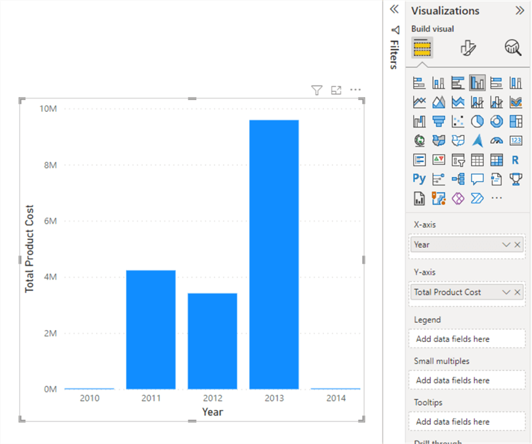
To achieve this, we can use Field Parameters to create a slicer that enables us to dynamically change the field values on each axis. Let's see how we can do this.
To demonstrate, I have imported a dataset into Power BI as shown below. We want to dynamically change between each measure and the categorical field selected.
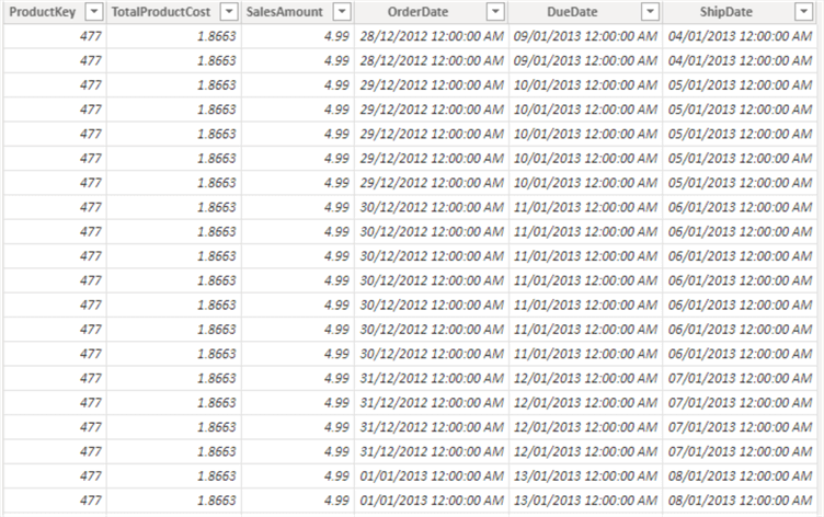
For instance, we might want to see Total Sales Amount by Year, or dynamically switch to show Total Product Cost by Month on the same chart.
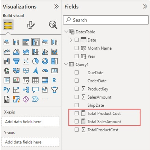
Within the DatesTable, I created a column for Year and Month. We want to use the Year, Month, and ProductKey columns as our categorical fields, and the Total Sales Amount and Total Product Cost measures as our numerical fields.
Next, we need to create measures for each of the dates. The sample measures can be created as follows.
Total Product Cost = SUM(Query1[TotalProductCost])
Total SalesAmount = SUM(Query1[SalesAmount])
In your case, there might be more or fewer measures to create, just adapt this to your business requirement. In all, the diagram below shows the measures and columns I have created for this demo.
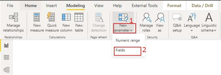
Next, we need to use Field Parameters to group values we want to see on the X or Y axis as follows. First, click on the "Modeling" tab at the top of the Power BI desktop as seen below.

Then, click on the dropdown "New Parameter" and select "Fields" from the options as shown below.
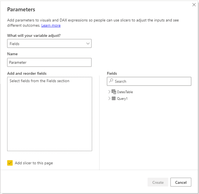
The Field Parameters window opens as seen below.
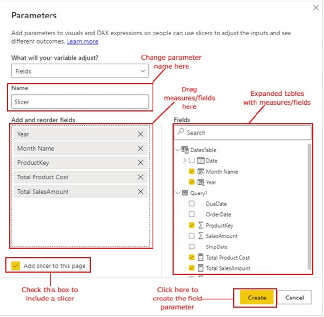
You can choose to change the name of the Parameter to something else or leave it as the default. I have changed this to "Slicer" as seen in the diagram below. Next, I will expand my tables on the right-hand side and drag in the fields I need to use for my X and Y axis. You need to leave the "Add slicer to this page" check box enabled, so a slicer can be automatically created for you, then click "Create". See below.
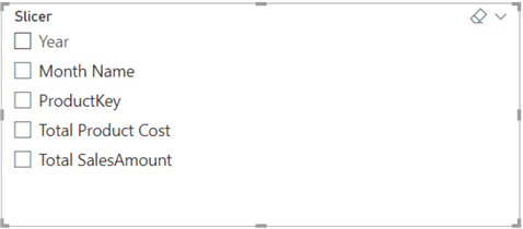
The create action will automatically create a slicer with the fields included in the "Add and reorder fields" section in the diagram above.
Also, DAX code is generated as seen below.

Next, we need to define which fields are on the X-axis and those that should be on the Y-axis. To do this, we need to add a grouping to the DAX code that was generated which would create an "X-axis" and "Y-axis" grouping.
From our understanding earlier, all fields for Y-axis should be numerical, thus we can include "Total Product Cost" and "Total Sales Amount" in the Y-axis group and the others which are categorical fields on the X-axis group.
There are two ways to achieve this, either we amend the code above or create new columns on the field parameter table created. Let's first look at how to approach it by amending the generated code as seen below.

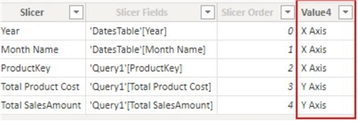
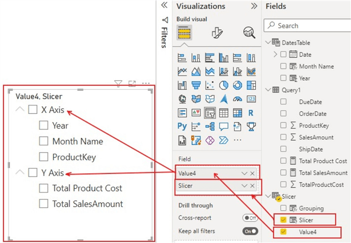
In the code above, I added a new column with two distinct values ("X Axis" and "Y Axis"). The new column is given a generic name as "Value4" as seen in the diagram below, but this name can be changed like any other column name.
The other way to create this grouping is to create the column just like how other columns are created using DAX. To do this we can use the DAX IF function to create a new column as seen below.
The output of this DAX created column is seen below.

Next, we need to use the "Slicer" ("Parameter" in your case if you have not changed the name earlier) in both the X and Y axis as shown in the diagram below. It will automatically recognize what fields go into what axis as we have defined earlier.
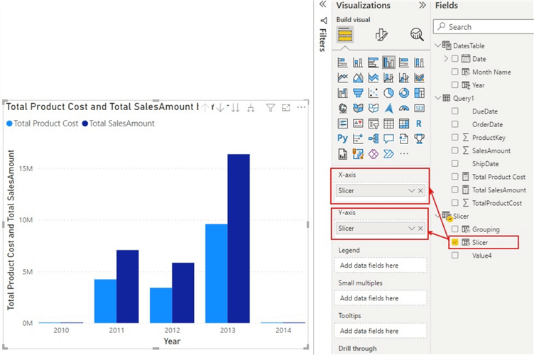
Next, we need to apply the grouping to the slicer visual we generated by dragging "Value4" or the "Grouping" column we created to the top of the "slicer" (or "Parameter" in your case) as seen in the diagram below. This should create the grouping by including all X-axis fields in the X-axis group and all Y-axis fields in Y-axis group.
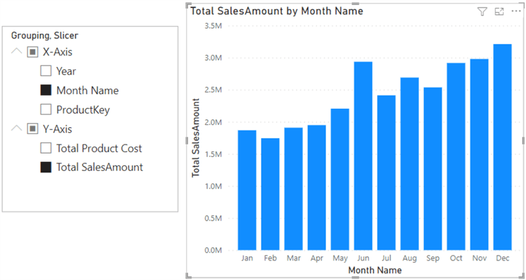
We can now select a field on the X-Axis group, like Month Name, and Ctrl click on a field on the Y-Axis group, like Total Sales Amount, and see the rendered visual as shown below.
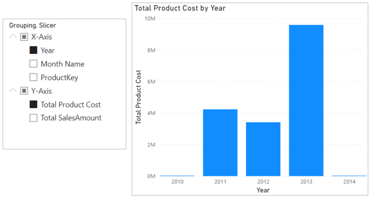
When we need to change the fields on the X and Y axis, like Year on the X-axis and Total Product Cost on the Y-axis, we just need to click on Year on the X-axis group and Ctrl click on Total Product Cost on the Y-axis. The rendered visual should look as follows.
In summary, there are several ways to approach this to meet your business requirements. There are other approaches I have seen that also solve the same business need, but some of those require creating more than one field parameter as well as more than one slicer visual. I have created this demo as simple as possible while also taking into consideration the fact that this approach ensures you only have a single slicer visual and a single field parameter on your model. This ensures the performance of your Power BI model is not impacted.
Next Steps
- See more information about Field Parameters in the Microsoft Documentation.
- See this YouTube video by Guy in a Cube on Dynamic X and Y axis on Power BI visuals.
- You can get more information on field parameters in Power BI in this article by SQL BI.
- You can also see my old article on Dynamic Power BI slicers using DAX logic.
- Try this tip out with your data.
Learn more about Power BI in this 3 hour training course.
About the author
 Kenneth A. Omorodion is a Business Intelligence Developer with over eight years of experience. He holds both a bachelor’s and master’s degree (Middlesex University in London). Kenneth has the MCSA, Microsoft Data Analyst - Power BI and Azure Fundamentals certifications. Kenneth is a Microsoft Certified Trainer and has delivered corporate training on Power BI, SQL Server, Excel and SSRS.
This author pledges the content of this article is based on professional experience and not AI generated.
View all my tips
Article Last Updated: 2022-07-29


