By: Bhavesh Patel | Updated: 2022-03-01 | Comments (1) | Related: > Power BI Charts
Problem
We can use Power BI Desktop to develop more interactive reports and in this tutorial, I will cover how to create a Toggle Button using bookmark navigation to toggle between different charts.
Solution
Below are the steps to create a report in Power BI that allows the user to toggle back and forth between two different charts. Let's get started.
Step 1: Prepare Data for Power BI Visual
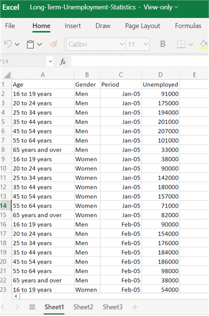
For this example, we will use this Excel file Long-Term-Unemployment-Statistics which you can download. This sample data looks at people that are unemployed based on age, gender and time period. Below is a sample of the data in Excel.
Step 2: Import Data for Power BI Visual
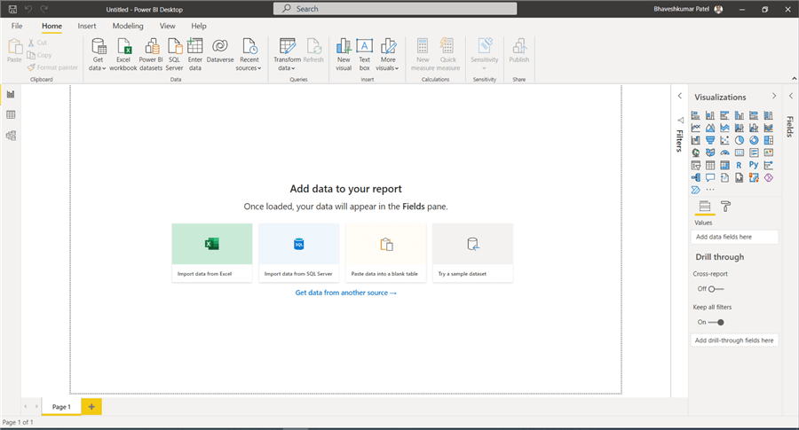
To import this Excel file, go to the Home module and click on Get Data and choose Import data from Excel.
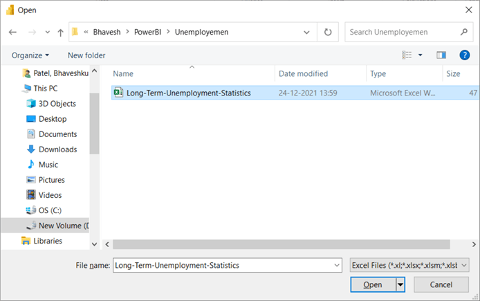
Choose your file and click Open.
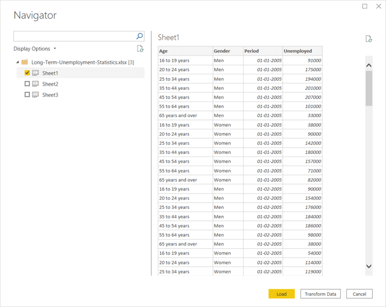
After opening the Excel file, the navigator page opens to select the appropriate data sheet. There are two options available Load or Transform Data (which allows you to transform the data with the Power Query editor). I selected Load to just load the data as is.
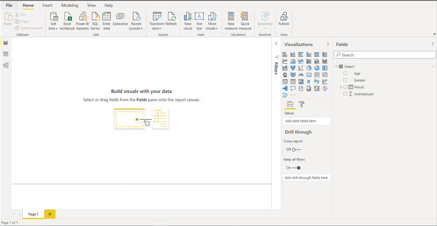
After loading the file, on the right side we can see the fields we can select for the report from the Excel sheet.
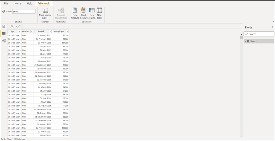
We can also look at the data under Table tools.
Step 4: Preparing Visuals
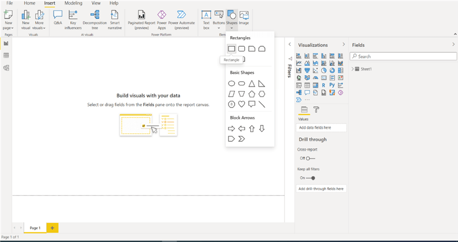
First, I will create a rectangle shape that will contain one of the charts.
After adding the rectangle shape into the canvas, it looks as follows.
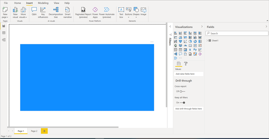
We can format the shape as needed as shown below where I changed the color.
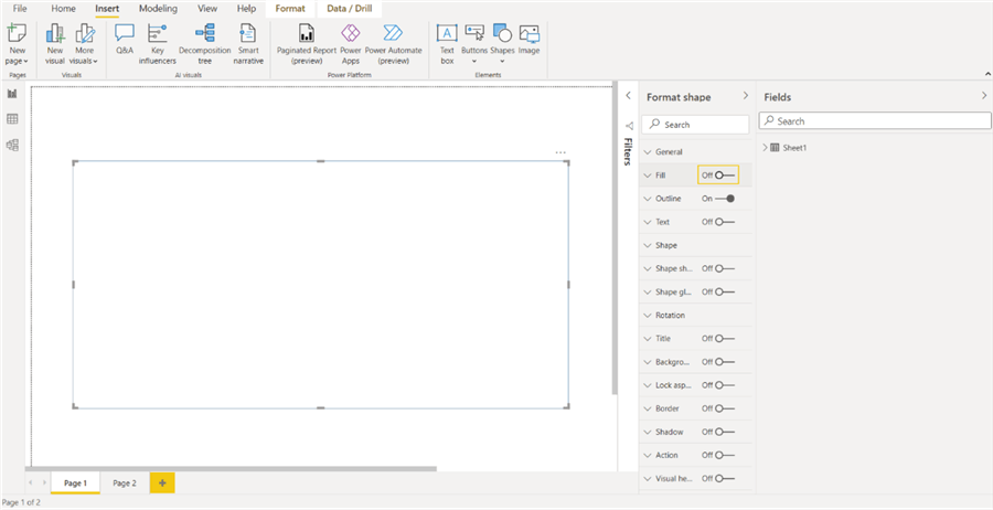
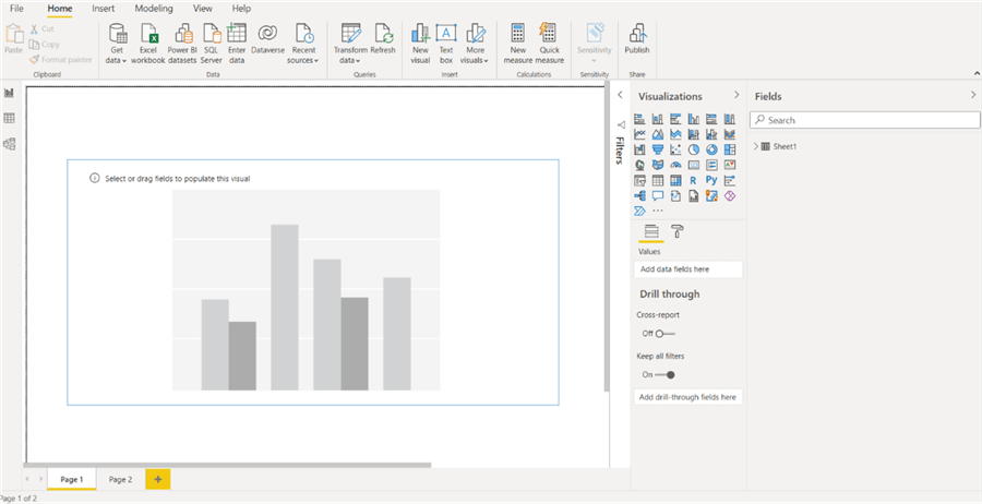
Now, I am going to add a Clustered Column Chart into that rectangle shape area.
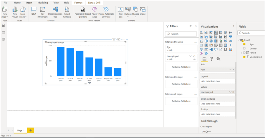
Now, we will select Age and Unemployed for the chart as shown below.
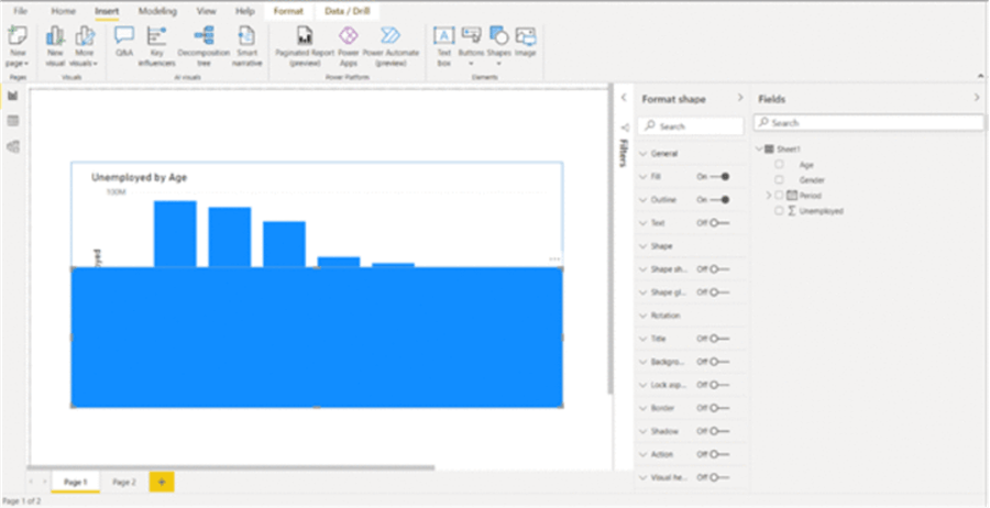
Now we will add another rectangle shape which will hold the second chart as shown below and place this over the top of the first rectangle.
Then in this new rectangle I will add a Donut Chart.
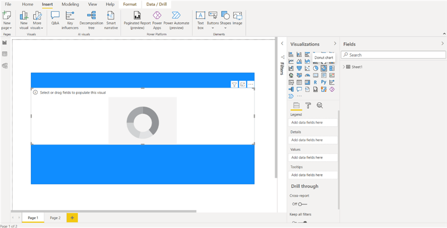
After adding the donut chart, I formatted it as shown below using Gender and Unemployed.
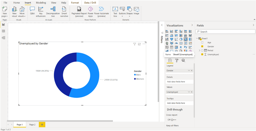
Now we can add our toggle buttons.
To do so select the Insert tab and then Buttons and add a blank button as shown below.
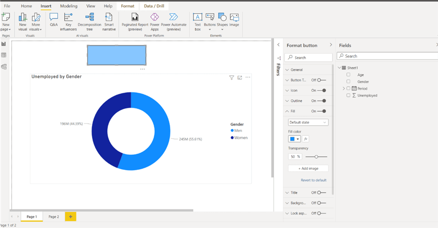
I selected the Button and copied it so we have 2 buttons and used a different fill color for the second button.
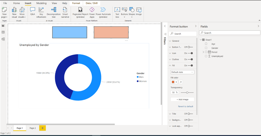
Now we need to add events to the Buttons based on the visual we want to show.
Go to View and Bookmarks.
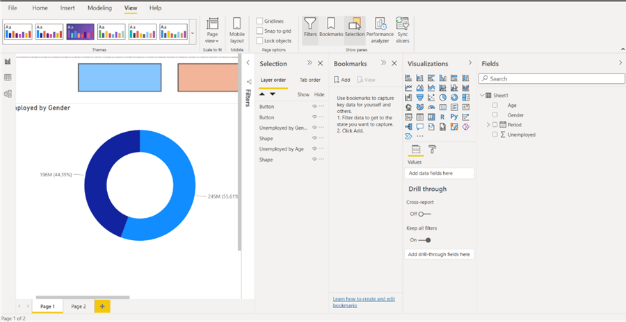
For the Gender Chart button, we need to set what we want to hide and click Add under bookmarks and give it a name which we will call GenderChart.
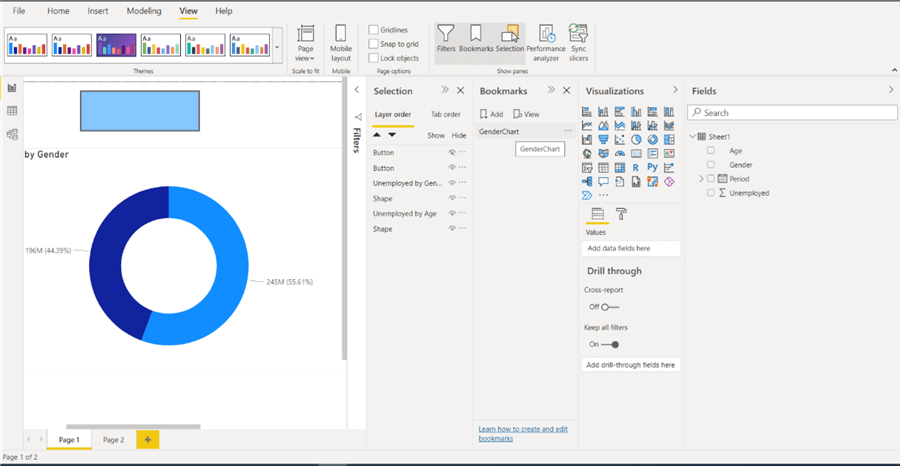
For the Age Chart button, we need to set what we want to hide and click Add under bookmarks and give it a name which we will call AgeChart.
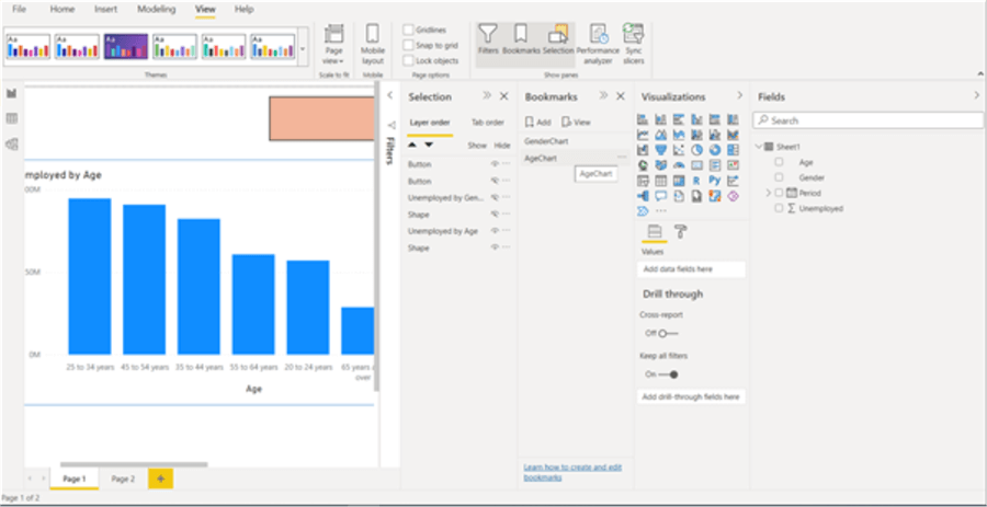
Now if you click on a bookmark the visual will hide or show depending on the bookmark used. Below shows the GenderChart.
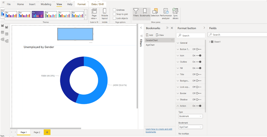
I can test the AgeChart button as follows.
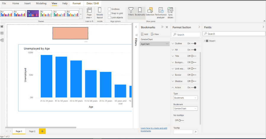
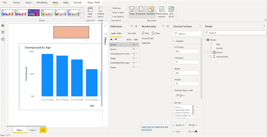
Now we can place the buttons in the same location so they are on top of each other, so it looks like only one button.
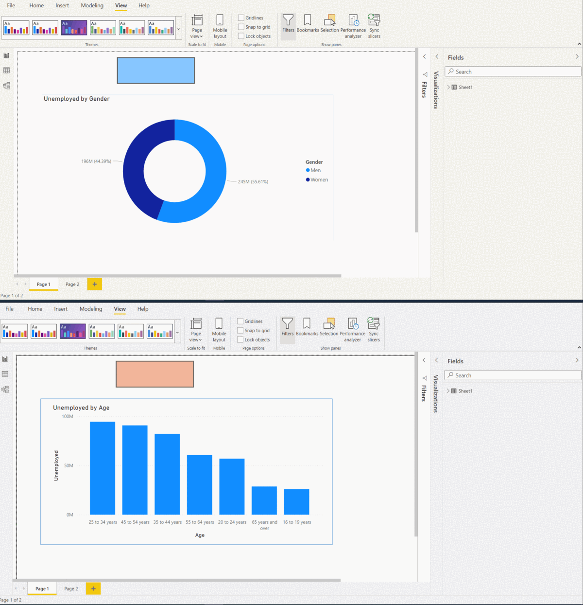
To toggle between the two charts, we can click the button to go back and forth as shown below in this animated image.
Next Steps
Try to implement this approach for one of your reports.
Related items:
- Learn more about SQL Server Power BI with these tips
- Download Power BI Tools and apps
- Power BI Documentation
Learn more about Power BI in this 3 hour training course.
About the author
 Bhavesh Patel is a SQL Server database professional with 10+ years of experience.
This author pledges the content of this article is based on professional experience and not AI generated.
View all my tips
Article Last Updated: 2022-03-01


