By: Scott Murray | Comments | Related: > Power BI Formatting
Problem
How can I take advantage of the new mobile features available for Power BI Report development?
Solution
Up to this point, the mobile experience in Power BI has been very static; developers were given very little leeway in adjusting the look and feel of Power BI dashboards that were viewed on a mobile device. However, recent Power BI Desktop updates have introduced a new and very much improved mobile design experience which transcends into a much more report consumer friendly mobile experience with more efficient navigation and formatting.
Specifically, the new functionality provides a design grid that includes a significant increase in the detail of the grid size which means you have many more places to "drop" a visual onto the mobile design. You actually have 9 times (not 9 more but 9 times) the number of grid placement locations than previous versions of Power BI Desktop. Although you were previously able to select the visuals to be added to a mobile view, you now have the ability to show, hide and overlay visuals that are on the mobile design grid which in turn provides a more refined view of your dashboard when viewing on a mobile device.
To review the basics of mobile dashboard development in Power BI, it would be beneficial to examine this tip.
Before we start our mobile design, you need to be sure to download the latest version of Power BI desktop. Additionally, we will be using the Financial Sample data set for the source of our Power BI file. Alternately, you could use the WideWorldImportersDW database as a data source. If you need a refresher on bringing data into Power BI please see this tip.
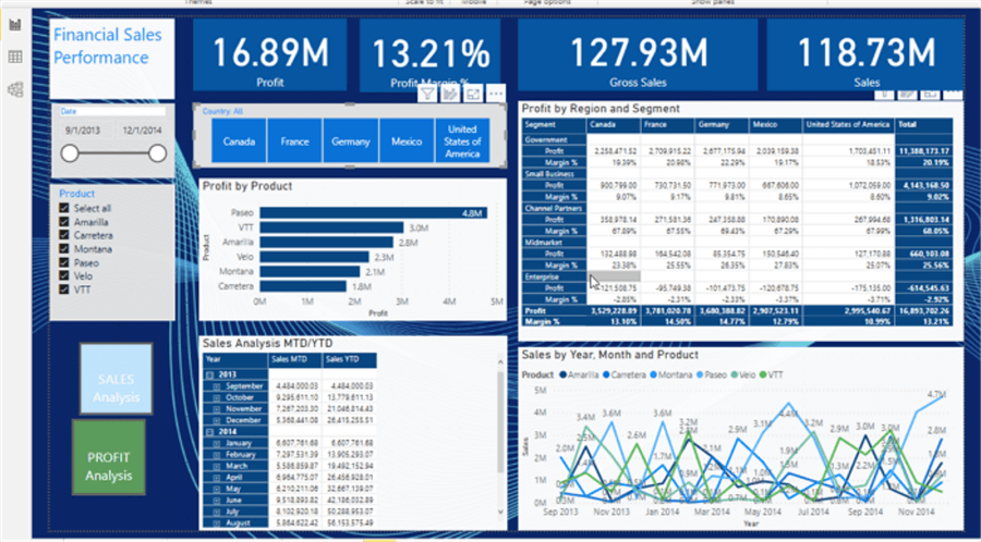
To get started with mobile design, we will start with a basic report that includes some cards across the top, a date slicer, a product slicer, a horizontal slicer for country, a bar chart, a profit matrix by region and segment, a profit matrix by MTD and YTD, a sales matrix by MTD and YTD, and finally a line chart. Also, two buttons exist in the lower left corner to allow for the showing and hiding of the MTD / YTD Sales and Profit Matrices. These buttons will become important as we move into our mobile design.
To start the creating our mobile version, we must switch to the mobile design grid by selecting the View toolbar tab and then clicking on the Mobile layout button.

Now our design gird opens; you will notice that the grain of the design grid is very fine.
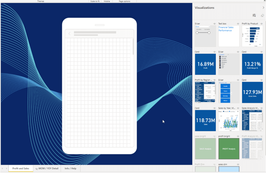
As we drag visuals from the right-side selection panel to the design grid, we have the ability to "snap" the visual, both size and placement to any of the small squares.
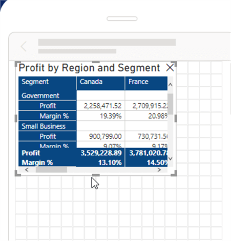
We can quickly add our visuals from our main report onto the mobile version of the report and then adjust the size according, as illustrated below. Additionally, you can just double click on the visual, and it will be added onto the design grid in an open space. You will also notice that each visual auto sizes as you increase and decrease the size of the visual on the design grid.
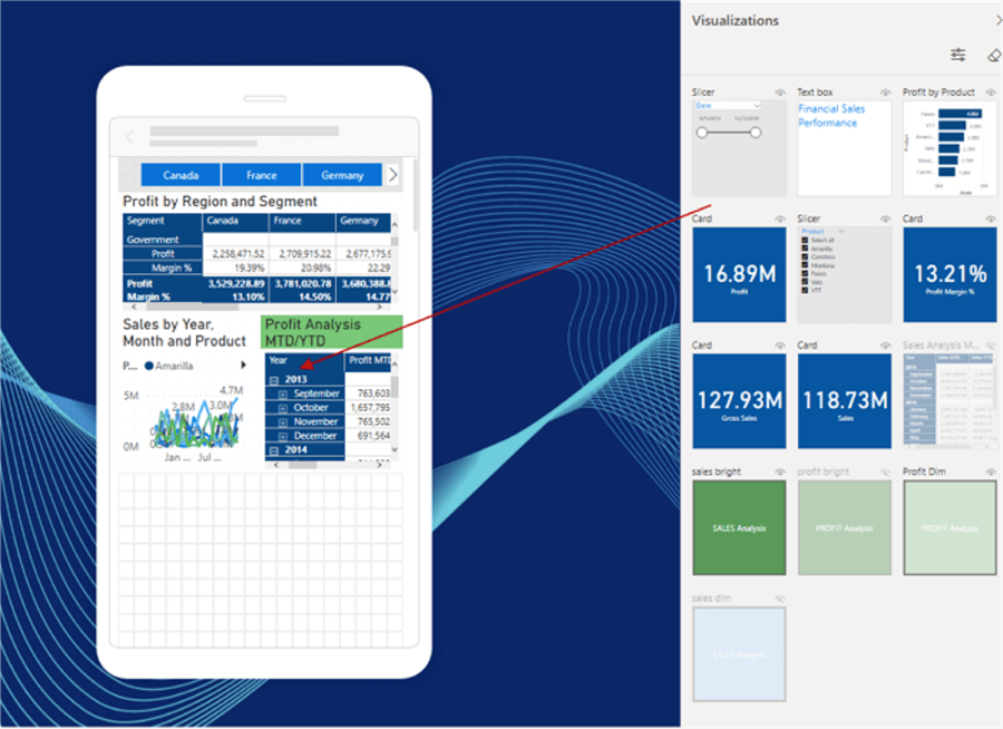
The new design grid also includes an icon in the upper right corner of the visual that shows whether the visual in visible or hidden in the main view. The visualization well also includes the visual name for easier identification (if specified or it uses the default label for the visuals such as card1).
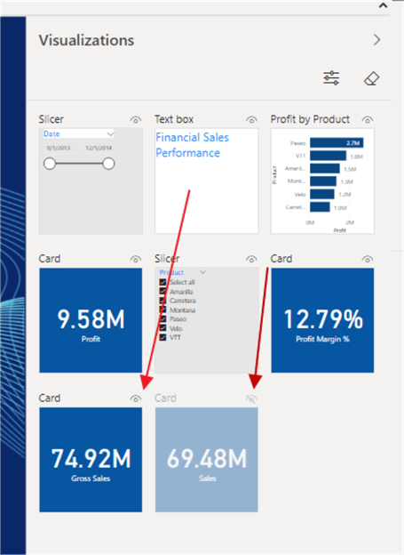
If you want to remove the visual, you will simply click the x in upper right corner of the visual. Likewise, you can remove ALL the visuals from the design by clicking on the eraser button in the upper right corner of the Visualization area.
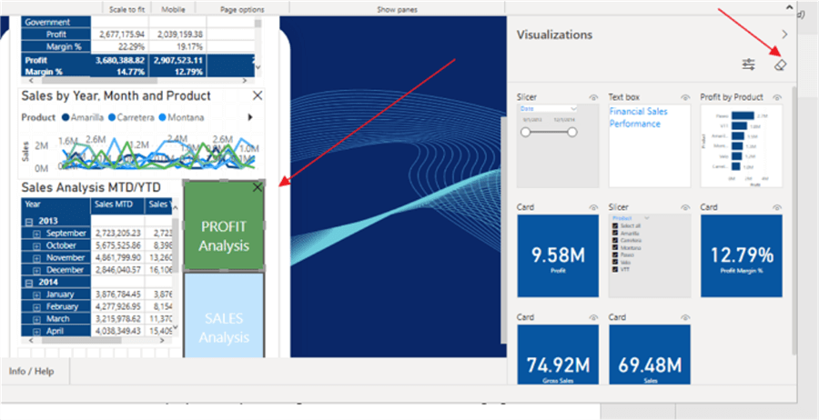
Additionally, we can now actually place one visual overtop of another visual with ease. Overlaying visuals provides several advantages including allowing a consistent visual / image behind another visual and also allows for creating interactive toggles via buttons and bookmarks.
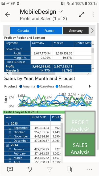
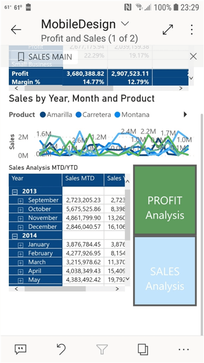
Based on the initial design of the mobile optimized view of the dashboard, when a report consumer views the report on her or his mobile device, the portrait view, shown below, displays the report design from the mobile view design grid.
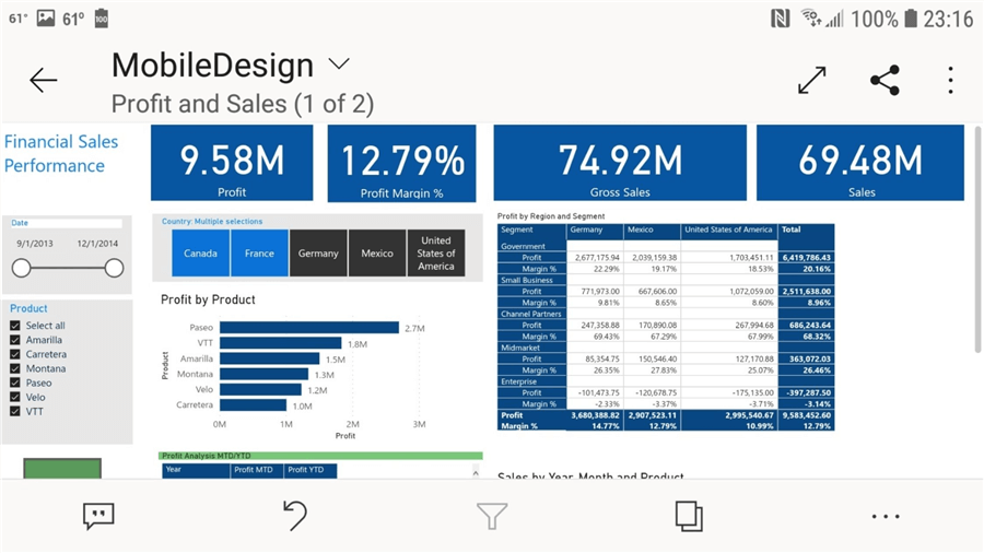
However, when the mobile device is switched to landscape mode, the original report design is shown.
In the following two screen prints, we are able to define a method of creating several buttons which show and hide a set of 2 matrix visuals, Profit Analysis MTD/YTD and Sales Analysis MTD/YTD. By setting up the actions of these buttons, which are linked to bookmarks, we are able to overlap the matrix visuals so they occupy the same space while the report consumer can easily interact with the buttons to flip between these two visuals.
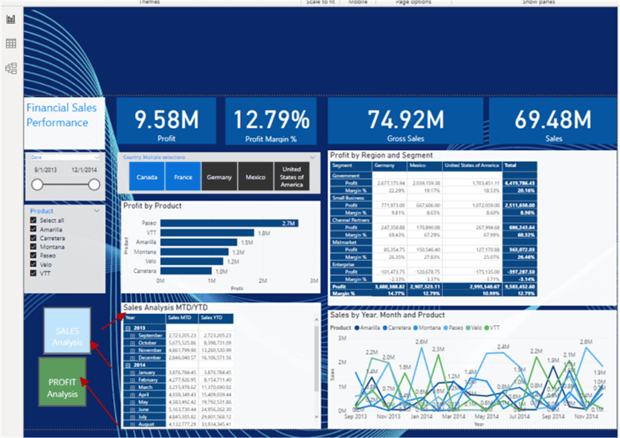
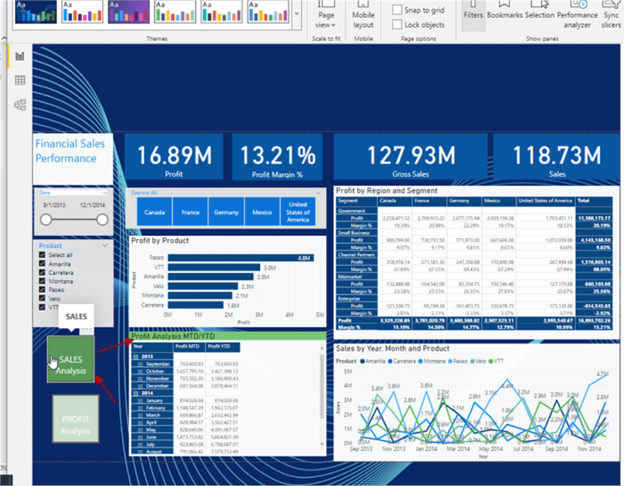
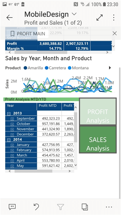
In the new mobile design and view, the same overlapping technique now can used to provide an interactive set of buttons and visuals. Thus, as illustrated in the next two screen prints, we can use the buttons on the mobile view / device to easily show / hide visuals which in turn provide more screen "real estate" for both the report designer and report consumer to utilize. One helpful hint when working with visible visuals and hidden visuals on the mobile view is to flip between showing and hiding the visual in the main view in order to see the visual appropriately for the mobile view. For instance, if you have a hidden visual that is on your mobile design view, it will not show on the design grid. Thus, you would temporarily set the visual to visible in the main view, and then place and adjust the visual in the mobile design until you have it placed appropriately. Then in the main view, you would want to hide it again.
In this tip we featured the new design tools available within the Power BI mobile view designer.
Next Steps
- Check out all of the Power BI Tips on MSSQLTips.com
Learn more about Power BI in this 3 hour training course.
About the author
 Scott Murray has a passion for crafting BI Solutions with SharePoint, SSAS, OLAP and SSRS.
This author pledges the content of this article is based on professional experience and not AI generated.
View all my tips


