Problem
Azure Synapse Analytics allows you to unify data and produce visuals for analytics. In this article we look at how to create a dashboard using various features of Azure Synapse Analytics.
Solution
Azure Synapse Analytics provides the following visualization capabilities:
- Built-in data visualization for Spark SQL query results.
- Language-specific data visualization libraries.
- Power BI reporting integration.
I’ll describe each tool from this list in the following sections.
Prepare Sample Data for Azure Synapse Analytics
Before we proceed to look into different tools, let’s prepare some sample data. I’ll use open-source US population data from Microsoft, which can be extracted using Python libraries.
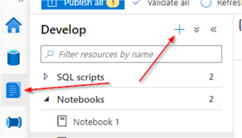
Let’s open the Synapse Studio, navigate to the Develop tab, and create a PySpark notebook:
Add the below code to create the data using the library and display a sample:
from azureml.opendatasets import UsPopulationCounty
data = UsPopulationCounty()
data_df = data.to_spark_dataframe()
# Display 10 rows
display(data_df.limit(10))
Here is the sample output:

Add another cell with the following code to filter out the state and population data for 2010, Write the results into the /powerbidemo/UsPopulation2010 folder within your default storage account, we’ll need this output in the following sections:
df2010=data_df.filter('year=2010').select('stateName','population')
df2010.coalesce(1).write.format('csv').mode('overwrite').option('header',True).save('/powerbidemo/UsPopulation2010')
Next, add a cell with the following code to calculate the total population by state name:
from pyspark.sql.functions import *
dfAgg=df2010.groupBy('stateName').agg(sum('population').alias('TotalPopulation'))
Built-in data visualization for Spark SQL query results and Azure Synapse Analytics
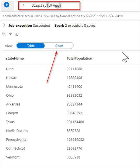
The Spark notebooks included in Synapse allow displaying code results in a tabular or chart mode.
For example, running the below code will show the results in the tabular format by default:
display(dfAgg)
However, you can change the output to the chart format using the Chart button:
Once in Chart mode, you can select several chart types and specify the key and value fields:

Language-specific data visualization libraries with Azure Synapse Analytics
Synapse supports languages like Python, Scala, .Net. You can use your favorite visualization library to build advanced charts. As an example, I’ve included the code that displays the query results for the top 20 states using Python’s popular Matplotlib library:
from matplotlib import pyplot as plt
dfAggTop20=dfAgg.orderBy(desc('TotalPopulation')). limit(20)
npStateList=[row.stateName for row in dfAggTop20.select('stateName').collect()]
npPopulationList=[row.TotalPopulation for row in dfAggTop20.select('TotalPopulation').collect()]
plt.subplots(figsize=(12,3))
plt.bar(npStateList,npPopulationList,0.5,1)
plt.xticks(rotation=45)
plt.show()
Here’s the screenshot with the query output:

Power BI Dashboard Reporting with Azure Synapse Analytics
The Azure Synapse Analytics Power BI integration allows building a more advanced and professional-looking dashboard without a single line of code. Moreover, these dashboards can be edited and saved from Synapse Analytics as well. You’ll need to have a Power BI license and online account to proceed with the following demo.
Let’s first create a simple Power BI report. Open Power Bi desktop and connect Azure Blob Storage and use CSV files from the folder /powerbidemo/UsPopulation2010/ that we saved in the previous section. Add a map component and configure it as follows:

Next, publish the report into your Power BI online workspace using the Publish button.
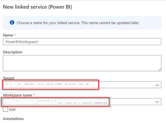
The next step is to link the Synapse Analytics and Power BI workspaces. Open the Synapse Studio, navigate to the Manage pane, and click the New button:

Select the Connect to Power BI button at the top of the wizard:

Select your tenant account and Power BI workspace:
Once the link is created, you’ll see the Power BI section at the Develop pane. Expand it and find the report we’ve published earlier under the Power BI reports node:

As you can see, this page replicates all Power BI components and visualization capabilities. You can also edit the report and save it back to the Power BI workspace using the Save button:

Next Steps
- Read: Azure Synapse Analytics Overview
- Read: Quickstart: Linking a Power BI workspace to a Synapse workspace
- Read: Visualize data with Power BI

Fikrat Azizov (MCSE Data Platform and MCSE Azure Solutions Architect) has been working with SQL Server since 2002. Fikrat’s main passions are SQL Server performance optimization, cloud data technologies and machine learning. Fikrat is currently working as a Solutions Architect at Slalom Canada.
- MSSQLTips Awards: Author of the Year Contender – 2019-2022 | Rising Star (50+ tips ) – 2021
Thanks Fikrat. Great article as usual.