Problem
The Titanic was a British passenger liner which sank in 1912. If you did not see the Titanic movie, you need to watch it to understand this article, because we will talk about the passengers, age, sex, social status, etc. Basically, the Titanic sank after striking an iceberg and it had 2224 passengers and more than 1500 died. In this tutorial, we will look at how to use Azure Data Studio and SandDance to analyze this dataset.
Solution
As mentioned above, we will use Azure Data Studio and SandDance to analyze the data and at the same time see interesting information about the Titanic as a data visualization.
If you are not familiar with Azure Data Studio, take a look to this article. It can be used for Azure components and SQL Server as well:
If you are not familiar with the SandDance visualization tool from Microsoft Research or need to install the open source add-in, please see this link:
- SandDance for Azure Data Studio – For installation, data access, chart types (scatter plot, bar chart, tree map), menu’s, snapshots, select and filter data, isolate data, exclude data and more
Getting Started
Microsoft included a nice TSV file with all the information related to the Titanic. You can download the information from GitHub: Titanicmaster.tsv.
Here is snapshot of the data to begin data exploration.
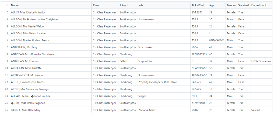
Basically, we have the names of the persons on the Titanic, Class (first class, second class, etc.), where they joined the ship, job, ticket cost, age, gender, if they survived and department.
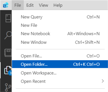
To create charts, in the Azure Data Studio, go to File > Open Folder and select the folder where the Titanicmaster.tsv is stored.
Go to the Explorer, right-click on the titanicmaster.tsv and select View in SandDance.

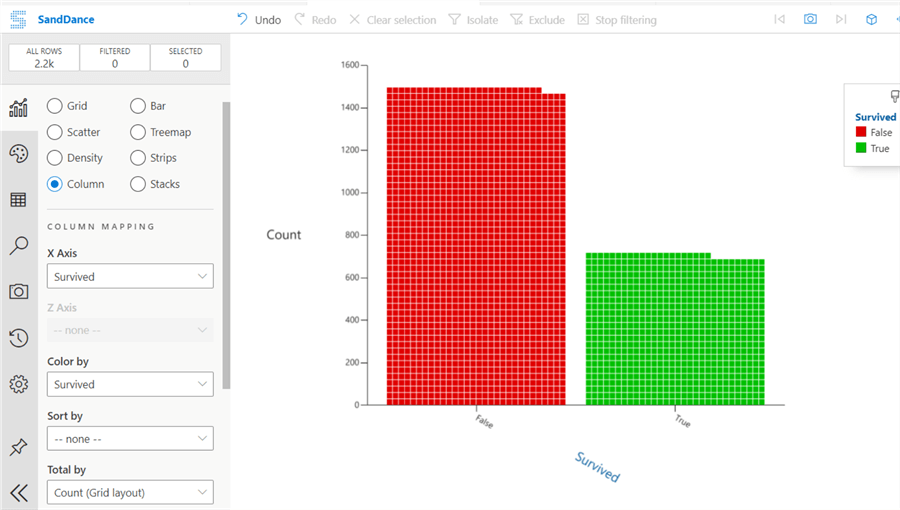
By default, the SandDance visualization will show in the X axis the Survived information, you will notice that more than 1400 persons died and around 700 survived.
If we look at the chart by age, we will notice that around 550 persons who died were in the range of 20-30 years. All the persons (5) between 70-80 years old died.
What we can notice is that several children died. The woman and children first code was not followed. We can see that several children died in the range between 0-10 years and 10-20.

One of the most important features about SandDance is that you can easily go to a single row of data. I am clicking on a single data point in the chart, I can select a single passenger that belongs to the age range between 70-80 years old.
If I use the Data Browser, I can even search in Bing information about this single passenger.

There is a wiki Encyclopedia about the Titanic on the web and we can see information about this user.

So, SandDance lets you analyze not only the big picture, but also small portions of data. Below we can see more information about Henry Michael Mitchell.

Now, I want to know if the people who bought an expensive ticket survived, or if there is a relationship between the price and the people that survived. Some people say money does not buy happiness, but others say poverty does not buy nothing. I will Facet the data by TicketCost.

As you can see, most of the people who died were poor or at least they bought the cheapest tickets between 0 and 100. On the other hand, people who bought the most expensive tickets, in the range between 500 and 600 all survived.

If we go back to the chart of survivors and people who died, there is an option to isolate the data. We will select the chart with people who died (survivor=false) and then select the Isolate option to remove the survivors from analysis and analyze only people that died.

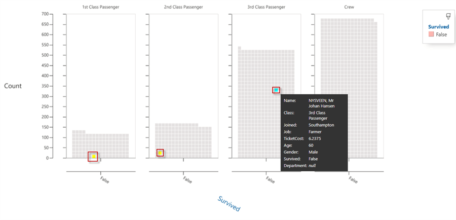
Now, we will analyze using the Facet by Class to analyze people who died specifying the Class.
Most of the people who died were from 3rd class. Also, the crew sacrificed their lives to save passengers. The captain sank with the liner.

Now, I want to know who were 60 years old and males on the passenger liner. We will use the Select by Search icon and then we will select the Age = 60 and add an expression to add the Gender = Male and finally press Search & Select.

As you can see, 3 males died that were 60 years old, from three different classes.
Conclusion
In this article, we saw how to visualize data using SandDance in Azure Data Studio. You can use also Power BI or a browser to generate reports with SandDance. This tool is very powerful, simple to use, intuitive and you can see the big picture and individual cases as well.
With SandDance you can visualize data from SQL Server on-premises, Azure SQL, Excel or CSV files.
Next Steps
For more information refer to the following links:

Daniel Calbimonte is a Microsoft Most Valuable Professional, Microsoft Certified Trainer and Microsoft Certified IT Professional for SQL Server. He is an accomplished SSIS author, teacher at IT Academies and has over 10 years of experience as a QE and developer for SQL Server related software. He has worked for the government, oil companies, web sites, magazines and universities around the world. Daniel also regularly speaks at SQL Servers conferences and blogs.
- MSSQLTips Awards: Author of the Year Contender – 2015-2018, 2022, 2023 | Champion (100+ tips) – 2018