Problem
I am a SQL professional within an analytics team. We used to service our clients with lots of tables. There is a growing demand among our clients for displays that show related data in sets of charts. We manage our data with SQL Server, but our clients use Excel. Therefore, we’re looking for examples that show multi-chart visualizations for SQL Server data in Excel.
Solution
Multiple data visualization packages are suitable for displaying data from a SQL Server instance. Matplotlib and Plotly are two packages rapidly growing in popularity among developers of data visualizations with Python for SQL Server data (Displaying Subplots for SQL Server Data with Python and Matplotlib and Compute and Display Candlestick Charts in SQL Server and Python). However, many organizational units prefer data analytics delivered with Excel. This tip introduces the basics of showing multiple charts per display with Excel for data from SQL Server and highlights several issues for preparing these data visualizations:
- Transferring data from SSMS to Excel and how to have Excel adapt automatically to incoming data values
- How to display multiple sets of line charts and scatter charts in a single Excel worksheet tab
- Demonstrates simple techniques for formatting charts after initial configuration
- How to configure different trend lines for scatter charts and identify which trend line fits the data best
Transferring Data from SQL Server to Excel via a Simple Copy and Paste
The SQL Server portion of this tip starts with a T-SQL script for returning the average closing price per month over a two-year timespan; the script returns one results set for each year. This kind of script can be readily adapted to accommodate other data types, such as sales from a web store by the item ID of each item on sale or the amount of precipitation per month across weather station locations.
The objective of the following script is to return two results sets that can easily be copied from SQL Server and pasted into an Excel workbook to serve as the data source for two charts in a line chart format. By running the script for each of two distinct ticker symbols, you can populate an Excel workbook file with data for four charts in a line chart format.
Here is the script for generating the first two results sets. These results sets are for the SOXL ticker symbol. SOXL is for a basket of securities traded on the Philadelphia stock exchange; these stocks are for companies that primarily produce or sell semiconductors. The other two results sets can be obtained by re-running the script for the MSFT ticker. MSFT is the ticker symbol for Microsoft.
The script starts by declaring and then assigning values to three local variables. The @year_number_1 and @year_number_2 local variables are for two years, namely 2020 and 2021. The @symbol local variable is for a ticker symbol, such as SOXL or MSFT. The first run of the script is for the @symbol local variable equal to SOXL. The second run of the script is for the @symbol local variable equal to MSFT. This second edition of the script does not show in the tip, but it is available in the tip’s download file in the Next Steps section at the end.
There are two select statements in the script. Both select statements return the average close price per month in a year. The first set of monthly close price averages is for when the year’s function return value for date in the where clause is equal to @year_number_1. The second set of monthly close price averages relies, in part, on the year’s function return value for the date being equal to @year_number_2. The value for date is from the yahoo_finance_ohlcv_values_with_symbol table, which has a date value for each trading date row.
declare
  @symbol nvarchar(10)
 ,@year_number_1 int
 ,@year_number_2 int

select
  @symbol = 'SOXL'
 ,@year_number_1 = 2020
 ,@year_number_2 = 2021

-- compute average monthly close for a symbol
-- in year_number_1 and year_number_2
-- computed data for @symbol and @year_number_1
select
  symbol
 ,year(date) [Year]
 ,datename(month,[date]) [Month_name]
 ,avg([close]) [avg_close]
from [DataScience].[dbo].[yahoo_finance_ohlcv_values_with_symbol]
where symbol = @symbol and year(date) = @year_number_1
group by symbol, year(date), month(date),datename(month,[date])
order by year(date), month(date)

-- computed data for @symbol and @year_number_2
select
  symbol
 ,year(date) [Year]
 ,datename(month,[date]) [Month_name]
 ,avg([close]) [avg_close]
from [DataScience].[dbo].[yahoo_finance_ohlcv_values_with_symbol]
where symbol = @symbol and year(date) = @year_number_2
group by symbol, year(date), month(date),datename(month,[date])
order by year(date), month(date)
Here are the results sets from the preceding script:
- Year column values are all 2020 in the top pane and 2021 in the bottom pane.
- The symbol column values in the top and bottom panes are for the ticker symbol. In the screenshot below, these column values are all SOXL. Another script in the download (see Next Steps section) for this tip populates the symbol column values with string values equal to MSFT.
- The Month_name column values are for the names of the months in a year. These names are computed with the help of the datename function. This function takes two arguments: the datename, for example, month, and the date value, which is represented by the date column value for a row in yahoo_finance_ohlcv_values_with_symbol.
- The avg_close column values are for the monthly average close prices within a year.

Here is a comparable pair of results sets. These results sets are outcomes from when the MSFT ticker symbol is assigned to @symbol in the preceding T-SQL script.
- Notice the symbol column values are all MSFT. Therefore, the values in the avg_close column are average monthly close prices for the MSFT ticker instead of the SOXL ticker.
- The following screenshot also has two panes. The top pane is for the months of 2020, and the bottom pane is for 2021.

There are multiple ways to migrate the values from the preceding two screenshots from SQL Server to tabs in Excel workbook files. When the results sets do not have many columns and rows, one of the most straightforward migration approaches is to copy the values from the Results tab in SSMS to the Windows clipboard and then paste clipboard contents to a tab in an Excel workbook file. The following screenshots display two excerpts from a workbook file named Four_XL_line_charts_ver2_for_20_and_21.xlsx with values migrated from the top pane in the first preceding screenshot and from the bottom pane in the second screenshot.
- The top display is for the tab displaying values for SOXL values from the first year (2020). The Excel tab has the name Symbol_1_Year_1.
- The bottom display is for the tab displaying values for MSFT values from the second year (2021). The Excel tab has the Symbol_2_year_2.

Creating and Displaying Multiple Line Charts in Excel with Data Copied from SQL Server
When creating charts in Excel based on SQL Server data, it’s helpful to think of Excel workbook files as containers of the SQL Server data.
After you initially create two or more charts in Excel for SQL Server data, you can pour fresh data from SQL Server on top of the data already in an Excel file to change each chart based on fresh data. Each chart will correspond to a results set from SQL Server that is typically on the same tab as the copied SQL Server data.
You can also copy each chart for some SQL Server data to a tab that shows the chart for the data without the SQL Server data. One key advantage of this step is that you can assemble multi-chart sets in a single display for easier comparisons.
Additionally, you can format charts based on SQL Server in several different ways to dramatically transform the appearance of basic charts to improve their readability and impact on viewers.
Displaying Line Charts for One Results Set at a Time
There are three significant steps for creating a line chart in Excel from a results set copied from SQL Server. The following text and table of screenshots describe and illustrate these steps.
- In Excel, select the copied data from SQL Server. Then, choose Insert from the Excel menu and click the line or area icon from the Charts section of the Insert ribbon.
- Hover over the icon for the type of line or area chart you want to create. The screenshot below shows the cursor hovering over an icon for a 2-D line chart with markers. Excel portrays what the chart will look like after you click the icon to add the chart to the tab.
- Drag the chart to a preferred location on the tab. The third screenshot below shows the line chart dragged so that its top left corner is in cell G2 of the Symbol_1_Year_1 tab.
As you can see from the third image below, the line chart appears with small, solid, circular markers along the line. The color of the markers and the line between markers have a default blue color. A subsequent subsection demonstrates other approaches for specifying alternative colors.
The y-coordinate values for the line markers are derived from cells D2 through D13. The title for the chart is from cell D1. This default assignment can be overwritten with the help of Excel expressions. As a SQL developer, you may prefer to assign another name to the avg_close results set column before copying the results set values from SQL Server to Excel.
The values in cells A2 through C13 appear along the x-axis of the line chart. This convention, along with the one for denoting y-axis coordinate values for line markers, specifies a row of values from the results set for each marker in the line chart.


Here is an image of the line chart created in the Symbol_2_Year_2 tab. This image appears after the third step for creating a line chart based on a results set copied to Excel from SQL Server. The values in cells A2 through D13 correspond to the results set based on @symbol equal to MSFT and @year_number_2 equal to 2021 from the preceding section. The difference from the prior section showing a results set in SSMS is that a line chart in an Excel tab accompanies the results set.

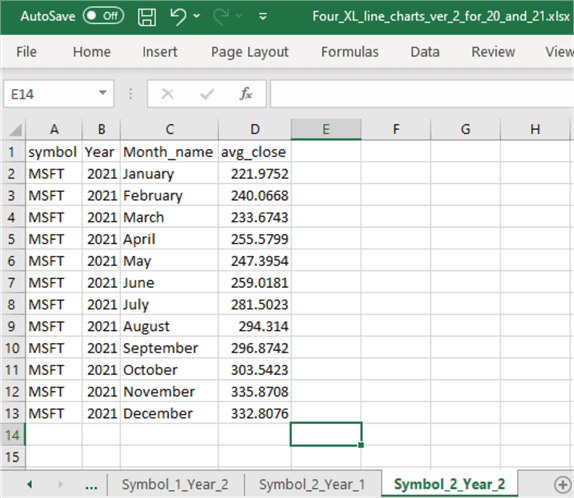
Based on the instructions and examples in this subsection, you can generate another line chart in the Four_XL_line_charts_ver2_for_20_and_21.xlsx workbook file based on the Symbol_2_Year_1 tab. This tip purposely leaves this chart out of the text descriptions so that you can practice creating a line chart on a tab and confirm your understanding of the content in the tip. The tab should have the name Symbol_2_Year_1. Therefore, the results set will be for an @symbol local variable value of MSFT and an @year_number_1 local variable value of 2020. You can look up the SQL Server results set values for this tab from one of the screenshots in the preceding section. Also, the download for this tip contains the missing tab with the omitted line chart image. The download includes a workbook file with line charts for the four combinations of ticker symbols (SOXL and MSFT) crossed with years (2020 and 2021).
Concurrently Displaying Line Charts for Multiple Results Sets in a Single Tab
One of the possible purposes for creating two or more results sets is to make comparisons among them. These comparisons will often be much easier to make when examining line charts with data for all results sets on a single tab than with four results sets filled with numbers in SSMS. This subsection illustrates the steps for preparing a multi-chart display of line charts in Excel.
The image below is for four charts in a line chart format. These charts are like the ones generated and discussed in the previous section, except all the line charts reside on a single Excel tab instead of one chart per tab. There are three primary roles of these charts:
- Groups all the charts from each of the four separate tabs. Each of the four underlying tabs displays a single line chart for a corresponding results set copied from SQL Server.
- Does not display the results set with the charts, making it easier to focus on a visual comparison between the charts.
- Adds dynamic titles to the overall set of four charts and individual charts within the group of four. A dynamic title means a chart title that automatically updates depending on the contents that the chart displays. Updates are implemented by concatenating string constants with string variables from source data copied from SQL Server to Excel.

Each of the four charts in the preceding image was created by copying each chart from the remaining tabs to the Consolidated Line Charts tab in the workbook.
To copy a chart between tabs in a workbook, you can select the chart in the source tab by right-clicking it. Then, choose Copy. Next, navigate to a destination tab, move to a cell on the destination tab, right-click the cell on the tab, and then select Paste.
The cursor in the preceding image rests in cell D2. As a result, you can see an Excel expression drawing on cells from two different tabs in the formula bar. The full expression changes based on the cell values on the designated tabs. For example, the first two terms from the formula bar appear below.
=Symbol_1_Year_1!A2 & " and " & Symbol_2_Year_1!A2
The first term extracts the contents of cell A2 from the Symbol_1_Year_1 tab and contains SOXL, while the second term extracts the contents of cell A2 from the Symbol_2_Year_1 tab and has MSFT. Therefore, the expression concatenates the contents of A2 from Symbol_1_Year_1 with the string constant “ and “. This value is, in turn, concatenated with the contents of A2 from the Symbol_2_Year_1 tab. As a result, the expression excerpt returns “SOXL and MSFT.” The full expression for the title of the four-chart set is “SOXL and MSFT Average Close Price per Month in 2020 and 2021.”
A careful examination of the four charts reveals that the chart titles in this subsection are not identical to the titles in the preceding subsection. Each of the charts in the prior subsection has a title of avg_close. Within this subsection, the chart titles reflect not only that avg_close values are being graphed but also to which ticker symbol the graphed avg_close values belong.
This change in the chart titles between subsections is associated with adding a title expression for each underlying chart. The revised chart specification appears below.
- Notice that cell Q1 in the Symbol_1_Year_1 tab contains an expression of =A2. This expression assigns the value of cell A2 on the tab, namely “SOXL,” to Q1
- The expression in cell Q2 on the tab is =D1. This expression assigns the value “avg_close” to Q2
- The expression in the chart’s title box is =Symbol_1_Year_1!$Q$1:$Q$2, which returns a display of “SOXL avg_close”
- This tip raises this matter so that you will be aware of different syntax rules for concatenating string values in worksheet cells versus chart title boxes within Excel charts
- Corresponding changes are made to cells Q1 and Q2, as well as the expression for the chart titles on tabs, namely Symbol_1_Year_2, Symbol_2_Year_1, and Symbol_2_Year_2

Formatting Multi-chart Sets with Chart Styles and Chart Colors for Lines and Markers
Excel has built-in libraries of chart styles and color palettes. If a built-in chart style or color palette matches your requirements, the libraries can reduce work to make it more impactful.
You can preview the library options for a chart by selecting a chart with a click on its border and then by clicking the paintbrush icon, which often appears close to the chart (often to the right). Clicking the icon opens a dialog box with visual displays showing the chart's built-in style and color palette options. The dialog opens to the chart style options, but you can use the menu at the top left corner of the box to navigate between style and color palette options.
Here is a screen excerpt that shows the dialog box with the Style library selected.
- The chart has small open circles on its sides and corners. This indicates the chart is selected.
- Selecting a chart’s border exposes a set of icons near the chart. These icons are for manipulating the properties of a chart. For example, the middle icon with a paintbrush is for assigning various style or color palette options to a chart.
- Clicking the paintbrush icon opens a dialog box that lets you apply a predefined chart style or color palette by selecting an image representing an option.
- Hovering over a style or color palette option gives you a quick view of what the chart would look like with that option selected.
- Clicking an option assigns that style or color option to the chart.

Here are a couple more screenshots illustrating how to preview and assign color palettes to a line chart.
- First, click the border of the line chart to select it for color palette editing.
- Next, click the paint brush icon.
- Then, click the Color menu in the top left corner of the dialog box that opens when you click the paint brush icon.
- You can view as many color palette options as you want to preview. Designate a color option for preview by clicking its surrounding box.
- After settling on a color palette, make that palette your current palette.
- Then, click off the dialog box to close the dialog with the color palette options.


With one exception, style options are applied to charts in the same way that color options are applied to charts in Excel. The exception is for the initial viewing of style options. Because the paintbrush icon opens by default to the style options, you do not need to select the Style menu item explicitly. You can bypass the style options by clicking the Color menu item to preview the available colors; then, you can return to the style options by clicking the Style menu item in the top left corner of the dialog box.
The following screenshots show an Excel workbook open to the Style menu options. The style options have already been selected for the four charts on the Consolidated Line Charts tab. This example, like the preceding one for color palette menu items, will walk you through the steps for previewing style options and assigning a style option to the currently selected chart.
- If you look in the top left corner of the dialog that opens when a user clicks the paintbrush icon for a selected chart, you can see the Style menu item has an underscore below it. This indicates the style menu items are available for preview and assignment to a chart.
- The top left chart is selected for the first style option assignment.
- After the dialog box opens in response to a click of the paintbrush icon, you can scroll to a style you want to apply to the chart.
- If you hover over a style menu item, Excel shows a preview of how the chart will appear with that style.
- Find the style option you want to use and exit the dialog box. Exiting the dialog box assigns the currently previewed style option to the chart.
- In our example, the style is already assigned. However, you can scroll through the styles until you find the option with a box around it. The box indicates the style was previously selected.
- The previously selected style is the third one in the list of style options. This is the third box in the screenshot below, with a box around it.
- Notice that a small text box with “Style 3” appears right below the selected style option.
- If you were trying to assign the style to the chart, you would click the style option you want to use.
- At this point, you can select another chart to preview an existing style name or assign a new style for the selected chart.
- The second style assignment preview occurs after selecting the lower right chart.
- In this case, the selected style option is named “Style 13.”
- The style options can affect many aspects of how a chart appears.
- Notice there is no background color for this chart.
- Also, this style only specifies the month name and year for x-axis values. This reserves more space for the marker identifications, making the text easier to read. This change occurs automatically as a consequence of choosing “Style 13.”
- Finally, this chart displays with a line marker. The line markers are diamond-shaped.
- The style setting can automatically affect many aspects of a chart, including background color, the inclusion of text for x-axis identifiers, and whether to denote points along a line with or without line markers.


Creating and Displaying Multiple Scatter Charts in Excel with Data Copied from SQL Server
A scatter chart is different than a line chart. Scatter graphs can always be considered a display of y values versus x values. In a two-dimensional scatter chart, the y values plot along the vertical axis, and the x values plot along the horizontal axis.
Each pair of x-axis and y-axis values is for an entity and corresponds to a point on the scatter chart. With the data for this tip, we can readily chart the average close price during the months in one year versus another. By examining the relationship between points across multiple ticker symbols, we can learn about the stability of the relationship across ticker symbols. For example, is the relationship across tickers consistent, or does it change from one ticker to the next? If it does change, how does it change?
Create Scatter Chart and Add Trend Line
Let’s create a scatter chart with Excel from SQL Server data. The “Transferring data from SQL Server to Excel via a simple copy and paste” section shows how to create datasets in Excel based on results sets derived from SQL Server. Unlike the line chart examples in the preceding section, scatter charts can easily require data from two or even more results sets.
The following screenshot shows two SQL Server results in a single worksheet tab.
- The first results set appears in cells A1 through D13. The first row reveals the column names. The remaining cells in column D show average close price values per month (avg_close) for January-December 2020.
- The second results set appears in cells G1 through J13. This row set contains comparable information for the SOXL ticker in the months of 2021.
- Columns L and M contain the column names and values for the scatter chart.
- Column L is a copy of the values from column D. In this scatter chart example, cells L2 through L13 are the x values for the scatter chart.
- Column M is a copy of the values from column J. Cells M2 through M13 are the y values for the scatter chart example.
- The values in L1 and M1 are the results set column names for the x and y values, respectively. The cell values in L1 and M1 are updated to reflect the ticker symbol, the name of the values in the chart (avg_close), and the last two digits of the year number (20 or 21).

Select the cells with x and y column names and values. The x column name and values are in L1 through L13. The Y column name and values are in cells M1 through M13. After selecting these cells, they turn grey.
Next, choose Insert from the Excel main menu. Then, hover over the basic scatter chart from the Charts section of the Insert menu ribbon. The following screenshot shows how Excel looks after selecting x and y cells and the chart type.

By clicking the first scatter chart icon, a scatter chart will be added to the current tab. You can then drag the chart to your preferred location on the tab.
- The following screenshot shows the chart dragged so that its top left corner is in the second row of column O.
- The default chart title for a scatter chart is the column name for the y values. In this example, that value resides in cell M1.
- If you hover your cursor over the solid circles for the points in the scatter chart, a small window opens with the x and y values for the scatter chart point marker. This allows you to validate that the chart reflects the data you chose.

One of the features that makes Excel scatter charts unique is the ease with which you can add and analyze trend lines for the points in a scatter chart.
- By default, Excel adds a linear trend line with slope and x-intercept parameter values. A trend line passes through the points in a scatter chart.
- You can add this default trend line by right-clicking any of the points in the scatter chart and choosing Add Trendline in the context menu box. When you right-click any point in a scatter chart, all the points for x and y values are selected.

After clicking the Add Trendline menu item, the default linear trend line is added to the scatter chart. The Format Trendline dialog may also appear. Here is what the screen may look like after adding the default trend line. The trend line is the dotted line through the points in the scatter chart. The default trend line is a linear line of best fit to the points in the scatter chart.

Another feature that makes Excel scatter charts unique is the ease of showing the parameters for a trend line and the R2 value for quantitatively denoting the fit of the line to the points in the scatter chart. The parameters of a default trend line are its slope and intercept. If the Format Trendline dialog is not open, you can open it by right-clicking the trend line and choosing Format Trendline.
The following screen image is an excerpt of the dialog box for formatting a default trend line. You can add the equation for the trend line (this shows its parameters) and the R2 value for the equation by clicking two check boxes at the bottom of the dialog box. These check boxes have the descriptive text “Display equation on chart” and “Display R-squared value on chart.”

The equation and R2display in a box on the scatter chart. This box sometimes appears on top of other critical chart elements, such as the trend line or a point in the scatter chart. If this happens, you can click in the box and drag the box with the equation and R2 value to another location that does not overlap with a critical chart element. This situation was regularly encountered while preparing the example for this tip. Here is the final chart image with the re-located box for the equation and R2 value.

Applying and Comparing Three Functions for Trend Line Fit
To give you a better feel for Excel analytics capabilities for trend lines in scatter charts, this subsection compares three functional forms for trend lines to the avg_close values for SOXL and MSFT tickers. The three functional forms are for:
- A linear trend line with slope and x-intercept values
- A linear trend line with slope value but an x-intercept value set to zero
- A second-order polynomial function
The default linear trend line does not generally pass through the origin point with values of x=0 and y=0. This is because its x-intercept value displaces the line away from the origin when x=0. On the other hand, a linear trend line with an intercept value set to 0 forces the line through the origin whenever x=0. Another critical distinction between a linear trend line with slope and x-intercept values versus a linear trend line with just a slope parameter is the number of parameters to be estimated. When the intercept is forced to be zero, there is just one parameter to estimate: the slope. When the intercept is not forced to be zero, there are two parameters to be estimated: the slope and x-intercept values. All other things equal, equations with more parameters typically estimate their underlying data points more accurately than equations with fewer parameters.
Polynomial functions of the second and higher orders allow for curvature in the line of best fit. A second-order polynomial will always have a bend in its line of best fit. The orientation of the curvature for a second-order polynomial depends on the sign of the parameter for x2. If the parameter is greater than zero, the function opens upward. If the parameter is less than zero, the function opens downward. If the parameter for x2 is zero in a second-order polynomial, the function falls back to a straight line with no curvature from a second-order polynomial term. Second-order polynomial trend functions have up to three parameters to estimate. Therefore, they will generally fit the underlying data points more accurately than linear trend forms with or without an x-intercept set to zero.
The following table shows three sets of Format TrendLine dialog box settings. One set is for each type of function covered in this subsection. The table’s first column names the trend line functional form. The table’s second column shows the Format TrendLine dialog box settings for the functional form.
a linear trend line with slope and x-intercept values

A linear trend line with slope value but an x-intercept value set to zero

a second-order polynomial function

This subsection fits the three types of trend lines to the x and y scatter values of SOXL and MSFT tickers as a preliminary step to determining which functional form of a trend line fits the data best.
The following screenshot shows the x and y scatter points with a default trend line through them. The points are for average close prices per month in 2021 versus 2020; the average monthly close prices in 2020 are the x values, and the average monthly close prices in 2021 are the y values. Recall the functional form for a default trend line is a linear trend line with slope and x-intercept parameter values. The trend line fit is more accurate for the MSFT ticker symbol than for the SOXL ticker symbol. The higher R2 for the MSFT trend line confirms the extra accuracy for the MSFT trend line versus the SOXL trend line.

The following screenshot shows the x and y scatter points with a linear trend line whose x-intercept value is zero. Notice there is just one parameter value for each ticker symbol’s trend line. The slope parameter for the SOXL ticker trend line (2.5501) is much larger than the slope for the MSFT ticker (1.4278). This means the average monthly close prices grew much more in 2021 relative to 2020 for SOXL than for MSFT. Also, the R2 values for both trend lines were very close to 1. An R2 value of 1 means the variance of y is fully accounted for by the variance of x.

The next screen excerpt is for the fit of the polynomial trend line through the scatter points. In this case, the R2 values for the two ticker symbols (0.753 for SOXL and 0.8933 for MSFT) are intermediate between the default linear trend line and the linear trend line with the x-intercept value set to zero. While the polynomial trend lines fit their scatter points better than the default linear trend line, the polynomial trend lines do not fit the data nearly as well as the linear trend line with no x-intercept parameter.

The superior fit of the linear trend line with no x-intercept parameter confirms that it reflects the true relationship between the x and y scatter points across the two tickers examined in this section. In this case, the proper specification of the relationship between x and y values is more important than the number of parameters used to estimate y values from x values.
Demonstrating Six Formatting Effects for Scatter Charts
This subsection presents six formatting end results you can explore on your own. As you may have noticed by this point, Excel has many manual techniques for creating and editing charts. A tab with the finished charts shown below is available in the tip’s download to help you duplicate or improve the manual steps reference below.
This first example edits a chart title and adds x- and y-axis titles, which are not added by default. You can add x- and y-axis titles by selecting a chart and then clicking the cross icon, which is right above the paintbrush icon for selected charts. This will produce a dialog box to select a check box for axis titles. Additionally, you can change the text in a chart title box by clicking on the box and overwriting text already in the box. Finally, you can change the font size for a chart title by right-clicking in the box and choosing the Font button.

The second example adds a gradient effect to an existing chart title. Right-click the chart title and choose Fill followed by Gradient to expose a menu of different gradient styles. Click the button control displaying the gradient effect you want to be applied to the chart title.

The third example adds a color palette for the scatter points and trend lines by selecting a chart and clicking the paintbrush icon followed by the Color menu item.

The fourth example shows the result of adding a style to a chart. Select a chart and click the paintbrush icon before clicking the preferred style option in the list of style options.

The fifth and sixth examples show two different selections for controlling the dash type of a trend line. You can start making these changes by right-clicking the trend line and choosing Format Trendline. Next, click the paint can icon to manipulate fill and line effects. Finally, click the Dash type control to select from a menu of preconfigured dash styles.

Next Steps
This tip aims to introduce techniques to SQL developers and data science engineers for implementing multi-chart displays with Excel based on data from SQL Server. The tip begins with a SQL script for extracting data from a SQL Server table that is appropriate for presentation via multi-chart displays. A simple Windows copy and paste operation is demonstrated for transferring data from SSMS to tabs in an Excel workbook file.
- The Excel portion of the tip begins with line chart examples. You can carefully follow the guidelines demonstrated for implementing line chart examples. Among the special features of the examples are:
- Basic instructions for creating a line chart in Excel
- Formatting instructions for enhancing the impact of your line charts
- Examples of how to chart data from multiple SQL Server results sets in a single Excel tab
- A second Excel section drills down on scatter charts:
- This section also covers how to create scatter charts for multiple SQL Server results sets
- One special feature of this section is how to create and analyze trend lines for your Excel scatter charts of SQL Server data
- This section also includes a quick review of formatting examples for scatter charts
The tip’s download file includes:
- SQL Server script files with code for creating results sets from a SQL Server table (yahoo_finance_ohlcv_values_with_symbol)
- See this prior article, A Framework for Comparing Time Series Data from Yahoo Finance and Stooq.com, for an overview of the table’s contents
- The size of this table is substantial, and most of its contents are not referenced in this tip
- Therefore, four CSV files are provided to make SQL Server results sets from the table available
- There are also several Excel workbook files for the completed chart examples modeled after those covered in this tip
- Finally, there is one Excel workbook file in the download that is only lightly referenced in the tip; this workbook file (Four_XL_line_charts_ver_2_for_19_and_20.xlsx) was created and shared to show how easy it is to re-populate an Excel workbook file
- This workbook file was created based on results sets from 2019 and 2020 for the SOXL and MSFT tickers
- This final Excel workbook example in the tip’s download confirms that you can pour fresh SQL Server data into an existing Excel workbook and obtain scatter charts for the fresh data
- An extra pair of CSV files are in the download to accommodate this final example

Rick Dobson is a SQL Server professional with decades of T-SQL experience that includes authoring books, running a national seminar practice, working for businesses on finance and healthcare development projects, and serving as a regular contributor to MSSQLTips.com. He has been a practicing Python developer for more than the past half decade – with a special emphasis for data visualization and ETL tasks with JSON and CSV files. His most recent professional passions include financial time series data and analyses, AI models, and statistics. If you are interested in growing your skills in any of these areas especially as they relate to financial securities, consider visiting his blog at https://securitytradinganalytics.blogspot.com/2023/12/.
- MSSQLTips Awards: Leadership (200+ tips) – 2025 | Author of the Year Contender – 2017-2024