By: Harris Amjad | Updated: 2022-09-26 | Comments (1) | Related: > Power BI Charts
Problem
Clustering data is useful when the data is extensively unstructured and manual segregation of the data into groups is impossible. This technique identifies the natural grouping within the dataset. We need a solution that intelligently groups similar data points into one segment, which is not correlated to other segments. How can I leverage Power BI Desktop scatter plots to visualize clustering effectively?
Solution
In this tip, Power BI Desktop, which is Microsoft's robust business intelligence tool is used. Using this tool you can connect, transform, and visualize the data using this tool.
A scatter plot is a visualization containing data points, plotted along the vertical and horizontal axis. This plot is extensively used to study the correlation between two variables. With the help of the Power BI Desktop clustering feature, you can quickly identify collections of related data points in the dataset. The algorithm examines the attribute values in the dataset to find patterns of similarity and dissimilarity and divides the data with similar patterns into a cluster of data.
We will take a look at a few different examples.
Analysis - Video Games Dataset
This dataset can be downloaded from Kaggle: Video Games Sales Dataset (PS4_GamesSales.csv). Using this dataset, we can segment the different categories of games based on sales in North America and Europe.
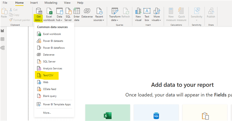
Open Power BI Desktop, then click Get data. From the drop-down menu, select the Text/CSV option. Next, select the location to download the dataset.
Finally, click Transform Data.
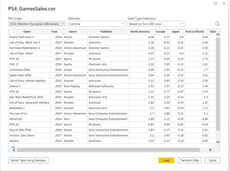
Now, since we are only interested in the games sold in North America and Europe, we need to remove unnecessary columns like Year, Japan, Rest of World, and Global. Select a column that needs to be deleted and click Remove Columns in the top navigation bar under the home tab.

After removing all the unnecessary columns, select Close and Apply from the top navigation bar under the home tab.

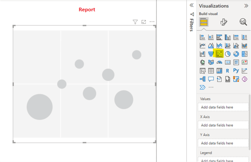
Add a scatter plot by clicking on it from the visualization pane on the left.
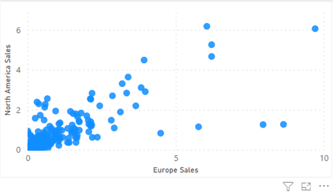
Bring the appropriate columns into the report by dragging each column from the fields pane into the appropriate places in the visualization pane. For example, in the current dataset case, drag the Game column to the values field, Europe Sales to the X-Axis field, and North America Sales to Y-Axis field under the visualization tab.
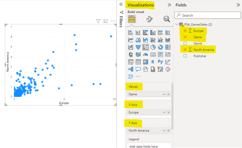
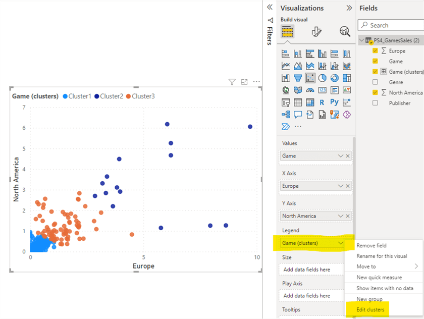
The following image shows the example scatter plot. Unfortunately, it is difficult to identify the different segments.
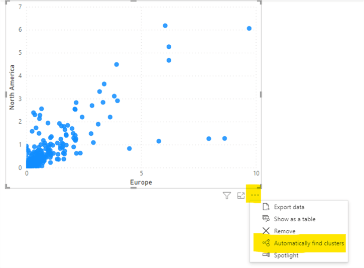
In order to apply clustering in the scatter plot, click the (…) More Options in the bottom right of the above image and then click the Automatically find clusters option.
The following Clusters pop-up will appear.
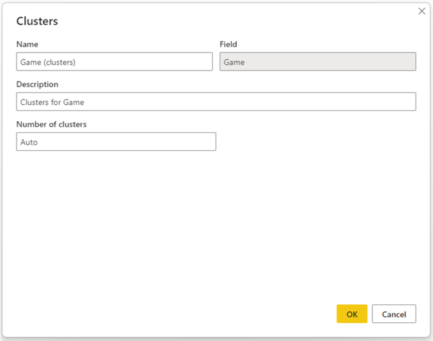
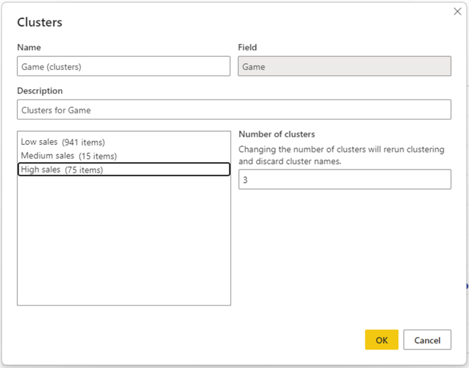
This pop-up allows you to edit the name, description, and number of clusters. The Field value in this pop-up is auto-populated from the Value field of the scatter plot. If the number of the clusters is Auto, then Power BI will intelligently identify the number of clusters. However, in this case, let's select 3 as the number of clusters and click OK.
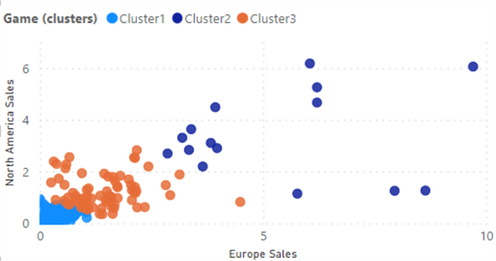
Look under the visualization pane on the right side, after selecting the scatter plot. The new cluster field created will be seen in the legend field of the scatter plot.
If the cluster details need editing, right-click the cluster column in the Legend field, and click Edit clusters.
Cluster names can be edited by clicking on them. This allows the creator to give more meaningful names to each cluster, i.e., Low sales, Medium sales, and High sales. Once you have renamed the clusters, click OK.
Analysis – Breast Cancer Dataset
This dataset can be downloaded from Kaggle: Breast Cancer Dataset.
In this dataset, there is a diagnosis column with two values (M = malignant, B = benign) that can be used to segregate two clusters in the data. However, for this tip, we will evaluate how well the clustering in the Power BI Desktop segregates the data points between two clusters (M = malignant, B = benign) without directly using the diagnosis column.
For this analysis, we will be using the following columns: id, radius_worst, and smoothness_worst.
In the Power BI Desktop, click Get data and then select the Text/CSV option. After that, select the location where the dataset should be downloaded. The following pop-up will appear:
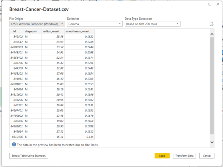
For this analysis, we will be using id, diagnosis, radius_worst, and smoothness_worst, which are all available, so click Load.
Add the scatter plot by clicking on it from the visualization pane to the report on the left. Bring the appropriate columns into the report by dragging each from the field's pane into the appropriate places in the visualization pane. For example, in the current dataset case, drag the id column to the values field, radius_worst to the X-Axis field, and smoothness_worst to Y-Axis field under the visualization tab. The following is the new scatter plot.
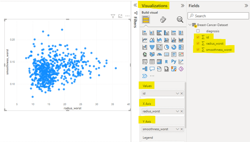
Let's try creating two clusters for the current scatter plot. To apply clustering in the scatter plot, click the (…) More Options (shown in the bottom right of the image above) and then click Automatically find clusters option.
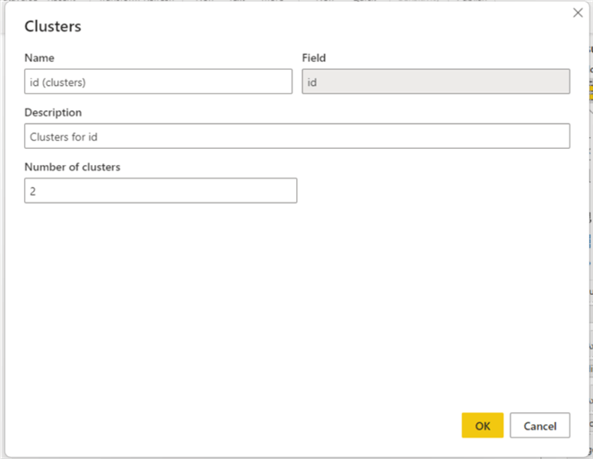
When the pop-up appears, enter a 2 in the Number of clusters field since we want to evaluate the cluster segregation of the data points with the actual segregation based on the diagnosis column.
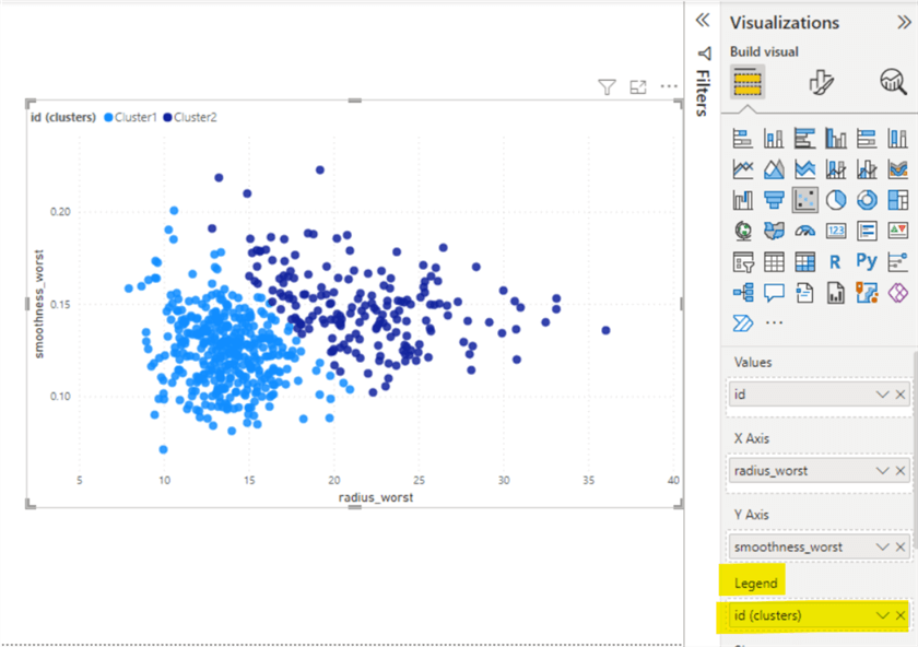
The following image shows the two clusters formed by the clustering in Power BI Desktop. The new cluster field created will be seen in the Legend field of the scatter plot.
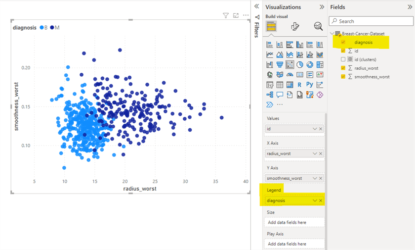
Now let's create another scatter plot where we will use the diagnosis as a Legend value instead of the newly created cluster field - id (clusters). Follow the previous steps to create the scatter plot, but skip the creating cluster steps, i.e., click the (…) More Options, click Automatically find clusters option. Instead, drag the diagnosis field from Field's pane in the Legend value under the visualization pane.
Let's compare both scatter plots.
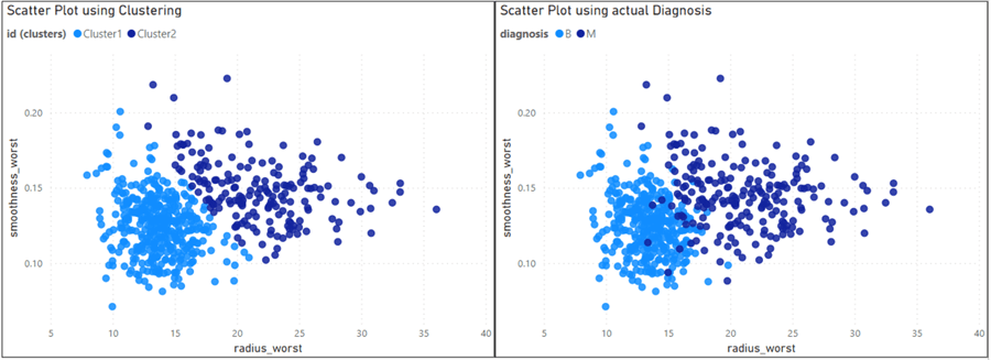
After close observation, it can be noted that clustering did create segregation of data points with great accuracy.
Conclusion
From the two analyses above, it is seen that clustering can be used to facilitate different problems. For instance, the first analysis showed that segregation of the games based on the different proportions of sales is needed to target the various marketing strategies in different parts of the world. Similarly, customer segmentation is another use case that can be achieved using clustering in Power BI Desktop.
In some machine learning models, data labels are essential. Hence, if the data labels are not present in the dataset, we can create the labels with great accuracy using Clustering in Power BI Desktop. This is evident from the second analysis.
Next Steps
- Check out all these MSSQLTips.com Power BI Tips
Learn more about Power BI in this 3 hour training course.
About the author
 Harris Amjad is a BI Artist, developing complete data-driven operating systems from ETL to Data Visualization.
This author pledges the content of this article is based on professional experience and not AI generated.
View all my tips
Article Last Updated: 2022-09-26


