Problem
Microsoft Power BI Desktop provides a wide variety of custom visuals. When making dashboards, there may be a need to slice and filter the data at runtime. The built-in slicers are very simple, but there are many Power BI custom visuals that we can add to Power BI. The Timeline Slicer is one of them. Most of the time, you want to filter data based on quarter and month; hence you must click a large number of dates, which can be quite cumbersome. The Timeline Slicer makes this process hassle-free. Simply select the hierarchy, i.e., year, month, or quarter, and then the filter will be available at that level. From here on, it is much easier to filter data. This slicer is not only more visually appealing, but it also makes it easier to filter data.
Solution
The Timeline Slicer is not a standalone visualization technique like graphs and charts. However, it can still prove essential when working with data that include a series of dates over a period of time. The Timeline Slicer allows users to slide, filter, and view data between different time slices. Its use cases are widespread. For example, a sales company may need to track and analyze its profits or sales between various time slices (days, months, years, etc.). This can be done easily using the Timeline Slicer, proving it to be a powerful tool. Time slicers provide users with a high-level overview of the variables affected within that time period.
The Timeline Slicer groups multiple instances of time and aggregates the time-dependent variable using some aggregating function, thus producing a pivot table. This allows the user to get a summary of the overall data, making it easier to understand.
What exactly is a pivot table? A pivot table reorganizes the original data set grouped by certain categorical variables against aggregates (sum, count, average, etc.) of quantitative variables.
Timeline slicers are so essential in timed data because:
- They make filtering pivot tables remarkably simple.
- They visually show the pivot table, making it much easier to understand.
- Time slicers also allow changing the pivot table in real-time, thus allowing greater retrieval of information in less time.
Now that we have covered the basics of timeline slicers, it’s time to look at how to use them with Power BI Desktop.
Creating a Source Table
For practical purposes, we will analyze how many pens a particular entity has sold over a period of time.
For starters, we will create a database and then access it using the commands below.
CREATE DATABASE Sales;
USE Sales;
Next, we will create a table within our database. Since we are using the Timeline Slicer visualization, our table must consist of at least one date/time column and a variable that either depends on the time or varies. So, we will create a table called Pens_Sold with two columns named Date and No_Of_Pens.
CREATE TABLE Pens_Sold
(
    Date DATE,
    No_Of_Pens INT
);
Now that we have created the table, we can populate it with the code below.
INSERT INTO Pens_Sold (Date, No_Of_Pens ) VALUES
('2023-01-01', '123 '),
('2023-01-12', '52 '),
('2023-01-22', '42 '),
('2023-02-03', '536 '),
('2023-02-13', '412 '),
('2023-02-28', '543 '),
('2023-03-04', '425 '),
('2023-03-17', '13 '),
('2023-03-29', '563 '),
('2023-04-01', '456 '),
('2023-04-19', '732 '),
('2023-04-21', '12 '),
('2023-05-02', '42 '),
('2023-05-14', '73 '),
('2023-05-28', '53 '),
('2023-06-01', '524 '),
('2023-06-12', '42 '),
('2023-06-22', '241 '),
('2023-07-01', '563 '),
('2023-07-19', '134 '),
('2023-07-24', '954 '),
('2023-08-01', '24 '),
('2023-08-17', '532 '),
('2023-08-30', '66 '),
('2023-09-07', '411 '),
('2023-09-13', '35 '),
('2023-09-30', '621 '),
('2023-10-02', '31 '),
('2023-10-16', '156 '),
('2023-10-31', '315 '),
('2023-11-01', '134 '),
('2023-11-13', '311 '),
('2023-11-23', '34 '),
('2023-12-01', '516 '),
('2023-12-16', '31 '),
('2023-12-31', '315 ');
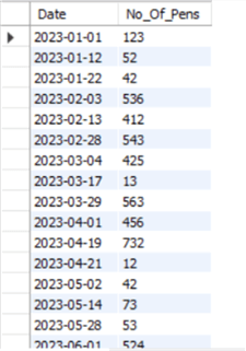
If you would like to view the created table, you can execute the command below:
SELECT * FROM Sales.Pens_Sold;
Here is the partial output of the table:
Using the Timeline Slicer in Power BI
Now that we have created our timed dataset, we can look at how to use the Timeline Slicer.
Launch Power BI and implement the steps below.
Step 1
First, we will need to import our data into Power BI.
In the Home section, click the Get data option to open a drop-down menu.
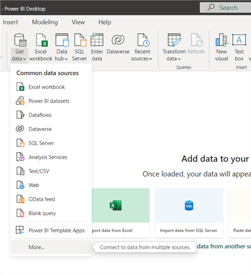
In the drop-down menu, click More…
Step 2
A dialogue box will appear. Click on Database beneath the search bar, then look for “MySQL database” within the databases listed on the right, or enter “MySQL database” in the search bar.
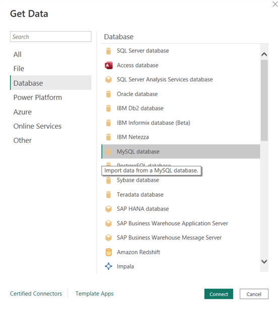
Once found, click on it and then click Connect.
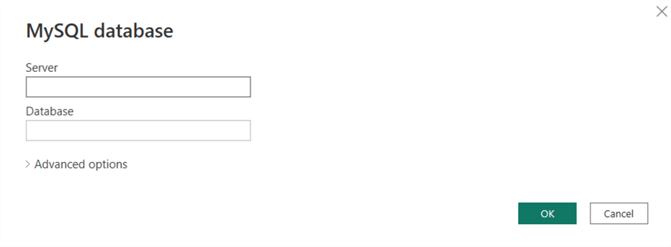
Step 3
The actions above will direct you to another window, where the MySQL database will ask you for the Server you would like to connect to and the Database you would like to use. Since I am hosting MySQL locally, I will use the localhost IP as the server, 127.0.0.1, and for the database, I will use the database we created earlier called Sales.
Step 4
Once you have successfully connected to the server, you will be directed to the Navigator window. Below the Display Options, select the table we created by ticking the checkbox to its left, as shown below:
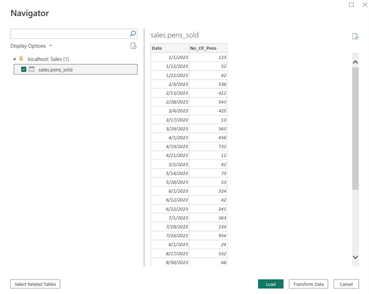
Here Power BI previews the data and allows you to transform it if the data requires cleaning or processing before being used. Since our data is already clean and does not require processing, we will click Load in the bottom right.
Step 5
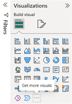
Considering the size of the data, the previous step may take a while to load. Once the dataset has loaded successfully, we can analyze it using the Timeline Slicer. Note: Before continuing, Power BI does not support a Timeline Slicer by default. We will need to install it in Power BI using a third-party extension. To do that, in the Visualizations panel, click on [. . .] (Get more visuals) which allows us to download various visualizations.
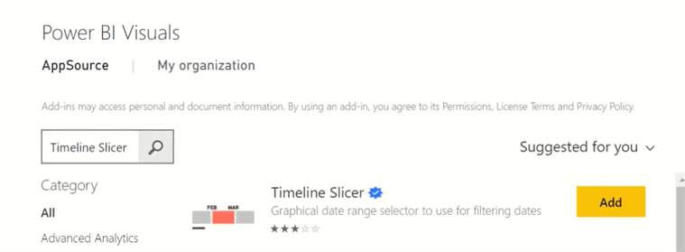
Step 6
This will direct you to the Power BI Visuals window, where third-party visualizations are available. In the search bar, type “Timeline Slicer” and click search. When found, click Add. This will add it to your Visualizations panel.
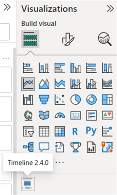
Step 7
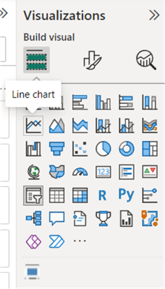
Go to your Visualizations tab and click the Timeline Slicer icon, as shown below. This will create a skeleton of your visualization in the Power BI workspace. Using your cursor, you can reshape, resize, move, and adjust it the way you desire.
Step 8
As mentioned before, since the Timeline Slicer is not a standalone visualization, it filters the data of another visualization according to the time slice selected. We will require another visualization to demonstrate how the slicer works. For the second visualization, we will use a simple Line Chart. To do so, click on the empty workspace to deselect the Timeline Slicer and then click on the Line Chart visual.
This will also create a skeleton for your Line Chart, ready to be populated.
Step 9
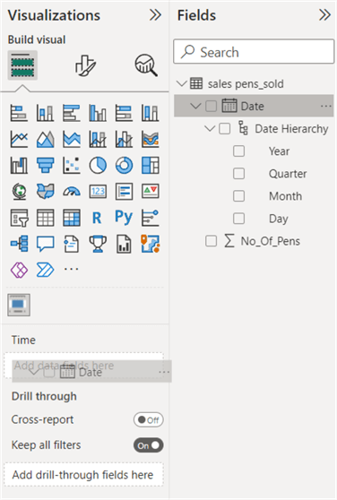
Select your Timeline Slicer, and then from the Fields panel, drag the Date column and insert it into the Time section as shown below. This provides your Timeline Slicer with all the date values, allowing it to filter them accordingly.
Step 10
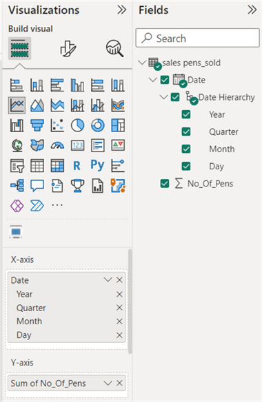
Next, select your Line Chart and select the Date column from the Field panel, but this time drag it to the X-axis section. Do the same with the No_Of_Pens field, but add it to the Y-axis section. Once you are done, it will look something like this:
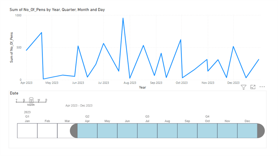
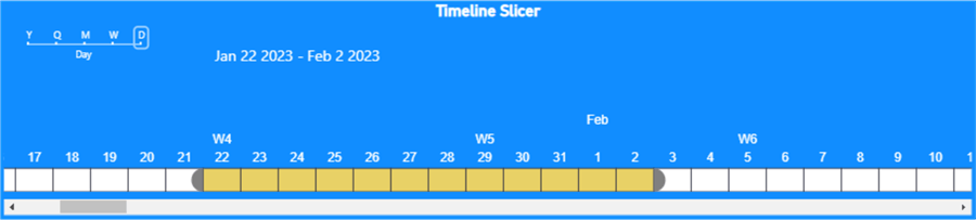
And the visualizations in your workspace will look like this:
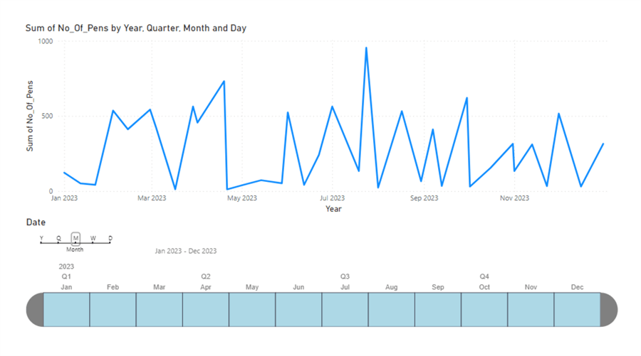
The image above shows the Line Chart on the top, with the Timeline Slicer beneath it. As you can see, another slider above the Timeline Slicer allows you to filter your data by year, quarter, month, week, or day. To its right, you can see a date range showing the time period currently selected by the Slicer.
If you deselect specific cells within the Slicer, it changes the range and the Line Chart, as shown below.
Slicing by weeks and days would allow filtering to be even more fine-grained. You can see the Timeline Slicer at work in various charts below:
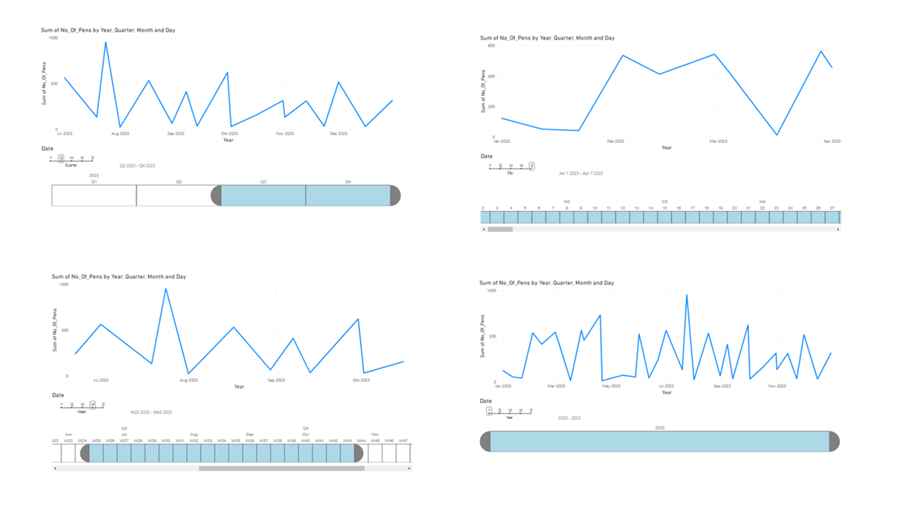
As you can see, the Line Chart changes according to your selection on the slicer.
Customizations
Right now, you may feel the visualization is not appealing to the eye. You may want to tweak a few things within the slicer to make it more useful. So, let’s adjust some of the visuals.
Visual Formatting
Under the Visual tab, you will find various options like Force selection, Weeks Determination Standards, Fiscal Year, First Day of Week, Range Header, Cells, Granularity, Labels, and Scroll position auto adjustment. Let’s investigate each of these.
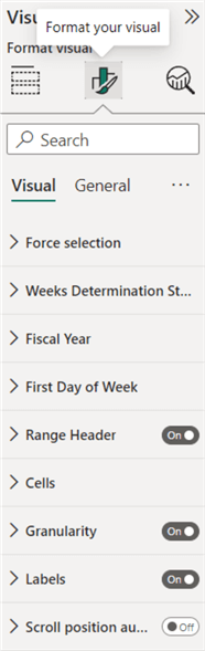
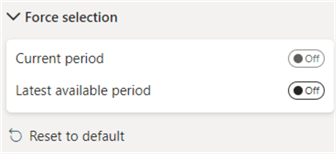
Force selection
Using force selection, you can automatically select the current period within your granularity or the latest available period in the Timeline Slicer. For example, if the chosen granularity is Year, the latest available period option will select the latest available year, while the current period will select the current year.
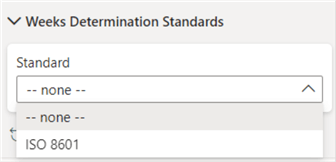
Week Determination Standards
Using this tab, you can change the week’s standard to either none or ISO 8601.
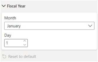
Fiscal Year
This tab changes the start date of the fiscal year.
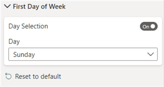
First Day Of Week
You can use this tab to change the day you’d like the Slicer’s week to start.
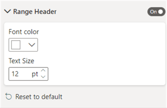
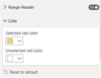
Range Header
Using this, you can change the Range Header’s font color and size. You can also toggle the Range Header off.
Cells
This tab allows you to change the color of the selected and unselected cells.
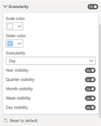
Granularity
This tab allows you to change the color of the granularity scale and its slider. You can also turn off granularities you do not want available in your Slicer.
Labels
This tab allows you to change the labels’ font color and size. Toggling off the Display all causes only the label of the granularity chosen to be shown.

Scroll position auto adjustment
Toggling on this option automatically adjusts the Slicer view (scroll position) whenever a change is made to the selection.
General Formatting
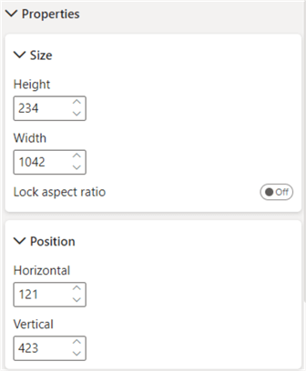
Properties
This allows you to change the size of your diagram and its position.
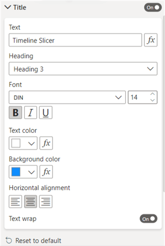
Title
This tab allows you to format your diagram’s title.
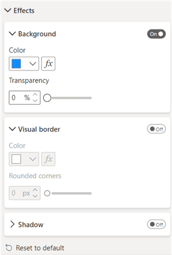
Effects
It allows you to change the background, add a visual border, and add a shadow.
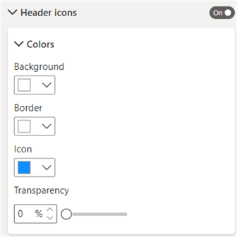
Header icons
This option allows you to customize the header icons, i.e., change their color, background color, etc.
Icons
Allows you to toggle various icons on/off.
Alt text
Allows you to add descriptions to the visual, which can be read when the visual is selected.
Formatted Timeline Slicer
Now we can view the result of our customizations.
The slicer looks much more visually appealing now. Of course, you can modify your slicer according to your theme so that it accents the other visualizations linked to it.
Conduct Analysis and Conclusion
Now that we have fully set up our visualizations, we can analyze our sales data. You can now select different granularities and different slices within those. This will allow you to analyze data within other slices and extrapolate more data and trends.
In this article, we emphasized the importance of a Timeline Slicer. We demonstrated how it is used alongside other visualizations which use data with a time element, allowing you to summarize data between various periods and examine trends. We then presented the steps to create a dataset with dates using MySQL and then use a Timeline Slicer alongside a Line Chart within Microsoft’s Power BI. These same techniques and steps can also be used with other data sources like SQL Server.
Next Steps
- Check out all the Power BI Tips on MSSQLTips.com

Harris Amjad currently works as a Software Engineer at Strategic Systems International. He is Microsoft Certified Data Analyst and Microsoft Certified Trainer. A rigorous, task-driven Data Enthusiast with substantial experience in Data Science, Data Analysis, and Data Engineering.
- MSSQLTips Awards: Trendsetter (25+ tips) – 2024 | Author Contender – 2023, 2024 | Rookie Contender – 2022

Hi,
Great article and the time-line slicer is add-on and seems like the slicer of Jupyter / Python series. Thank you for adding add-on feature of “Time-Line Slicer in Power BI” which otherwise is not available on its own.
Best regards,
Abhishek Singh