Problem
The Power BI KPI visual is very useful when representing information that compares a value against a target on the same visual. The behavior of the visual is sometimes confusing to business users, particularly when they compare what the KPI visual is showing with what a Power BI Card visual is showing.
Recently, I was approached by a friend to help find an approach to change the default behavior of the KPI visual as it tends to show the most recent value rather than an aggregated value as the Card visual would do. In this article, I will only describe an approach to achieve this very common requirement using DAX; I will not detail what the KPI visual does or how to use it. If you would like to learn more about how to use it in detail, I recommend reading this article written by Raza of RADACAD: KPI Visual in Power BI Explained.
Solution
To demonstrate the default behavior of the Power BI KPI visual, I will use the image below.

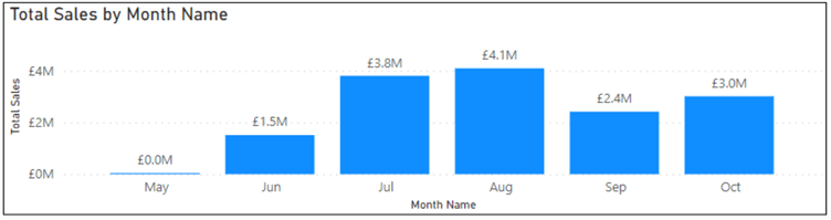
We can see that the KPI visual summarizes the latest value (in this case, the month of October) of sales, as seen on the column chart on the right. This is different from the behavior of the Power BI Card visual, which summarizes all sales values for the entire data period (in this case, from May to October).
Then comes the issue that business users face when using the KPI visual. They have a business requirement to show the complete aggregated value of Sales as would a Card visual while comparing the value to a periodic target.
I have used a simple dataset, as seen in the image below, to demonstrate how you can summarize all the available months’ values on the KPI visual, as would the Card visual, and still be able to compare it to a target value.
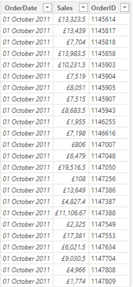
The dataset has just three columns for demo purposes (of course, there are more rows in the dataset, but I have shown only a few rows for demo), and we will create a measure for “Total Sales” using the DAX code below.
Total Sales = SUM(ExportedData[Sales])
When this DAX expression is used on a KPI Card visual, we get the output, as seen in the image below.
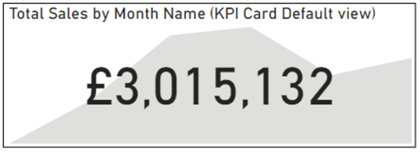
As seen in this column chart visual, the above image represents the last month’s value.
When the same “Total Sales” measure is applied on a Card visual, we get the output below.

If you need to change this default behavior, create a measure for “Total Sales,” as seen in the DAX expression below.
Total Sales (Altering default) =
CALCULATE (
    SUM ( ExportedData[Sales] ),
    ALLEXCEPT ( DatesTable, DatesTable[Month Name])
)
The magic is done by the DAX function ALLEXCEPT, which returns all the rows of a table except those that are affected by the specified column filters. For more information on how this function works, I recommend reading the Microsoft documentation: ALLEXCEPT.
When the output of the DAX expression above is used on the Power BI KPI visual, the default behavior will be altered, and the KPI visual will show the following:

The above visual now represents all the available months’ sales (see below).
What If You Have a Monthly Target?
If your target value is monthly, it may not make sense to use it as it is on the KPI visual above since it would be comparing the aggregated sales value with a single month’s target value.
So, to cater to this situation, you need to create conditional logic to ensure that when the sales value on the KPI visual is aggregated for the whole period, a certain value of the target is returned. When a slicer is selected for a specific period, e.g., if a month like August is selected on a slicer, then an alternative conditional logic value for the target is returned based on monthly targets. I will demonstrate how this can be achieved using the DAX expression below. However, this depends on your business requirement and settings, so adapt the code below to suit your needs.
Target =
IF ( ISFILTERED ( DatesTable[Month Name] ), 1000000, 1000000 * 12 )
In the expression above, the ISFILTERED function is applied to the first argument of the IF function. This returns a target value of 1 million whenever a month is selected on a slicer. This represents the monthly target value. The second argument of the expression above is a logic I applied for this demo, yours might be different, but the idea is adaptable. The second argument says if no month is selected on the slicer, then return 1 million multiplied by 12 as the value for the target to be used to compare with the aggregated KPI visual sales value.
The image below shows the KPI card’s appearance when no month is selected on the slicer above it. As you can see, the target value is 12 million (1 million multiplied by 12), the second argument of the conditional expression we wrote earlier.
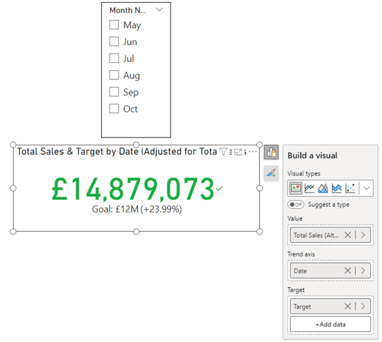
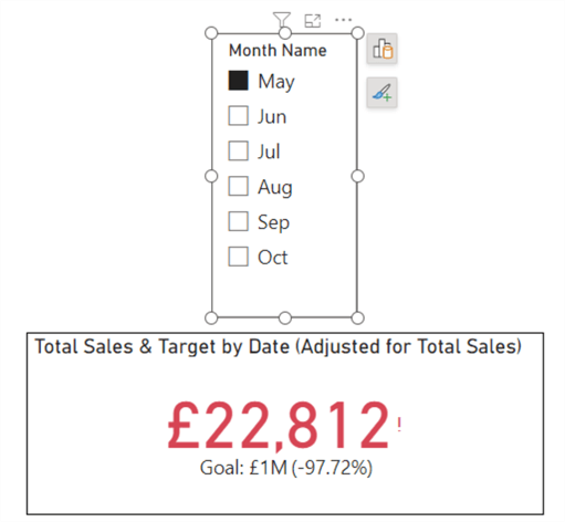
Now, select the month of “May” on the slicer and see what happens. This is represented in the image below. As you can see, the target value is now changed to 1 Million since a slicer selection has been made.
In summary, in this article, we have successfully demonstrated an approach to how we can alter the default behavior of the Power BI KPI visual and adapt how the target value works with it. It should be noted that the ISFILTERED function is not the only function that can be used in the context; other DAX functions can replace both the IF and ISFILTERED functions and still achieve the same output. Try to adapt this to your solution.
Next Steps
- See this YouTube video from RADACAD: KPI Visual in Power BI Explained.
- Get more information on the ALLEXCEPT DAX Function.
- Get more information on how to use the DAX ISFILTERED Function.
- Get more information on how to use the DAX IF Function.

Kenneth A. Omorodion is a Microsoft Certified Solutions Associate (MCSA) with 12+ years of enterprise application experience in Power BI, DAX, Microsoft Fabric, Business Intelligence, data warehousing, SSRS, T-SQL, and Azure. Beyond his technical skills, Kenneth has expertise working with stakeholders’ and business leaders to help them better understand key insights. He has a great track record of successfully delivering full life cycle Business Intelligence and data solutions to organizations with measurable business impact.
- MSSQLTips Awards
- Achiever Award (75+ Tips) – 2025
- Author of the Year-2021
- Author Contender-2022/2023/2024