Problem
Microsoft Power BI Desktop offers users a wide variety of certified custom visuals. Sometimes one wants to conduct a comparative analysis to assess the impact of different variables on output. Hence, when a decision revolves around the effects of the variables, a tornado chart assists in making the decision since it provides sensitive analysis. This tutorial will highlight all the steps to create a tornado chart in Power BI Desktop.
Solution
Wouldn’t it be great to overcome issues, tensions, and confusion in meetings with less subjectivity and more objectivity and evidence? Decision-making is one of a manager’s key responsibilities; unfortunately, futile arguments ensue in important business meetings. Since data is often insufficiently utilized in many organizations, managers frequently chase insignificant issues, unable to often move forward to address critical matters. So, how can a good manager leverage their organization’s data sources to facilitate faster and optimal decision-making?
One of the primary responsibilities of a productive manager is to conduct comparative analysis as part of their decision-making and strategic planning processes, which involves a thorough evaluation of competing options. In such circumstances, a tornado diagram is a convenient visualization. Like a bar graph, the data categories in a tornado chart are listed vertically, having each category sectioned. The bars are also ordered, usually with the largest at the top, giving the visual the shape of a tornado. It is a fitting tool that allows comparison-based use cases and sensitivity analysis, which measures the impact of independent variables on a dependent variable under a given set of assumptions.
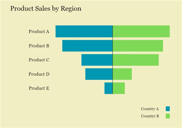
A typical tornado chart is illustrated above. Some of its components are:
- Horizontal Bars: These bars correspond to the data points of different categories being compared. Each category has its own bar, and the length of the bar is proportional to the value being measured on the x-axis. Considering the above illustration, we can see that each product has its own bar, with product A having the largest overall sales.
- Categorical Division: Tornado charts also comprise two sections, one on the left and one on the right, representing the categorical division of a category with another variable. For instance, we can differentiate product sales according to regional differences in the above tornado chart. The division is color coded to ensure clear visual contrast.
- Axis: Axis is integral to a visualization, and for a tornado chart, data categories are encoded on the y-axis, with the dependent variable on the x-axis. Like in the above chart, the product categories are mentioned on the y-axis, and we can infer that the sales variable is encoded on the x-axis.
So, when should we use a tornado diagram? Apart from a comparative analysis use case shown in the illustration above, where we are trying to judge the best-performing product out of all the competing options, tornado diagrams are also handy for sensitivity analysis. A range of factors determine a product’s overall performance; not all are equally important. Managers can thus use a tornado diagram to evaluate the most impactful factors and divert their attention accordingly during decision-making.
In sensitivity analysis, however, although the longest bar computes the most impact on the dependent variable, we also need to consider the direction of the bars, whether they are left or right of the central line. Usually, variables with bars on the right side have a positive impact, meaning an increase in their values leads to a higher outcome and vice versa. For comparative purposes, all the variables are varied by the same degree.
Thus, we see that a tornado chart is a very useful visualization:
- Decision-makers can quickly identify the most influential variables and prioritize their attention and resources accordingly. They don’t have to rummage through all the independent variables, especially those with the least impact.
- It is a very intuitive visualization technique as it provides a concise representation of the impact of various variables on the outcome, making it easier for stakeholders to understand and engage with the information.
- It also facilitates risk assessment of variables and scenario analysis, which aids in more informed decision-making.
Creating a Schema in SQL Server
Now that we understand the fundamentals and importance of a tornado diagram, it is time for a more practical demonstration. Consider that you are an investor seeking to buy shares in an SME. As a part of their sales pitch, the management and executives have promised good profitability, attributing their success to cost minimization of their business operations. So how can you, as an investor, use this firm’s publicly available financial information to confirm that the executives are not ‘sugarcoating’ their statistics? A good idea will be to use a tornado chart to compare the expenses of two periods.
Thus, for our data model, we will create a schema using SQL Server outlining the business expenses in 2017 and 2022.
To start, we will create a database and then access it using the following commands:
--MSSQLTips.com
CREATE DATABASE expense;
USE expense;
Now we will outline the structure of our two expense tables.
--MSSQLTips.com
CREATE TABLE expenses_2017
(
   [expense category] varchar(40),
   amount int
);
--MSSQLTips.com
CREATE TABLE expenses_2022
(
   [expense category] varchar(40),
    amount int
);
Then we can populate these tables using the following statements:
--MSSQLTips.com
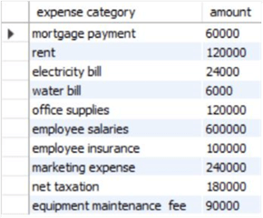
INSERT INTO expenses_2017 VALUES
('mortgage payment', 60000),
('rent', 120000),
('electricity bill', 24000),
('water bill', 6000),
('office supplies', 120000),
('employee salaries', 600000),
('employee insurance', 100000),
('marketing expense', 240000),
('net taxation', 180000),
('equipment maintenance fee', 90000);
--MSSQLTips.com
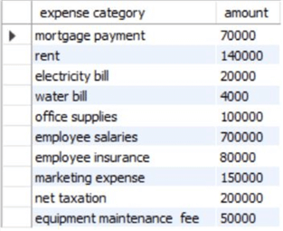
INSERT INTO expenses_2022 VALUES
('mortgage payment', 70000),
('rent', 140000),
('electricity bill', 20000),
('water bill', 4000),
('office supplies', 100000),
('employee salaries', 700000),
('employee insurance', 80000),
('marketing expense', 150000),
('net taxation', 200000),
('equipment maintenance fee', 50000);
As we can see, our tables are relatively simple. Across the two years, the expense categories have remained the same, and only the corresponding expenditure amount has varied. We can observe our tables using the following query:
--MSSQLTips.com
SELECT * FROM expenses_2017;
--MSSQLTips.com
SELECT * FROM expenses_2022;
Creating a Visualization in Power BI
Now that we have a data model, we can import our schema to Microsoft’s Power BI and create a custom tornado visualization to determine the cost breakdown of 2017 versus the one in 2022.
Step 1
In the main interface of Power BI, click on “Get data” in the “Data” section of the “Home ribbon”. A list of common data sources will appear. Select the “SQL Server” option, as shown below. Power BI also offers many other sources to import your data.

The “SQL Server database” window will appear. Enter the relevant server credentials and click “OK” at the bottom.

The “Navigator” window will pop up. Below the “Display Options,” select your expenses tables and click on the “Transform Data” option as shown below. Power BI also gives the option to preview our tables and inspect them for any errors. The transform data option then helps us rectify any of these errors.
Although our dataset is complete, we still need to transform the data to merge the two expense tables and introduce a date column. As we will see later, these steps are necessary to construct our visualization.

Step 2
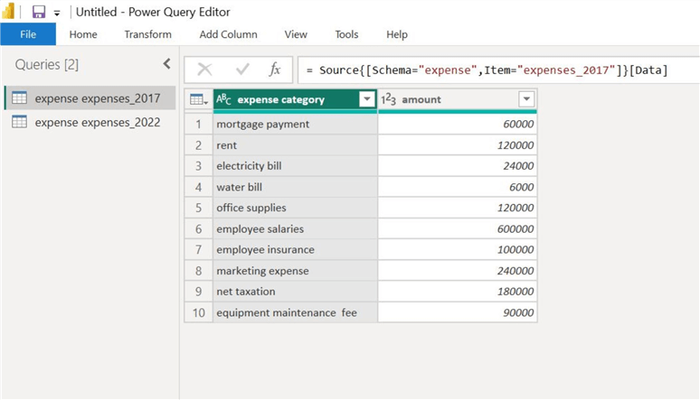
The “Power Query Editor” will now open, and we can observe our tables as shown below. Below the “Queries [2]” heading, we can switch between our available tables to edit them.
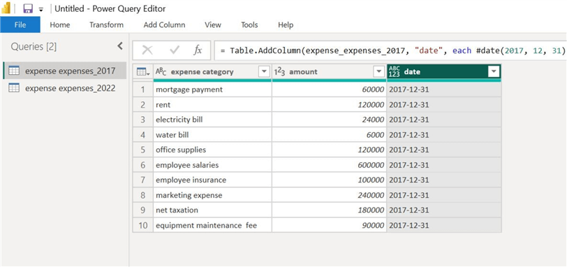
To insert the date column in our “expenses_2017” table, click on the “Custom Column” option in the “Add Column” ribbon as outlined below.

This will cause the “Custom Column” dialog box to open. As shown below, we can name our new column “date,” and in the formula box, insert the following DAX expression:
//MSSQLTips.com
date = #date(2017,12,31)
This function will insert a new column with all observations set to 31 December 2017. Why this date specifically? Since we only need a year-based comparison, we can choose an arbitrary date from 2017.

After clicking “OK,” we see our newly appended column in our expenses table below.
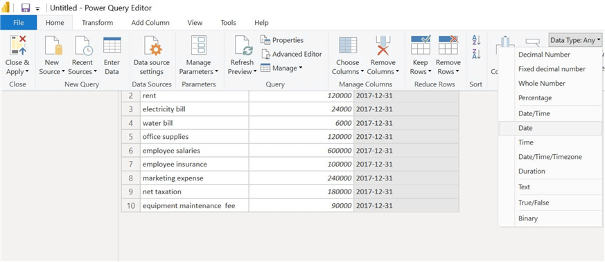
However, the data type of our “date” column is set incorrectly. To correct this, click on the “date” column heading, click on the drop-down arrow in the “Data Type: Any” option to the far right in the “Home” ribbon, and then select the “Date” option as shown below.
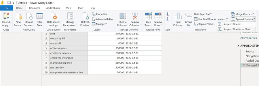
Our “date” column will now be correctly labeled. We must repeat the above steps for our other expense table to get the results below. The new “date” column has the year 2022.

Now that we have appended the tables’ date columns, we can merge the two into a single query. To do so, click on the drop-down arrow in the “Append Queries” option in the “Home” ribbon and then select the option “Append Queries as New” as shown.
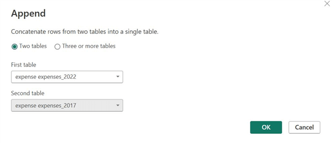
In the “Append” window, select the tables as shown below and then click “OK.”
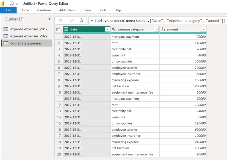
We can now see our newly appended table, as shown below. Below the “Queries [3]” header, we can right-click and rename our new table and give it a more descriptive name.
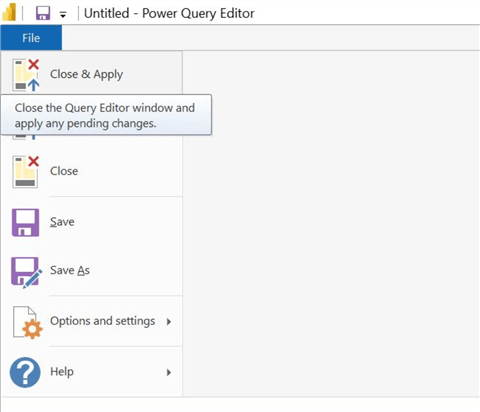
Since we are done with the data manipulation step, we can exit the Power Query Editor by clicking “File” and “Close & Apply.”
Step 3
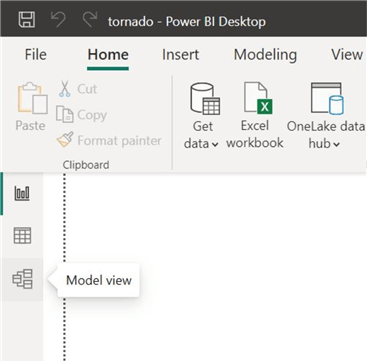
We will now be redirected back to the main interface of Power BI. We now need to ensure that our appended table does not have a relationship with the prior expense table, as those are now redundant. To do so, click on “Model view,” as shown.
This is what our schema currently looks like.
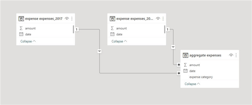
To get rid of the relationship with the “aggregate expenses” table, right-click the relationship arrow and click “Delete.”
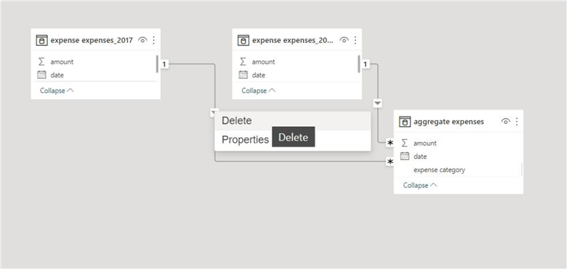
Our final data model should look something like this:

We can now revert to the main interface of Power BI.
Step 4
To create our tornado visual, click on “…” in the “Visualizations” panel and then click “Get more visuals,” as shown below. We must install a custom visual as Power BI doesn’t natively support tornado diagrams.
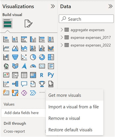
In the “Power BI Visuals” window, search for a tornado chart and install the custom extension shown below.

Step 5
We are now ready to create our visualization. Select the tornado chart icon in the “Visualizations” panel, as shown below.

To populate the visual, drag the “expense category” column to the “Group field” and the “date” column to the “Legend” field. Click the drop-down arrow beside the data column and select the “Date Hierarchy” option, as we need a year-based comparison.
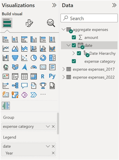
Lastly, insert the “amount” column in the “Values” field.

As shown below, we can now observe a rudimentary version of our tornado visualization.

Customizations
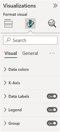
It is evident from the above tornado diagram that our work is complete yet. Our bars are not sorted, and the visualization is rather plain. Fortunately, Power BI offers users plenty of formatting options to rectify this problem. We can work with two streams of formatting, as shown below:
Visual Formatting
Visual formatting deals with the appearance of our visuals, and we can edit the following elements:
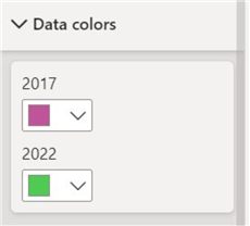
Data colors. This allows us to edit the color of our bars and thus appropriately color code our visual.
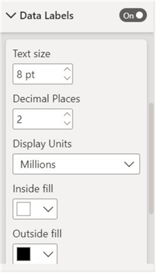
Data Labels. We can choose the exact expense values to appear on our bars here. We can also then edit the appearance of the labels by altering the text size and display units, as shown below.
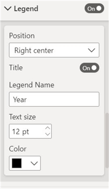
Legend. Enable the legend of the visual and alter its position, title, and text size.
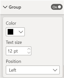
Group. Change the position of data categories here.
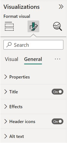
General Formatting
This stream allows to alter the visual aspects that are generally common to all visualizations, such as:
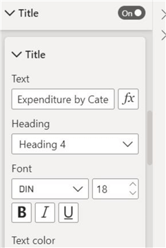
Title. We can write a descriptive title for our visual and then change its font, size, and alignment, as shown below.
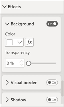
Effects. Here we can alter the background color of our diagram and create a visual border to make our tornado diagram more appealing.
As a last step, click “…” at the upper right corner of your visual border. Then click “Sort axis” and select the “Sort descending” option for the “Sum of amount” axis, as shown below. This step will create a sorted diagram, giving our visual its tornado shape.

We can now observe the final version of our tornado diagram below.

Conduct Analysis
Now that we are done with creating our tornado diagram, it’s time to subject it to analysis and answer the question of whether the costs in 2022 have shrunk or not relative to previous years. At a glance, although the expenditure structure between the two years appears similar, a close inspection reveals that employee salaries, which continue to be the most significant chunk of expenses, have increased by 100,000. Other categories, including taxation, mortgage, and rent, have also risen, except marketing expenses. Thus, it seems that expenditure has risen in 2022 as opposed to the claims of the company executives! However, on the other hand, the figures are likely not inflation adjusted, so it is also probable that the actual expenditure fell in 2022.
In this tip, we have given an overview of the tornado diagram, its applications, and its importance. After creating our data model in SQL Server, we outlined the procedure to create this visualization in Power BI.
Next Steps
- Check out all the Power BI Tips on MSSQLTips.com

Harris Amjad currently works as a Software Engineer at Strategic Systems International. He is Microsoft Certified Data Analyst and Microsoft Certified Trainer. A rigorous, task-driven Data Enthusiast with substantial experience in Data Science, Data Analysis, and Data Engineering.
- MSSQLTips Awards: Trendsetter (25+ tips) – 2024 | Author Contender – 2023, 2024 | Rookie Contender – 2022
